

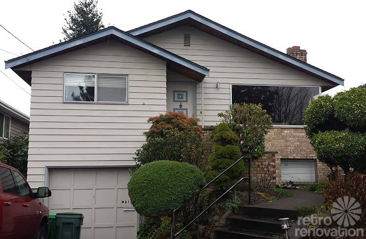
 Reader Allison is excited to jazz up the front of the 1967 house she moved into last summer. She’s not afraid to give the house a bold new look, but isn’t sure exactly where to begin when choosing a new color scheme for her exterior. She need to take into consideration” (1) the coloring of the brick, (2) the prominence of the garage, which sits below grade, and (3) the fact that she plans to simplify the landscaping, which will open up the facade further. She has asked for our ideas to add new life to her blank-slate beige exterior.
 Allison writes:
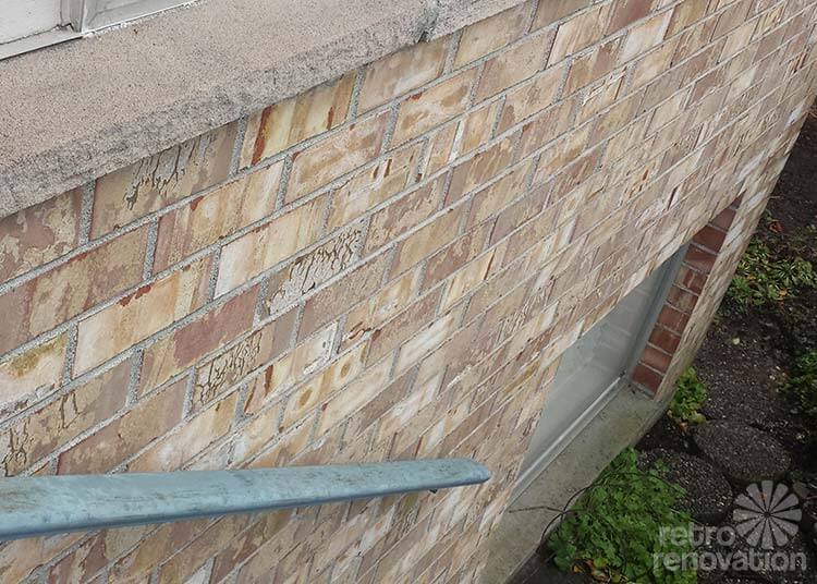
We bought this great 1967 Seattle house last summer, and will need to paint it this summer. Pretty much anything goes, though the color of the brickwork accent on the lower front part of the house should be considered.
The photo of the entire front of the house shows mature plantings, many of them topiary, but these will go away when we get to landscaping the yard with low-maintenance native plants. My SO also has asked that I not pick anything too dark, as he is a firm believer that dark paints fade in the sun no matter what type of paint is used. We’re not afraid to do something bold, as long as it’s not so crazy that the neighbors hate us.
Readers — what colors would you recommend for Allison’s exterior?
Kate’s solution: Green dream
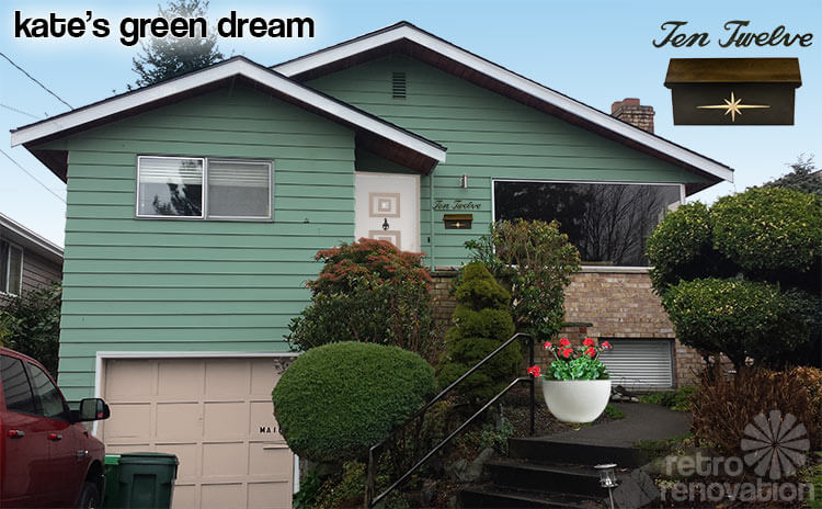 My first thought when looking at Allison’s house was: This house needs color. I’ve seen countless homeowners in my neighborhood make the same mistake as the former owner of Allison’s house — painting a house’s siding the same color beige as the brick. This kind of monochromatic paint treatment neutralizes a home’s character, making it feel blah. Since Allison’s brick reads as a versatile light beige, it works well with a large variety of shades.
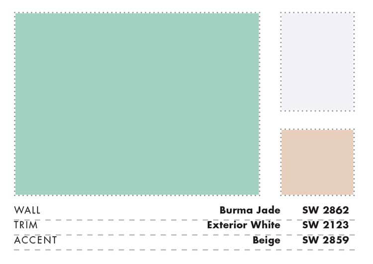
To narrow it down to one, I looked at Sherwin Williams Suburban Modern paint palettes, which features some fabulous color combination ideas for mid century homes. I chose the Burma Jade color grouping for Allison’s house because the light beige color was very similar to her brick and the green really brightens up her siding while contrasting nicely with the brick foundation. Using white for the trim helps accentuate the interesting roofline and makes the front door feel clean and inviting. Using the beige color for the garage door helps to visually ground the house by repeating the color of the brick at the base of the house. Beige is also used on the front door accent squares, which repeat the square shape from the garage doors.
To finish off this look, I’d add some vintage mid century cursive address numbers from Etsy seller MintyKeennear the front door or above the garage door. If vintage can’t be found, she can have new ones made, like this Home Address Lettering from Etsy seller ModernHomeIdeas, or possibly even find some at a local hardware store. If Allison’s mailman doesn’t mind doing stairs, Allison could get a retro house mount mailbox like this atomic starburst mailbox from Etsy seller EleanorMeriwether to mount near the front door. Allison mentioned that she will be taking out some of the overgrown shrubs and planting new, low maintenance plants this spring. I’d advise adding a touch more color and interest with one nice planter, like this Iris Speckled Planter from West Elm near the curve in her sidewalk. Planting the pot with some cheerful, bright red geraniums will bump up the curb appeal and add even more emphasis to the home’s entry.
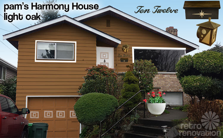
Pam’s Harmony House light oak exterior paint idea
 Hi Allison,
Idea #1, above: I know you said “not too dark” and maybe this is. So, consider it a general “idea”. I was originally thinking “caramel”, but in looking at vintage paint palettes found this “Light oak” in a Sears Harmony House brochure from my collection. When Kate sampled it into her photoshop (we do this “live” together via google hangouts), I liked the way it looked. Again, though, you could go lighter — more like coffee with lots of cream. Caffe latte. Over on our Facebook page, a commenter called this “Mocha”. You’re in Seattle, golly, they make their own palette of “Barista Marrones.” That’s Italian for “brown”. As in Chestnut. Haha, now I am having too much fun, I am surely annoying you.
Honestly, you could use many colors with that brickwork as a start. Except maybe stuff that’s too yellow. We tried harvest gold for the paint color, and we did not like the look.
As you can see from the mockup, I also thought it might be fun to continue the raised wood door decoration — the squares — onto the garage door. I would use real wood just like the door (don’t paint it on.) Kate and I tried the square-in-a-squares in a variety of ways. I liked the Charlie Brown stripe (my term, hehe) the best. If you go with this idea, there definitely will be a not too many, not too few, just right solution, I think.
In addition, I asked Kate to beef up the window trim to see how that would like. I like it. But of course, adding more trim around the windows will involve more dough re mi than just paint, and I don’t know how much you are up for that.
Finally, I don’t think that the current bullet light near the front door is doing much for the facade. It’s too small, and I think any light needs to move closer to the doorway. How about something more atomic, like the vintage porch light I found on etsy from ChromeTiki. Note, the mockup makes the fixture look brown — but it should be wrought iron black (like the mailbox) for pop. Note, with the mailbox and the lettering and decor decor, a decorative light might be one thing too many up there. Layer/edit all these elements/ideas carefully for best effect.
Pam’s Get-yee-an-architect to carefully redesign the facade
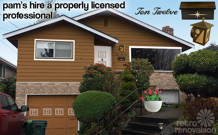 Idea #2, above: I do not like this rendering — it is not right — but I show it to convey the thought that: That big front section with the garage seems, to me, to be ripe for some architectural exploitation. I suspect the original treatment — all clapboards for two stories — was common in your neighborhood, the choice of the “merchant builder” who built all the houses. If you want to add more dimension… more architectural interest… especially given that long tall front gable set up and the planes and angles (if those are the right words) of the house already in place… I think the answer is to get with a good architect or other such professional to work up some ideas. Back in the day, it was quite common to use different facing materials, often painted out with different colors, to give unique personality to similar “little boxes” all built in a row. For example: Horizontal clapboards on most of the house — vertical board and battens in strategic places — with masonry half-walls and such also carefully designed in. Those three facings combined — in particular — very common.
In this vein in general, I thought of the book, Rob Keil’s Little Boxes: The Architecture Of A Classic Midcentury Suburb *affiliate link. It’s features a number of little houses with different kinds of facade treatments and incorporating levels and garages on the bottom like a split level house. Now, this book is about Westlake Village in suburban San Francisco, and most all the houses shown have wacky mod rooflines. But if you can dish out the dough for the book — which is now out of print and has become pricey — I sure like eyeballing the ideas. If you don’t want to spend the money, check out vintage house plan catalogs. The designers and illustrators of vintage marketing materials like these worked hard to make their houses pretty, and their illustrations can contain lots and lots of great curb appeal ideas straight from the years the houses were conceived.
Good luck, Allison — thank you for submitting your Retro Design Dilemma — and send us photos when you decide a course of action and finish up with your new paint job!


Brian T says
By the way, since the photos are not too far off from the amount of detail one can see from the street, can I ask people to reconsider the use of the fancy “ten-twelve” cursive house numbers? Is there a single person who could read them in these photos? There are plenty of other period-appropriate options that are far more legible. An ambulance driver or fire engine would not be a fan of the script. If we’re conscientiously avoiding asbestos etc. for safety reasons, why not also pick house numbers that put safety before style. Just a thought.
Allison Woods says
Those cursive house numbers are not my style at all. I have our house numbers, but haven’t put them up yet–I need to figure out how to mount them. https://www.etsy.com/transaction/131624293?ref=fb2_tnx_title
Brian, I messaged you through the form on your page about the house deal–it’s probably not as interesting to the rest of the readers as it is to us. 😉
Kate says
Yes, it is true about house numbers. For safety, they should be numerals, and have some sort of illumination. Emergency responders need to be able to read them quickly and at night.
Brian Landreville says
Allison- No, I didn’t bid on it. my client didn’t have the vision to look past the wallpaper, kitchen, yard etc….. I saw it the day it came on. Everyone was surprised they didn’t wait to look at offers. The sellers definitely left money on the table, but its great to see your bringing the house back. Glad you love it there. That is a great neighborhood to live in.
Brian Landreville says
I brought my client by right as it came on the market. (I’m a real estate agent) I joked to them it was the official test house for wallpaper. There was certainly a lot. Checked out your blog, looks like your doing things right. Your in a prime neighborhood, so anything you do will not be too much. Glad your getting rid of the awful concrete backyard. Have fun!
Allison Woods says
The listing went live around noon Tuesday, I saw it at 3:30, and we put in our offer at about 7:30. I think we reached agreement Friday morning. Was your client the other bidder? And can I just say how much we LOVE that house? (And I can’t believe we get to live there)
Allison Woods says
Apologies about my comments today being scattershot–I was looking at everything on my phone while I was trying to work. I’ve gotten a lot of inspiration from the comments, and am seeing the house pallete taking shape in a painting that I posted on FB. Right now I’m leaning toward a light Tiffany blue for the siding, with spruce green or aubergine for the trim, door color TBD. In order to break up the verticality on the left side of the house, we could go a shade or two darker on the lower part of the house, though I have to look at where that would hit going around the corner. As for the garage, we both hate that door. The best solution is to get a new one, but if we keep this one, I think going with a darker tint will ground the house and make it recede. Check the FB page for the painting–there are probably 50 color combinations right there in a 3 x 4′ piece of canvas.
Oh–and if you really love it, you can buy it. I can make more.
Thanks everyone. This has been super fun.
Brian Landreville says
I was in that house when it was for sale back in February. I especially liked the mature landscaping. I remember mentioning to my client at the time that I would pick a tone in the brick (there were a lot to choose from) and paint the house that color and it would blend in great with the brickwork which is an important architectural detail on the house. I also remember the old owners loved their wallpaper, lots of interesting patterns. Maybe that will be another design quandary for Allison to pose to the readers.
Allison Woods says
Brian–you probably saw the house after we reached mutual agreement. We moved like mad to get the house.
The original owners (we bought from the estate) were Norwegian. We removed 1000 SF of wallpaper, (only the blue brocade in the front bedroom–my office, remains) had the oak refinished (the master has it too) and recarpeted downstairs the week after closing. Since then we have gutted the kitchen and blown out the wall between it and the dining room. This year we plan to remodel both upstairs bathrooms, replace all interior doors and mouldings, replace the windows, remove the sunroom, and jackhammer out the concrete back yard. Grass, a grade-level deck, and a hot tub are slated for the back yard.
The fireplaces will both eventually be replaced, and we may open up the stairway to downstairs eventually.
Our house blog is way out of date right now, but you can see everything we have done inside (except now the kitchen is completely done) here: http://8012house.wordpress.com/
Allison Woods says
The fireplaces will be REFACED, not replaced.
pam kueber says
Of course, I loved all the old wallpaper. FLOCKED PAISLEY oh my goodness, be still my heart! Oh well. I know I am way out beyond most folks’ tolerance for this! 🙂
Allison Woods says
That 6′ of flocked paisley stayed too, I forgot about that bit. It looks pretty good down in the rec room.
Scott says
Those bricks just scream they want to be paired with a warm Light Pink house with rich Carnation Pink accents and a flat-shingle Cinamon Frost roof. 🙂
Carol says
Allison, What a darling house you have! I agree with option 3 in that the space needs to be broken up visually. If you went with some trim around the windows and around the door and ran a wide trim board where the brick stops in the photo, then the lower siding could be painted a different color. This would visually ground the house. This would look very nice given that the plantings will be removed and the house will have to stand on its own. Martha Stewart paint at KMart has the best coordinating colors on one sample I’ve ever seen. The color combinations are impeccable! You can have them color matched with the manufacturer of choice. Start with one gallon to make sure it’s right. The paint readers vary from store to store. This would lend more of a cottage feel, but being a midcentury modest, I think it would look great. It would take a good carpenter a day to do this and would be economical. Window box over the garage window is also a great idea. I wouldn’t do shutters. No need to hide that fabulous corner window. Go bright on the front door and leave the rest sedate. Check out Martha Stewart paint, surprising awesome color combos. You can paint the garage door ribs a darker color and the insets a lighter color. This makes for a sedate checkerboard. A large house near me with a lot of stone, the color of your brick, did this with the coordinating pale mushroom and taupe trim paint and it looked awesome.
Martha says
Hi Allison,
Your brick has lots of variations: light yellow, gold, peachy pinks, brown, and red tones, with an overall light brick appearance.To best compliment those colors, and the natural wood of the eaves, I feel you need a warm tone for cohesiveness, and it should be in the family of one of the above colors.
If you are looking for wow and pop, I suggest Sherwin Williams Carribean Coral 2854 for the main color. Accent trim with a lighter color, New Colonial Yellow 2853. Then you can accentuate the door using a darker color, Fairfax Brown 2856. Details on the door can be painted in the NCYellow. This color combination is found in SW collection.
Or another combination might be NCYellow as the main color, trim Fairfax Brown and door Carribean Coral.
I know you said no brown, but as an accent, it really works since it is warm.
The siding I would paint in satin, but the garage door, which should be the same color as the siding, should be gloss.
I’d stay away from gray, blue, and cool greens. A warm green (like Sage 2860) could work because of its yellow undertones that work with your existing colors.
It is hard to tell exact shades of your colors on a computer monitor; so you really need to test paint suggestions via quarts.
That’s my two cents… Good Luck!
Allison Woods says
Adding the brick makes it look too suburban to me, though it unifies it, thanks for the suggestion.
I HAVE driven around quite a bit but have not been inspired. There is no way we will use any brown, no worries there.
pam kueber says
I agree — as I said, adding the brick is “not right” — but I was trying to show that adding other materials is always a possibility and was done “back in the day.”
Robin, NV says
Pam, I realize this is a little unorthodox but I sent you a Tweet with my idea for Allison’s house. It was the only way I could figure out how to send you a picture. 🙂
Robin, NV says
I like the third option but I would shy away from the brown. It looks like too many of the modern townhouses you see in Seattle. I also think it would be difficult to match the brick. But it does unify the look of the house.