

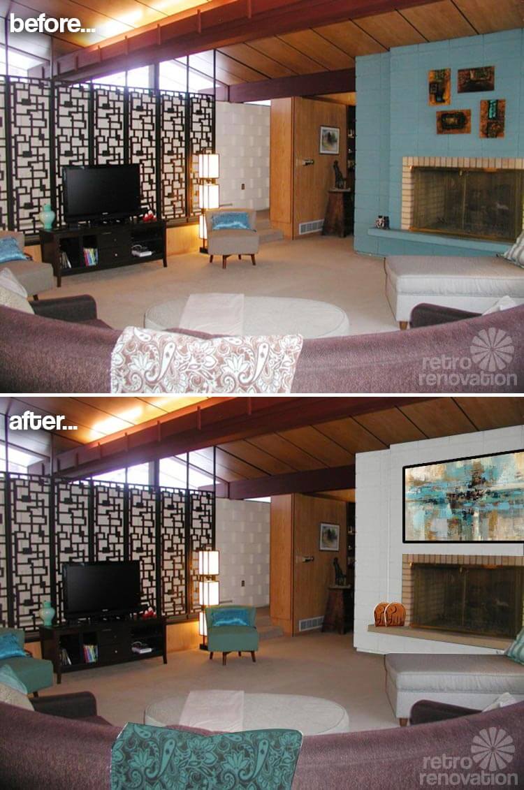
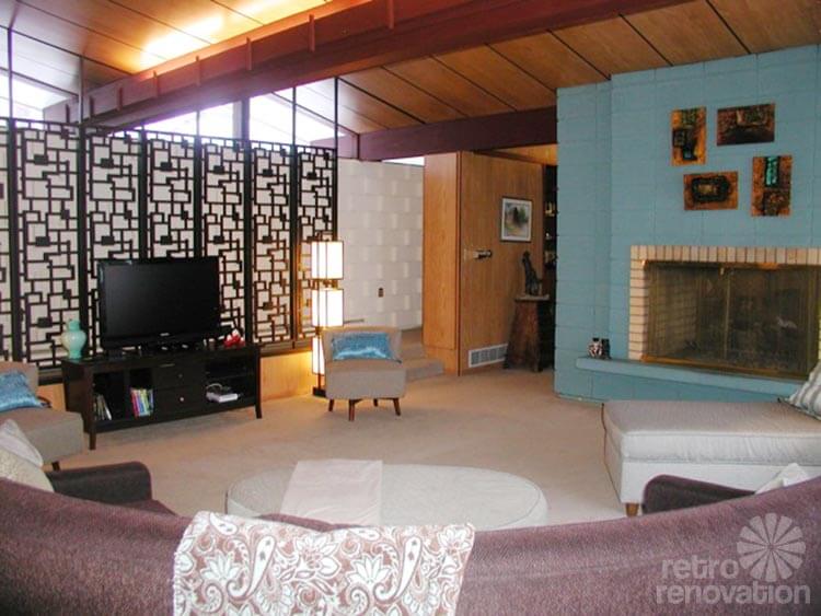
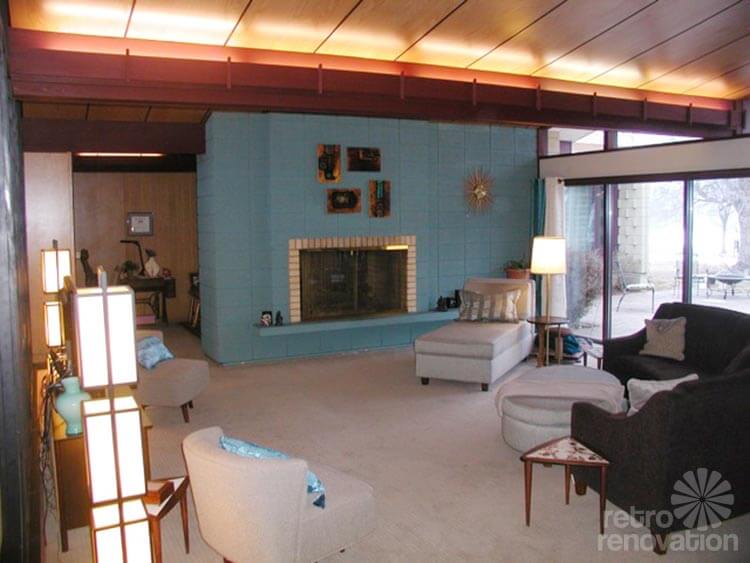
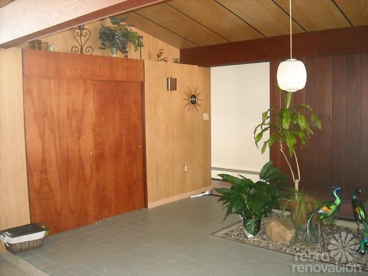
 Reader Kathy has an impressive mid-century modern house with oodles of amazing original features including a biomorphic wall screen, mahogany wall panels and clerestory windows. However, There is one feature that has been bothering her since the day she first moved in. The paint color of the large concrete block fireplace — she calls it “the big blue monster — is not jiving with the rest of her home’s decor. Now Kathy has asked for our help with ideas to tame this turquoise tyrant.
 Kathy writes:
Dear Pam and Kate,
A good friend told me many years ago to live in your house for a while, and let it tell you what it needs. I have lived with it for nearly a year, and the same thing is bothering today as it did the day I first saw it. The big blue monster.
My design dilemma is my fireplace wall. It is a double-sided fireplace in the living room and den. It is painted turquoise block and is in need of new paint or something different.
It is the focal wall in the living room. The part I don’t like is the contrast of the blonde brick that matches nothing else.
There is blonde paneling on the short walls and the ceiling. Another block wall in the room is more interesting, with concrete caps placed between the blocks, and it is painted cream color.
There is also an eight-panel helix patterned wood screen and a wall of glass overlooking the patio. All other rooms in the house have mahogany panels and doors. I feel this accent is lacking in the living room. The fireplace wall is 15′ long x 9′ high, and the opening is 55″ wide x 33″ high.
My idea is to somehow incorporate mahogany either in shelves or panels and paint the block to more closely match the original double oven which is more blue green than the fireplace. The hearth may also look good clad in mahogany. Not sure how to blend the block and brick.
This is what people see when they stand in my entry and I feel it is not as attractive as other details in the room. Please help me tame the monster.

Readers — What paint colors or other design ideas would you suggest to make this fireplace fit in with the rest of the room?
Pam and Kate’s solution for the space:
For this Retro Design Dilemma, Pam and I jumped online together to ogle and talk — and together we came up with a solution we both agreed on:
As you can see from the Before & Afters above, we believe that in this room, the key to success may be: Harmonizing the color of Big Blue — paint it the same color as the other concrete blocks on the wall visible, above.
Here was our thinking:
- There are already many finishes in Kathy’s room: Light mahogany wood, dark mahogany wood, cream cinder block walls, black decorative screen [reminds us of breeze blocks only lighter], beige carpet, tan fireplace brick and blue fireplace block. They are all very pretty. But, hmmmm, adding yet another color to the mix — that blue — is giving us finish overload — our eyes don’t know where to rest.
- The architecture of the room is very graphic, and the space, very open. Any finishes you choose, or accents you add, must work within this graphic framework.
- All of the existing finishes are warm and organic feeling. The blue of the fireplace is really the only “cool” color in the space. Because of this, and because it takes up such a large area, it makes it stick out and feel out of place.
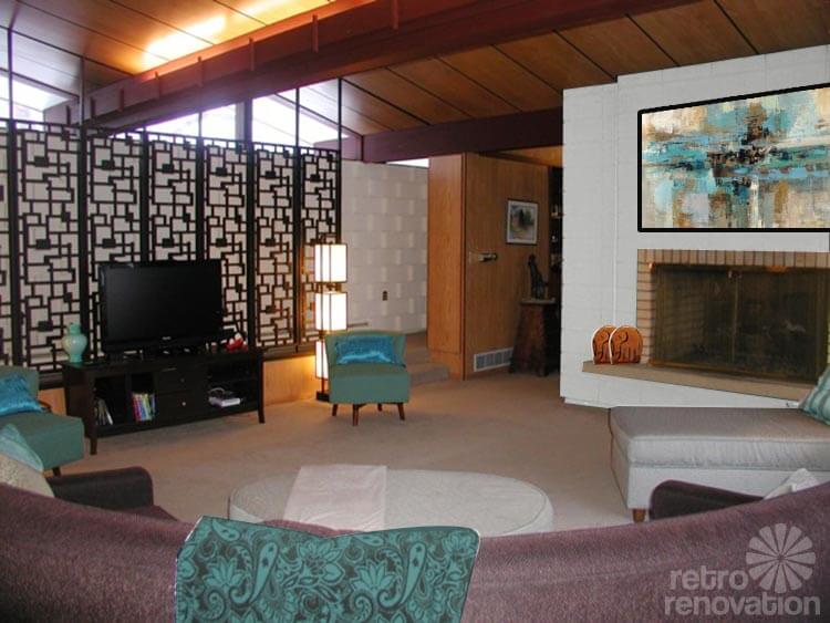
To solve for the issue: Simply paint the fireplace the same cream color as that back wall. Kathy can then use her desired accent color — a turquoise blue — in furnishings and accessories throughout the room. In fact, the color “pops” quite nicely … artistically … graphically … once you harmonize that big block fireplace.
Kathy’s idea of possibly covering some part of the fireplace with mahogany was also on the right track, we thought, since that would repeat the mahogany and help make the fireplace feel connected to the rest of the space. However, Pam and I both agree that there is already quite a bit of wood in the space — walls, beams, ceiling — and think the best — and surely, a way easier — bet would be to repaint the fireplace the same cream color as the other cinder block walls. This also will prevent the room from feeling too heavy with all of that wood.
In the mock up above, you’ll notice that we didn’t paint the cream colored bricks around the fireplace opening. We think that instead of painting the bricks, leaving them natural and then paint the ledge the same color as the brick. This will help make the area feel more grounded and part of the whole design. In general, we also like to avoid painting original brick.
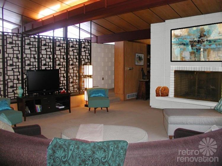 Above: We tried painting the bricks that immediately surround the fireplace opening and the hearth ledge, too. We do not like this look as much as our ‘keep these natural’ board. Too … stark .. we like the warmness of the beige brick and ledge.
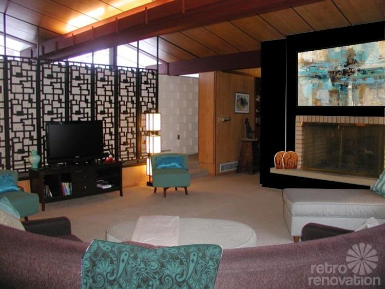
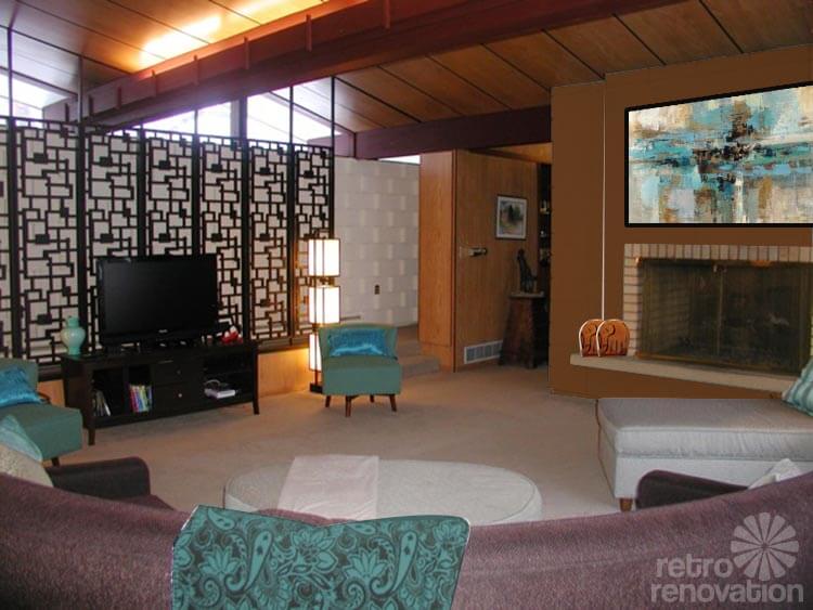
Two mockups of reader suggestions:
Quick-like, Kate mocked up to ideas from reader comments:
Use high quality paint — we suggest subscribing to Consumer Reports to access their independent tests
Pam wanted to note that when selecting paint for the fireplace, it is important to pick the very best quality paint that you can afford. You will also want a finish that is easy to clean. When painting, also ensure that the surface is prepped and paint applied using the best quality products and practices available — the surface of that fireplace is such an important element in the room, you want that paint and finish to be absolutely delicious. Good paint really can make a difference! This will help prevent headaches down the road — painting a fireplace is a big job. Pam suggests checking Consumer Reports for the paint quality testing. You will need to subscribe, but she thinks it could be worth it.
In addition to painting the fireplace and mantel, we suggest:
- Reupholster or replace the chairs flanking the TV and choosing a rich teal fabric. The room itself — walls, ceilings, flooring — needs to stay neutral to look cohesive. Add color in the furniture and accessories.
- Add the accent color in other accessories — such as in pillows, throws and artwork.
- Instead of having several small pieces of art on the fireplace, try one large painting or print. The art we used is a print called “Morning Fjord” available at Art.com, which picks up all of the colors in the room while the black frame mimics the room divider.
- Try not to have too many small accessories scattered around the space. The scale and style of this room dictate fewer, larger accessories. Instead, move the smaller accessories in the main living room to the built in shelf in the den, or make a colorful tablescapes that group items together.
- Think of the design of this room as a piece of modern art. The lines, textures and shapes speak for themselves without needing much additional decoration. The huge expanses of windows frame the “art” that is the world outside and work to bring the outside in.
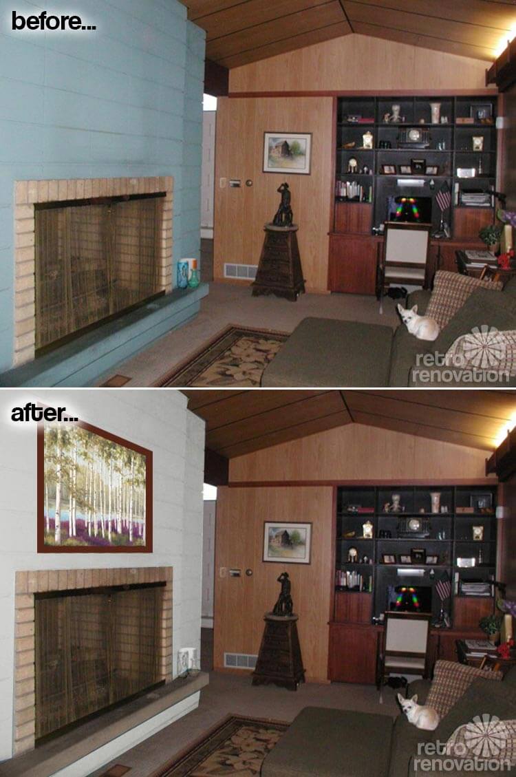 We agreed that the same treatment should be applied to the opposite side of the fireplace in the den. Again, the fireplace is painted to be the same cream as the home’s other cinder block walls, leaving the beige brick and painting the ledge to match. Another framed print from Art.com — entitled “Plumb Forest Floor” — hangs above the fireplace in a mahogany frame that echoes the built-in shelving. Have lots of fun using that terrific built-in shelving to make art-scapes with your smaller collectibles!
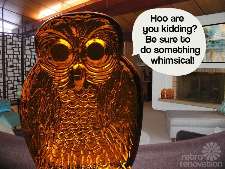
When it comes to adding small pieces to the living room, sometimes a collection of similar small objects can read as a part of the bigger picture. And minimilist mid-century modern can get… ascetic feeling — we we believe in not taking it all too seriously and being sure to add some whimsy. Here we’ve illustrated that point by going a bit overboard on the scale of this Blenko Amber Glass Owl bookend from Etsy seller MoonshineAntiqueShop. We also liked these fun vintage Amber Glass Blenko Elephant bookends from Etsy seller ShootingCreek.And how about these Blenko Owl Amber Glass bookends from Etsy seller junk2funkbiz and a great Blenko Amber Glass lamp from Etsy seller HostaHillFarm. We like that these bookends are silly. We like that they are from a famous mid-century glassmaker. And we like their color — the amber glass works well in the space because its warm feel echoes the warmth of the wood, and the color contrasts nicely with the aqua, too found in the room. These Blenko pieces can get expensive – but put them on your birthday and holiday lists and in a few years, we guarantee you’ll have a collection!


Jane says
I think it would look great painted a shade darker or lighter than the brick in the fireplace surround. While not as exciting as aqua a more earth tone neutral will brighten up the room and look clean and modern, you can then use aqua as an accent color to help tie the rooms together.
As a side note I recently painted the 1930s kitchen in my rental house an aqua color called La Fonda Mirage from Valspar’s National Historic Trust line. Great color – everyone loves it
Courtney Allison says
I would see about painting it white or a very light neutral grey (something like Behr’s Moonglow) and then doing rich stained wood for the hearth and adding in maybe some matching floating shelves to offset the fireplace opening. Simple, streamlined and it will brighten up the space a lot since you have such a nice mixture of other paneling and wood elements in the room. It’d pop without being overwhelming.
Good luck!! You have a gorgeous home!
Jeff says
I was thinking white too- like a nice, bright white chalk paint. That would really lighten up the room.
Or a very light grey
Stacia says
Natural. Absolutely. Do the brick and inside too, all the same color. Same as other wall or a bit darker. It’s hard to tell if they are in the same room or not. Beautiful space!
Jenny A. says
First of all – squealing with delight – you have an amazing house! I second everyone above that is leaning towards a more natural/neutral color for the fireplace. I think a darker gray might be nice. I agree with you, Kathy, about the blue, though. The color itself isn’t bad, just maybe not for that particular application.
Roundhouse Sarah says
I don’t think painting it aqua like the ovens is really all that different then what you have going on. I feel that you will then call it the aqua monster. Paint it a neutral color like ivory, beige, tan, or gray or have it refaced with a natural stone. The mantle could be painted to match the beam that goes across the ceiling to add a bit of contrast and repetition. Also the interior of the fireplace ( where you burn the wood) can be painted black with fireproof paint ( sold mostly to paint BBQ pits). I did this to mine and it looks great, hides all signs of dirt and soot and I don’t know, it just makes every fireplace look so much better, more refined.
Good luck! Your house is beautiful by the way, congrats!
Patty says
Agree with first sentence and suggestion except paint with neutral and avoid refacing the stone unless you want to spend more money.
Try to match the other stone wall if you can so you don’t have paint it too.
Kkmk says
I propose a color picked from one of the other elements in the room like one of the many wood tones or the other block wall. Then the bricks might make more sense from a color perspective. I am wondering if the bricks are original. They do seem to fit as a natural material, earthy tone, etc.
Kkmk says
The architect Alden Dow used similar stone blocks in many of his designs. You might find some ideas in his work. hhttp://www.discoverysquare.org/abdow.html
http://www.abdow.org/index.php/photo-gallery/78
http://abd-homeandstudio.tumblr.com
Leslie says
I think I’d consider re-facing with decorative stone. There are nice mid century looks out there that would look great in your fab house!
Good Luck!
Rowena says
I agree with Leslie, a decorative stone that’s mid century would complemnt the other features of the house. You have a really lovely home by the way.
Pam Quinn says
I agree that the original natural color would be ideal but if that is not an option I think I would go with black! Please keep us updated. Your home is beautiful!
Mary Elizabeth says
Kathy, you have such a beautiful home with so many gorgeous textures and materials. I can see why you feel the fireplace block is a blue monster eating the room. I agree with Nathaniel that it should be painted a more natural color, and given the dark colors of the wood in the rest of the house, I would go for a light gray or sandy beige.
In the different photos there appears to be no art or different experiments with art above the fireplace. I think directly above the fireplace you could put one large metal or metal and wood sculpture, something like this:
http://www.ebay.com/itm/Superb-Mid-Century-Wall-Hanging-Wood-Doves-Metal-Leaves-Vintage-Decor-Birds-Art-/360856502991?pt=LH_DefaultDomain_0&hash=item5404b942cf
or like this:
http://www.ebay.com/itm/Curtis-Jerre-Signed-Abstract-Wall-Sculpture-Mid-Century-Vintage-Decor-Unique-/331124527746?pt=Art_Sculpture&hash=item4d188f5282
depending on your taste and budget. A large atomic starburst with some wood in it or flying birds would be great also. Think grand and sweeping. Then the recesses on either side could have three or four mahogany “floating” shelves with vases or art in colors you like and want to pick up in the rest of the room.
Nathanael Kitchen says
I know you probably already considered this but I think it would look great in the natural block color or something close to it. Sand blasting is usually not an option if your living there but maybe a grey thats close to what the block would look like. I think ( just my opinion) that brick and block looks better when they are painted in more natural hues. Of course not painted is best but if someone already did it (our fireplace is painted yellow) you have to come up with something you can live with. Its a beautiful house! I am sure what ever you decide will be great!