

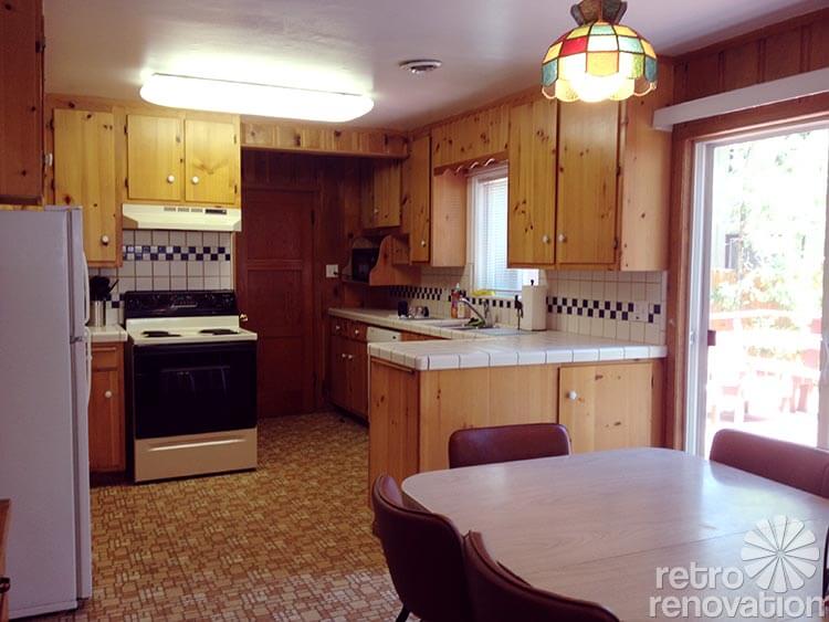
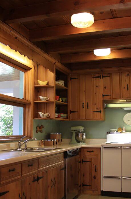
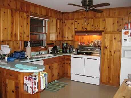
 Reader Michaela needs no convincing when it comes to loving her knotty pine kitchen — yes, knotty is nice! However, she’s at a loss when it comes to some decorating questions. Smartly, Michaela is starting small by trying to figure out what color to paint the ceiling — bright white? Off white? Beige? She’s also wondering what color appliances would look best in the space, since she plans to replace them over time. And what about the table? Michaela says she would love to add some color to her kitchen somehow — through the appliances, counter tops or some other way — and she needs our help to decide which direction to choose. Opportunity to play decorator, dear readers!
Michaela writes:
Basically I’m looking for help not so much to redo my kitchen but to tweak it here and there so it just has a nicer, fresher feel. For example, the white vinyl vertical blinds will likely be replaced. I’m also replacing that grate on the ceiling and painting it white to match the ceiling. I’ve done a lot in terms of just cleaning up the look. Little things like replacing all the big white ceramic knobs on the kitchen cabinets with more original-looking antique bronze small knobs.
My main question right now is which color white color to paint the ceiling to go with the knotty pine. I will also slowly be replacing the white kitchen appliances with black appliances. But for now I just want to start with painting the ceiling a shade of white, and there is a laundry room next to it where the ceiling needs to be painted as well.
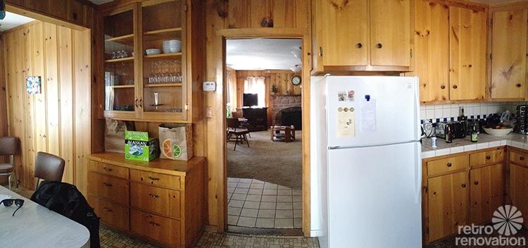
I have the same issue in the living room. The rest of the house has knotty pine ceilings. Anyway suggestions on the color of white would really help me a lot. I don’t want to be too creamy, and stark white may not be the best. But I just don’t know. Every white has certain color undertones and I’m unclear how to proceed. BTW I’m keeping the little vintage lamps you see in the first photo. They’ve grown on me. Just need to work on cleaning them. Lots and lots of cleaning!
P.S. I’m on the fence about the table and chairs. They were there in the house when I purchased it. At first I h***d them. Now they don’t seem as egregious. Someone helped me arrange the chairs differently, taking some of the chairs away from the table which makes it seem more homey. But I’m being offered good money for this table and chairs. So advice on this will be much appreciated. Eventually I’d like to redo the flooring. But it’s in such good shape I can’t see replacing it right now. Eventually I’d like to replace each appliance with a black colored appliance as they die away. And I’d also eventually like to change the countertops to something other than white. Just because …. I like color. I know granite may go away soon in popularity, but I picture a nice black brown purple eggplant type granite. I have it in my other kitchen…I think it would look great in there.
Ok readers — now we need your help. What color would you paint the ceiling? How about the appliance color?
Thoughts on window treatments or other ways to bring more color into the space?
***
Pam & Kate’s ideas for this knotty pine beauty:
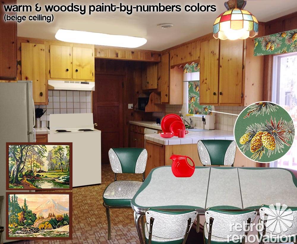
When it came to Michaela’s knotty pine kitchen — which has many original, fundamental features that we love! — the first thing Pam and I both agreed on was that it could be even prettier with the addition of more color. While we loved the table that was already in the space, we both felt it could be switched out to immediately bring more color/interest down to that end of the kitchen. Since Michaela loves and wants to keep her colorful slag-light pendants, those are the start for building out the color palette — and they are a great start.
We love the way deep emerald green looks with knotty pine, so I searched and found this vintage teal green and cracked ice table from Ebay seller siloview. The table’s decorative scalloped design mimics some of the scalloped woodwork in Michaela’s kitchen. The chairs — which are new reproductions of classic diner chairs from Vitro — match the vintage table beautifully and add more color and pizazz to the space. (Photo of green Vitro chairs from Classic Kitchens.)
When it comes to the appliances, Pam and I were concerned that black appliances are too dark for the space. We’d much rather see Michaela use almond, white or if she’s game — vintage appliances — in her kitchen. Pam reminds us that there are plenty of 30″ vintage electric ranges — like this vintage Kenmore electric stove — out there.
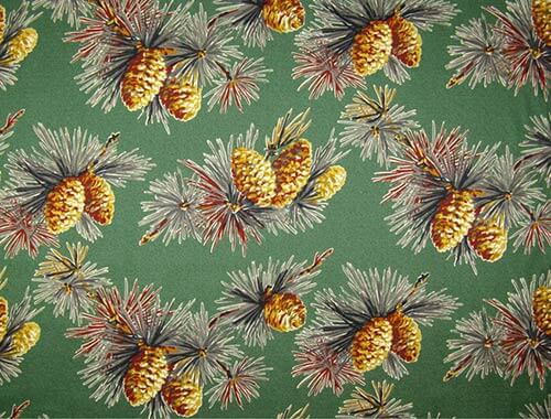 To pump up the color even more, we suggest that Michaela consider window treatments using barkcloth like that from Full Swing Textiles Moonlight in the Pines barkcloth in Juniper to make some valances for the over the sink window, patio slider and large window by the dining area. This pattern is great because it picks up the green from the table and chair set, the yellowy orange of the knotty pine wood and flooring and has pops of red and black to help tie in accent colors in the room — such as the vintage lights that Michaela has grown to love. It also brings home the “woodsy” feel that we suspect Michaela likes — we saw the moose tray hanging on the wall near the table.
Michaela, you also can hunt for vintage fabric or vintage valances…. and be check out our story, 7 places to buy barkcloth, for more barkcloth possibilities at a variety of price points.
For the patio slider, the valance will help cover up the very practical vertical blinds on the patio door. On the other two windows, making cafe curtains from the same barkcloth will help spread the color, pattern and softness throughout the room. . If Michaela needs further light blocking on these two windows, a roller shade can easily be added underneath the valance.
One final thought: Decorator Pam says she is thinking all the window treatments in this room would look better if they are boxy and tailored, rather than gathered and flouncy. “Box valances” can be pretty easy to DIY.


Okay. Back to decorating. Speaking of the moose tray that Michaela has hanging on the wall in her dining area, we think that it — and the small painting on the opposite wall — are too dinky for the wall space — those big walls offer a terrific opportunity to add color and personality! One idea that could suit this retro kitchen: How about starting a vintage paint-by-number collection — like these vintage paint-by-numbers from Ebay seller dayzeemaydog and hang them in a gallery-wall like installation on each wall. This will add interest and more color to the space, plus it gives Michaela something fun to collect over time.
Another way to pump up the color in Michaela’s knotty pine kitchen — bring in a second color from the light fixture by adding some colorful dinnerware like fan-favorite Fiestaware in scarlet red. Be careful, though, Michaela — with most any design palette, we’d recommend going slow with the addition of color. Start with two colors — one is a ‘main’ accent color — in this case the green… the other — in this case, the red — is the secondary accent color. The risk if you start bringing in more colors is that it becomes… chaotic. Take it slow.
 When it comes to the ceiling color, we think the stark white shown above might be a leettle too stark. To be sure, a brite white ceiling is going to reflect the most light back into the kitchen. From a practical, “I want light”, “I need light” standpoint, a #1 go-to solution is to paint your ceiling brite white and bounce a lot of light on to it. In the kitchen work area — that for sure is happening now. But, the question is… with all that lovely warm knotty pine, can we knock the white down a bit and still have enough light in the space? You could try it –>
Above: Instead, Pam suggested we try a light beige color for the ceiling, perhaps something along the lines of Sherwin Williams biscuit, which is a beige with warm orangey undertones similar to those in the knotty pine. If we didn’t want brite white, we would try a color like this. Note: Pam says that in her downstairs family room — which has original cherry paneling — she painted the ceiling S-W Beige from the Suburban Modern Palette (use the Search box in the header area at the top of any page to find our stories about this important go-to palette). The S-W beige looks great — the ceiling actually reads as “white”. BUT, Pam’s family room was designed to be overall dark and cozy — not a space she wanted to be lite and brite. So that is the trade-off you are playing with when making this color choice….
You’ll also notice that I removed the black and white checkerboard tiles in the kitchen back splash, which to us competed with the serenity of the knotty pine and read more as diner retro than the woodsy, knotty pine retro we are going for. Since Michaela is thinking she will replace the counter tops (and likely the back splash too) at some point, for now she could do a quick fix like reader Lori who painted her ceramic tile backsplash. If Michaela decided to take on painting her back splash, she could paint the black tiles the same color as the other white tiles so they blend in. P.S. Michaela, Pam says she kinda likes your counter tops. Ripping them out and replacing them will be costly and a hassle. So maybe… live with them at least a year… do more research here on Retro Renovation… and take your time in making this decision.
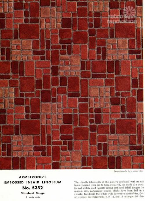 Armstrong #5352 — woot!
Lastly, both Pam and I immediately exclaimed how lucky Michaela is to have one of the most desired patterns of retro kitchen flooring in her kitchen — Armstrong #5352. Michaela, did you realize???? Again, we suggest that you study up on this design, then live with it for at least year to see if it grows on you like the light fixtures did — especially since you say that the floor is in great shape.
Though the most popular color way of Armstrong #5352 was the brick red, we think the warm golden color way in Michaela’s kitchen is just dreamy. Michaela — do you know some of our readers would do just about anything for that flooring?
All that said about this flooring, though: Precautionary Pam advises: There can be vintage nastiness in our vintage houses such as as lead and asbestos in the old materials and their layers — Michaela, this includes flooring like this — we don’t know what era your flooring is from, what’s in it, or what adhesives were used to install it; before you proceed, get with our own properly licensed professional to assess what you have so that you can make informed decisions. Readers and Michaela: No advice on this issue allowed in the comments — Get With Your Own Properly Licensed Professional to Assess What YOU HAVE So That YOU Can Make Informed Decisions.
More knotty pine love:
Great space, Michaela, let us know what you decide! Meanwhile, here are a few knotty pine inspirations from our archives, golly, we’re just basking in the honeyful glow of it all!:
 Above: The time capsule house with FIVE vintage pastel bathrooms also had this fantastic knotty pine basement!
 Above: Knotty Pine and turquoise together — ‘Betty Crafter’ says, Yes to the Knotty Pine.
 Above: Eartha Kitsch respectfully retained and revived the Knotty Pine kitchen in her 1956 ranch home.
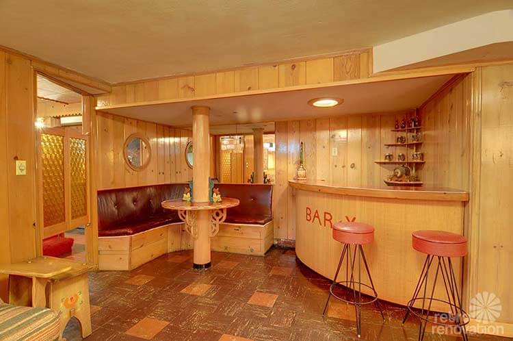 Above: This 1940 time capsule in Seattle had the same Knotty Pine loving owners for 70+ years — and quite possibly the most impressive basement we’ve ever seen.
 Above: Jeff worked hard to add detail to his Knotty Pine den — finding a place where you can still buy scalloped, mid century style Knotty Pine cornices and molding.
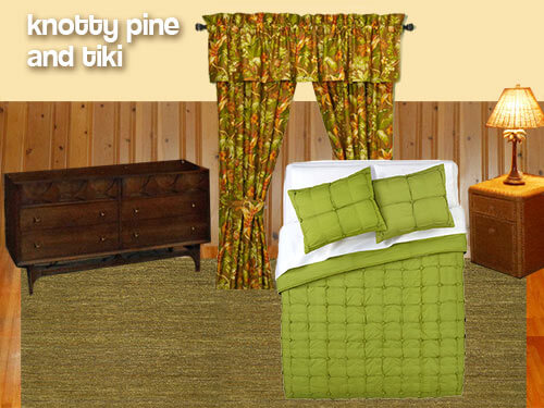 Above: Knotty Pine isn’t just for the kitchen — in this Retro Design Dilemma, we helped reader Jeanne come up with ideas to decorate her Knotty Pine bedroom with Tiki flair.
 Above: Back in 2010, we gave reader Tracy ideas for decorating the Knotty Pine kitchen in her 1962 ranch house.
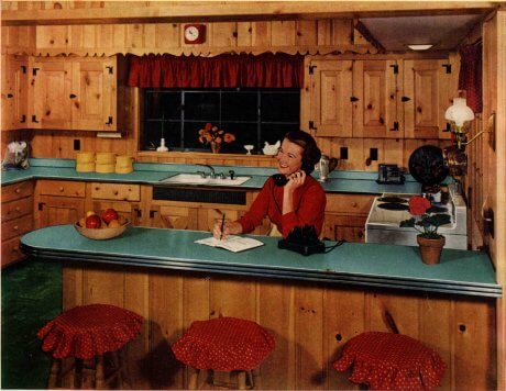 Above: Back in 1952, Formica already knew that Knotty Pine was nice in this vintage advertisement.


Portoar says
I think bright white on the ceiling would be too stark. If you have Benjamin Moore in your area, I would check out their Navajo Wite, it’s a great off white without yellow undertones and would work well with the knotty pine. I agree that you should avoid black appliances. you can bring in color by replacing the tile backslash and countertop. With those cabinets I would suggest a retro formic, which is inexpensive and environmental friendly.
Robin, NV says
What a great kitchen! I love that floor, I would keep it and use its colors as a jumping off point for other things.
1. I wouldn’t go with black appliances here. The kitchen is already a little dark and I’m afraid black would just create holes. White or almond look quite nice against knotty pine. Others have mentioned turquoise vintage appliances but they can be hard to find and spendy to buy.
2. If you’re thinking of redoing the countertops and backsplash, I’d go with laminate in bittersweet and just paint the backsplash a creamy off white. Or pick a laminate color that works with either the floors or the stained glass light fixtures. Personally, I would shy away from dark colors for the countertops. I think it would make the kitchen seem dreary.
3. I like the table and chairs but if you’re not into them, I think a round wood table and four chairs would look good. Something like this: http://www.overstock.com/Home-Garden/Dining-Room-Bar-Furniture/Country,/style,/711/cat.html?sort=Top+Sellers
It sounds like MIchaela leans toward a modern look rather than a retro look but I think she can find a happy medium. I know Pam and Kate can figure it out anyway.
Robin, NV says
Sorry, wrong link. Try this one http://www.overstock.com/#/3504350/product.html
Donella says
Hello!
How about painting the ceiling sky blue or light aqua? It would balance nicely with the paneling, and give you the color you are looking for without being overbearing. I can also see this with either blue/aqua appliances, stainless, or black/white could also work. Then replace the countertops (I know, eventually) with something light, like a whitish and non-busy solid surface – perhaps something like a Caesarstone Ocean Foam or Nougat. Then replace the backsplash with a very airy/watery blue/auqa glass tile in a random pattern & white grout… or a piece of back-painted glass. As for the table & chairs – I love them! But I could see the chairs recovered in a buttery yellow vinyl. The bluish ceiling & backsplash with the light yellow chairs would pull the light fixtures in really nicely!
I also can’t tell you how happy I am to hear that you are planning to get rid of the vertical blinds. The world should be rid of every vertical blind ever made! A sheer or lightweight drape in a pattern that pulls in the colors from the light fixtures would be a perfect compliment!
Then (again, eventually, I know), I would love to see the floor replaced with a VCT tile in a checkerboard or random pattern of light colors.
Good luck, and I hope to see an update as things progress!
pam kueber says
I actually think that vertical blinds are a wonderful solution for patio doors….
Donella says
To each their own, I suppose. But I despise them. Curtains, curtains, curtains. And again, curtains.
I’m not a big fan of blinds in general though, unless they are nice wood blinds or shutters in the right setting, or cordless honeycomb blinds.
pam kueber says
Pinch pleat curtains are my all time favorite, I am the blogosphere’s #1 cheerleader and proponent of pinch pleats. But for a patio door so tight in the kitchen like this…. I don’t think that’s what I’d do. Too much stack back — and in this case, all the stack back would need to be on the right side… pushing all the curtains into one asymmetric block (and one of the beauties of pinch pleats is their lovely soft symmetry.) Wide horizontal venetians will weigh too much… Roller shades also will be too wide to endure… For light control and ease of use, in this space, I might end up with verticals, they do have their purpose. Maybe not brite white ones though… maybe there is another material or color that would be less in your face
Donella says
I’m a big fan of sheers on a rod at patio doors. They are easy enough to just pull open or closed (if you ever actually close them – we never do), and there’s no necessity for a lot of stacking at the sides. I have a 9ft 3-panel patio door with two sheer curtain panels on a rod, and when they are open they’ll squish down to only 8 inches or so, if I really want them to.
Sheers will also allow in the abundance of light that patio doors provide, in addition to obscuring – but not completely blocking – the view when they are closed.
Aesthetically, vertical blinds will always be my last choice. But the main reason I despise them is that awful clank-clank-clank and perpetual movement whenever anything touches – or even walks by – them. Like nails on a damn chalkboard.
My mother-in-law loves them. It’s actually a bit of a joke between us.
pam kueber says
I hear ya. Not my fave either, aesthetically, but functionally, they have their place. If you want blackout control — for harsh sun or the black hole of darkness at night or so’s peeples can’t see in your house at night — they have their benefits.
Chad says
I’m struggling with this very issue in a big way. I might end up building a tall garden wall, or just know that I have to put a shirt on to get a glass of water at night, or stop minding if the neighbors see me in my underwear. I’ll probably go with Alternate 3.
Gina says
I agree that you might play with the colors from the hanging lights. For the ceiling I’d go with a white that has a bit of yellow in it. I’d do it carefully, though. A little yellow goes a long way. (If you follow the link in a prior comment to Betty Draper’s kitchen, you can see that color on the door and walls in the background.) The other option I see is an eggshell white. That would work for sure, but it’s a bit neutral and blah in comparison. I’d stay far away from black appliances. Not only aren’t they period in any respect, to me they look like Darth Vader, who I’d never invite into my kitchen. I’d go with the earth tones of the 60’s/70’s (avocado, chocolate, burnt orange) or stainless, which pretty much has no character (but hangs onto finger prints and drips like crazy) or keep it white which is what I remember from the 50’s. I understand your feeling about the table. It doesn’t work for me either. If you wanted to make it period, you’d put a plastic tablecloth on it, or something red checkered–or both! Or you might prefer a real wood table and chairs that go better with the knotty pine.
Eartha Kitsch says
The paneling and cabinets look like they’re in beautiful condition! The only things that are jarring to me are the countertop and backsplash. They look like the wrong era to match the knotty pine. I’d swap those out as well as the florescent ceiling light. Any color appliances will work – especially if you can’t afford the more expensive colored ones. The white fridge looks perfectly fine to me but maybe the stove looks like it might be the same era as the backsplash so the black front is jarring. My mind sees it as a black hole in the space. If you don’t have a ton to spend, I’d spend money on that countertop and backsplash before I’d replace a perfectly good white fridge.
Bring color in with some vintage dishes and fun finds in that built-in hutch. It’s screaming to hold some color! 🙂 Maybe some fun barkcloth curtains on the window? I love the flooring with the knotty pine.
pam kueber says
I hear what folks are saying re: the florescent light. But… I spent some time two years ago helping my mom freshen up her kitchen — she has a florescent light EXACTLY like Michaela’s — and golly jolly, does it ever brighten up the kitchen. It’s darned impressive. Haha: Retro.
P.S. My first spelling was “flourescent”. I think that’s when your blender goes crazy and the cookie dough ends up on the ceiling.
Katy says
Red! some retro look. maybe Big Chill… or Cream with colored handles. They are quite easy to paint yourself or have done
Lynne says
Oh, one more thing…the hardware on the cabinets, is it copper? If it is, run with it. Copper is fantastic. Canister sets, those jello mold thingys, planters, something copper on the center of the table.
If you would do any light replacement, there are some wonderful copper fixtures.
Lynne says
I’m commenting without reading, so I apologize if I cover an area that’s already been discussed.
I think you need to keep a white, or at least very light ceiling. The wood cabinets soak up light in quick hurry, so I’d keep it bright, and I’d use a slightly glossy paint.
Knotty pine is kind of “busy” and I mean that in the nicest possible way. I would be careful in how much pattern I brought in. Let the knotty pine be the star.
I would start small. Paint the ceiling. Get curtains/drapes up. I think your kitchen has a rustic charm to it, I’d like to see a plaid on those windows. Maybe colors that tie in the little lights you like? Get an area rug for in front of the sink.
Then, take a step back and see what else it might need. Don’t go crazy with “stuff”.
As for appliances, I’d just stick with white. The counter and back splash look to be in good condition, even if they aren’t your cup of tea. I’d do the other small things first (canisters, rug, etc) then if and when you replace the counters, the rest of the room will tell you which way to go. Still, I’d keep it simple and let those cabinets do all the talking.
Kirsten says
I would avoid black. It’s too dark for pine cabinetry, I think. It’l make the room kind of gloomy and plain. Pine is perfect for a wow in it’s environment. Indulge in color to set it off.
I’d replace the backsplash with something that can be adaptive over time such as subway tile (square tile can be off-putting to the eye as backsplash). Then, you have a wonderful opportunity to create color pop with the appliances! Turquoise, or red to pick up those hanging lamps… or pick up a color from your floor tile. (It looks like there might be baby blue in the flooring; it’s hard to see in these small snaps.). You don’t have to buy all new ones either. Just paint the ones you have. For the small amount of wallspace not covered in pine, try a secondary pull from the floor (something light) or a nice buttery yellow.
lexavline says
I love the fixtures above the table! Maybe work with those colors? Redish laminate countertops would look awesome.