

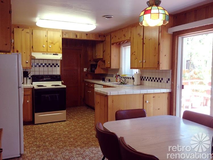
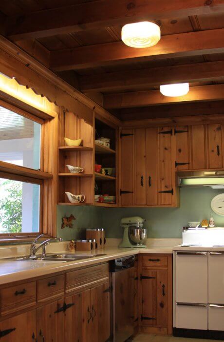
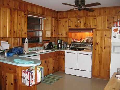
 Reader Michaela needs no convincing when it comes to loving her knotty pine kitchen — yes, knotty is nice! However, she’s at a loss when it comes to some decorating questions. Smartly, Michaela is starting small by trying to figure out what color to paint the ceiling — bright white? Off white? Beige? She’s also wondering what color appliances would look best in the space, since she plans to replace them over time. And what about the table? Michaela says she would love to add some color to her kitchen somehow — through the appliances, counter tops or some other way — and she needs our help to decide which direction to choose. Opportunity to play decorator, dear readers!
Michaela writes:
Basically I’m looking for help not so much to redo my kitchen but to tweak it here and there so it just has a nicer, fresher feel. For example, the white vinyl vertical blinds will likely be replaced. I’m also replacing that grate on the ceiling and painting it white to match the ceiling. I’ve done a lot in terms of just cleaning up the look. Little things like replacing all the big white ceramic knobs on the kitchen cabinets with more original-looking antique bronze small knobs.
My main question right now is which color white color to paint the ceiling to go with the knotty pine. I will also slowly be replacing the white kitchen appliances with black appliances. But for now I just want to start with painting the ceiling a shade of white, and there is a laundry room next to it where the ceiling needs to be painted as well.
I have the same issue in the living room. The rest of the house has knotty pine ceilings. Anyway suggestions on the color of white would really help me a lot. I don’t want to be too creamy, and stark white may not be the best. But I just don’t know. Every white has certain color undertones and I’m unclear how to proceed. BTW I’m keeping the little vintage lamps you see in the first photo. They’ve grown on me. Just need to work on cleaning them. Lots and lots of cleaning!
P.S. I’m on the fence about the table and chairs. They were there in the house when I purchased it. At first I h***d them. Now they don’t seem as egregious. Someone helped me arrange the chairs differently, taking some of the chairs away from the table which makes it seem more homey. But I’m being offered good money for this table and chairs. So advice on this will be much appreciated. Eventually I’d like to redo the flooring. But it’s in such good shape I can’t see replacing it right now. Eventually I’d like to replace each appliance with a black colored appliance as they die away. And I’d also eventually like to change the countertops to something other than white. Just because …. I like color. I know granite may go away soon in popularity, but I picture a nice black brown purple eggplant type granite. I have it in my other kitchen…I think it would look great in there.
Ok readers — now we need your help. What color would you paint the ceiling? How about the appliance color?
Thoughts on window treatments or other ways to bring more color into the space?
***
Pam & Kate’s ideas for this knotty pine beauty:
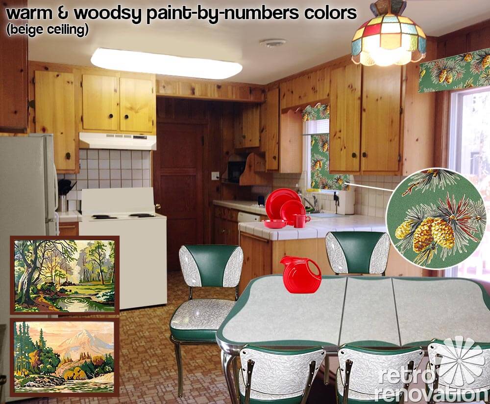
When it came to Michaela’s knotty pine kitchen — which has many original, fundamental features that we love! — the first thing Pam and I both agreed on was that it could be even prettier with the addition of more color. While we loved the table that was already in the space, we both felt it could be switched out to immediately bring more color/interest down to that end of the kitchen. Since Michaela loves and wants to keep her colorful slag-light pendants, those are the start for building out the color palette — and they are a great start.
We love the way deep emerald green looks with knotty pine, so I searched and found this vintage teal green and cracked ice table from Ebay seller siloview. The table’s decorative scalloped design mimics some of the scalloped woodwork in Michaela’s kitchen. The chairs — which are new reproductions of classic diner chairs from Vitro — match the vintage table beautifully and add more color and pizazz to the space. (Photo of green Vitro chairs from Classic Kitchens.)
When it comes to the appliances, Pam and I were concerned that black appliances are too dark for the space. We’d much rather see Michaela use almond, white or if she’s game — vintage appliances — in her kitchen. Pam reminds us that there are plenty of 30″ vintage electric ranges — like this vintage Kenmore electric stove — out there.
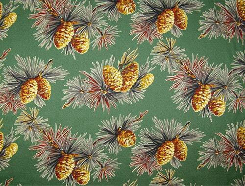 To pump up the color even more, we suggest that Michaela consider window treatments using barkcloth like that from Full Swing Textiles Moonlight in the Pines barkcloth in Juniper to make some valances for the over the sink window, patio slider and large window by the dining area. This pattern is great because it picks up the green from the table and chair set, the yellowy orange of the knotty pine wood and flooring and has pops of red and black to help tie in accent colors in the room — such as the vintage lights that Michaela has grown to love. It also brings home the “woodsy” feel that we suspect Michaela likes — we saw the moose tray hanging on the wall near the table.
Michaela, you also can hunt for vintage fabric or vintage valances…. and be check out our story, 7 places to buy barkcloth, for more barkcloth possibilities at a variety of price points.
For the patio slider, the valance will help cover up the very practical vertical blinds on the patio door. On the other two windows, making cafe curtains from the same barkcloth will help spread the color, pattern and softness throughout the room. . If Michaela needs further light blocking on these two windows, a roller shade can easily be added underneath the valance.
One final thought: Decorator Pam says she is thinking all the window treatments in this room would look better if they are boxy and tailored, rather than gathered and flouncy. “Box valances” can be pretty easy to DIY.


Okay. Back to decorating. Speaking of the moose tray that Michaela has hanging on the wall in her dining area, we think that it — and the small painting on the opposite wall — are too dinky for the wall space — those big walls offer a terrific opportunity to add color and personality! One idea that could suit this retro kitchen: How about starting a vintage paint-by-number collection — like these vintage paint-by-numbers from Ebay seller dayzeemaydog and hang them in a gallery-wall like installation on each wall. This will add interest and more color to the space, plus it gives Michaela something fun to collect over time.
Another way to pump up the color in Michaela’s knotty pine kitchen — bring in a second color from the light fixture by adding some colorful dinnerware like fan-favorite Fiestaware in scarlet red. Be careful, though, Michaela — with most any design palette, we’d recommend going slow with the addition of color. Start with two colors — one is a ‘main’ accent color — in this case the green… the other — in this case, the red — is the secondary accent color. The risk if you start bringing in more colors is that it becomes… chaotic. Take it slow.
 When it comes to the ceiling color, we think the stark white shown above might be a leettle too stark. To be sure, a brite white ceiling is going to reflect the most light back into the kitchen. From a practical, “I want light”, “I need light” standpoint, a #1 go-to solution is to paint your ceiling brite white and bounce a lot of light on to it. In the kitchen work area — that for sure is happening now. But, the question is… with all that lovely warm knotty pine, can we knock the white down a bit and still have enough light in the space? You could try it –>
Above: Instead, Pam suggested we try a light beige color for the ceiling, perhaps something along the lines of Sherwin Williams biscuit, which is a beige with warm orangey undertones similar to those in the knotty pine. If we didn’t want brite white, we would try a color like this. Note: Pam says that in her downstairs family room — which has original cherry paneling — she painted the ceiling S-W Beige from the Suburban Modern Palette (use the Search box in the header area at the top of any page to find our stories about this important go-to palette). The S-W beige looks great — the ceiling actually reads as “white”. BUT, Pam’s family room was designed to be overall dark and cozy — not a space she wanted to be lite and brite. So that is the trade-off you are playing with when making this color choice….
You’ll also notice that I removed the black and white checkerboard tiles in the kitchen back splash, which to us competed with the serenity of the knotty pine and read more as diner retro than the woodsy, knotty pine retro we are going for. Since Michaela is thinking she will replace the counter tops (and likely the back splash too) at some point, for now she could do a quick fix like reader Lori who painted her ceramic tile backsplash. If Michaela decided to take on painting her back splash, she could paint the black tiles the same color as the other white tiles so they blend in. P.S. Michaela, Pam says she kinda likes your counter tops. Ripping them out and replacing them will be costly and a hassle. So maybe… live with them at least a year… do more research here on Retro Renovation… and take your time in making this decision.
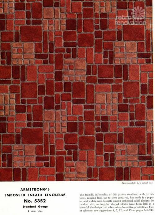 Armstrong #5352 — woot!
Lastly, both Pam and I immediately exclaimed how lucky Michaela is to have one of the most desired patterns of retro kitchen flooring in her kitchen — Armstrong #5352. Michaela, did you realize???? Again, we suggest that you study up on this design, then live with it for at least year to see if it grows on you like the light fixtures did — especially since you say that the floor is in great shape.
Though the most popular color way of Armstrong #5352 was the brick red, we think the warm golden color way in Michaela’s kitchen is just dreamy. Michaela — do you know some of our readers would do just about anything for that flooring?
All that said about this flooring, though: Precautionary Pam advises: There can be vintage nastiness in our vintage houses such as as lead and asbestos in the old materials and their layers — Michaela, this includes flooring like this — we don’t know what era your flooring is from, what’s in it, or what adhesives were used to install it; before you proceed, get with our own properly licensed professional to assess what you have so that you can make informed decisions. Readers and Michaela: No advice on this issue allowed in the comments — Get With Your Own Properly Licensed Professional to Assess What YOU HAVE So That YOU Can Make Informed Decisions.
More knotty pine love:
Great space, Michaela, let us know what you decide! Meanwhile, here are a few knotty pine inspirations from our archives, golly, we’re just basking in the honeyful glow of it all!:
 Above: The time capsule house with FIVE vintage pastel bathrooms also had this fantastic knotty pine basement!
 Above: Knotty Pine and turquoise together — ‘Betty Crafter’ says, Yes to the Knotty Pine.
 Above: Eartha Kitsch respectfully retained and revived the Knotty Pine kitchen in her 1956 ranch home.
 Above: This 1940 time capsule in Seattle had the same Knotty Pine loving owners for 70+ years — and quite possibly the most impressive basement we’ve ever seen.
 Above: Jeff worked hard to add detail to his Knotty Pine den — finding a place where you can still buy scalloped, mid century style Knotty Pine cornices and molding.
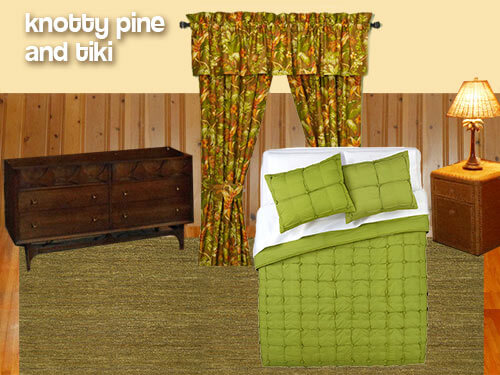 Above: Knotty Pine isn’t just for the kitchen — in this Retro Design Dilemma, we helped reader Jeanne come up with ideas to decorate her Knotty Pine bedroom with Tiki flair.
 Above: Back in 2010, we gave reader Tracy ideas for decorating the Knotty Pine kitchen in her 1962 ranch house.
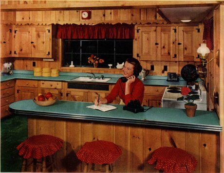 Above: Back in 1952, Formica already knew that Knotty Pine was nice in this vintage advertisement.


Sarah says
Knotty pine has a lot of pattern to it – so I think that a solid color countertop/backsplash is a good choice. One interim step that might make sense would be to paint/seal the grout with a lighter color – minimizing the grid pattern that is prominent currently. That would stop the pine and the grid from ‘competing.’
I also think moving away from fluorescent light is an excellent idea. Fluorescent is so harsh – and a better lighting situation would significantly affect your other color choices…
Stacy says
I just want to agree with Sarah about painting the grout to eliminate the obvious grid pattern. When I was re-doing my kitchen, new counters were not in my minimal budget. I used DIY grout stain/paint from the local home improvement store to match my (tan)grout to my white tiles and the result was fantastic. I went from hating my “outdated” tile countertops to loving them and honestly not wanting to replace them after all. Definitely helped me to love the house I was in!
lisa in Seattle says
Cute kitchen! I agree: out with the fluorescent light. If recessed lighting is too complicated to install, maybe track lighting would fit the bill. I have it in my kitchen and love being able to aim the lights where it is needed. You can get fixtures that take small halogen bulbs for a sparkly look, or ones designed for “normal” lightbulbs, but use LEDs for energy efficiency.
I also suggest you consider putting either white/cream or a color in the back of your hutch. You can paint it, but since the wood is nice I’d suggest painting pieces of foamboard instead and installing that behind the shelves.
Finally, although stainless steel appliances are not so beloved on this forum, personally I think they look wonderful with a retro kitchen, especially knotty pine. Many of the ones available now have curvy fronts and handles that to me recall the early 50s in spirit. And they can lighten a space very nicely.
Bob Connor says
One other improvement to consider is to replace the fluorescent light with 4-5 recessed pot lights. I did that in our early 70s kitchen and it looks more high end for the period. The light is also more warm and enhances colors too.
lynda davis says
I absolutely agree with replacing the fluorescent light with recessed lights. Lighting makes a big difference in the room. I think I would carefully try to paint the black tiles, maybe a pale gold to go with the floor. You might try finding some of the decal/cling product that would stick to the tiles for a quick fix. The table is big and nice for dinner for a crowd or for projects. The Ethan Allen maple type of dining set would look nice too. I would put colorful dishes in the glass cabinet that look nice with the colorful light. Draperies or curtains would look nice to replace the vertical blinds. If you want to redo the countertop, I would just go with a laminate and then paint the backsplash. I too vote for the white appliances for the room.
pam kueber says
I *think* I disagree re the lighting — in one important respect. I really think that the fluorescent lighting that is there will illuminate the space much much better than cans. This is a topic I need to research more and then write about… But the basic issue is: Cans only throw light DOWN. For maximum brightness in a room, you want to get light up on to the ceiling, too, as possible. I read something about this on Martin Holladay’s blog. I will add this to my list.
Do recessed lights look more “high end”. Yes, in our culture currently, I’d agree. But I don’t think this light a room as well…
Chad says
Agreed. I had a small argument over this when we were redoing my grandmother’s kitchen in a high rise. The ceiling had to be framed out because it was reinforced concrete, so we needed to add a cavity to for the electrician to run wiring. In a space about 8×12 there are now 2 overhead lights and a few under-cabinet lights spaced out, and it works great. If I had lost the argument the ceiling would be 4 inches lower and there’d be like 10 recessed lights. I would highly recommend adding under cabinet lighting if you have shadows that bother you since when you’re working at the counter you’re not blocking it. But really, some kitchens today have so many recessed lights I feel like putting sunglasses on.
Anastasia says
Ambient vs. task lighting debate? The cans would be task lighting, strong & powerful for that one location.
For a room like this it needs to be spread around to avoid “black holes”, definitely!
Bob Connor says
Pam, actually I must have lucked out with our can lights as they turned out to light a 10′ by 20′ kitchen well, in fact, if you put on other lights they can be rather strong. I used Commercial electric 6″ pots with a ridged baffle with GE 15 watt compact fluorescent lights equivalent to 65 watt incandescent bulbs. I have building experience, I am not a lighting designer but used my own judgment and installed 6 fixtures to replace 1 4 lamp fluorescent fixture (I know, I know, I won’t tell how I did it). Even though light is directed down, It seems to be spread out enough. This summer, I had a cut on my ankle and my mother dressed it and she said doing it under one of the lights helped her see better so that’s a good feature too.
Jacki says
I know this is late in coming, but has anyone thought about Solatube skylights with the light fixture option. I recently had two of these retrofitted where the original flush ceiling lights used to be. If you are not familiar with these they give off a tremendous amount of daylight. With the optional light kit they are each 60 watts, but because they are installed in the reflective tube, the light is much brighter. I am constantly trying to turn off the light switch that isn’t on. I was amazed at how well they fit in style wise in my ’63 pink kitchen. You might want to look them up, they are truly amazing!
linda h says
I was going to suggest that ” moonlight in the pines” fabric. I had seen it and thought about buying it to recover an ottoman.
JP says
Any advice on knotty pine stained dark in the 70s? Is it possible to lighten it?
Allen says
You could try pickling the finish. There are many ways to do this that you can find online. You could practice on a spare piece or on the inside of one of the cabinets to try it out.
Chad says
Stains usually penetrate into the wood. You could sand it out, but that would probably be pure torture if you’re not talking about a flat surface. Or embrace the dark color. A friend of my mother’s bought a really awesome Tudor house with very dark woodwork and decorated in dark, earthy colors, and she said “in England they would have brightened this room with chintz.” If the dark color makes sense architecturally (which it certainly does in a Tudor) the task at hand is to find a way to make it work for you without damaging the architecture.
JP says
It’s wall panelleling, not cabinets, and it’s on all the walls of a late 40s Cape addition. The previous owners enclosed and finished the covered walkway between the garage and the home and we plan to use it as a dining room. The stain is really, really dark. I’m almost tempted to paint it, if I cannot lighten it…
pam kueber says
And also: If you are new to your old house, go slow. Live with stuff a year (unless their are environmental or safety issues) before messing with original surfaces. Study up on them. You might change your mind — and save $$$ in the process.
midmichigan says
Red is dead and yellow is mellow but aqua always wins.
tammyCA says
Wow, wonderful knotty pine kitchen & living room, too…and, you have that terrific display cabinet. This kitchen gives the vibe of a warm hug. Liven it up with some color in vintage tableclothes, curtains and colorful Mid century pottery & dishes in the cabinet. If you look at vintage tableclothes/fabrics you will see great color combinations and patterns..then you could pull the colors from them, like here: https://www.etsy.com/listing/176315957/vintage-40s-50s-barkcloth-tablecloth?ref=sr_gallery_7&ga_search_query=yellow+tablecloth+barkcloth&ga_ship_to=US&ga_search_type=vintage&ga_view_type=gallery
My advice is not to go with black appliances (nor stark white)..it will look very out of place, too modernistic with the warm wood & it will stand out like a sore thumb. I think the white/black tile also doesn’t match up..those would be great in a white cabinet Art Deco kitchen or ’50s diner type kitchen, just not here.
It’s okay to have small shots of black, like in black iron handles/hinges, that was how they were back then.
What about warm copper for appliances? Like here: http://www.houzz.com/photos/542154/Fall-Parade-of-Homes-2011-kitchen-grand-rapids
Houses in the ’40s/’50s had copper accents, like those jello molds on the wall, tea kettles, lamp shades.
I like the colorful light shades & you could pull color from them for inspiration.
Also love the “Paint by Numbers” idea & colors board Pam & Kate put up. If you can find those landscape ones (painted well) at yards sales you’d be very lucky as they are $$ on ebay. I tried to just paint a new one myself & believe me, it is NOT the same..the vintage are better.
Instead I found some small copper frames at the dollar store and put vintage linen postcards in them & hung them on my brick wall..love them.
tammyCA says
Btw, a trick a grandmother told me to avoid large nail holes in nice paneling (or walls) use instead “strong” sewing needles..just tiny holes.
pam kueber says
great tip, i’ll try it!
Patty says
? Will they hold heavy items? Machine needles? Tell us more!
pam kueber says
Okay tammy — now find me the source for those coppertone appliances – ? the links!
Allen says
My restore in Chattanooga has around 50 of those copper microwaves in the photo brand new in the box. They have a display out and look very nice.
tammyCA says
I just randomly searched & pulled up any appliance in coppertone & that came up. I wasn’t even sure they were around, I was just thinking of those “appliance shells” that was recently posted & wondering if copper was a choice..I also came upon this “dishwasher shell” in copper: http://www.frigodesign.com/custom-kitchens/appliance-frames-and-panels/one-piece-dishwasher-panels-shell-design.html
I just think those copper stove hoods & back splashes I’ve seen in posters homes are cool so why not appliances?
As for the needles to hang pictures..I’m not sure how much weight they hold..I haven’t tried it yet, but I was going to try the T-Pin needles..the T is kinda like a hook. I just don’t like putting big nail holes in my plaster walls.
PAppel says
I like the countertop as is. White cannot be beat for versatility. Please think of the money you will save in nor teplacing it.
My suggestion is: instead of painting the black tiles white, why not paint them one of the colors to be used – either the main green color (something similar to the background of the material used for the window treatments or your accent color.
June Cahill says
I agree with Cynthia and Nina – about the black appliances – and then coupled with the darker counters – I’m afraid that’s a whole lot of dark!
Of the various kitchens above, I LOVE the kitchen with the turquoise counters – fun to get sunny yellow with turquoise ( or I also love the idea of red appliances – but not necessarily with the turquoise.)
I LOVE the lighting over the dining table! And maybe add some fun ceramic pieces that mimic the colors in the lights.
And, I think that dining table (do you have a big family? or maybe dinners where friends join in? – You’ve got a lot of table room and seating there!) is fabulous in the space. Maybe put some colorful chalkware planter in the middle of the table for a little color? If you’re ‘up’ for a new table, I think that knotty pine screams for one of the vintage tables (similar to the one you already have) but with a colorful top!
You know, I have my parents carmel/maple bedroom furniture and I’ve added orange and greens – It looks really nice, but I’ve got a LOT of light in the bedroom! Depending on the natural light your kitchen receives will depend on how ‘dark’ you can go with your appliances and counters… (also adore the built-in hutch!) – You’re SO lucky to have such a wonderful knotty kitchen – and so lucky you appreciate it!:)
nina462 says
as a fellow homeowner of a knotty pine kitchen & basement – I’d go for the woodsy turquoise theme; or the yellow & red accent. Actually, turquoise, yellow and red all go together 🙂