

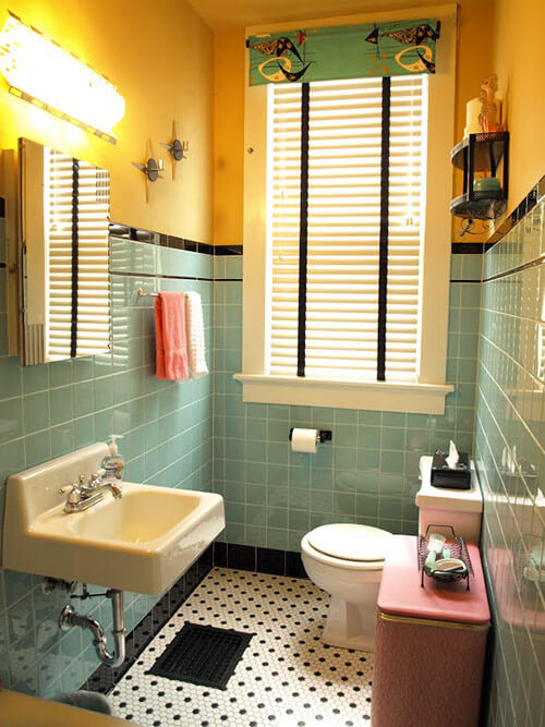
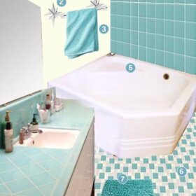
 When we last heard from Kristen and Paul, the couple had a stash of Daltile Aqua Glow wall tiles stacked in their garage and were eagerly awaiting the day when they could be installed in their charming 1899 home’s main floor bathroom. Fast forward a year — and their bathroom is now complete. Kristen loves it so much she wanted to sleep in there for the first few days after it was complete, and yowza, we don’t blame her — what a gorgeous bathroom!
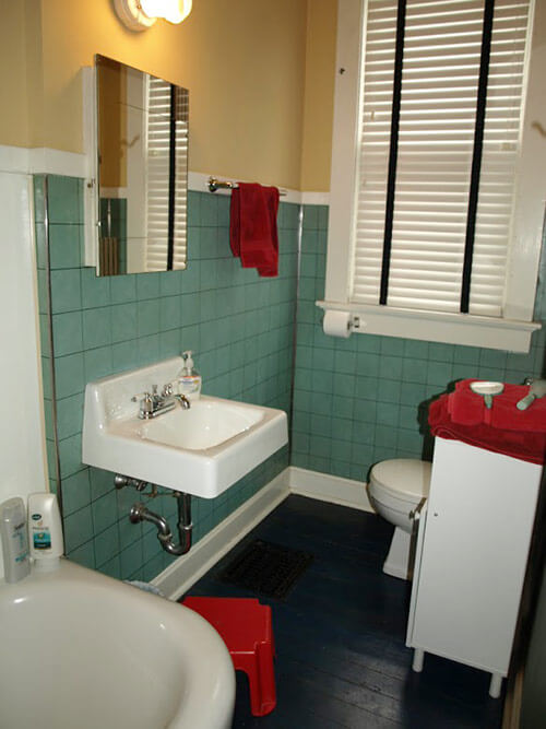
While Kristen and Paul loved their original bathroom’s color scheme, the vintage wallboard just wasn’t standing up to daily abuse and cleaning, so they marshaled their energy to gear up for a gut remodel. After months of careful planning and finding just the right tile, they began their bathroom remodel. The couple was able to keep and reuse their vintage tub, sink and medicine cabinet, saving them a bundle and allowing room in the budget for them to hire a contractor to do their tile work.
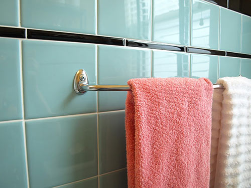
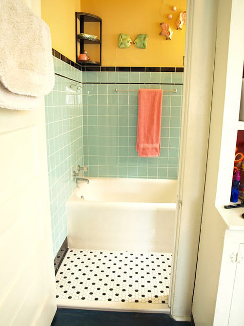
Daltile Aqua Glow field tile with black trim
Kristen writes:
So here’s the story on our new vintage bath remodel:
Our bathroom is the last room to be remodeled in our entire house. We are used to doing most of the labor ourselves however I knew that with the precision of the tile that I wanted to hire a professional. And though it is a small bathroom I knew it would be costly so we waited to do this room last until we were absolutely sure we knew what we wanted.
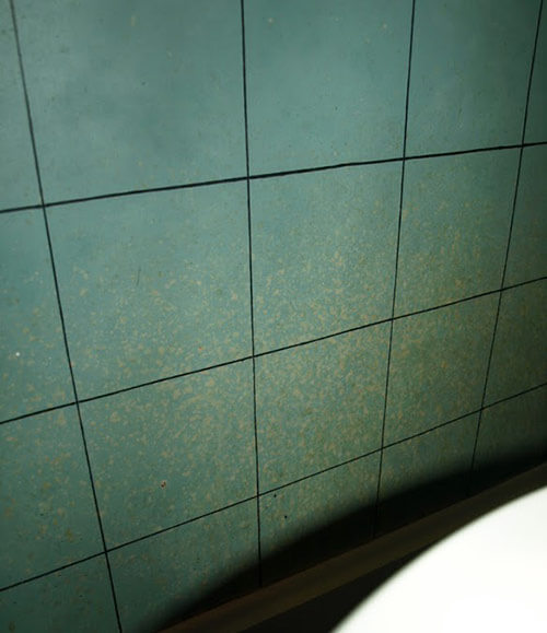
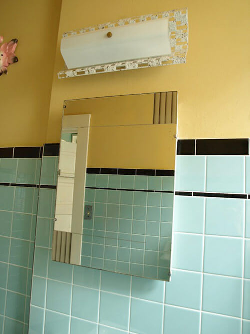
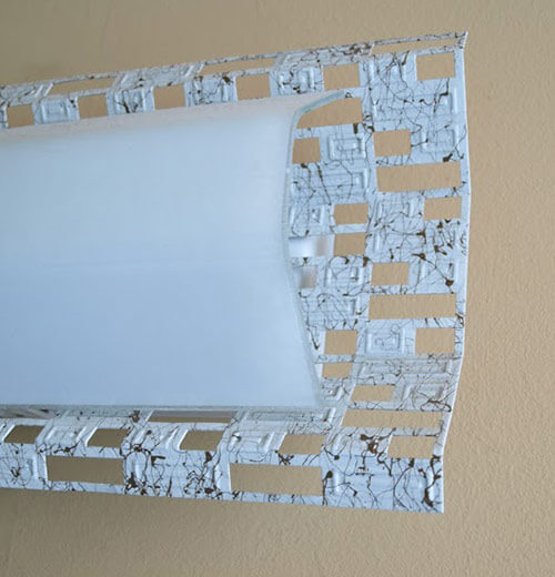
What we started out with was not bad by any means. The last major remodel to that part of the house was done in the 40s or 50s so we were left with very nice vintage fixtures including an Art Deco style medicine cabinet. Although I loved the original turquoise wallboard, it just did not hold up to splashing, flushing and toddler potty training over the years! We were told that this type of wallboard paneling was a thick paperboard with painted surface. We could never be clean it properly without wiping the finish and painted surface off and eventually it just got too gross! (see close-up photo). I knew something more permanent and cleanable would have to be installed.

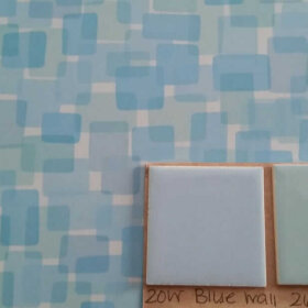
I basically knew that I wanted the same kind of look…just done the way it should’ve originally been done with shiny and scrubbable tile. I even selected a tile in the same blue family… The glorious aqua glow ceramic 4 x 4 wall tile from Daltile.
Just a note… My local Daltile showroom said that this tile was discontinued, but I was able to find it online although I had to wait for 3 months for it to be delivered. It was well worth the wait because I can’t imagine a more perfect shade of vintage blue. I love it so much…I wanted to sleep in the bathroom the first couple nights after it was finished!
- Editor’s note: We reached out to the PR department at Daltile to ask whether or not aqua glow had been discontinued and were told: NO, it has NOT been discontinued. However, it is a custom order. We’ve heard from a few other readers who were told by a tile retailer that this color was no longer available. Hey, we’ve also heard from readers who say that their local tile store doesn’t know about Daltile’s Mosaic Tile Designer. These retailers are wrong. Moral of the story: Push back, people! Vendors are so accustomed to selling what is popular today and are often not as informed as customers like us who have done the research about less frequently purchased materials. Call Daltile customer service directly if your local store tells you they can’t order this color or the mosaic flooring — special order may be more work to buy, but it is do-able.
- And: Looking for 4 x 4 pastel tiles for a vintage bathroom? See our story 30+ places to find 4″ x 4″ ceramic bathroom tile in vintage colors.
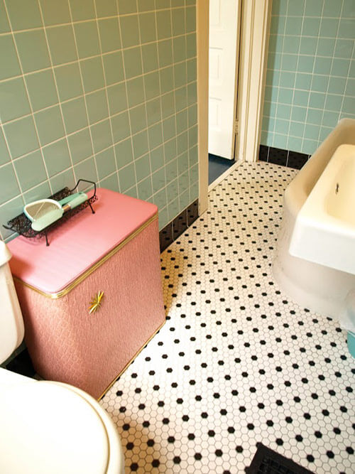
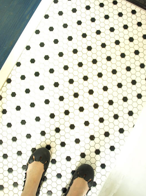
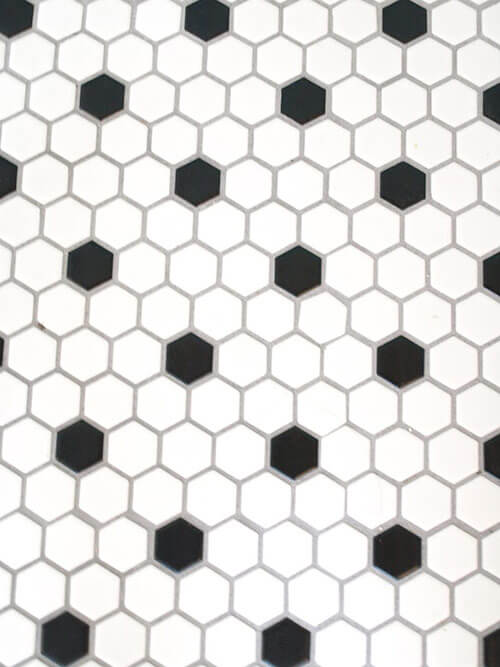
The floors are sheets of 1″ black-and-white hex tile by American Olean. I had considered a more square or rectangular motif tile floor, but decided I had a lot of block/rectangular angles going on and wanted something to contrast – I love the way they look like little polkadots!
6″ wide black cove base tile — a wonderful detail
I asked Kristen what inspired her to use the black 6″ cove base tiles around the bottom of the wall — a detail that both Pam and I absolutely loved. She replied:
Well, I like a lot of contrast. So I knew I wanted black bullnose borders at the top with pencil stick trim… it just seemed to make sense to add the black cove at the bottom. I think the tile guys actually suggested that’s how they usually finish the bottom…. and I studied vintage bathrooms. And I could not find Aqua Glow specialty pieces, so we had to fill in with the black. Yes, I believe they are 6 x 6… on that detail, I pretty much just referred to the tile guys, I had never heard of cove base before. 😉
 At first my tile guys were not crazy about working on an older home with plaster and lath board walls, but as the work was finishing up they really started liking the look. They even said it was nice to work on a project with a bit more color than the taupe and beige tiles they are putting in newer homes.
The paint color is It is Gold 3 by Laura Ashley.


I have included one preview shot of our mid century modest winter home that we just bought in southern Florida! (It has a pink tile bathroom — the floor is very similar to yours—hooray!) We are super excited about it and plan on decorating it up retro and renting it out on the off-season…. So if you’d like I can keep you updated about that as well.

Well, thanks again & it is always an honor to be featured!
No: Thank you, Kristen and Paul, for sharing yet another lovely project with us — you are very talented indeed. We absolutely love the tile you chose for the walls, trim, floor — your bathroom is adorable, just like your family. We look forward to hearing about your new adventures in your little slice of retro Florida, too. Keep us posted!
See more of Kristen and Paul’s home:
- Mixing old & older: Kristen and Paul create and artsy, retro home on a shoestring budget
- Kristen’s 7 step-by-step tips to make a pleasing gallery wall
Link love
- Kristen and Paul’s Ebay store The Robot Parade
- The Etsy version of their store The Robot Parade


deena says
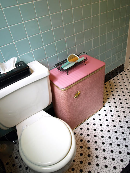
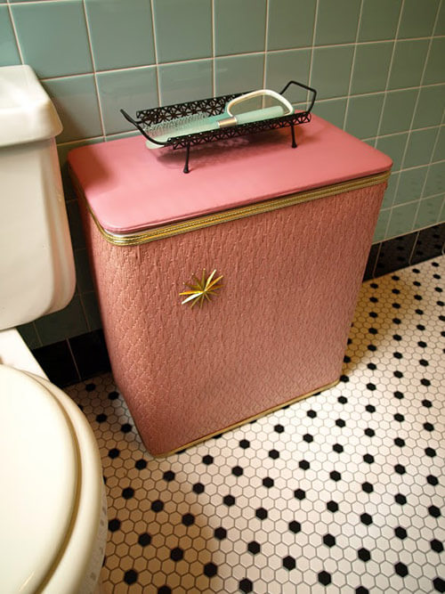
Where did you find the laundry hamper?
Kristen says
Hi Deena,
The hamper is actually a conglomerate of 2 hampers found at yard sales! I originally found a plain pink one (this one above) that I used for a while as is, but later found a beat up brown one for $1 that had the gold trim & starburst. My husband helped me pry off the embellishments and add them to the pink one. I was happy how it turned out– I’ve never seen another one like it =)
deena says
Yard sale, a good idea. You definitely cannot buy them anymore.
Marilyn says
Very nicely done, as you home was… you all make a great team. I applaud you on taking the initiative to make such an impact on your neighborhood as well…It is such a nice hobby….keep it up…
Kristen says
Karen, hi.. yes we talked via emails about the frustration with ordering the Aqua Glow!! My project is just now finished… thank YOU so much for the encouragement about the Aqua Glow being worth the all the hassle!
Karen says
Wow, this story sounds familiar! Right down to wanting to sleep in my bathroom after my remodel. I did my bathroom with 4″ Daltile aqua glow, black pencil accent, black bullnose and 6″ black tiles at the bottom back in 2012. Can read all about it here: http://runswithscissors4.blogspot.com/2012/09/it-all-started-with-idea.html
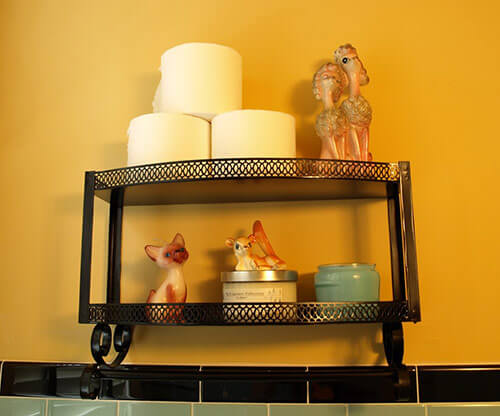
I had purchased a gold shelf and painted it black, black poodle chalkware and paint by number trash can. Before and after photos on my blog.
Neil says
I want to congratulate you on a wonderful job! We’ve all seen “new vintage” renovations and restorations that were certainly charming or colorful or faithful, and even pretty, but you’ve gone the extra step by making it exceptionally well-designed too.
By training a judicious eye on the relationships between tones and textures, and shapes and patterns and hues, and how it all converses in a given space, you’ve achieved a “vintage” look that is not merely a reference to a bygone era but is actually timeless, and just feels … right.
I imagine it is so successful because, besides using colors and materials that are faithful to the era’s taste, you’ve governed all your design choices with a strong eye for what’s “good”, what’s balanced, what’s visually integral; the eye is drawn to travel gently, instead of jittering around the room.
I hope your thoughtful vision encourages others to design and redesign (and edit!) with judiciousness and taste; not solely with mad-cappery, fun though that is. It makes the crucial difference between pleasing …. and superb.
Kristen says
Wow, what a super comment… I think I even just teared up a little. Thank you very much!
Debbie says
Love. Love. Love! Fantastic job and a beautiful results. I’m getting ready to renovate my 1949 main bath that is still in it’s original state. Seeing your results makes me even more excited to get it done. Inspirational.
Michael says
Glorious!!
carolynapplebee says
forgot the link
http://www.zillow.com/homedetails/5001-Vanalden-Ave-Tarzana-CA-91356/19946338_zpid/
pam kueber says
Fantastic!
carolynapplebee says
i see these stories and want to finish my floors more quickly, so i can move onto the bath. i’ve hesitated about blue, thinking about being limited, but now that i see this blue and bright yellow, i get inspired.
on another note, this week i saw a house on the market owned by actress Annie Potts. six beautiful 1943 bathrooms — red and black/green and lavender/red and cream??pale yellow. awesome.
Scott says
Lots of great choices here, and that blue is just wonderful.
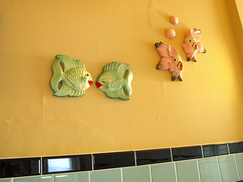
I’ve been thinking a lot about a wall mounted sink myself, a fun-looking but very practical choice when space is at a premium. And any bathroom with happy fish is always gets my stamp of approval. 🙂