


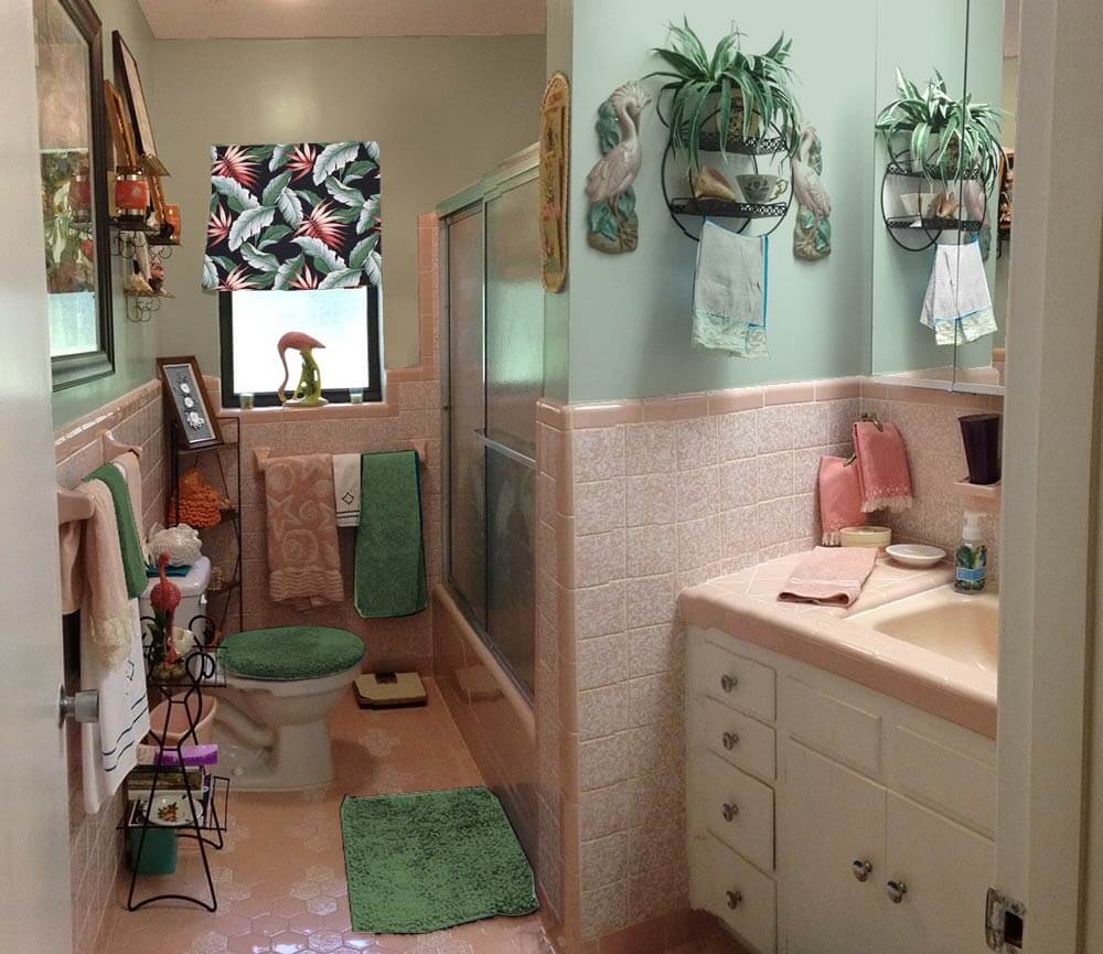
 About a year ago, Diane bought a lovely 1960 ‘granny ranch’ in Florida. She’s been having fun decorating the original pink bathroom with vintage goodies from her mother’s collection, but now she is having problems deciding on a paint color for this kitschy space. She hopes Pam and me — and our wonderful readers — can help. Retro Design Dilemma time!
 Diane’s request (edited):
Hey Pam & Kate, I have a design dilemma for you. We bought a 1960 “granny ranch” a year or so ago in Florida with some money my late mother left us — as an investment and also in part to honor her and give me a place to put many of her vintage things with which I wasn’t yet ready to part (yes, I unashamedly claim the title of sentimentalist & vintage hoarder!)
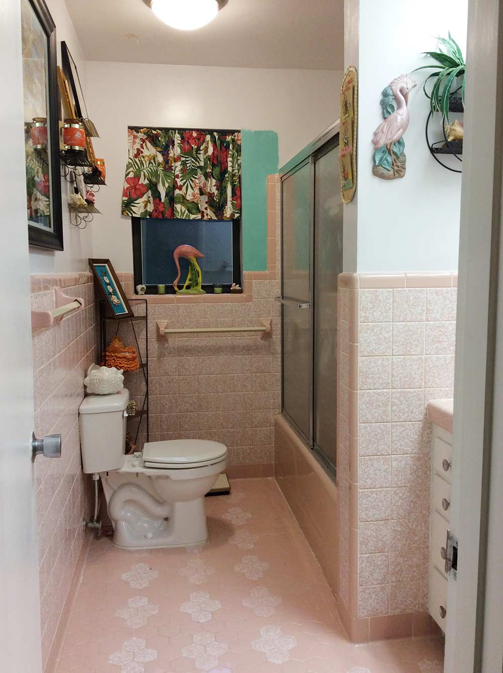
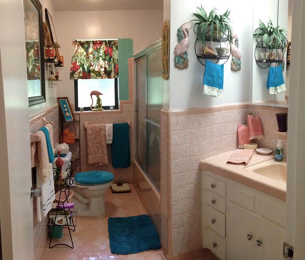
Now I am trying to figure out what to do with the walls of my pink tiled bathroom there — paint, or maybe wallpaper?
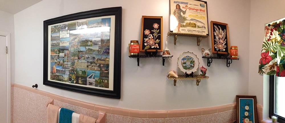
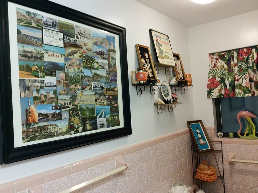
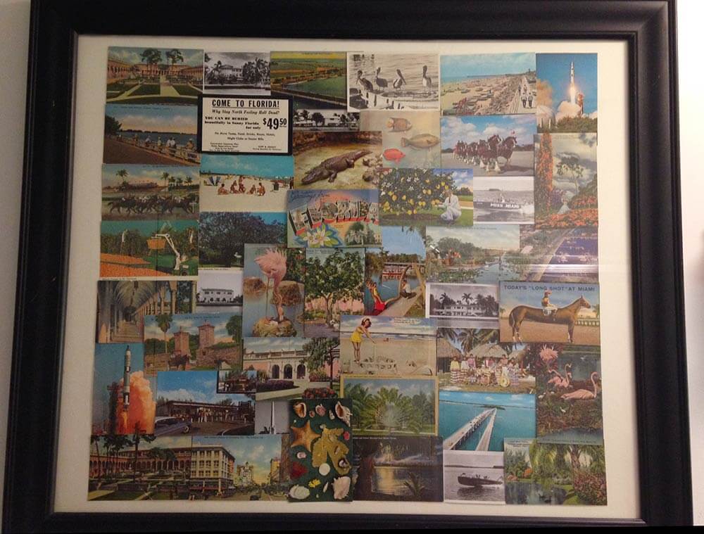
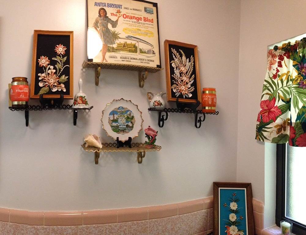
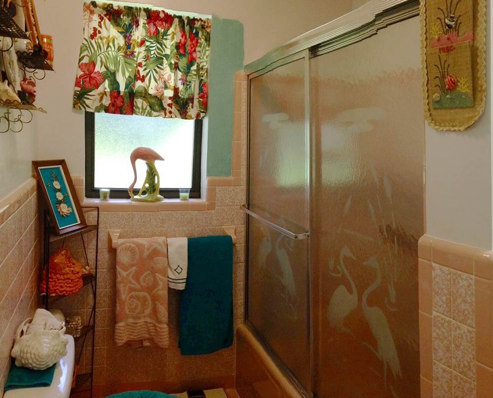
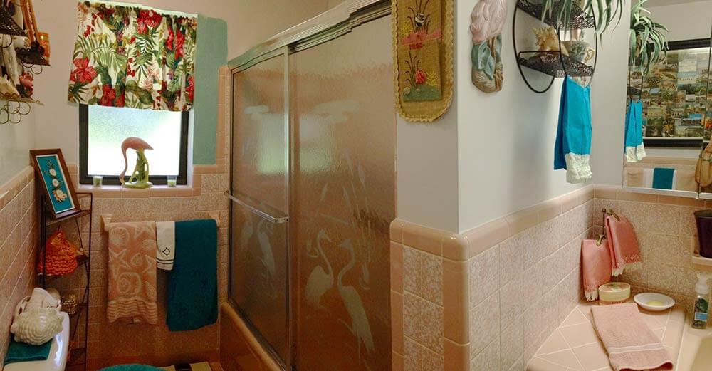
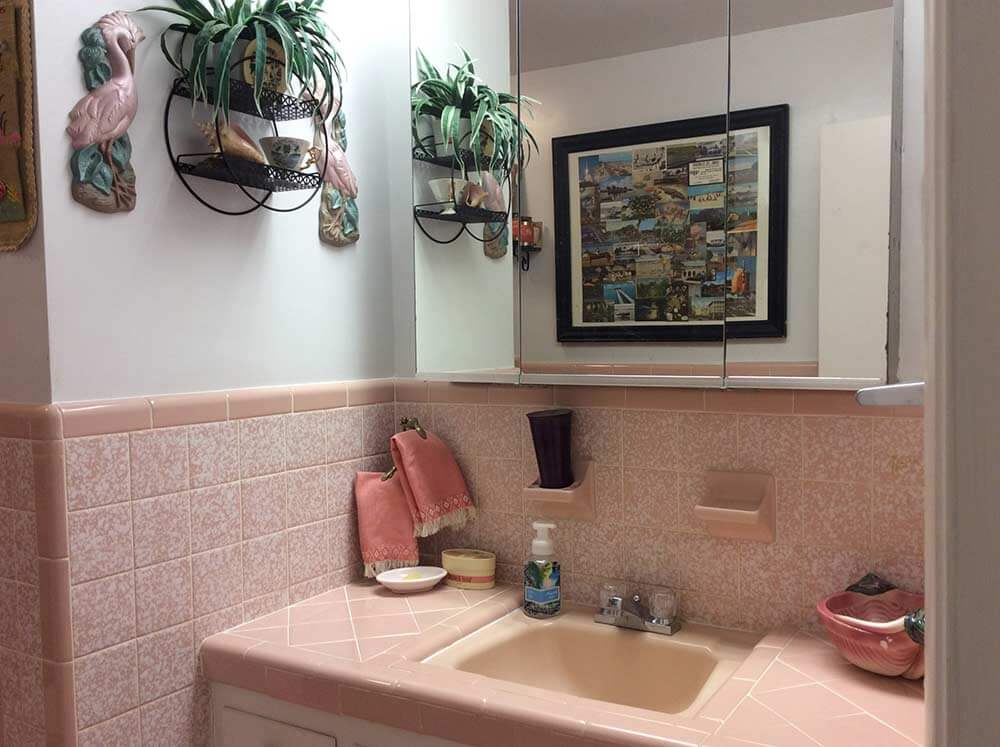
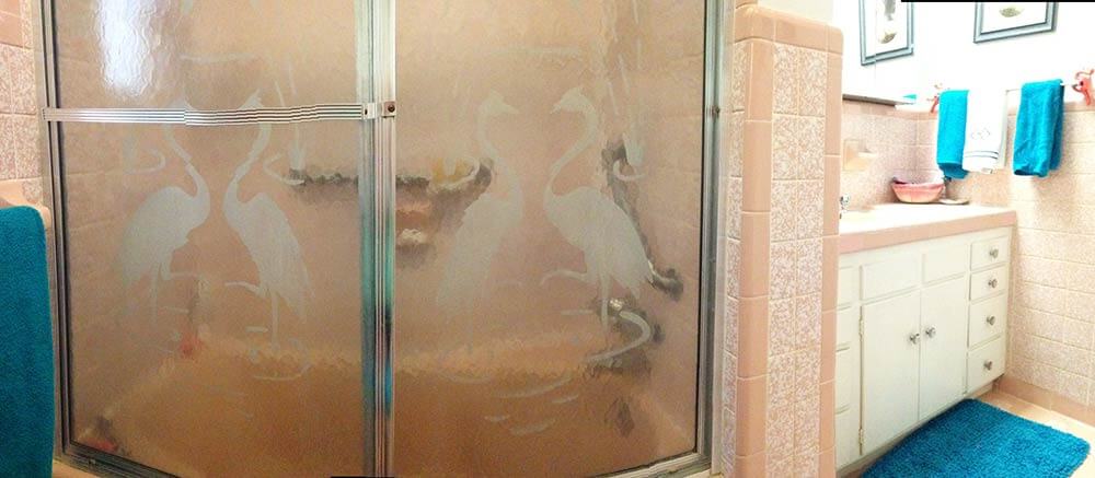
I am going with a kitschy florida theme for the decor, spring boarding off of the vintage etched flamingo shower doors and a huge homemade collage I put together of old florida postcards from family members dating from the 40s, 50s & 60s, which I had discovered among my late mother’s things.
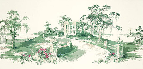
I am also thinking about using the great vintage wall paper mural “Magnolia Hill” (which I bought from your recent link to Steve’s wallpaper & blinds recently) in the hallway off of the bathroom.
- There are still some of this murals left, read our story — Thibault wallpaper murals in 11 designs
Anyway, I had initially thought that a contrasting color of Sherwin Williams “Holiday Turquoise” from their Suburban Modern collection would be just the ticket for the bathroom walls. However now, after applying a small swath of it on the wall, I am having second thoughts. Just the one coat seems to make the room appear darker — I’m worried what a second coat might do! Think you or your readers might be able to help me out with some suggestions? I’m open & up for almost anything! Much thanks!
Ok readers — what should Diane do with the walls in her vintage pink bathroom? Wallpaper? Paint – and if so, what color?
Kate’s ideas for decorating this pink bathroom:
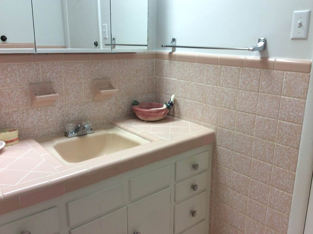
My first thought when taking a peek into Diane’s 1960 pink bathroom — after I ooohed and awwwed over that gorgeous original tile — was that the deep teal blue towels, bath mat and toilet seat cover weren’t quite right for the space. Because they are so saturated with color, and much darker than most of the other decor in the room, the steal too much attention away from the fun, kitschy vintage accessories and delightful original tile. Also, because there is already a lot going on in the small space, simplifying the color scheme will help unify the space overall. For this same reason — that is, so much wall decor, both Pam and I agree you can skip the wallpaper — paint is the answer and yes, a real color will be better than off-white, grounding the wall decor better.
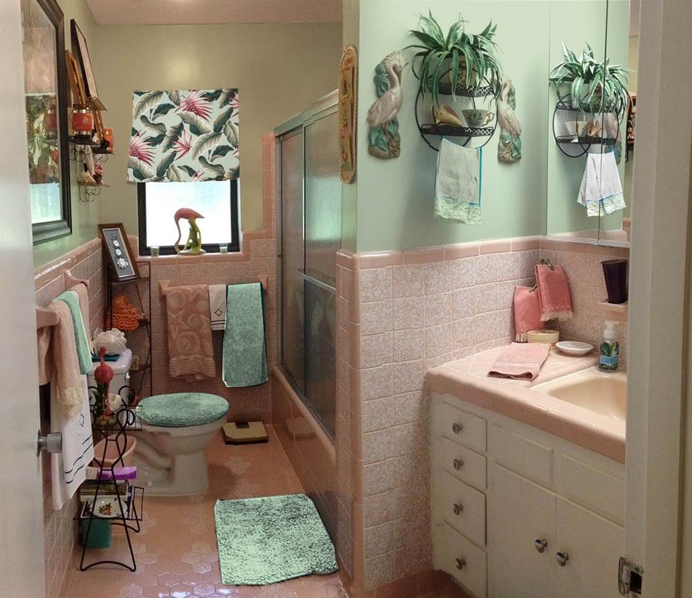
 Above — First, I tried using the Sherwin Williams ‘Holiday Turquoise’ paint that Diane was contemplating, which looks much better with matching turquoise accessories instead of the deep teal towels.
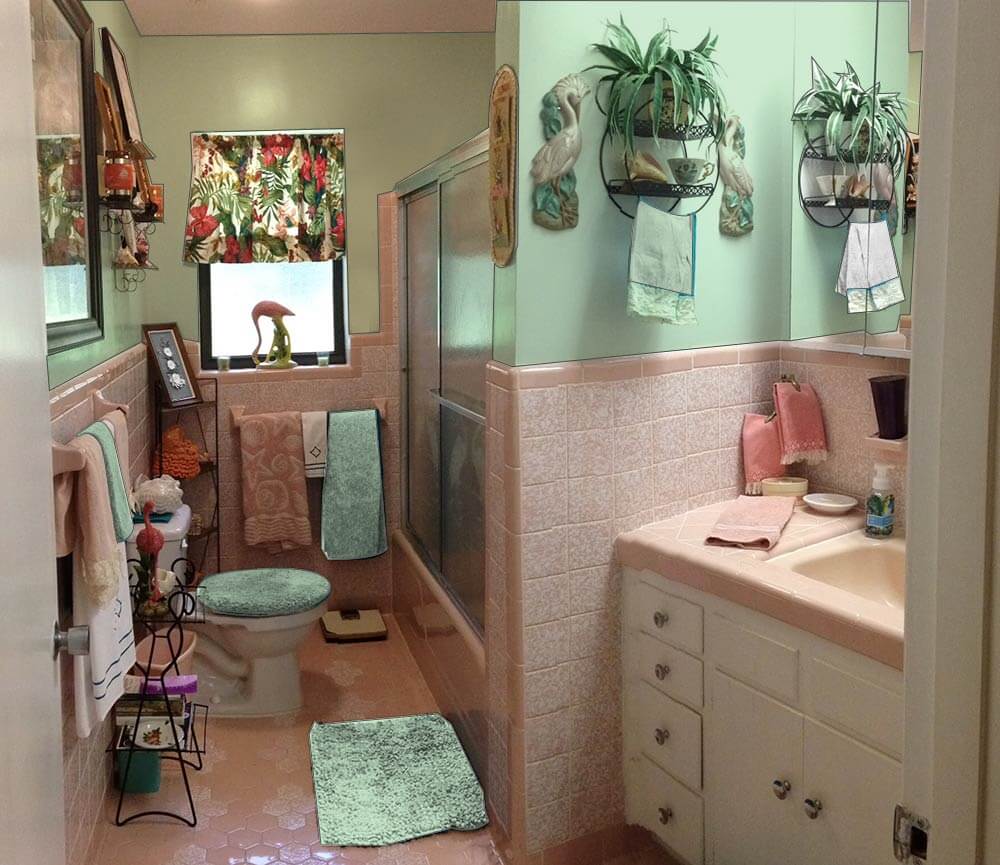 Next, I tried a light green paint, pulled from the tropical print barkcloth curtain on the window. I think this color works well in the space without making it feel too dark overall because it helps harmonize the tropical barkcloth printed window curtain and complements the pink. Pink is basically light red and the complementary color of red is green — a combination that is very pleasing when done correctly. Adding a similar shade of green towel, bathmat and toilet seat cover helps disperse the green around the room.
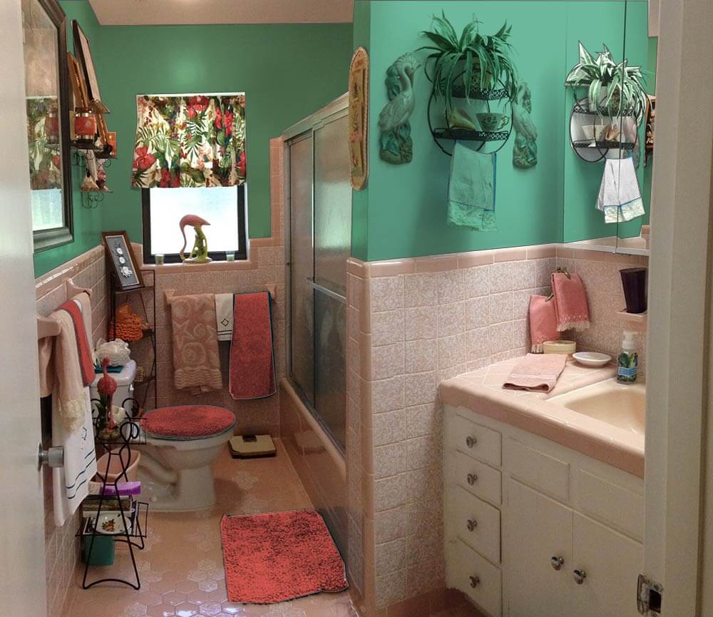 Alternately, if Diane wants to add some major kick to the space, choosing a deeper teal green would create a tropical, ‘vintage miami’ feel in the space. Adding red bath towels and accessories help make the barkcloth curtain pop and make visual sense in the room.
Pam’s additional suggestions:
 I very much agree with Kate’s key suggestion — that the royal blue linens are detracting from making this beautiful bathroom come together beautifully. I would take her suggestions even one step further and say: Change out the curtain. I think it would be relatively easy and inexpensive to find a similar, tropical styled fabric — but one that is in pink and green or blue pastel tones rather than the stronger primary tones of your current tones.
For example, above: Kate photoshopped Diamondhead Fabric’s Molokini (Sage) cotton bark crepe into the window and oooooh, I quite like how it looks. The pink really makes this pop. Then, choose paint colors and towels from the fabric itself. In general, I really like it when the field color of a fabric and the wall color are the same. Of course: You will probably want to get a real sample of the fabric first to test.
 Above: Diamondhead’s Akaka (Natural) also has pink tones. I am less thrilled about this curtain, because of the natural field. In any case, we included it so you could get another idea of how a pink pastel-based fabric could look.
Of course, you can also look for vintage fabric. Living in Florida, you could probably find 50 different options with one trip to a local antique mall, I bet!
Finally, in response to many readers who suggested a more neutral paint color — a grey or ivory or lighter shade of the pink — I very much agree those could work too — and again, would coordinate the wall color with the field color of your window treatment. Honestly, ‘most any color could work done with a deft hand. That said, I think — and I think that Kate agrees — that you can make shades of aquamarine or green or blue work just fine — in particular because this is a kitschtastic Florida space where, hey, less is not more — more is more! We all respond to color differently — so do what sings to you! Paint is relatively cheap — it’s the perfect medium with which to take some chances… to push some design limits!
Good luck, Diane, and let us know how it turns out!
 UPDATE — Above:Pam asked me to make a mock up with the Diamondhead Fabrics Molokini (black) cotton bark crepe fabric suggested by commenter James of the Woods — looks pretty good!


Andrea says
You can always ask at the paint store to do 75% or 50% saturation if you want the color lighter. We learned going up or down on a paint chip does not mean the same color just lighter or darker. Each color has a different unique formula. We did our walls in the living room a similar turquoise & the back of built in bookcase 50% saturation of same color.
Wendy in St. Louis says
I agree with ‘too much going on for wallpaper’, and I don’t think turquoise is going to do you any favors. Any dark color, IMO, is not going to work because of the mottling on the tile. I would go with a creamy white or a diluted green in the same tone as the leaves in the curtains. I have a green like this in my living room – I’ll try to find the color name. It was a light green from Sherwin Williams that I had them mix at 50%. You get the right tone, but it’s more of a suggestion of color than a HEY LOOK AT ME color.
sara says
I really like the turquoise! And of course, with paint you can always re-do it if you don’t like it. You could try doing one entire wall with the turquoise and see what you think. I have found that rooms don’t necessarily look darker with a bold shade on the wall. It may just be the contrast with the existing paint that is making you feel like it will be dark. Lovely bathroom! I’m jealous 🙂
JKM says
I vote for painted walls since there’s so much going on in there, pattern-wise. Personally, I like the turquoise but, if you’re afraid it’ll be too dark all over the room, perhaps you could paint it on one wall as an accent. The back window wall, where you’ve painted the swatch, might be a nice accent with other walls being a shade or two lighter.
Mary says
My mother painted our Mamie pink bathroom a light shade of grey. This is the realtor in me talking, but I think I would pull out, and maybe rotate, the vintage fun knick-knacks, and do solid towels in a color that really pops against the pink – maybe darker grey towels against the pink tile and lighter grey walls. (My mother also rotated knick-knacks quarterly, actually!) That way, you can actually see and appreciate them individually, where they are kind of competing for attention right now. It would make for a sleeker look. Love the bathroom!
Glamorlux Nancy says
I agree. A light grey is a nice, sleek off-set color for the pink. Wallpaper would be too busy and a potential maintenance problem in a bathroom. Beautiful bathroom! Enjoy!
Brenda says
LOVE the bathroom! I was faced with a similar dilemma and opted for a solid color paint in a shade lighter than my tiles. In your case, I would go a shade or two darker since your tiles are light. While I love the idea of vintage wallpaper…there is a lot going on right now with the items on shelves, etc and I think that would look too busy. 🙂 I can’t wait to see the finished product and good luck!
Jeanne says
I have to agree with Roundhouse Sarah on this. I love wallpaper, but there is a lot going on and I think painted walls wouldn’t conflict and would showcase all of your cool kitschy elements. I’m a sucker for turquoise, but I’m thinking that painting the walls the same pinky-peach color as the tile (or maybe a tint lighter) would be a nice subtle background and I would still use turquoise as highlights (towels, etc.). Although the nice barkcloth valance appears to have more greens than turquoise in it.
The mural in the hallway will be a nice touch! I love those Florida granny ranches! Good for you!! 🙂
Chad's Crooked House says
From the photo, I love the way the turquoise looks. There’s a lot of white in the tile already and I like the walls to contrast. But maybe it darkens the room more than the photo shows. And maybe I’m more OK with dark than you are. I think that often colors look darker and scarier when they’re going on than they do once they’re up. I picked a paint color for my grandmother’s kitchen and she was really upset about how dark it was, but then when it was done everyone agreed that it would have looked wishy washy if we had gone lighter.
Regarding the wallpaper: My first impression was that I’d rather see something with a colored background… but if you really don’t like the turquoise then I could be wrong. Also, it has a cool but really busy pattern when you already have a cool, busy pattern on the curtain and a lot of stuff on the walls. Either you need a subtler wallpaper or some of your existing decor is gonna have to go.
I’d say paint the whole room the turquoise, or the next shade lighter if it really is too dark, see if you like it in the whole room, and then if you don’t you can think about papering over it. You’re not talking about a major risk here!
Roundhouse Sarah says
Either option will look good honestly. It all comes down to picking solid or print. Looking at the photos of your bathroom, there’s a lot going on in there. The texture of the wall and floor tiles, the print on the shower door and all the lovely vintage nic-nacs….. To me adding another print all over would be chaos. So as much as I like wallpaper I’m going to have to say paint for this dilemma. I would do a light yellow on the walls and accessorize with turquoise towels so that you don’t have to give up your vision of using that beautiful color that you love.
Bthayer says
I would do a shade in between the two tile colors.
by the way is that a Will George Flamingo in the window? I have the mate. 🙂
Geronimom says
I wish! No, I’m afraid it has “Mexico” stamped on the bottom… Lucky you for having an original!
midmichigan says
Back in the era I noticed a few bathrooms with a wallpaper border just above the bullnose tile and then paint above that to the ceiling. As for colors, I’m no interior decorator but pink seems to go with black, white and of course, pink. Cool bathroom.