

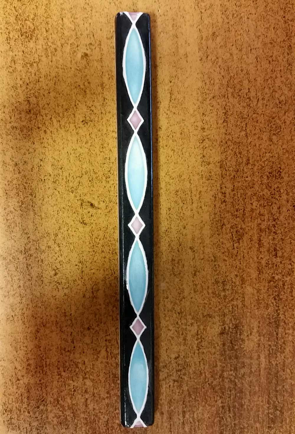
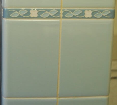
 Midcentury bathrooms almost always featured pastel-colored 4″(ish) square ceramic tiles. Bullnose could be: Same color… white… black (early postwar)… or a contrasting or complementary secondary color that was then also picked up the floor tile. Really snazzy bathrooms may have used a line of decorative liner tile, too. Right now, we know of one place where you can still get retro style liner tile — and the colors are hand-painted on, so you can get whatever color you want.
#1 Get custom painted decorative liner tiles from B&W Tile:
Our source — you won’t be surprised — B&W Tile, which is also our #1 go-to place for 4″x4″ tile in retro pastels, including Mamie Pink.
B&W sent us the two photos above. For this story, I also asked Kate to dig through our archives and look for examples of vintage liner tile we’ve shown. We have lots of examples of color combinations you can aim for, if you are planning a retro bathroom from scratch and have the time and extra money to work with B&W to create custom decorative liner tiles to go with.
#2 Mission Tile West
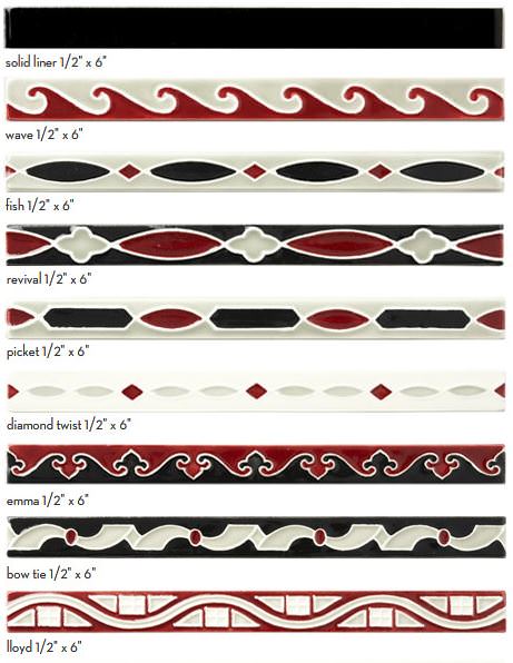
Mission Tile West also has liner tiles in eight designs. You can custom order these in a variety of colors.
 Get your scrolling finger ready to go. Here at Retro Renovation, we summarily ignore and defy online “rules” that suggest stories be written for gnat-sized attention spans. We prefer the epic. So there.
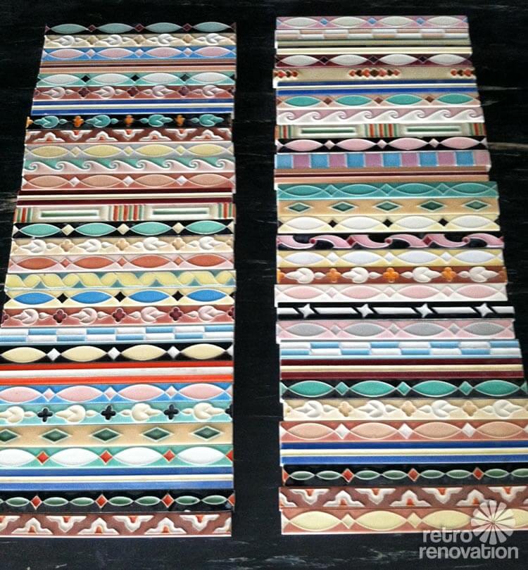
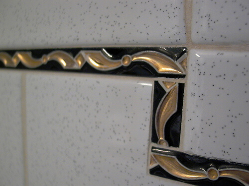
Examples of decorative bathroom liner tile:
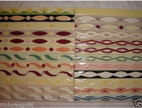 Above: From our story Vintage NOS ceramic tile border sizzle strips for sale — Mosaic Tile company, Zanesville, Ohio. We spotted this delicious stash for sale on eBay. Yes, you can occasionally find this tile New Old Stock (NOS) vintage. However, I wouldn’t hold my breath, especially because you’re going to need a lot of it to run around the entire perimeter of a bathroom (unless you take Sarah’s approach, see below.)
Of course, World of Tile had some real beauties. Ugh.
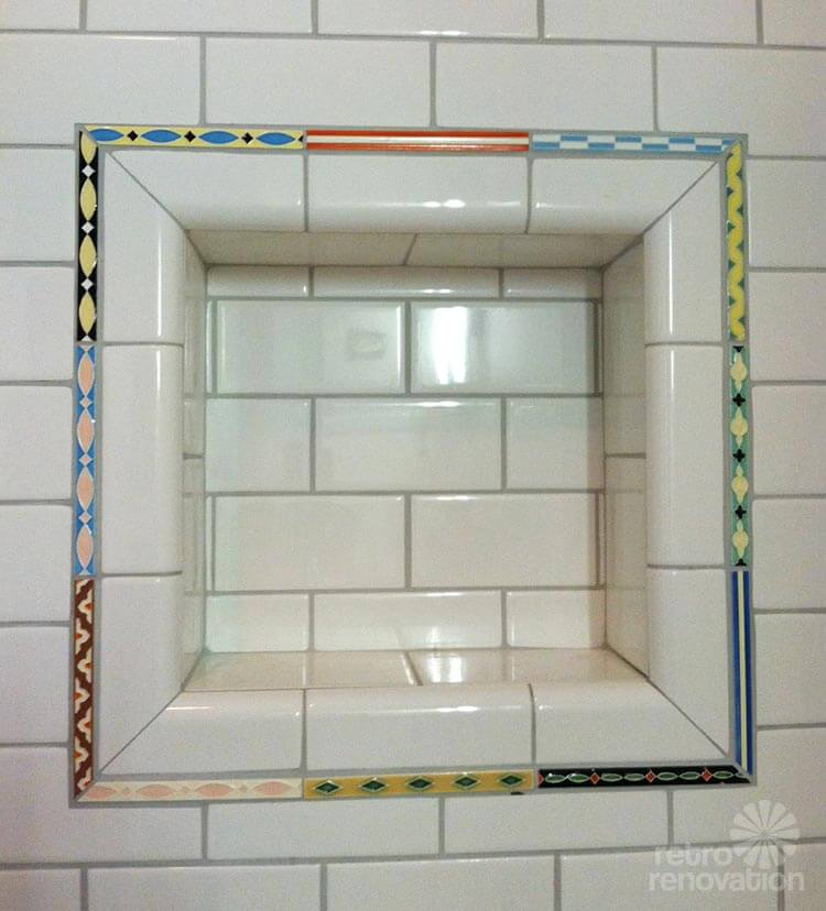
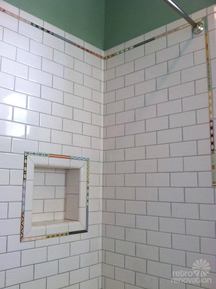 Three photos above: Roundhouse Sarah snapped up a bunch of the eBay stash and very creatively, mixed and matched it in her parents’ bathroom remodel. Fabulous! See Robert and Caroline’s mid century home with dreamy St. Charles kitchen cabinets.
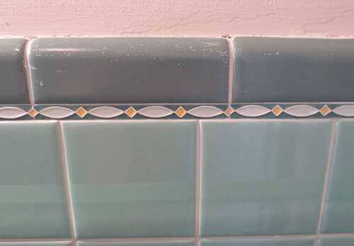
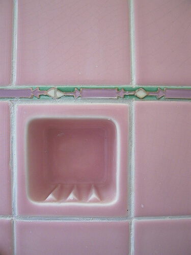
 Two decorative liner tile designs above: From our story 6 colorful 1950 vintage bathrooms — The Comer House in Gallatin, Tenn.
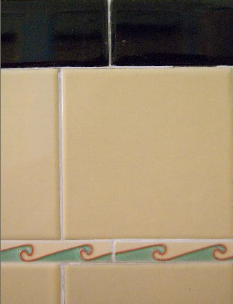
 Two designs above: From our story Liner tiles add personality and quality to your retro bathroom — and where to find them. Okay, so we wrote about this before — six years ago. But we didn’t have all these photos then because the blog was only two months old!
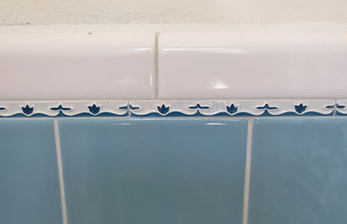
 Above: In Rachel and Brian’s 1920s bathroom. Yes — note — this look goes all the way back to the 1920s, at least.
 Above: Original bathroom tiles from reader chicken301 from one of our uploaders.
 Above: From reader cig1977 in Melrose, MA — also from our vintage bathroom tile uploader.
 Above: I spotted this flowery liner tile in a time capsule estate sale 1964 bathroom with the works.
 Mike and Lindsey also have liner tile in their French Provincial to Retro Modern pink bathroom.
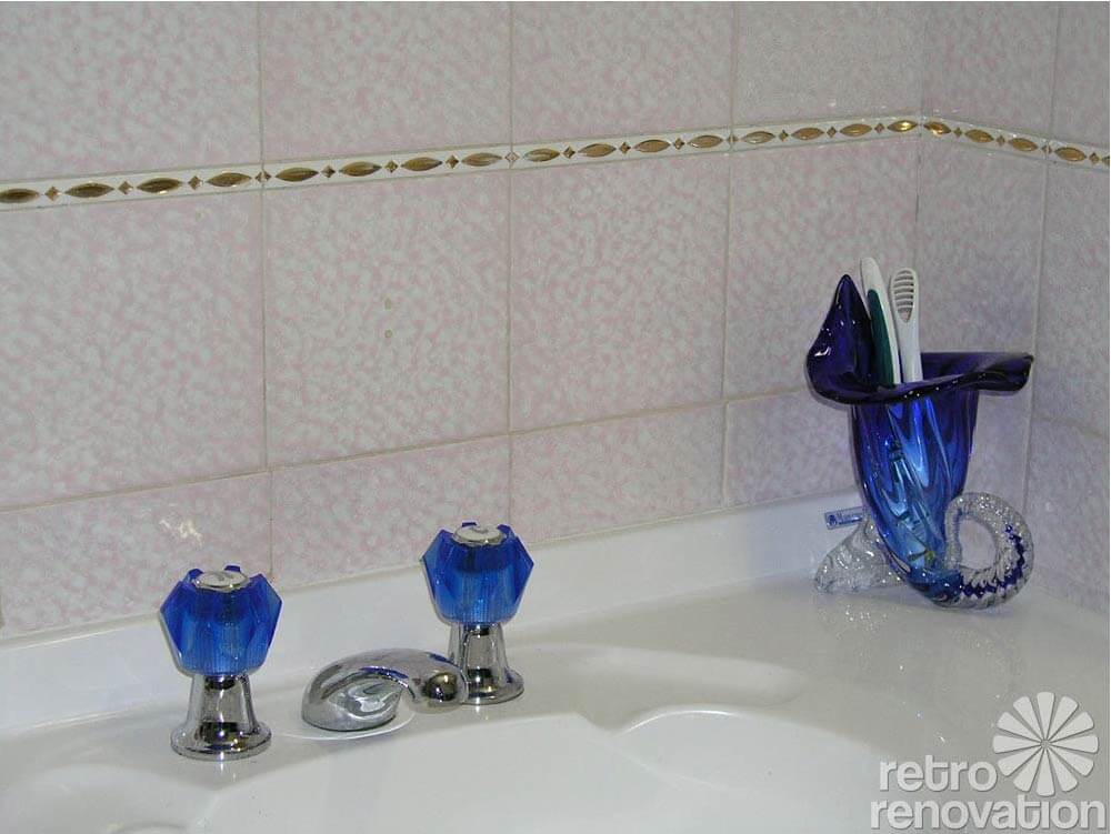
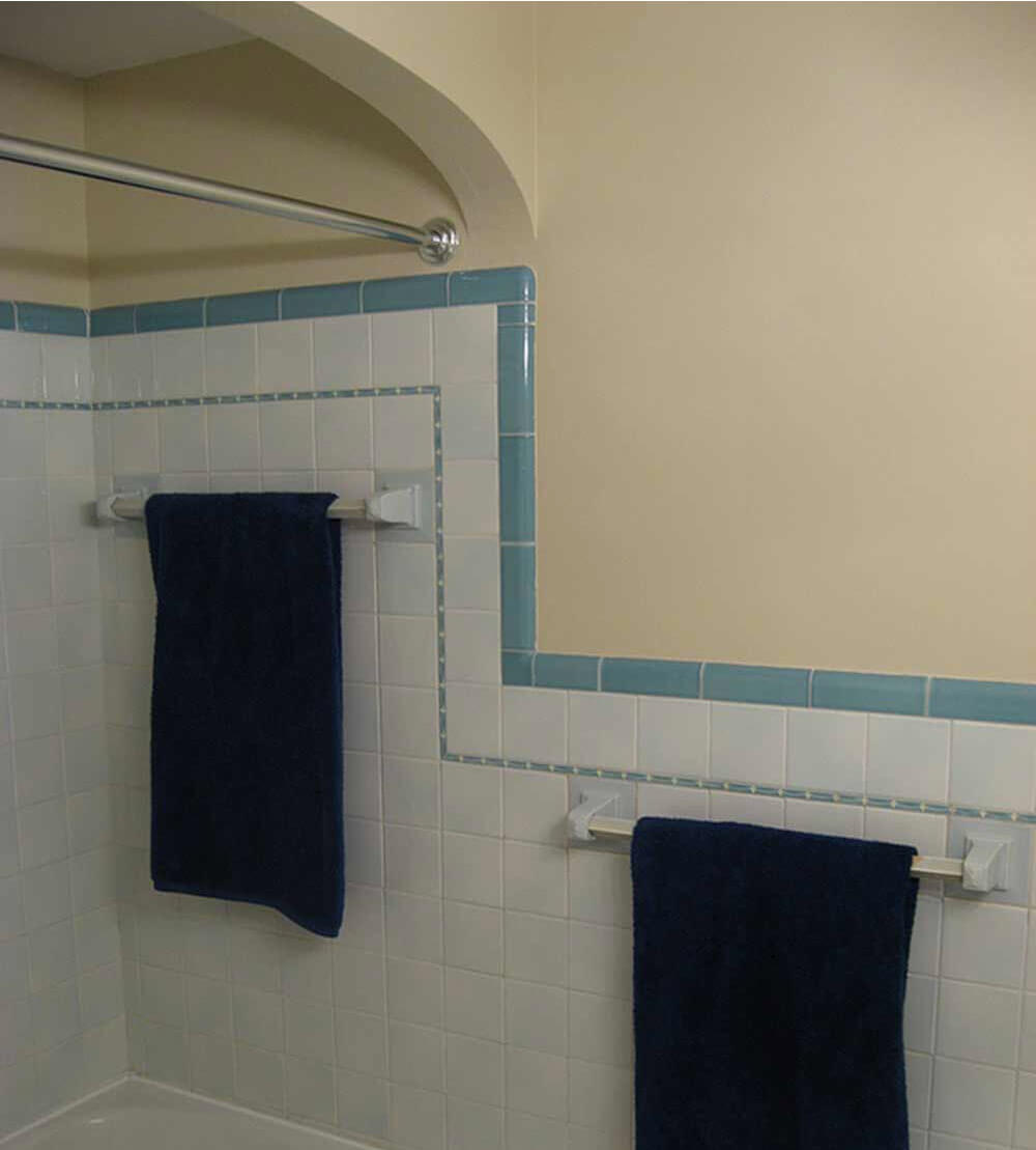
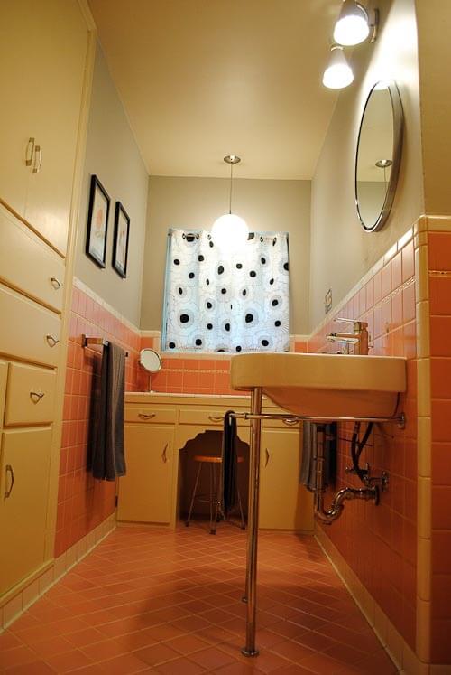
As you can see from these examples, back in they day they placed the decorative liner tile either (1) right under the bullnose, or (2) below the first 4″x4″ tile under the bullnose. Personally, I’d likely put it under the 4″x4″ — I think the deco tile pops better there. And if you’re gonna spend the money, well, golly, you want to see it. Either way, though — lovely! Thanks again to all the readers who have contributed photos over the years, so we can ogle — admire — and dream!


Kristie says
I am curious about the first picture of liner tile from B&W. We had ours made for our kitchen about 13 years ago at B&H, and it was those exact colors.
Still love my kitchen. Going retro is a good way to make sure your kitchen doesn’t get outdated. Sounds ironic, but it’s true!
pam kueber says
Yes, no matter what decorating choices you make, they will be dated. Dated to the date they were popular. As in: Grey and greige everything = so 2014-2015. Soon enough: Outdated. So if you choose styles that were popular when your house was actually built, at least they will be dated to a date that likely makes sense given the architecture of the entire house.
June Cahill says
I can’t tell you how these tiles (liners) make my heart SING! I first saw these in a home (from the 40s) my friend was renting in Long Beach – I think I was there in the early 80s. Her bathroom was PURPLE with liners of purple/green/black – I was in AWE of these small items of beauty – as my girlfriend in France says, “They are like ‘bon-bons'” (she actually used that term about French lingerie, but I think it could apply to these tiles as well!)
Since then, I’ve seen them ‘in the wild’ (being a realtor gives one a little ‘leg-up’ on seeing other people’s bathrooms!) and am always impressed and amazed how something so small can inject so much beauty! Thank you for sharing your wealth of knowledge. I’m due for a little pink bathroom makeover this year – (the HARD way!) and just might add some of these for a ‘hop’ of beauty and color! 😉
Kathy G. says
Hi! I vaguely remember these tiles from a restroom in a department store ? or maybe a restaurant? in Los Angeles in the early 1960’s. It was an older building mostly in grey colors – for the exterior. The tiles are pretty swell looking now!
Laurie Louise says
Thanks, Pam! We have two bathroom renos ahead, after we complete about five jillion other things. I think their are lots o’ liners in our future. Thanks for showing the pretties that will add flair (notice I avoided the word “pop” again?) to our spaces.
Kathy in San Leandro says
I recently lucked into 20+ feet of NOS liners on eBay.
Here’s another, spendier, source of custom-painted liners:
http://www.missiontilewest.com/fashioned-by-mission-tile-west/revival-classics/retro-liners/
And here’s a link to a fellow who has posted photos of more B&W tile colors than Clay Squared features:
http://www.johnpwilson.net/b&W.html
When you mouse over the photo, it shows you the color code from B&W, which helps when you order your samples.
Thanks for featuring liners, Pam!
pam kueber says
Thanks, Kathy, I’ll check out those Mission Tile West options!
Jamie says
I worked in a “bungalow” at the 9th Circuit Court of Appeals in Pasadena (a former luxury hotel repurposed by the federal government). The bungalow (actually, a mini-manse built in 1910 by an eminent Pas architect) had the most awesome Mission tile in both bathrooms in the dreamiest creamiest blues, creams and Nile green. I dream about those bathrooms sometimes….
Pratt & Larson says
Pratt & Larson makes some liners like these in our made to order Motif series and our friends over at Mission Tile West also have a terrific selection in their Revival Classics series! http://www.missiontilewest.com/fashioned-by-mission-tile-west/revival-classics/retro-liners/
In fact they have a few lines that would be perfect for any retro renovation. Happy Tiling!
pam kueber says
Thank you, Pratt & Larson, we will expand on our research shortly!
Alison Marie says
Thank you, thank you, thank you for always sharing so much really useful information. We’re hoping to renovate a master bath in a 1968 house this year, and affordable white 4×4 tile plus a black and white liner would be gorgeous and in the budget!!!! Would you consider adding a ‘Pin it’ button link to each photo, to make it easier to save these images from the blog?
Robin, NV says
I looked and looked for liner tile for our recent kitchen backsplash redo. The subway tile we put in fits almost perfectly except for a 1/2 inch gap where it meets the cabinets – just big enough to be noticeable and just small enough to be tricky to deal with. Ugh. Unfortunately I couldn’t find a liner tile that matched my new color scheme so the gap remains – and was the first thing my mother-in-law noticed in our remodeled kitchen. MILs, double ugh. 🙁
Donna says
there’s always *someone*….
https://www.youtube.com/watch?v=nsaxNehMibg
🙂
Robin, NV says
Hah! Yes, that’s perfect. We tiled from the bottom up figuring if there was a gap at the top under the cabinets it wouldn’t be noticeable. But of course, my MIL, who’s 4’11” noticed right away and felt the need to point it out.
LuAnn says
I love *epic*! Wow, I will be looking at these awesome liner tiles all day. Thanks for putting all this info together Pam. 🙂
Mary Elizabeth says
What I like best about these liner tiles is that, as Sarah showed in her parents’ bath, they make plain white tile (available virtually anywhere for less money than tile in vintage colors) hop right into the mid-century. (I was going to say “pop,” but that’s so Home and Garden Channel.) So if I were doing a tile job, I would spend less on the plain tile and a little extra on the liner strips.
It’s nice to see how the site has developed over the years and how many different stories can be drawn on to cover a topic. Do you know that when we Google any terms to do with renovating “vintage,” “mid-century” or “retro,” your site comes up in the first three or four hits?
Roundhouse Sarah says
Yes exactly! We splurged on those liner tiles but the white tiles were very cheap (by tile standards). We also are very happy with how versatile the bathroom is. No matter who owns this house in the future, they have so many options when it comes to picking out wall, towel and curtain colors. Hopefully this will keep someone from gutting it simply bc they don’t know how to decorate it.
pam kueber says
🙂
Laurie Louise says
Thanks, ME, for not “popping!” 🙂
Mary Elizabeth says
You are so welcome. After so many years of watching decorating shows (my cable package no longer includes that channel), none of the colors in my house pop any more. Sometimes they pull, sometimes they stand out, sometimes they blend in, occasionally they swear (my mom’s word) and often they enhance. But they never “pop.” 🙂
pam kueber says
I guess I need to be careful in the future, ‘cuz now I use the term.
Punctuate and graphically punctuate… or key accent color… I think I say those some times
Tertiary colors, in particular, can be used to graphically punctuate your secondary and primary colors. How else to say this? To lead your eye around the room without overwhelming the rest of the design. A little sparkle, but very carefully edited.
I also was talking with katiedoodle this morning about my 60-30-10 rule of decorating and how I need to write about it. 60% principal color, 30% secondary color, 10% – the accent color, yes, the pop.
Kate says
Saying secondary and tertiary colors reminds me of the color wheel: primary colors (red, blue and yellow) mixed, create the secondary colors ( orange, purple and green) and if you mix those you get tertiary colors (Yellow orange, red orange, red violet, blue violet, blue green and yellow green). But maybe just artsy types think of this? Maybe it is main color, accent color and “sprinkle” color??? 🙂
pam kueber says
hmmm… i hear what you’re saying, we don’t want language to confuse the color
how about principal color, complementary color and accent color?
Kate says
That could work…