

 For our third installment in our series, 99 ideas to decorate a pink bathroom, we focus on pink and gray bathrooms. While this seems like a straightforward color combination, care must be taken to determine if the gray tile you have is a warm gray or cool gray. We tend to believe that most vintage bathrooms were warm gray, so that is our focus here. However, if you are dealing with a cool gray tile, some of the warm-feeling taupes, beiges and browns used in these mood boards may not work as effectively.
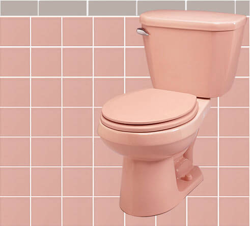
 To get started, I used pink field tile from B&W… a Bahama Pink toilet from Gerber. I mocked up the gray bullnose using a color in powerpoint. If you are designing a pink-and-gray tile bathroom like this from scratch, you can shop the gray bullnose tile from B&W and Daltile, for starters. Caution: Some grays are warm, some are cold.
For the towels featured in all these design boards, I shopped the large variety of colors available at The Company Store.
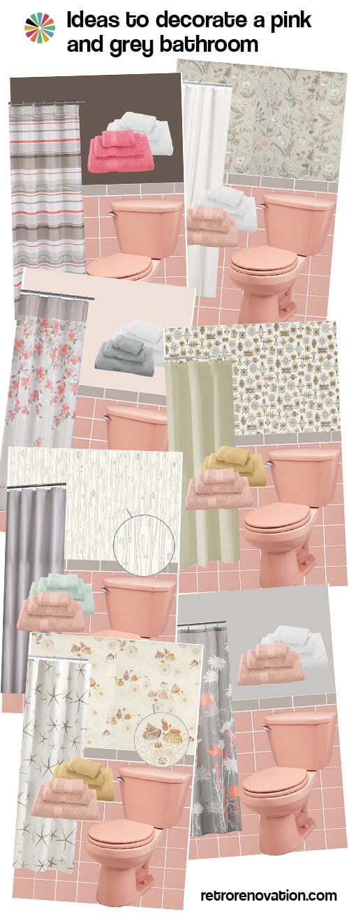
Pink and gray bathroom decorating ideas that start with the wallpaper
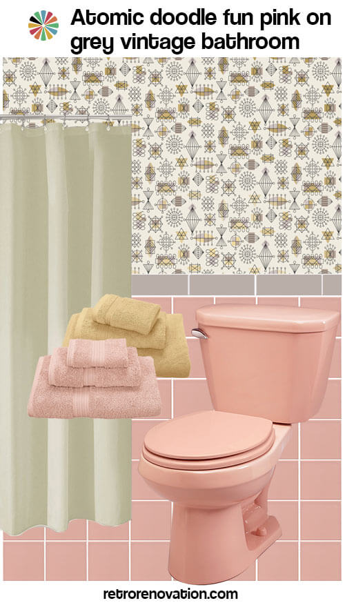
Atomic doodle fun pink: The lively wallpaper pattern from Bradbury & Bradbury — Atomic Doodle in Taupe — gives this pink and gray bathroom a fun feel. Since the gray accent tile is a warm grey, it blends well with the taupe color found in the paper pattern. An off-white shower curtain and pink and gold towels tie into the wallpaper pattern without competing with it.
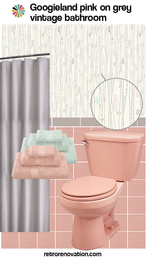
Googieland pink: Another great pattern, also from Bradbury & Bradbury called Googieland Ivory, gives this pink and gray bathroom a lighter feel. A solid grey shower curtain and pink and pale aqua towels — picked to match the colors of the googies in the wallpaper — round out the look.
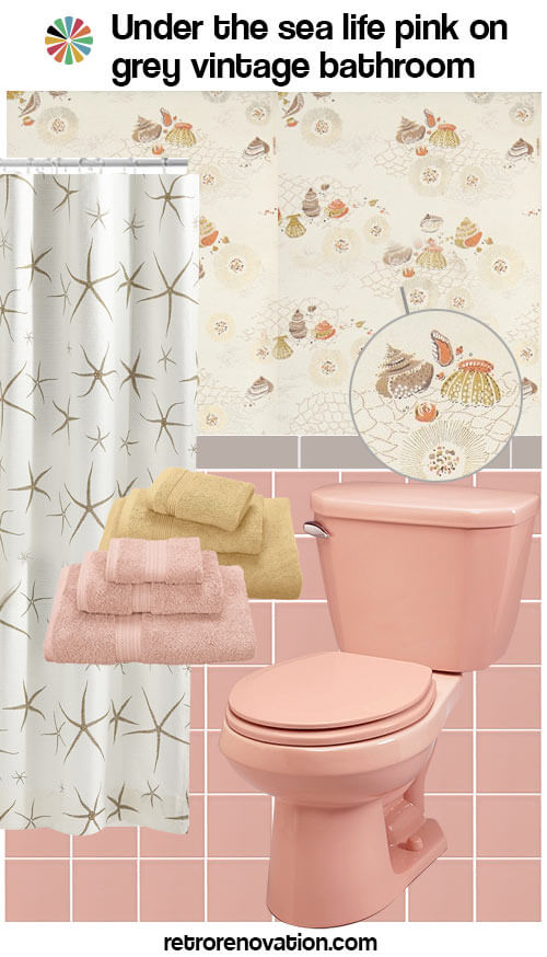
Under the sea life pink: Next I looked to Hannah’s Treasures for some vintage wallpaper options, and found this neutral nautical 1960s wallpaper. The bits of gray, taupe, orange and gold all set on an off-white background create a calming look with just a bit of color. Instead of going with a plain shower curtain, this off-white and gold skinny starfish curtain from Frontgate is calm enough to not clash with the wallpaper, and backs up the nautical theme. Simple light pink and gold towels finish off the look.
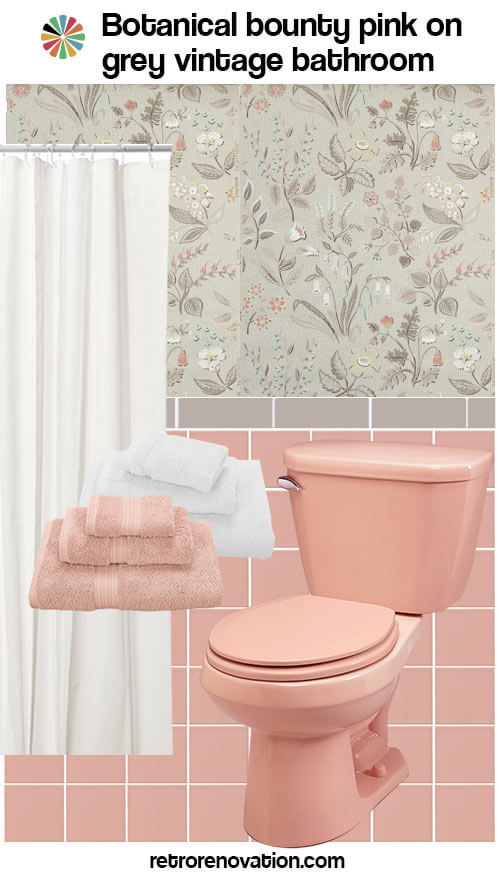
Botanical bounty pink: Finally, this 1950s gray floral pattern wallpaper from Hannah’s Treasures gives the room a calm feeling with a bit of whimsy. A plain white shower curtain and pink and white towels keep the room feeling fresh.
Pink and gray bathroom paint ideas that take their colors from the shower curtain:
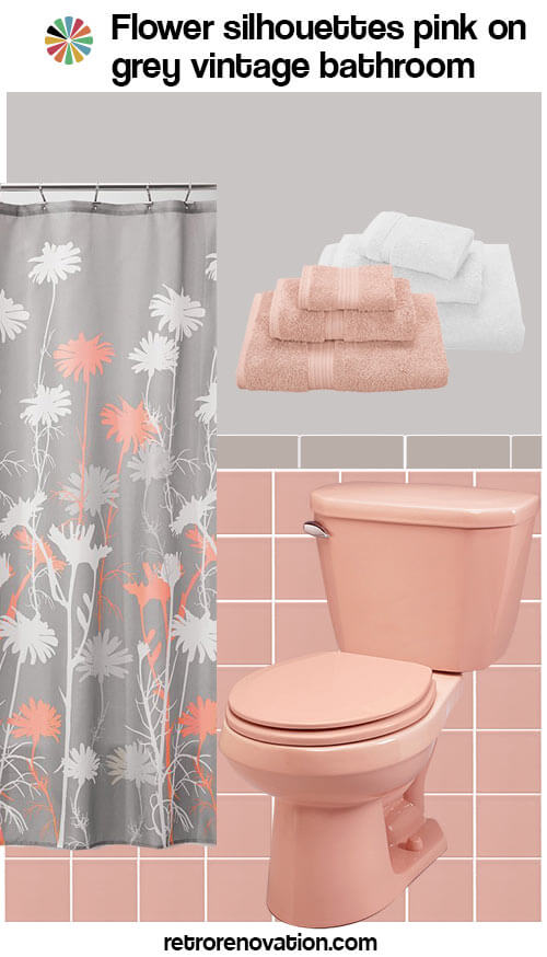
Flower silhouettes pink: For a midcentury yet modern feeling pink and gray bathroom, this flower silhouette shower curtain feels fresh and artsy. Mixed with a coordinating light gray wall color and pink and white towels, the room feels fresh and new.
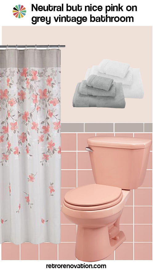
Neutral but nice: This flowery shower curtain, with its whispy falling flower stems from Kohl’s is airy and light. Check the listing — there are also matching embroidered towels and rugs! Painting the wall a lighter, pinky beige keeps the space feeling warm and inviting, while gray and white towels round out the look.
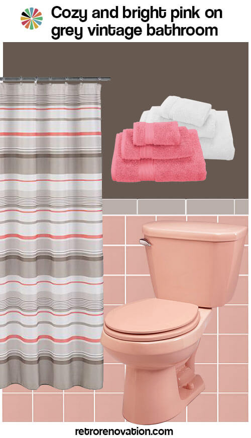
Cozy and bright: If you want a less feminine look in your pink bathroom, why not try some stripes? This grayish, white and coral pink shower curtain from Kohl’s feels fun without the flowers. A dark chocolate wall color — pulled from the curtain — creates a dramatic feel, and bright pink and white towels finish off the space.

Feels like tome: Add some reading material to your bathroom with this Hardy Boys book shower curtain design. Pull the serene minty green book cover color from the shower curtain and let it bathe the walls of your bath, while fluffy pink and gold towels make you want to cozy up with a good book.
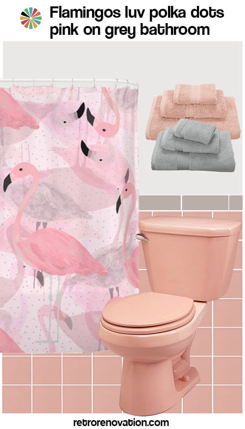
Flamingos luv polka dots: Pam found this shower curtain at Society 6. I love this shower curtain!
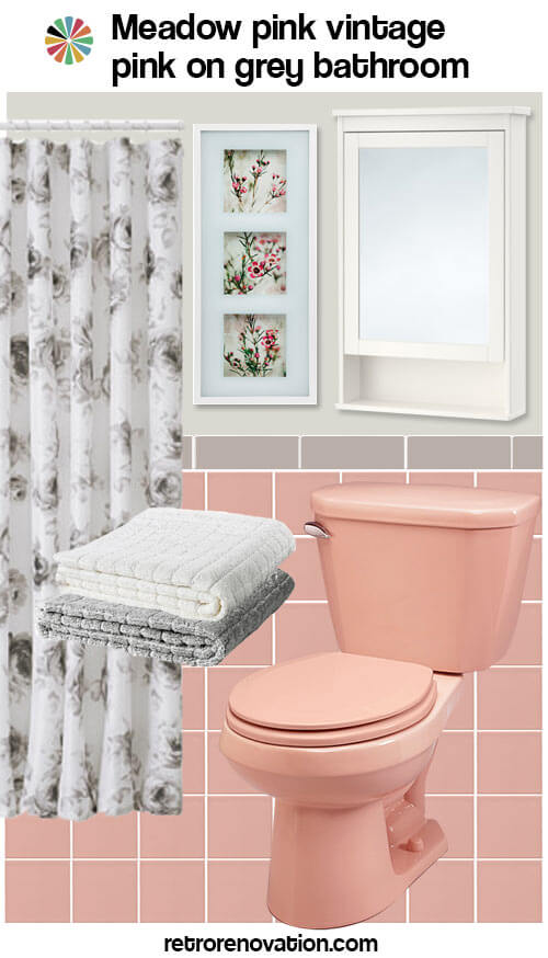
Meadow pink: This submission from reader Elisabeth uses all products that can be found at Ikea, including a grey and white flowered shower curtain, white and grey towels, framed flower wall art and this Hemnes mirror cabinet in white, all set on a greenish grey wall color. This feels like a retro-spa bathroom — and we love how the little bit of fuchsia intensity in the flowers perks up the calm just a wee bit — lovely!
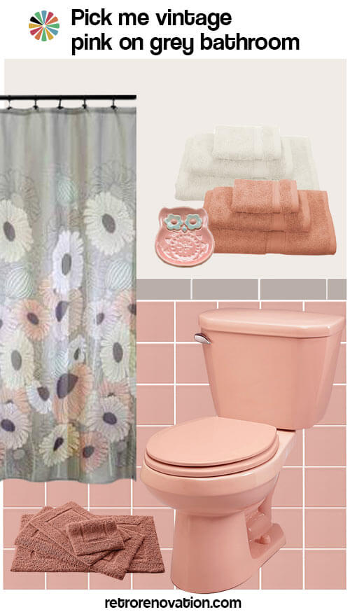
Pick me: Reader Robin came up with this fun take on a pink and grey bathroom — a flowered shower curtain from Walmart, cream and tuscan bath towels and clay colored bath mat from The Company Store, an adorable Japanese style owl dish from Amazon.com and she even picked a specific wall color — Ibis white by Sherwin Williams.
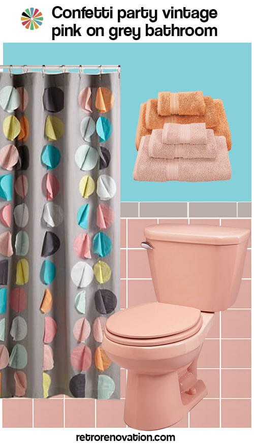
Confetti party: Nothing says fun like this colorful confetti party shower curtain from The Land of Nod, which has a fun 3D effect. Some coordinating light pink and orange towels from The Company Store and a bright and cheery aqua paint color round out the invitees to this bathroom party.
Now it’s your turn!
Coming up next: Ideas for a pink-tile-with-pink-trim bathroom.


jenn says
hi, im looking for help for my moms house that was built in the early 1950’s. she has pink & grey tile only in the bathtub area. the tub and toilet are white. the walls are painted pink with grey trim (no tile on walls) but the main wall is severly stained with soot/heat from the in-wall gas heater. I was thinking about painting the walls with a darker grey to conceal the soot and blend it in in the future. any suggestions. her house doesn’t have that “modern midcentry” look like i keep finding when i google.
pam kueber says
That sounds fine, Jenn. I am not an expert on this subject, but perhaps you could also talk to a paint store and see if they have some kind of primer to cover the soot — or a cleaner to remove it safely, then you could go lighter in color if you like.
Sounds like she has a Midcentury MODEST bathrooms. See our Midcentury Modest Manifesto! https://retrorenovation.com/mid-century-modest-manifesto/
Good luck. Good daughter!
Joe Felice says
Love the flamboyance of flamingos.
Jordan says
Super cute ideas here! I always love retro bathrooms that use colors like pink or yellow – it’s so unique from the way modern bathrooms look now. Thanks for sharing!
Mary Elizabeth says
Ha, ha, Pam! I think in the “Neutral but Nice” bath (which I love) you meant to say “whispy” flower stems, not “whisky.” Anyway, happy Fourth of July martinis to you!
Is it my imagination, or are there more and more shower curtains and towels featuring pink? When I moved in to this house four years ago, there were very few choices that would go in my pink and gray bath.
pam kueber says
hehe, I think Kate was contemplating cocktails when she typed that one: She surely has needed a few after making up all these design boards (and there are many more to come!)
Kate says
Yes, after all those mood boards, I could really use a cocktail! 🙂
Tracy Perez says
I h*** [edited] pink! Equal time for blue, green, and black and white tiles please!!!!
pam kueber says
Reminder, Tracy, we don’t use that word here!
Pink = Emblematic. We love all vintage color bathrooms. Use the same techniques we’re using here to create color combos for these other colors.
And, as I said in the first story in this series: Since pink was the most popular bathroom tile color in midcentury America — we get the most questions about that one. Hence: This series — I wanna just point all the continuing flow of questioners everafter here!
Robin, NV says
Sorry to climb up on my soap box yet again but… as the proud owner of a Ming green bathroom, I can tell you that pink bathrooms are WAY easier to decorate and coordinate. Pink is such a lovely neutral color that plays nice with tons of other colors. Ming green is not neutral and is seriously hard to coordinate with. I’d love to see just one day devoted to decorating ideas for a Ming green bathroom.
But I’m loving this series for pink bathrooms and getting to play along! 😀
pam kueber says
ok, we’ll do it! But… I think the same theories would all apply!
Debra says
I, too have a half bath with Crane’s jade green sink and toilet. I’m thinking jade and Ming might be quite similar. I’m moving the fixtures to the basement, going to find an aqua or turquoise that will compliment the green. The bedroom it will become an entire suite for will have a tropical theme, some espresso there, as well.
Kate says
I think you have to be careful mixing jade/mint green and turquoise together…if the two shades read as too similar it might look like a mistake was made instead of an intentional decision to mix these colors.
Robin, NV says
Yes – trying to match or “come close” to Ming green is unlikely to occur and will end up looking not so great. I’ve found that the color works well with other pastels – yellow, pink, lavender. I have Ming green fixtures with speckled yellow/cream/gold tile. I think it looks fine but I have yet to find a wall color or accessories that work with my color combo.
Mary Elizabeth says
Robin, I know what you mean. Green is really hard to match and complement. My 1939 house had a bathroom with green tile with black liner and bullnose. The green had a hint of a yellow swirl in it. It was a really pretty tile that I loved when I bought the house, but it didn’t want to coordinate with any other green. The wallpaper (which seemed to have been a former owner’s attempt to ignore all the green completely) was aged and falling off, and the shower stall needed re-tiling. I went through about 18 wallpaper books and tons of tile samples trying to find a color that went with that particular green and that particular yellow. I ended up stripping the paper and just painting the walls pale yellow, and the shower was an entirely different color. I wish this site had been available to me then. And the Internet. And call forwarding. And automatic car locks. 🙂
Beth says
I’ve got the inverse…gray with pink. Sadly I don’t have the original sink, tub, and toilet, they’re white. But anyway, I’ve “pinked” the heck out of it to balance the gray and pink, and I am loving it and all these ideas : )
pam kueber says
to pink or not to pink, that is the question! but of course the answer is: to pink!
tammyCA says
“feels like tome” is fun…neat Hardy Boys curtain. I used that wall paint color (found in the “oops” section at HomeDepot) for a shelf & little chair & was so pleased with this ‘vintage-y’ shade. I actually have some Hardy Boys books mixed in with my Nancy Drew & Cherry Ames, also in that pretty green-blue shade.
Sandra says
I love the Bradbury wallpapers and have used Atomic Doodle for my inspiration in my kitchen. My brother works for them–and I’ve seen them print these historic papers using traditional silk screening techniques. Many of their designs are in historic homes and museums from the Victorian era.
However, I have not installed the paper in my kitchen, yet, in part because I’m still considering its appropriate location: it is not scrubbable or meant for a damp environment.
I think there may be ways to top-coat it, but I would do more research before putting it in a bathroom where water would condense on it, or anywhere where it might need to be scrubbed from time to time. These papers aren’t pre-pasted, either. I’m thinking of doing a glass backsplash with this paper behind it.
LuAnn says
I’m loving all the inspiration with the pink bathroom extravaganza! We don’t have a pink bathroom, although I’d bet that it was pink just before the previous owners put it up for sale 15 years ago. It’s white now. Yesterday I had the thought that I could still have the look without ripping out what’s in there now. Pink towels, shower curtain and rug might make me a happier camper in the meantime. 🙂
pam kueber says
Yes! How about pink paint on the wall, too?
LuAnn says
I love that idea!
Robin, NV says
Love Botanical Bounty and Feels like Tome!
pam kueber says
Kate’s “Feels like Tome” made me LOL