

Do you need to choose colors for your bathroom, but aren’t sure where to start? After our recent miniseries we pulled our methods into an easy-to-scan infographic. Our formula can be applied to virtually any bathroom with any color of tile and fixtures. And really, it can be used in virtually any room that has you frozen in your decorating track.
A foolproof guide to choosing bathroom colors – successfully
We’ve distilled all of our bathroom decorating advice into five easy steps + tips on how to add more light, understand visual gravity and Pam’s 60-30-10 rule for choosing colors.
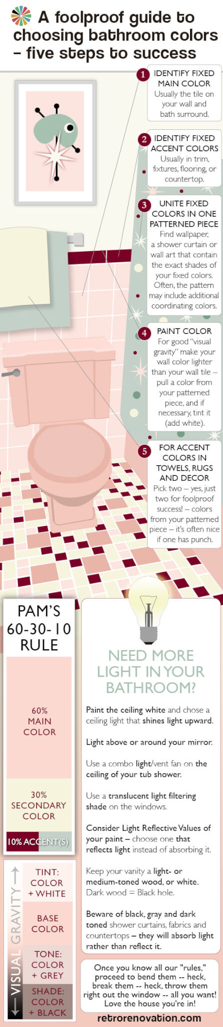
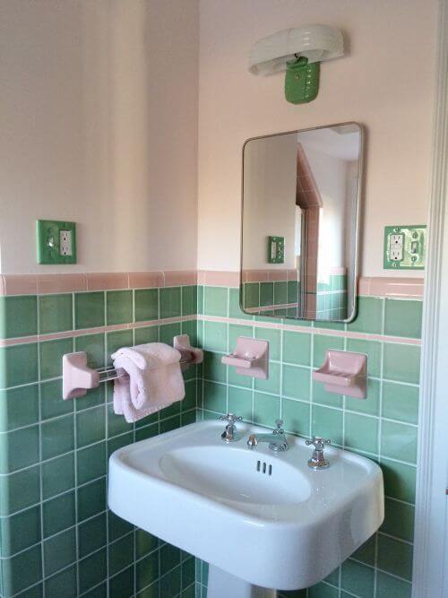
1. Identify your main fixed color:
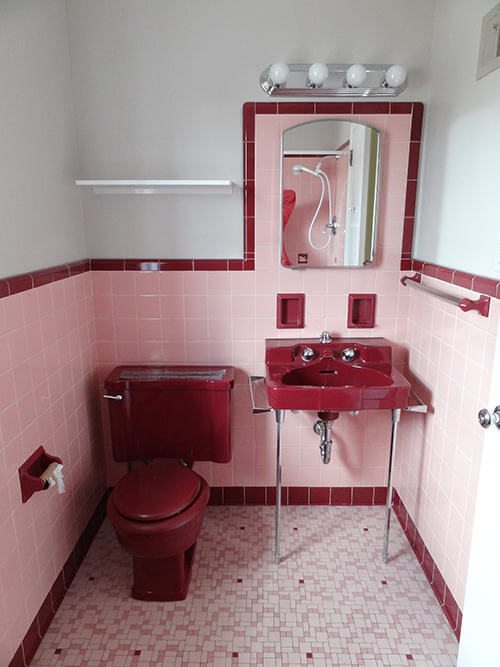
First, you need to determine your main fixed color. This will likely be the color of the existing wall tile in your bathroom, since it likely covers more than half of the total wall surface in the space. You can “play it up” or try to “play it down,” but you can’t get around it. Your floor tile and/or bathroom fixtures may also be this color. Basically, your main fixed color is the color that is the most prominent color of the elements in the room that are attached and not easily changed.
2. Identify fixed accent colors that you need to take into account:
If you have other fixed colors (in lesser proportions than your main fixed color) in your bathroom, they must be taken into account. Fixed accent colors often are found in fixtures, bullnose and floors. If so, these likely must be a part of your overall palette.
3. Unite fixed colors in one patterned piece:
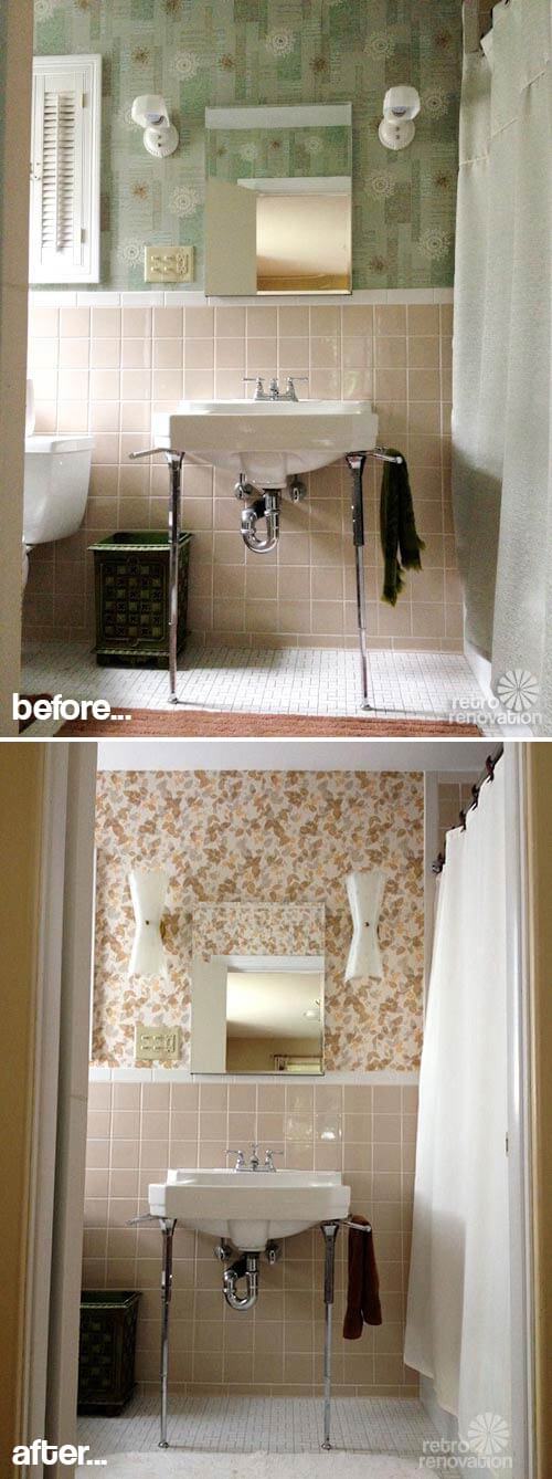
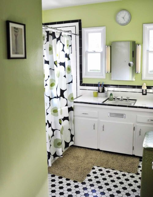
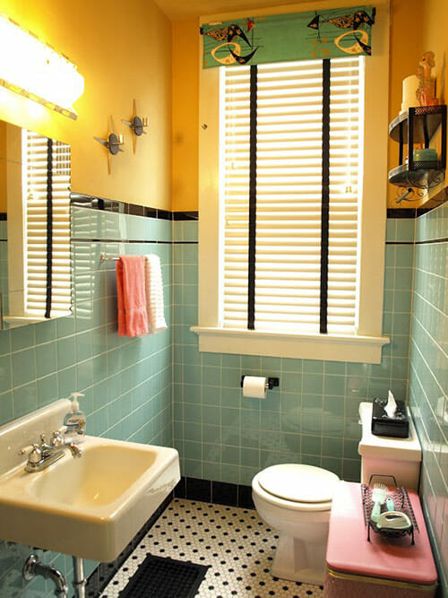
Now that you have identified your main color and your secondary color, it is time to unite these two (or more) colors into a patterned piece that will help pull the room together and can even help you determine an accent color or two for your room. You’ll want to find wallpaper, a shower curtain or wall art that contains all the colors you will use in your bathroom.
Ideally, the pattern will include the exact shade(s) of your wall tile, colors of any other tile in your bathroom and then, additional colors that the pattern designer collected. The good thing about finding a patterned piece is that it likely already reflects effective color combinations chosen by a professional designer. Within this pattern, the designer will have selected other colors that go well with your fixed colors. Note, it is possible to have pattern in two places (such as wallpaper AND shower curtain) — but we’re not going to go into that, because this is a “foolproof” guide. Suffice to say: If you start layering patterns, study up.
Meanwhile, even within our foolproof guide:
Be cautious of: Grids — Since the wall and floor tile are already strong grid designs in the room, you’ll have to be wary of adding yet another grid. Too many grids can make the room feel forced, uncomfortable to the eye and even cage-like. It is generally more foolproof to choose a wallpaper or shower curtain design with a more free form pattern that is not too geometric to avoid the overuse of grids in the space.
Be cautious of: Scale — Another aspect to consider when choosing a patterned piece is scale. Vintage bathrooms are typically small spaces, so for foolproof design success, avoid overpoweringly large patterns — that is, unless you are consciously going for a bold graphic look. [For bold graphic ideas, see our 99 pink bathroom designs — we show plenty of ways to do this.] Scale is also important when choosing wall art for a small bathroom. Typically the wall tile in vintage bathrooms covers more than half of the available wall space, leaving relatively small sections of wall for hanging art. A large piece of art that takes up all the available wall space may make the space feel claustrophobic; a grouping of smaller pieces with some space around them can provide something interesting to look at without making it feel forced. Edit.
4. Choose a paint color
If you are not going to use wallpaper in your bathroom, you’ll need to choose a paint color that works with your color scheme. Once you have found your patterned piece — art or shower curtain — take it into your bathroom so you can see it alongside your tile, flooring, etc. Pull one color from the shower curtain or art for the paint color for your walls. You can use this color exactly as seen on the patterned item — or add white to tint it lighter, black to shade it darker, or both black and white to tone it somewhere in between. Beware of going too dark, though — See our discussion of “Visual Gravity.”
If you’ve chosen wallpaper, use the same process to choose a color from the wallpaper for your shower curtain, or use a neutral (we like soft whites). Pam always looks at the “field” color of the wallpaper first to consider for a shower curtain color — this can result in lovely harmony.
- When choosing a paint color, don’t forget to determine the Light Reflective Value of your paint color
- And more on Light Reflective Values of paint — from Kate’s house
5. Use accent colors in the accessories
Next, what is a “third” color from your patterned piece that you can use sparingly as an accent throughout? This is a good place to be contrast-y (go opposite your field tile) for visual dynamism aka “pop”. Use this color for… accents like towels, rugs, maybe a valance or café curtain or soap dish. But don’t overdo it, or it’s no longer an accent – see Pam’s 60-30-10 rule.
 Pam’s 60-30-10 rule
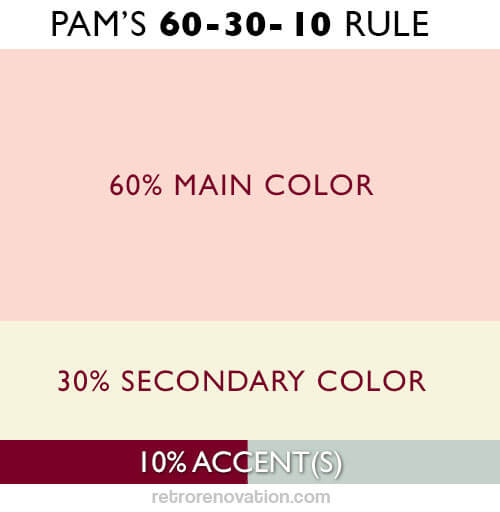
When it comes to application of distinct colors, think 60-30-10. That is:
- 60% your main color (e.g. usually the color of your wall tile)
- 30% secondary color (paint color or field color of wallpaper)
- 10% accent color (for foolproof success, limit to just two accent colors. And, here’s the easiest place for successful contrast)
Towels and rugs: Use your main color, your secondary color, your accent colors – mix and match.
Decorations on the wall: Color also should relate to your overall color scheme. Group in odd numbers, make sure you use the “white space” around them to frame them effectively.

Visual gravity:
Visual gravity refers to the feeling that the decor in a space is ‘grounded.’ “Visual gravity” is comfortable to us. Lighter colors up high, deepening darker as you do down. Just like in the world: Sky is light, trees are medium, ground is dark — we feel grounded, safe. If in doubt, use this principle for your bathroom design too. That is, beware dark bold colors on walls above pastel tile unless you are consciously going for that topsy-turvy effect; and, beware of entering the room when you have a hangover.
Other things to consider
Are your fixed colors warm or cool?
This is actually a whole ‘nother big topic in and of itself, but in short: Are the fixed main and secondary colors in your bathroom both warm (pink, yellow) or cool (blue, green) colors — e.g. ‘Red is hot, blue is not’? Or, do they combine a warm and cool color scheme? Take this into account when you are choosing an accent color and deciding on a wall color. If your bathroom is predominantly cool, adding small warm accents can really make the accent color pop off the cooler background, whereas if your accent color is also a cool color, the accessories and art you choose will have less of a visual impact because they mesh more closely with the color temperature of the space. If your bathroom has a window that gets a lot of warm afternoon light and you want to make it feel visually cooler, you can add cool colors to the space, whereas if your bathroom always feels cold, adding some warmer colors can help it feel more comfortable and cozy. Note: Chrome is cold and actually a contrast for most vintage bathrooms which tend to be warm even if they are “neutral” example: warm grey, warm white, etc.
Need more light in your bathroom?
- Painting the ceiling white and shining a ceiling light, centered in the bathroom, up onto it helps to reflect the light all around the room, giving it the feeling of being filled with light.
- Putting lighting above or framing your mirror has a similar light bouncing affect.
- Add more light in your tub or shower area by putting a combo light/vent fan on the ceiling over your tub shower, which will help light up this small, enclosed space. Remember to put your vent fan on its own switch and add a timer!
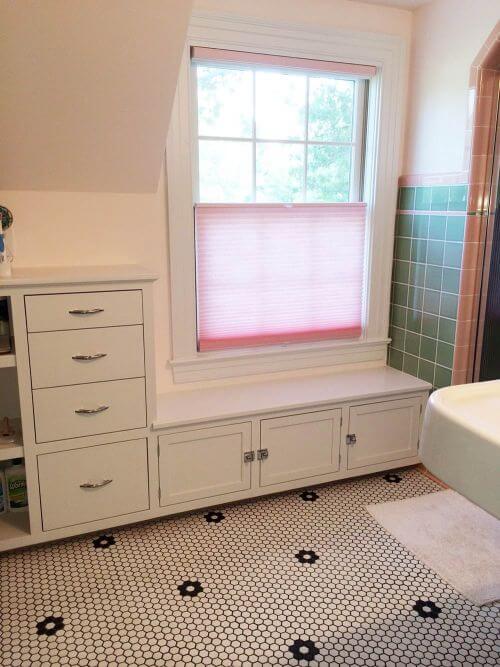
- On your window, use a translucent light filtering shade (like a pleated shade) that can deliver privacy but still radiate the natural light coming in from outdoors. Make sure it is easy to pull up and down — use it! Another solution: Put frosted/privacy glass in your window — or use the stick on privacy film — to let in the most light possible while maintaining privacy.
- Get to know the Light Reflective Values of your paint choices. For your walls, choose a paint color that reflects light, not absorbs it.
- Keep your bathroom vanity a light- or medium-toned wood, or white. Dark wood=black hole.
- Similarly, beware of black, gray and dark-toned everything — tile, floors, shower curtains, fabrics, countertops – they will absorb light rather than reflect it.


PrimroseRoad says
I could use some help here. My master bath is the traditional grey/pale blue. We have to rip out a large portion (two walls and the shower; the existing fixtures are shot — toilet is held together with duct tape) because of water damage. BUT I found a pair of perfect mint green Criterion sinks that I would love to use. Any ideas that might work?
And my decorating tip — never underestimate the power of painted glass. It’s a terrific reflective surface and can be used everywhere – put it directly on a wall for a clean look in lieu of tile or make it the top of your vanity — and it can be any color or pattern you want.
pam kueber says
Hi Primrose, It doesn’t sound like a good match if you still have gray/pale blue tile in there…
Joe Felice says
One time, in a post, you pictured a shower curtain that was the PERFECT fabric, pattern & color for curtains in my office. I researched the shower curtain, and found it to be available ONLY in the UK. And all over the place there, but NOWHERE here in the States!!! And UK vendors would not ship here, for all the money in the world. (Seems nobody likes us anymore.) So I asked who the manufacturer/supplier/wholesaler was & I contacted that company. No sell in the United States of America. I guess you obtained your pictures from the web, and not from places that could actually sell us the merchandise. And I have encountered this situation with regards to other textiles and wallpapers. UK, yes, US, no can do. What’s up with that?????
pam kueber says
Well, I think the issue works the same from many directions. It can be difficult to ship to other countries no matter which direction.
Gigabyte says
Great inspirational photos! I love the 60-30-10 rule and will use it when decorating my other rooms, but what do you do when there are 2 main colors in the bathroom (in my case, black wall tiles with turquoise corner tub/sink/toilet/floor tiles)? Do you still pick a 3rd accent color? And what goes with black and turquoise anyway? lol
pam kueber says
Using our foolproof rules, yes, you want to find a third accent color. First, find your patterned piece with both the black and turquoise in them. The pattern designer — who is trained in such things — will have also selected other colors that go-with. Use one of those as your accent.
Example: See my kitchen. Turquoise cabinets. A decent amount of black (let’s pretend this is the second color, as in your example). And in my patterned piece — my window fabric valance — my accent color: Red.
Lots of colors could go with black and turquoise actually. In addition to red, I could imagine…. coral… certain greens…. certain pinks…. probably more.
Caryn says
Oh thanks for this… perfect timing for me! I just this weekend finished removing all the remaining slivers of 1970 harvest gold/brown wallpaper (horrible condition, couldn’t be saved!) from our little Jack & Jill bathroom. The bathroom is all avocado green (tile, sink, shower, toilet) and the only thing I’ve decided on so far is a groovy orange 70s open weave curtain for the one window. Hopefully, referring back to this article will help me narrow down my other decisions and not get too overwhelmed 🙂
Carolyn says
This curtain of which you speak – Beauti-Vue perhaps?!
Caryn says
Oh gosh, I WISH it were… I’ve drooled over those but they aren’t in my budget right now! What I have is a pair of pinch-pleat open weave panels by Sears Roebuck, found in excellent condition at Goodwill not too long ago. I altered/shortened them to work for the window in our family room but have enough left to make a curtain for the smaller bathroom window!
Elizabeth says
Makes no difference what color I think I want, I can never seem to achieve it. For our current bathroom remodel I hoped to replicate a makeover that you guys did maybe a year ago – you had a butterfly shower curtain and pine cone bath mat. I can’t get the walls green! We have no windows in our bathroom so its really hard to judge the paint colors until you actually get them on the walls, and everything that looks good in natural light looks horribly dark in there. We finally ended up with what should have been a very light green with a hint of blue but on our walls is turquoise. All the fixtures, including the new vanity top and sinks are white, so I guess we are now moving into key west mode and I will swap out the butterflies shower curtain for one with sail boats. Color is hard!!!!
Robin, NV says
Argh! I know!! Finding the right color to work with my Ming green bathroom with yellowy/orangy tiles has been impossible. I try to follow Pam’s rule of thumb but I don’t know which color is dominant because there’s a lot of both.
Ed says
Have you tried the “natural light” LED bulbs? The newer generation can look rather nice in the appropriate application, and lend a more natural hue to colors in the room.
ineffablespace says
“everything that looks good in natural light looks horribly dark in there.”
Paint–and everything else,really–needs to be picked out in the environment in which it will be seen. It doesn’t matter what it looks like in natural light if it will only be seen in a windowless, fluorescent-lit room.
This is why many 18th c. color palettes were so garish. Much of the year people were using the rooms in the pitch dark walking around with a few candles. Any subtle color would look like grey. Look at some of the rooms in Williamsburg’s Governor’s Palace and the latest color of Monticello’s dining room.
pam kueber says
Thanks for the info on why the colors of the 18th c. — I never thought about it that way! Fascinating — and totally makes sense!
Carol says
Green is hard. You wouldn’t think so but when we painted my brothers new house he fell in love with some barkcloth I had with the grayed down colors. We decided to paint the kitchen green since the cabinets were clear coated maple. I purchased at least 8 gallons of paint all from the same manufacturer. Some were color matched from the fabric. I finally started mixing and the final result was great except it needed a little more gray. FYI, we had so much green paint that we painted the living room the same green. His house looks like a brick granny house. A brick cottage with a “tudor” entrance with a dining room of windows on one end. The sort of house you would find off the mainstreet in anytown USA. Very classic with a cottage feel inside so the rooms are basically compartmentalized but flow easily. He hasn’t repainted anything in 14 years and it still looks great. Felt your paint pain for weeks!
Skye says
An idea: get some big poster board and some paint samples and actually test the colors out on at /least/ a 2ft x 2ft square. It’s impossible to get a true idea of a color from a little chip! Plus you can do several at once without having to paint over your sample square a bunch of times.
My bathroom is a Dresden/cadet blue with a darker blue trim. I went a little crazy and painted the walls hot pink (Diva by Behr) because there isn’t much drywall showing. ( I am a color glutton).
The cabinets and countertop are white. I found a black/white pinup-girl print shower curtain at the thrift store so now my bathroom is rockin’. I get a lot of natural light though so I was able to get away with doing the bright color.
pam kueber says
“Color gluttons” welcomed here!
Joe Felice says
Colors never look the same in the store as they do at home. Buy a sample-size jar of paint, and paint a 2×2-ft. square, then observe it for a few days. I don’t know WHAT lights they use in the store, but they always skew the colors. I did not follow my own advice and had the living room painted a nice color, but lighter than what I wanted. So the lesson is: Light is so important. The same color will look slightly different at different times of the day, and certain tones will come out under artificial light at night. Plus, I’ve noticed that paint even changes tone slightly as it cures. I swear, my bedroom is not the same color it was the day after it was painted!
Mary Elizabeth says
I think reading your many examples of how to decorate a pink bathroom helped me intuit all these principles, but it’s nice to see them all spelled out so neatly.
I believe similar principles apply to other rooms, such as living rooms, in which the biggest color determiner is the sofa (and loveseat), or kitchens, in which the biggest color is the cabinetry and/or the countertop. But the reason it’s so important to point them out in bathrooms is that you (and most of your readers) believe that when the tile is in good shape, we should work with it. It is a fixed color, not something you change on a whim.
MOM says
PAM GO LVILLE CRAIGSLIST ANTIQUES-DWYER
pam kueber says
Hi Mom, will do!
pam kueber says
Adorable, Mom, but that’s way too much dough re mi! http://louisville.craigslist.org/atq/5250287753.html
Mary Elizabeth says
Maybe your mom is thinking how nice that little kitchen will work in an in-law apartment in your house. 🙂 Seriously, when you consider that working appliances come with the deal–and the cost of small stoves and refrigerators for spaces such as studio apartments and trailers–it isn’t so bad a price.
Stove:
https://www.katom.com/162-WNM110P.html?utm_source=msn&utm_medium=cpc&utm_content=162-WNM110P
Refrigerator:
http://www.beveragefactory.com/refrigeration/luxury/refrigerator-freezer/summit-bi540sstb-fridge-freezer.html?CAWELAID=320012430000235911
Au33delarue says
A great post! Thank you, I really think I will be able to transform my old bathroom into something nice…
ineffablespace says
I usually take into account whether someone will be putting makeup on in the bathroom with color selection, or at least saturation. If you can it makes sense ( to me) to pick something complimentary to your skin tones so whatever light reflects on your face is “helpful”. I had a client that you could tell which bathroom she put on her makeup. One of the bathrooms definitely seemed to affect the results. The one bathroom, which had no natural light was also a color that didn’t seem good for her skin tone–it wouldn’t have been complimentary in clothing for her.
I think you can go a little crazier in powder rooms. I would never do a black bathroom but I would probably do a black powder room.
pam kueber says
Great tip!
Robin, NV says
When I was looking for a new paint color for my bathroom, the woman at the paint counter suggested painting a little bit of the wall reflected in the bathroom mirror (the wall behind me when looking at the mirror), so I could see how the paint color looked against my skin. It really helps visualize what different paint colors will do to your skin tone.
ineffablespace says
This is one of the reasons why I don’t understand the bias that people have regarding pink bathrooms. Pink is complimentary to many skin tones, except maybe some strongly olive complexions.
Retroski says
Pink should work with olive skin, usually it needs to have a cooler undertone vs a warm one.
Figuring out if your skin has a warm or cool undertone is a good way to determine your most flattering bathroom colors.
Joe Felice says
I’ve heard that you should choose colors that “flatter” your skin tone. (I think Marni even mentioned this.) But lighting can make a HUGE difference. Not all bathrooms have windows. Neither of mine do. I changed the incandescent bulbs to LED daylight, and DAMN! Twice the light for half the energy. But not all people want that bright of light. I liked it so well, I put new LEDs in the kitchen under the cabinets. Don’t even need the overhead. LEDs also come in “warm” or “soft” white, just like fluorescents, but I detest the orangish-yellow tint of those. Nothing seems to look right to me, but I understand it’s a matter of opinon & taste.
John says
Great article! So many times people will rip-out and remodel when all they needed to do was work with what was there. This applies to all sorts of renovations. When I fixed up my 1949 house exterior, the first item was to put the gutters back on. I chose a color I like, then went one lighter. That set the tone – a manufactured factory painted color that came the closest to the mortar in the brick pattern. From there the whole house came together working off of that color retaining the red brick and only painting the trim.