

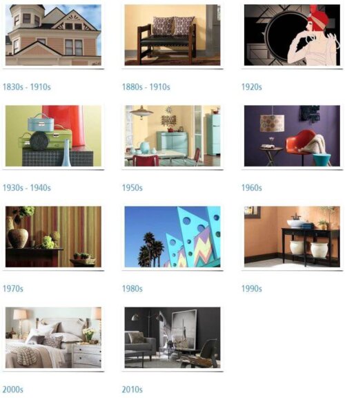
 To celebrate their 150th anniversary, Sherwin-Williams has created a historical color journey showing paint color trends throughout the decades. The timeline starts in the Victorian era and spans all the way to the 2010s — which they refer to as the ‘greying of America.’ The color history is a great starting point for those who want historically accurate paint colors for their homes and need a frame of reference. Which decade is your favorite? To get swatches of any of these historic colors without having to head down to the paint store, see our story revealing the ‘secret’ for how to get paper samples of any of Sherwin-Williams’ paint color swatches, including one of the most useful palettes we ever found, their Suburban Modern paint colors. Oh and: Happy Birthday, S-W!

YOU MAY ALSO LIKE


Reader Interactions
17 comments

Retroski says
I like how these make the palettes of the times come alive. The 1980s reminds me of all the 80s stuff in thrift shops now (and growing up). The 30s-40s reminds me of barkcloth.
Marilyn says
Baby blue was really popular here for walls if you remember The Parent Trap Hayley Mills bedroom was that color but even Living Rooms were. Also big on either Colonial or French Provincial furniture. And then part of my childhood went into the 70’s and that was big on a brick color with browns or green as accent. I don’t see those colors there. Also I would love for someone who grew up in the 40’s to tell me what colors they had on the wall. Specifically because I would love to do a 40’s theme.
Beverly says
Such a delight for the eyes!
Seeing the palette of the 2010s greys makes me want to rush out and paint my home anything else–oh, wait, I have!
Jonny says
The commentary was really well written and clearly had some tongue-in-cheek mentions of all the beige and grey. I’d bet $1 that whoever wrote those captions is yearning for a return to colors.
Jay says
The 30/40 and the 70’s samples shown are what I can appreciate most; having experienced them growing up. Not only as wall colors but interior furnishings as well. The deeper shaded somewhat more conservative colors seemed to appeal more to my parents generation – married during and after WWII. The bright 50s and 60s colors didn’t go over so well but possibly just a regional thing.
Marilyn says
Jay do you remember what deeper shades colors? trying to do 40’s…
Mary Elizabeth says
I was born post World War II, so I grew up in homes that had been decorated just after the war. Few people in my family redecorated more than once in 20 years or so, and therefore the ’40s colors were with us well into the ’60s and beyond. Here are some examples:
One popular color was a combination of a dark burgundy called “maroon” and a dark green, such as forest or dark sage, plus pink for an accent. In our living room, the walls were papered in a pink, white, green, and maroon stripe; the sofa was maroon, and there was a green overstuffed chair and maroon curtains with pink and white roses and green leaves. Flowers, stripes and paisley were popular for print fabrics and wallpapers. There were a couple of wooden chairs with needlepoint seats with roses. Needlepoint and crewel embroidery were carried over from the Victorian/Arts and Crafts period and were still alive in the ’40s, not so popular in the ’50s, and then revived in the late ’60s.
Kitchens in my house and friends’ houses were usually dark to light yellow or dark to light blue, or some combination of these with white. Apple red was a popular accent color. When my grandmother moved into a new house in the early fifties, she painted the kitchen a dark salmon, which was somewhat unusual, and the countertops were aqua boomerangs. She was the style leader in the family, so she was going more 1950s then. But I would say her living room was still 1940s, with classic or traditional furniture shapes, sage green upholstery and golden yellow walls.
Fruit was popular in fabrics and metal canisters and bread boxes. I have some retro curtains that look like the ones in my family’s homes in the 1940s and ’50s–they are dark yellow/gold with blue diagonal lines and fruit. To decorate your kitchen in 1940s colors, you can look for vintage tablecloths and metal ware on eBay and etsy and draw the colors from those.
I think the main thing about 1940s decorating was that people were just recovering from the Depression and the war, so they tended to use things they already had (furniture and draperies) and to make few changes. For example, if you were sticking with the same furniture but the walls needed painting, you would go with colors that coordinated with what you already had. Or if you wanted all new color in the room, you would make slipcovers to cover the sofa and chairs.
Would love for you to share your 1940s decorating results with Pam and Kate.
Debbie in Portland says
Do you know if they will have the brochures again? I somehow misplaced all of mine except the one from the 1950’s. It makes me smile every time I run across it: my dad built houses from the 50’s through the early 80’s, and the one color that he could not stand was chartreuse. Of course it was super-popular and he had to paint a lot of rooms that color. I can still hear him muttering “shart-ROOSE” as if it were a curse word. 🙂
Dan says
It seems our parents and grandparents were far less afraid of having color in their lives. When I look at what constitutes “tasteful ” color schemes of today, it makes me want to rush home and paint something orange or chartreuse (or maybe both!).
Geronimom says
Interesting – and sad when you juxtapose just how colorless, blah and boring the current 2010s are compared with every other era. Oh well, I guess gray had to have its moment of glory at least once. Will be SO glad to see what finally follows it – it would be fun if there were a knee jerk reaction and we end up going all vivid & bright like the ’60s? Although, actually, IMO, I think they should have said “latter” ’60s – as the first half of that era looked nothing like that in my home! Based upon my memories of our house decor back in the ’60’s (was born in ’62) we had harvest gold walls (well, whatever wasn’t faux wood paneling 😉 and turquoise appliances. The sofa was avocado green (Naugahyde – ugh!) with side chairs of bright orange and turquoise, respectively – and lots of orange, turquoise & harvest gold accents…I guess my mom was ahead of her time as they claim those colors for the ’70s!
Geronimom says
Forgot to mention that mom had that furniture all recovered in those colors in 1965. I remember her telling me that in her naive innocence, when she was pregnant with my older brother (b. 1959) she and dad went furniture shopping for their brand new home and she picked out a lovely WHITE ???? 3pc. sectional sofa with white accent chairs. Unfortunately, when my brothers and myself eventually arrived upon the scene, we pretty much ruined that lovely upholstery with fingerprints, juice stains and the like – so in 1965 she had it all recovered – in that nasty but durable Naugahyde!
Mary Elizabeth says
Dear Geronimom, I thought the terms n***y and u**y were banned on this site. I want to put in a few positive words for Naugahyde. A black Naugahyde sofa bed was my first furniture purchase when a newlywed in 1969.
First, it was sturdy, almost invulnerable, lasting through three moves, several pets and a small child. (The last time I saw it, it was in my ex-husband’s home circa 1990. It may still be there.) My friends who have purchased real leather sofas have found them to be more prone to damage by pets and children.
Second, it was easy to maintain. You could clean it with a damp cloth and even a little antiseptic cleaner when needed (when the baby had projectile vomiting, for example).
Third, it was animal friendly. No live beings were sacrificed in its production. Contrary to popular belief, it is not made from an animal called a “nauga.” It is rubber based.
Fourth, the Naugahyde, developed by Uniroyal engineers in Naugatuck, Connecticut and produced in Wisconsin, is made in America. It has employed thousands of workers since its invention in the early 1900s. Other faux leathers are made abroad. You can see the whole history of Naugahyde at: http://www.naugahyde.com/about/history.cfm
And neither I nor any family member is connected to this company.
Katharine says
Great info! Thanks! I will consider this when updating my living room furniture. Was not aware of this fabric’s durability with pets. ????
linda h says
I guess graduating from high school in 1971 and becoming an adult in the 70’s helped set my favorite color palette. So today my ranch style home built in 1976 is decorated in Sherwin -Williams 1970’s colors. When we moved in in 2004 we bought paint from Sherwin -Williams so it’s not technically their decade of the 70’s palette, but close.
Carolyn says
Wouldn’t it be interesting to be in a room where these colors were displayed to compare and contrast and see what was going on in the world and America? And did S-W really “Cover the Earth”?
Funny how the colors remained unchanged for 70, 30, 20 years and then popularity could be divided into decades. One decade stood out for me in that S-W used so many examples compared to the other eras. Anyone else notice it?