


 Reader Paige needs our help — she and her husband Dustin recently bought a 1960 ranch house, and they are struggling to decide what paint color would help liven up the brown, brown and more brown found throughout the kitchen and connected dining room. She isn’t a fan of the brown backsplash, flooring and countertops, but they will have to stay for now. Can we give Paige a few paint and decorating ideas to help add some color her kitchen?

Paige writes:
I’ve been a follower of Retro Renovation for a long time and have seen you help fellow readers with paint! My husband and I just bought a 1960 ranch, and I am really struggling with what color to paint the kitchen/dining room.
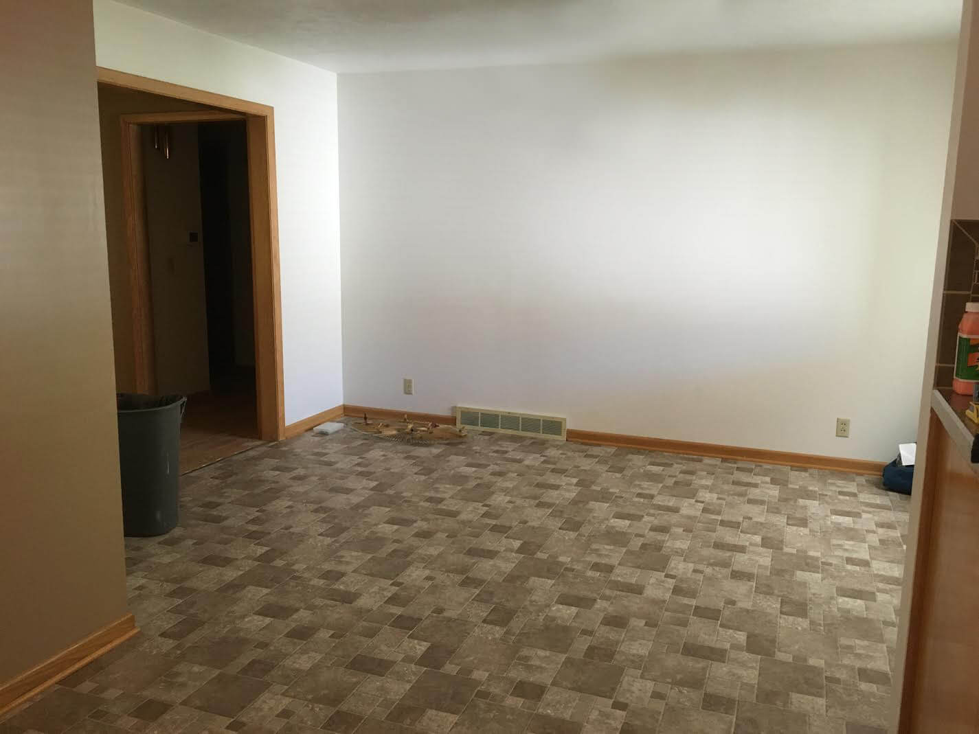
Our kitchen is open to the dining room, and unfortunately the brown back splash and brown floor will have to stay for a while.
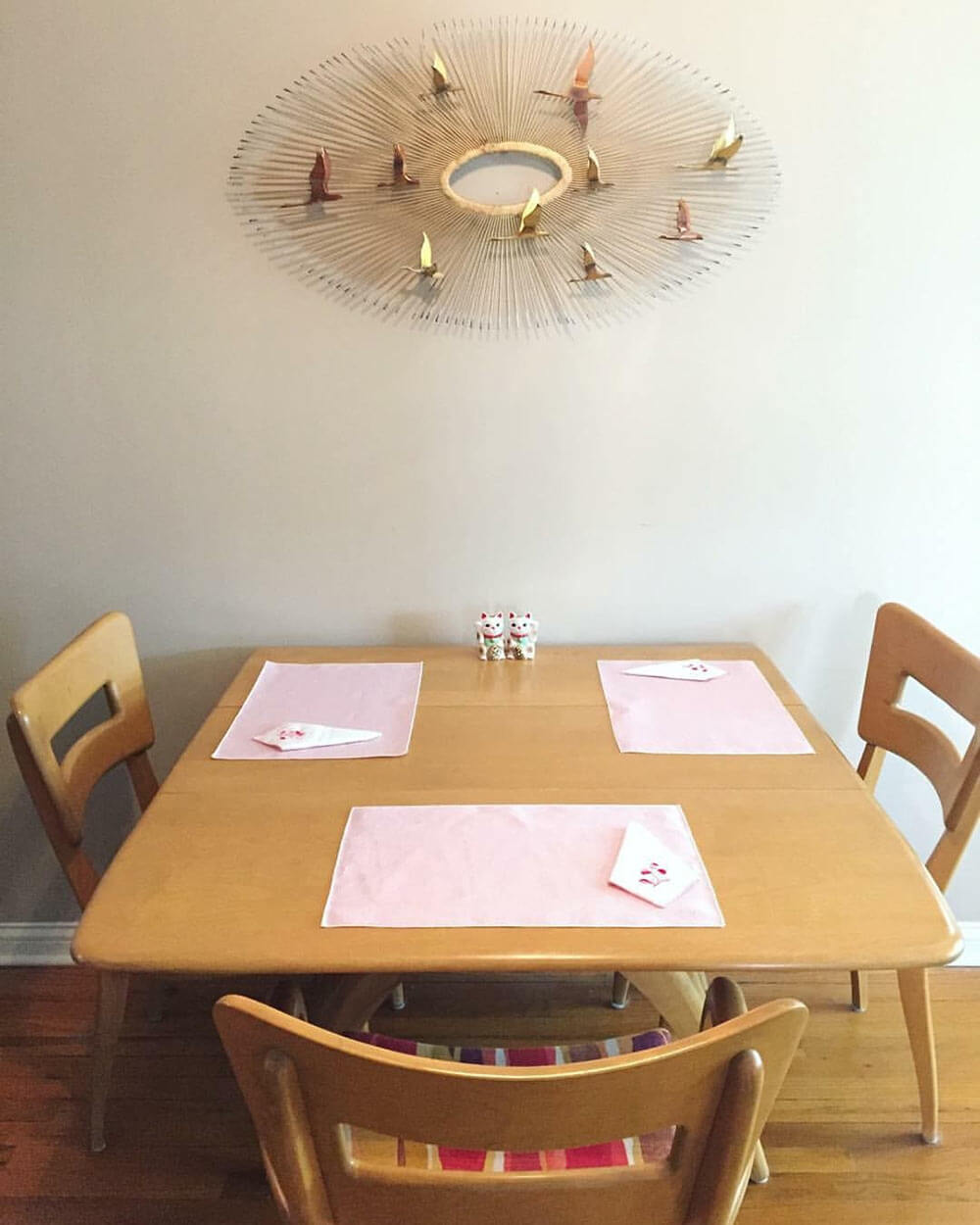
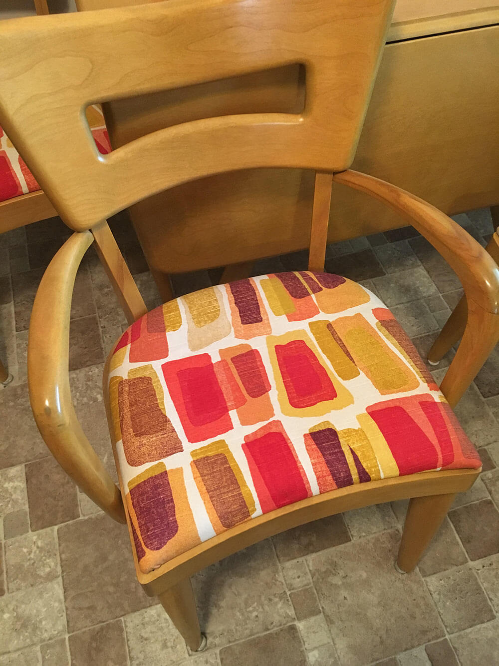
That, paired with the blonde woodwork and a wheat Heywood Wakefield table and chairs are really giving me some issues! I’m not attached to the upholstery on the chairs so that can be changed if need be! I definitely want to go with color in the kitchen but everything I pick seems to clash with the floor. Any advice would be greatly appreciated!
So, what can we do to help liven up all of that brown? We think there are a few key changes that can make a huge difference and up the happy factor in Paige’s kitchen:
- Light: Adding additional sources of bright light — like new, brighter ceiling lights — will help the space feel more cheery right away.
- Color: Between the brown wood cabinets and trim, brown tile floor, brown tile backsplash, brown countertop and beige walls, there is sure a lot of brown in Paige’s kitchen. The quick, easy and inexpensive way to fix this problem is to choose a cheery paint color for the walls, or maybe even a wallpaper accent wall.
- Rug: To further up the happy in Paige’s kitchen, we suggest getting a large area rug to place under the table in the dining area. This will not only add color and pattern to the space, but also help break up the large expanse of brown flooring.
Now, let’s see four options we came up with to help brighten up Paige’s brown kitchen.
Kate’s option 1: A happy aqua
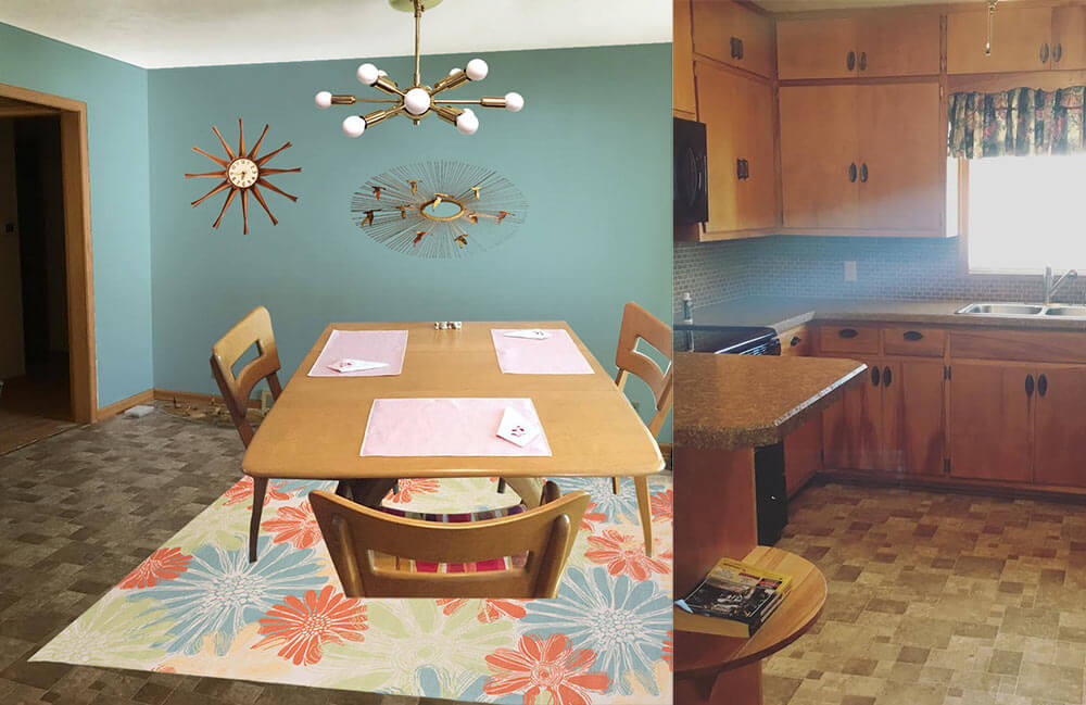 In this option, I found a light colored cheery flower print indoor/outdoor rug that will contrast with the medium brown floor tiles and inject some life into the room. Next, I pulled the aqua blue flower color found in the rug and used that shade to paint the walls. This instantly refreshes the space! Playing off Paige’s Jere inspired starburst wall hanging, I also added a coordinating sputnik light fixture that will not only add interest but also more light to the space. Finally, a medium toned vintage wood starburst clock helps repeat just a little bit of the wood up on the walls. Paige could recover her dining chairs with a solid coral, green or aqua fabric and also use that fabric to make coordinating valences for above the sink and dining room window.
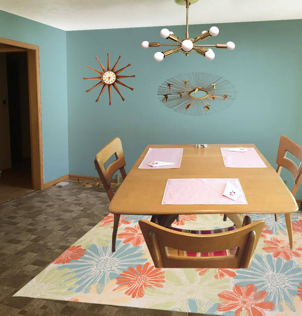
- Aqua walls — like Sherwin-Williams ‘Spa’
- Paige’s Heywood Wakefield dinette set
- Paige’s Jere inspired wall art
- Sputnik light from Practical Props
- Rug from Overstock.com
- Vintage starburst clock from Ebay
Kate’s option 2: Cheerful coral
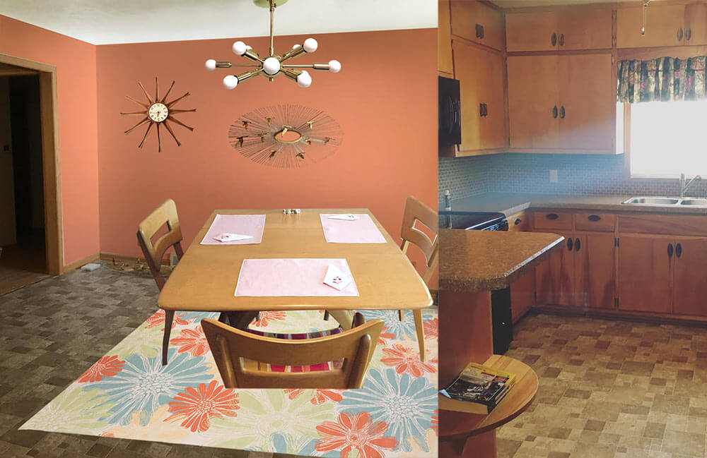 This option — similar to option 1 but a good choice if Paige likes warm colors more than cool colors — I used the same light colored cheery flower print indoor/outdoor rug that will contrast with the medium brown floor tiles and inject some life into the room. Next, I pulled the coral flower color found in the rug and used that shade to paint the walls. This instantly refreshes the space! Playing off Paige’s Jere inspired starburst wall hanging, I also added a coordinating sputnik light fixture that will not only add interest but also more light to the space. Finally, a medium toned vintage wood starburst clock helps repeat just a little bit of the wood up on the walls. Paige could recover her dining chairs with a solid coral, green or aqua fabric and also use that fabric to make coordinating valences for above the sink and dining room window.
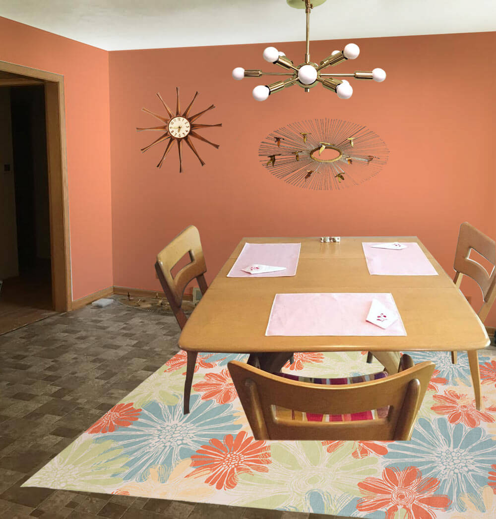
- Coral walls — like Sherwin-Williams ‘Persimmon’
- Paige’s Heywood Wakefield dinette set
- Paige’s Jere inspired wall art
- Sputnik light from Practical Props
- Rug from Overstock.com
- Vintage starburst clock from Ebay
Kate’s option 3: Kitschy kitchen wallpaper
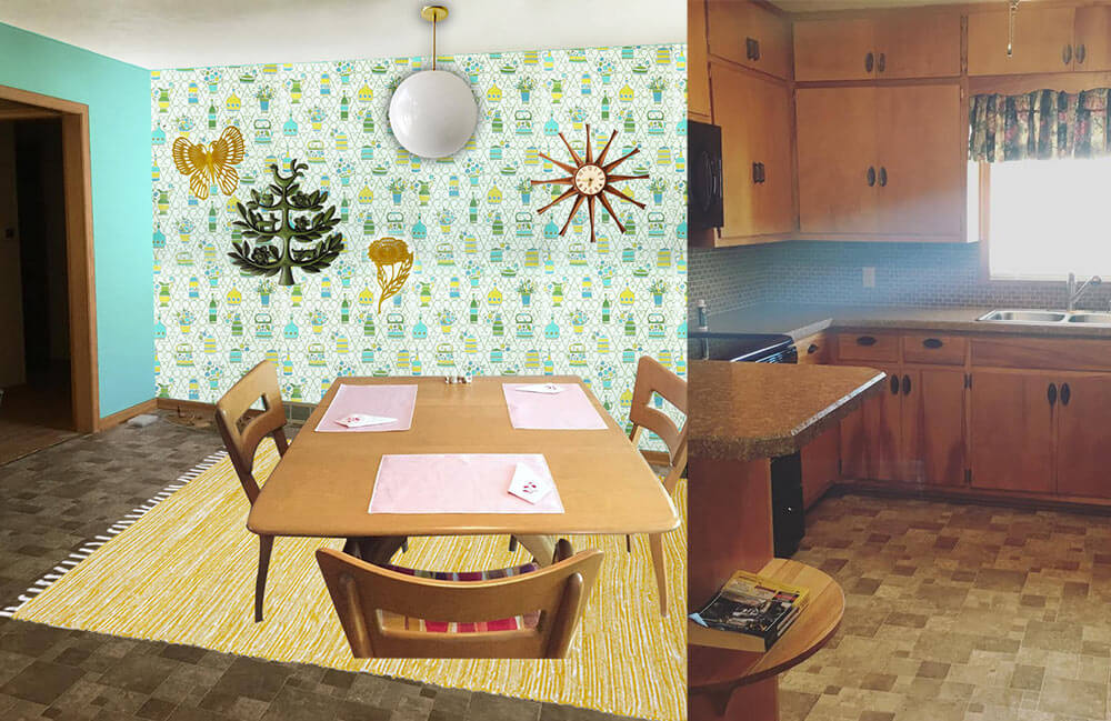
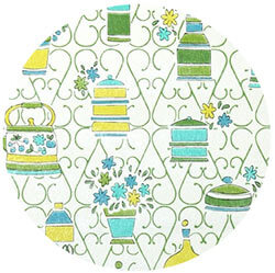 In this option, I started with some fabulous vintage 1970s wallpaper with a kitschy kitchen themed print. So as not to overwhelm the space and save on cost, I would wallpaper just one wall as an accent wall. The remainder of the walls would be painted a cheery aqua, pulled from the wallpaper pattern. Next, I’d add a yellow area rug — another color pulled from the wallpaper pattern — to help brighten up the floor and add even more color. A classic globe ceiling light over the table would not compete for attention with the wallpaper, and would provide a nice amount of light in the space. A grouping of vintage wall plaques in coordinating colors to the wallpaper helps repeat the color scheme and ads a bit more kitsch to this kitchen. Finally, a medium toned vintage wood starburst clock helps repeat just a little bit of the wood up on the walls. Paige could recover her dining chairs with a yellow, green or aqua fabric matched to the wallpaper pattern and also use that fabric to make coordinating valences for above the sink and dining room window.
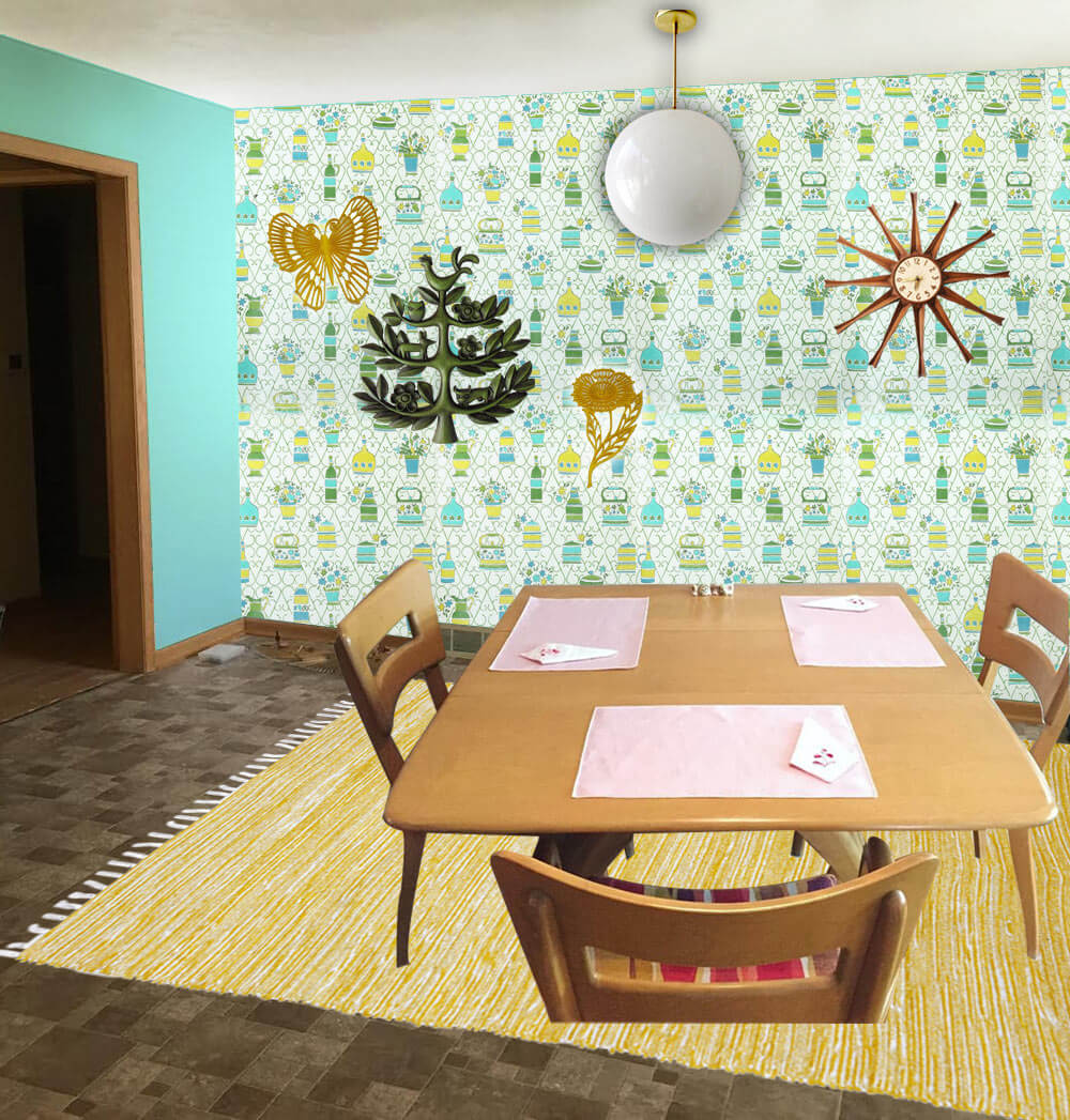
- 1970s wallpaper from Hannah’s Treasures
- Bright aqua walls that coordinate with the aqua in the vintage wallpaper — like Sherwin-Williams ‘Tantalizing Teal’
- Paige’s Heywood Wakefield dinette set
- Globe pendant light from Practical Props
- Rug from Overstock.com
- Vintage starburst clock from Ebay
- Vintage tree of life wall hanging from Ebay
- Vintage yellow flower and butterfly wall hanging from Ebay
Pam’s option 4: Warm and woodsy like Grandma’s kitchen
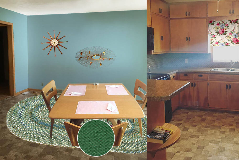 Pam here. The first thing I thought of when I saw Paige’s kitchen was to start with a braided rug, because this whole space has old-fashioned feel, like a knotty pine kitchen. In addition, that DELICIOUS Heywood Wakefield Dogbone set can skew old-timey or mid mod. So I went for a kitchen like my Grandma Agnes had. I found a Capel rug that would look good with the brown — kinda foresty. I looked for a cheery barkcloth that would add more pattern via matching valances for the two windows — hey, you could also do a cafe curtain on the bottom half of the dining room window, which would add even more cheer. Kate chose a dusty blue paint color taken the rug and the barkcloth. In this concept, I skipped a light for over the table thinking you may want to keep the existing fan with light, for function. And I found forest green fabric for the chair pads.
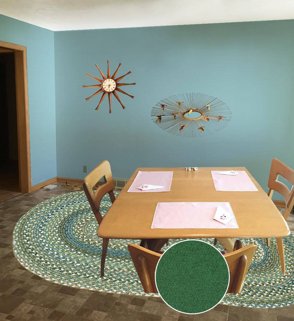
- Aqua blue wall paint — like Sherwin-Williams ‘Raindrop’
- Paige’s Heywood Wakefield dinette set
- Braided oval American Legacy rug in Pine Forest from Capel Rugs
- Maharam Messenger ‘Turf’ fabric from Modern Fabrics to recover the chair seats
- Martha’s Vineyard vintage barkcloth fabric from Ebay seller floridabungalow for window treatments
- Vintage starburst clock from Ebay
- Paige’s Jere inspired wall art
Ok, readers — here’s your chance to chime in. Which of these options do you like best for Paige’s kitchen? And: Feel free to add your own ideas to the comments, too!


Cindy says
I love the aqua! We just bought a 1956 ranch with the same dark cabinets. I used an aqua color for most of the walls and a wallpaper from Hannah’s treasures on 2 walls. It made a huge difference!!
SusieQT says
Some under-cabinet lighting and a set of turquoise canisters would do wonders!
Sharon says
I like the aqua walls and Starburst clock ideas but would never put a rug underneath a regularly used dining table (except to protect a nicely carpeted floor) because chair legs almost always get stuck and it makes cleaning under and around the table more difficult. I can’t understand why this is such a popular design feature. It would drive me nuts.
Mary Elizabeth says
I agree, Sharon. I have had a lot of trouble with rugs or carpeting under dining tables, and I don’t use them. (The only time it worked for me was when I had swivel bucket seats with my dining table in the 1970s.) Now I just glue soft coaster pads on my chair legs to make them easy to pull in and out without damaging the floor. But in some households of mostly adults, the people get in the habit of picking up chairs to set them under the table, and they are fine with it.
Marilyn says
Lots of ideas with knotty pine kitchens in the early 1960 era…I found one with barn red laminate counter, dark green tile and wall-paper as a back splash in white, red, and green although that could be just green paint if you prefer it…I thought I posted an image but I can’t find it on here. The Dining Room could be some shade of green with a braided rug. Love the wall piece you have and the upholstery for the D.R.
Sky says
I also liked the aqua kitchen or the coral one. It’s such a great idea to use the walls for a pop of color in the kitchen. The wallpaper is also great, as long as the pattern is not too crowded.
James M. Shaw says
Thank you for sharing the amazing ideas.
Chuck-Conni Madsen says
I like the first one with aqua walls plain and colorful rug. I think it would be the easiest to live with for the longest time.
Rona D says
Aqua. Or a bright Turquoise? Or a 70’s green? I have a walnut Drexler dining set on an 80’s parquet wood floor. I custom mixed a bright avocado green that is lovely, but not for everyone… It really balances out the wood. Like a tree…
Bill says
Seems to me that the question was what to do about the “brown” kitchen, but most of the suggestions are modifying the dining room. If you want to work on the kitchen, I’d agree on two things: add/brighten lights, and (thank goodness you’ve already said this) *don’t* paint the cabinets. I’d suggest some accessories – a grouping of copper (or at least copper-bottom) pots on a pot rack or on the walls can add sparkle; if not copper, some bright-colored enamel ware could help. (Le Creuset will cost you more than a floor – their dutch ovens are over $300 – but Lodge has a similar piece – enamel on iron – for under $80.) In addition to color, the stuff is superb for cooking! For added color at low cost, how about an oilcloth “floor cloth” in your choice of colors? Or get two for a quick change. They’re usually under $100 and will last for years in normal use. Good luck with your choices, and enjoy your new home!
LJ says
I don’t think a throw rug in a kitchen is very practical, so I would try an outdoor rug, which are less expensive and more durable! We have a very cool two-tone rug in our wood-paneled den from OSH it was only $99!