

 Last up in our six-part series reviewing the history and timeline transformations of the most common colors used for vintage bathroom fixtures: Let’s look at the variety of gray tubs, sinks and toilets offered by a variety of manufacturers reaching back as far as 1927. Along the way, we also get great ideas about how to decorate a gray bathroom — an eminently versatile color — without going all … monotone.
American Standard: 1962 Platinum Gray
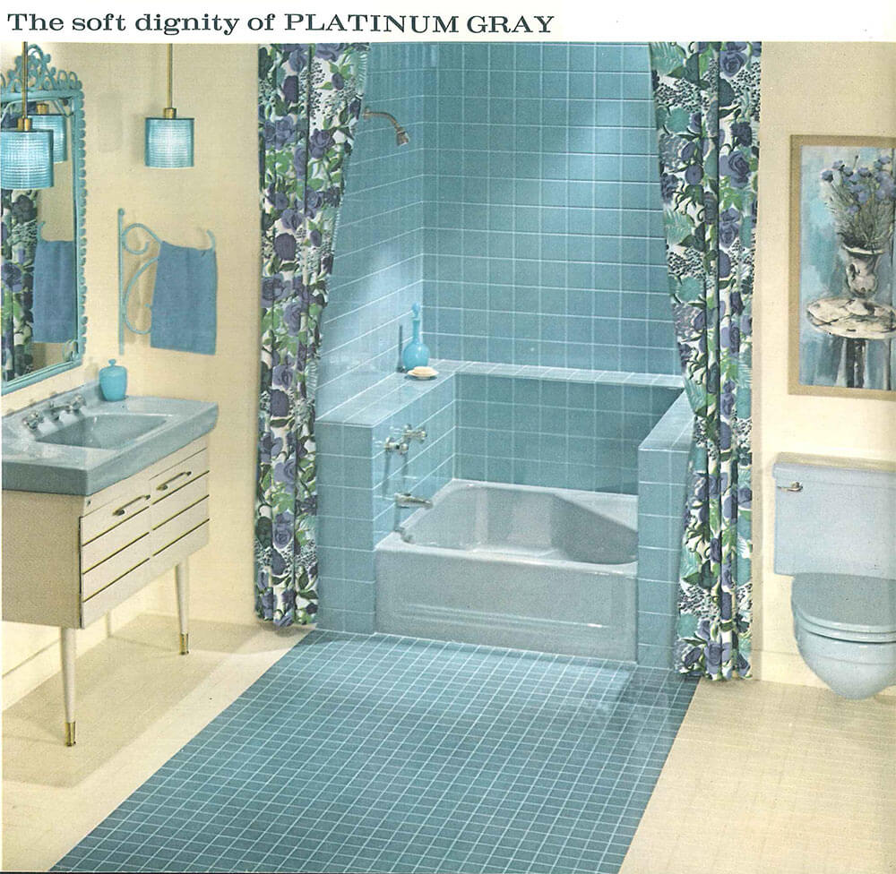 American Standard’s Platinum Gray looks fantastic when mixed with a creamy yellow and blue.
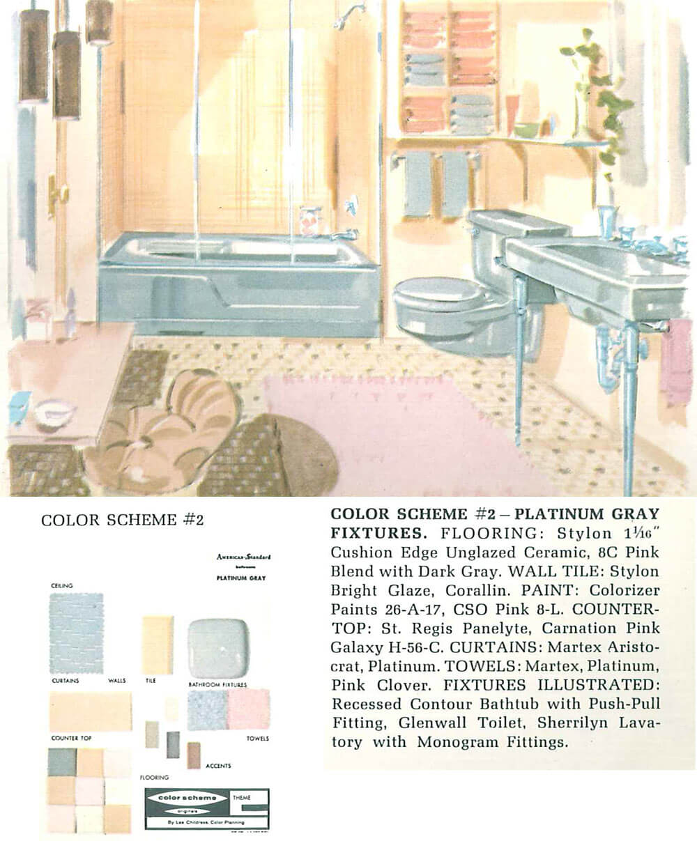 And here, they’ve mixed gray with beige, yellow and pink creating a cheery space.
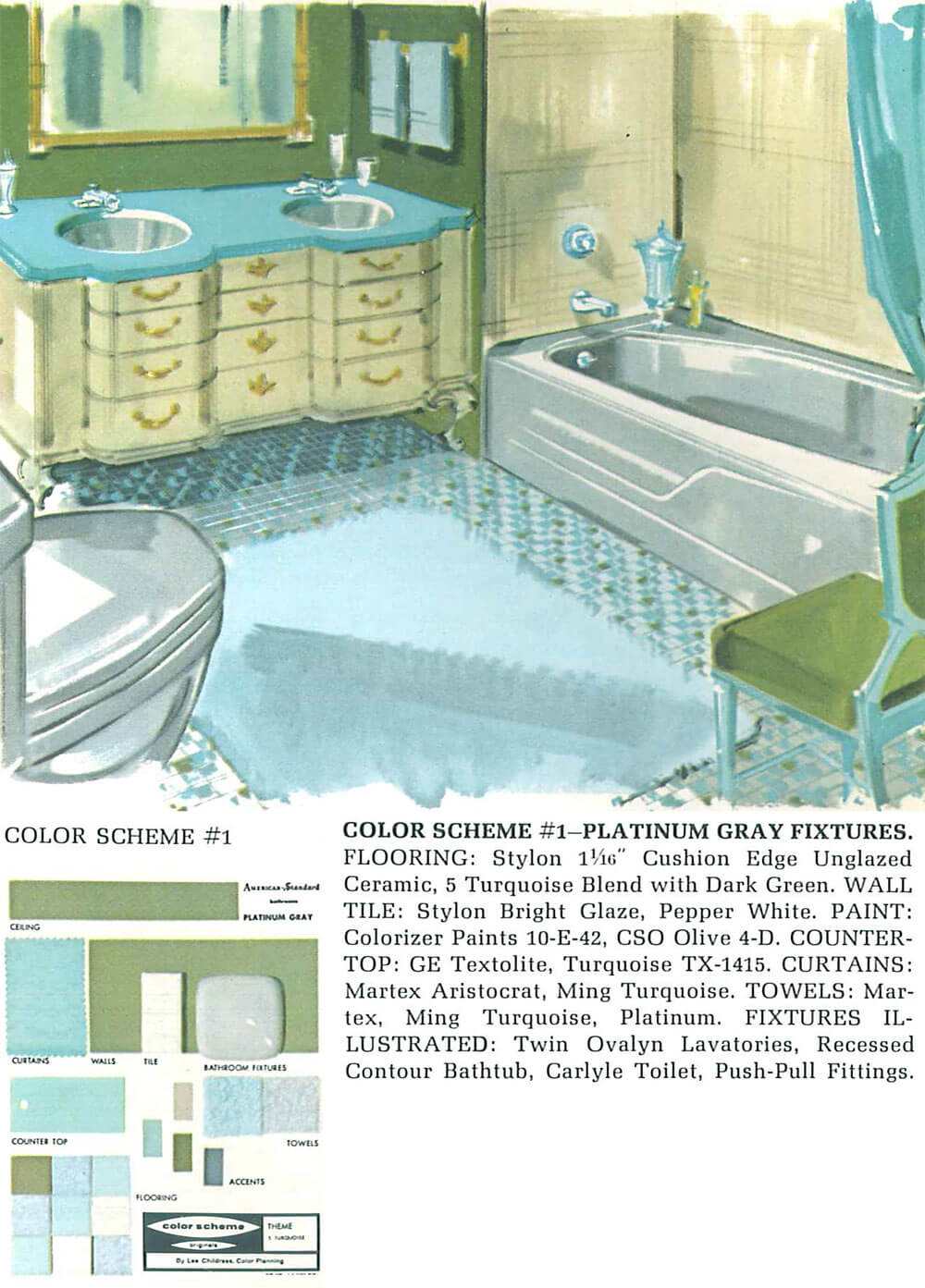
Even this richer color combination of gray with avocado green, blue and cream is anything but boring.
Three images above: 1962 American-Standard catalog from the Building Technology Heritage Library.
Kohler: 1927 West Point Gray and the 1952-1967 Argent
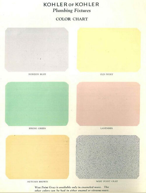 Although Kohler was the first company to start making fixtures in color back in 1927, the ‘West Point Gray’ in their original color lineup.
 ‘Argent’ was Kohler’s 1950s gray. It appears to have been quite rich in depth. Shown (above) in a 1959 catalog in the Building Technology Heritage Library, the color gets a high-contrast decorator treatment.
 In this 1961 catalog in the Building Technology Heritage Library, they pair it with 60s flower power colors — orange and green. Who’da thunk it!
Over on their extensive color timeline, Kohler says that Argent was in their lineup form 1952-1967.
Briggs: 1950s Pearl Gray
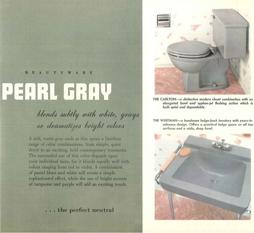
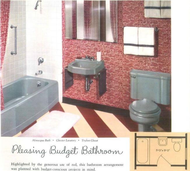
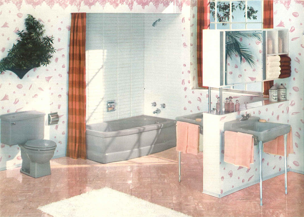 Brigg’s Pearl Gray seems to be a darker gray than the American Standard Platinum Gray, definitely more declaratively gray with less likelihood of reflecting and taking on the hue of adjacent strong colors. When combined with white tile and rosy pink floors and accents, it looks very nice indeed — pink and gray is one of Pam’s favorite color combinations in a vintage bathroom, whenever she sees one. The two images above show Pearl Gray from the 1950s Briggs Beautyware catalog from the Building Technology Heritage Library.
AllianceWare: 1950s Grey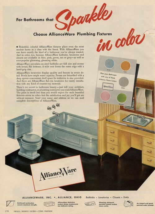
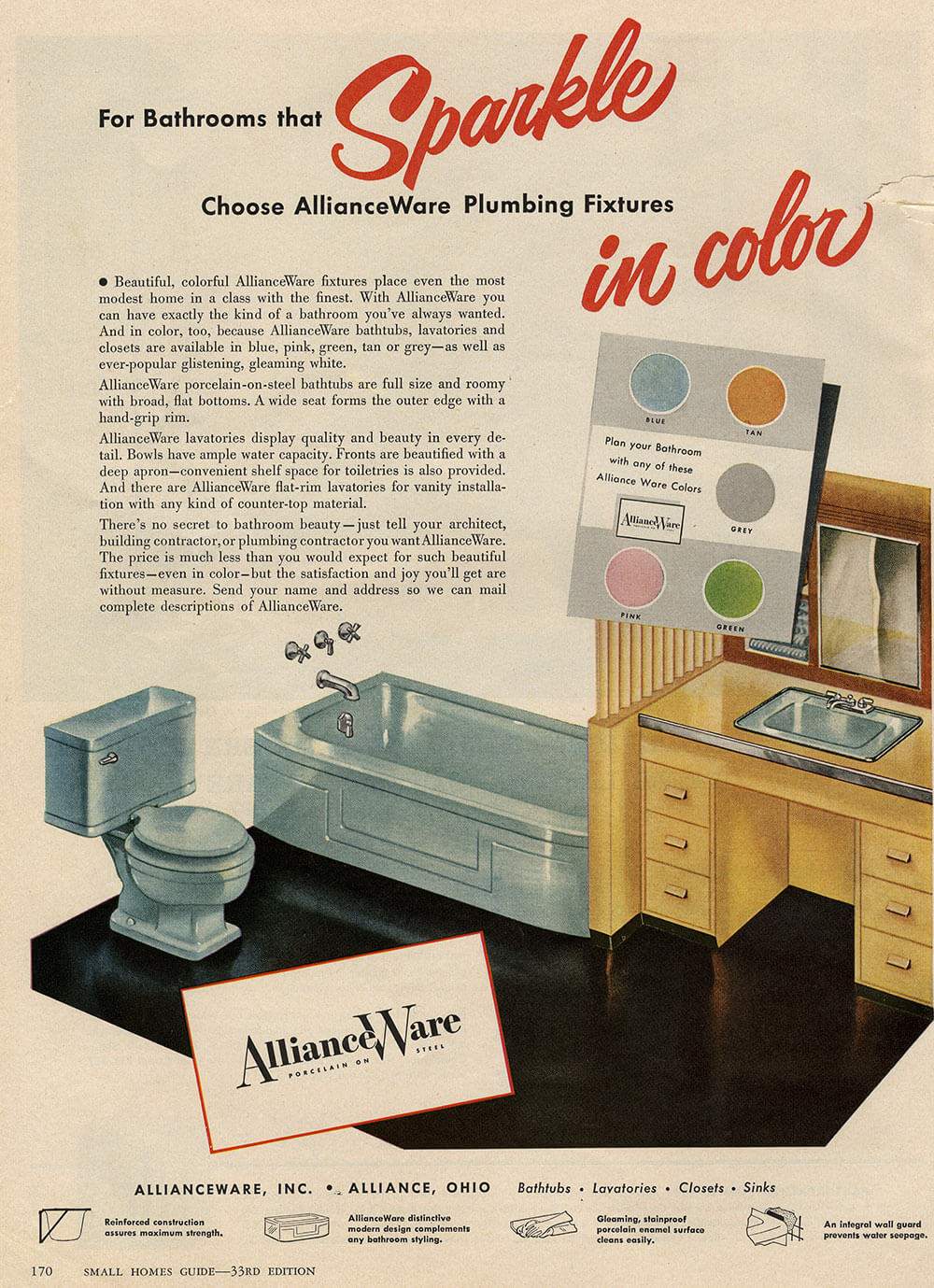
Pam found this ad for AllianceWare bathroom fixtures that includes ‘Grey’ in a 1950s Small Homes Guide. Alliance Ware kinda makes us smile, because it seems they did not have a marketing person to name their colors!
See all our stories about vintage bathroom colors:
- Decorating a beige bathroom: Color history and ideas from six manufacturers from 1927 to 1962
- The color green in kitchens and bathrooms sinks, tubs and toilets from 1928 to 1962
- The color pink in bathroom sinks, tubs and toilets — from 1927 to 1962
- The color blue in bathroom sinks, tubs and toilets — from 1927 to 1962
- Decorating a yellow bathroom: Color history and ideas from five manufacturers from 1927 to 1962


Camille says
My unusual color scheme is American Standard grey tub,toilet and 2 hudee ring sinks. Walls are light and dark green vitro lite with a green tile mosaic floor
Rick G says
The pink 1957 three piece set that I just snagged, came out of a washroom which had grey 4 inch tile, with black tile as trim & edge & the two looked fantastic together !! – honestly, I still don’t know why these people wanted it all gone ( and replaced with ….. yup ….. white. I really started to hate grey with a passion, as we ventured out to shop for a house, there were so, so many & all, so, SO BORING !!! – but now, looking at it more fairly , I’m reminded of the way a lot of the mid century homes would properly use grey in a pallet ; sparingly , for trim, accents, and such; it worked. The tone if not too dark , can be a good thing !! If I had a grey three piece bath set offered ; I would have no problem making it work ….. ( although my wife may be slightly curious, why we would possibly need another bunch of bath stuff ?! And ……… it would take me awhile to think up an answer !! )
Stephanie S says
When I first moved into my 1956 house last year I was not happy that I ended up with a gray bathroom. Walls have 4 1/4 inch square tiles in light gray with darker gray trim and the floors have small rectangular tiles in light/dark gray. The previous owners thought they were being helpful by painting the walls a purplish gray and the ceilings too, ugh. It was truly awful and depressing. What to do? I considered wall paper but wasn’t looking forward to installing it. I love color so I ended up with bright yellow walls (forsythia paint), a white ceiling and chose to hang 2 geometric patterned shower curtains with bright colors including yellow that matches the walls, orange, light/dark green, purple, darker pink and a little white. I accented with an orange rug, 2 circle shaped yellow rugs under the vanity and bought some towels with the same greens and orange as are in the shower curtains. The room is small but after those updates plus adding ceiling fixtures (there were none) and replacing the vanity/vanity lighting, the room really pops now and seems larger. Some people might think it’s loud but I want to be energized when I’m using my bathroom in the mornings before work, not subdued by gray/white as others had suggested to me.
Joe Felice says
I cannot recall ever having seen gray porcelain fixtures. It would present some interesting decorating choices.
conorb says
We recently ordered and just received our special order Ice Grey Kohler tub and toilet for our master bathroom remodel. We’re pairing them with vintage Crane Criterion sinks in Parisian Red along with new shower and wall tile from Daltile.
I’m just finishing installation of the sinks and vanity and will then continue to work on building out the shower.
My wife and I are very excited to bring our bathroom back to life using Grey tones in a more contemporary palette.
Sam R says
I have a Platinum Grey American Standard sink and a black/grey molded plastic shower enclosure that I intend to use in my basement bathroom, which will be matched with a grey toilet when everything else is done (the white toilet currently there works for now). I’ve been debating on what colors to use for backing tile behind the sink, and whether to tile the rest of the walls or paint them. Trying to figure out what colors to use has been a challenge, but these ads give me a few ideas. My basement ceiling is quite low (not up to current code, but grandfathered in), so brighter colors that make things feel more open is a must. Most likely I’ll use a couple of shades of blue VCT for the flooring and yellow for the walls.
JaniceW says
I’m in the middle of construction of a grey tile bathroom with white fixtures. I’m painting the walls a coral pink color to match a flamingo rug. It is beautiful.
pam kueber says
It sounds gorgeous! Be sure to send me photos when you are done!!!!
Glen H says
What a coincidence! My flat has just been repainted and the walls in the bath are a very pale grey. With the gloss white architraves, green trim tiles and accessories, it looks surprisingly fresh and bright.
If you told me 6 months ago that I would like it, I would have laughed at you!
Chris says
I’m not thrilled with what I consider the trendy overuse of grey today — like on every HGTV show…
But I really like it when it’s authentic vintage!
My friend used to live in an early 1950s house and their bathroom was great! It was gray, beigey pink, and burgundy. She has a really great eye and a knack for mixing old and new. (I tend to go for the full-on time capsule look.) But she found a wonderful sheet that incorporated all the colors and used it as a shower curtain. They painted the top part of the wall with a neutral color that had a metallic sheen to it. It all came together!!!!
tammyCA says
Same here..I don’t like all the contemporary bland monochromatic grays but vintage gray always had company in different colors. Looking at my vintage tropical barkcloth..there’s gray ground with plants & flowers in chartreuse, deep pinks, teal..love it..my 1954 bathroom has gray & teal tiles.
Karin says
They’re all amazing. What an eye opener. That first pic with the platinum gray and blue combo is stunning. I see gray fixtures in a whole new light, which I imagine was the point, lol. My painting instructor always referred to gray’s versatility as “Mouse power” because it has the ability to make primary colors next to it really sing. Great post, thank you.