

 I know I often say this, but this 1976 time capsule house for sale in Salem, Oregon, listed by Ty Hildebrand, may be my favorite 1970s time capsule house ever! Thanks to reader Wendy for this time capsule tip! The lines and angles of the house are amazing. The setting and views, too. The house appears to be in amazing, move-in condition — I wouldn’t need to change a thing! And, given that I am the world’s #1 lover of wallpaper, I am in heaven. I spoke to Ty on the phone on Friday, and he told me that the original homeowners used a decorator in Portland, Oregon, who was known for her genius with wallpaper. He also says the wallpaper is so strongly adhered that prospective buyers still looking at the house are considering stucco-ing over it (gasp! horrors!) rather than removing it.
I will bury that thought deep away in my psyche and instead say: Hooray: 40 terrific photos — captured by Cal Curths of HD Open House — sharing this slice of high-style 1976 design, still here for us to admire.
From the listing:
- Year built: 1976
- 4,207 s.f.
- On 3.31 acres
- Two bedrooms, 3.5 bathrooms
- Three fireplaces
- $550,000
And so I diverge: On Commenting:
So here’s the deal, dear readers: It’s beginning to seem like America is running out of time capsule houses from the 1940s, 1950s and 1960s — and that time capsule houses from the 1970s are now popping up all over. This transition is going to mean a lot of wallpaper (often with matchy-matchy pinch pleats) … crazy-wonderful tile … bittersweet kitchen countertops… and burnt orange, rust, and lime green shag carpet. The 1970s are my favorite era, because designers pushed things to the limit. They pushed things beyond the limit. However, I know a lot of folks cannot get their eyes around 70s style (yet. Buwahahaha, my evil-righteous plan is to change that). But, I do ask this: Given my commenting rules, which center on civility aka The Golden Rule, I ask that if you don’t like (e.g. if you h***) the wallpaper, or whatever, that you simply skip that in any comments. I do not approve, or delete, comments that are critical, when such criticism is not invited. I ask permission to feature all these time capsules. We are, therefore, invited in. So let’s all be super courteous — comment as if we are standing in the home with the original owners — grateful and gob-smacked for the opportunity to see these wonders! Thank you for your understanding!
Let’s take a look at some of my favorite spaces:
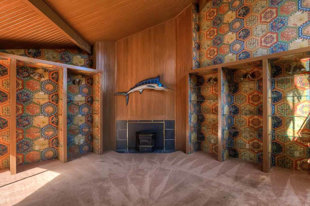
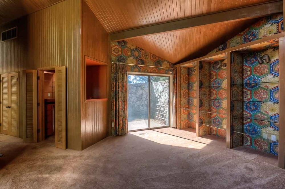 Above: That family room (?) with all the gleaming woodwork, colorful yet soothing (yes: soothing!) wallpaper, matching pinch pleats, and cozy carpet — complete with marlin — perfection!
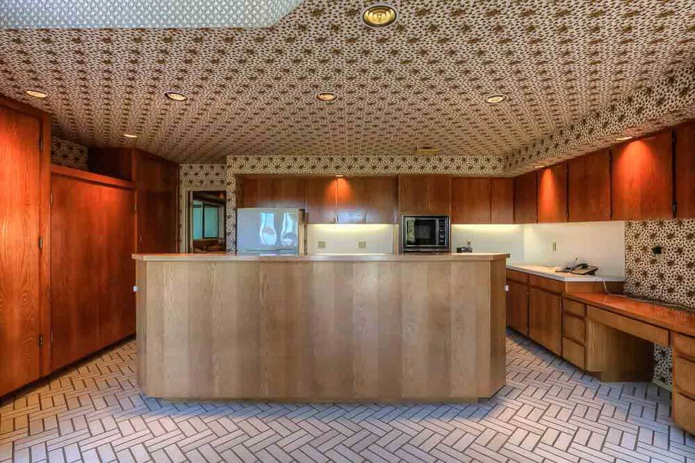
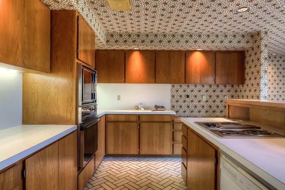
 Above: Yes, a kitchen like this, with high-quality wallpaper adhered to the walls — and the ceiling — so it doesn’t fall down, is my dream. I love this flooring, too.
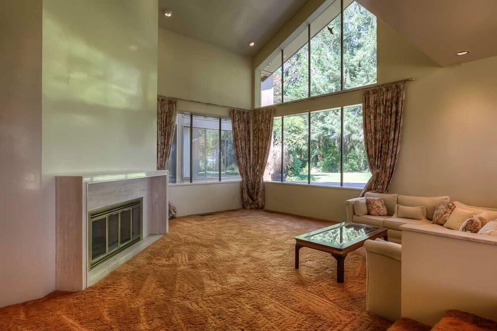

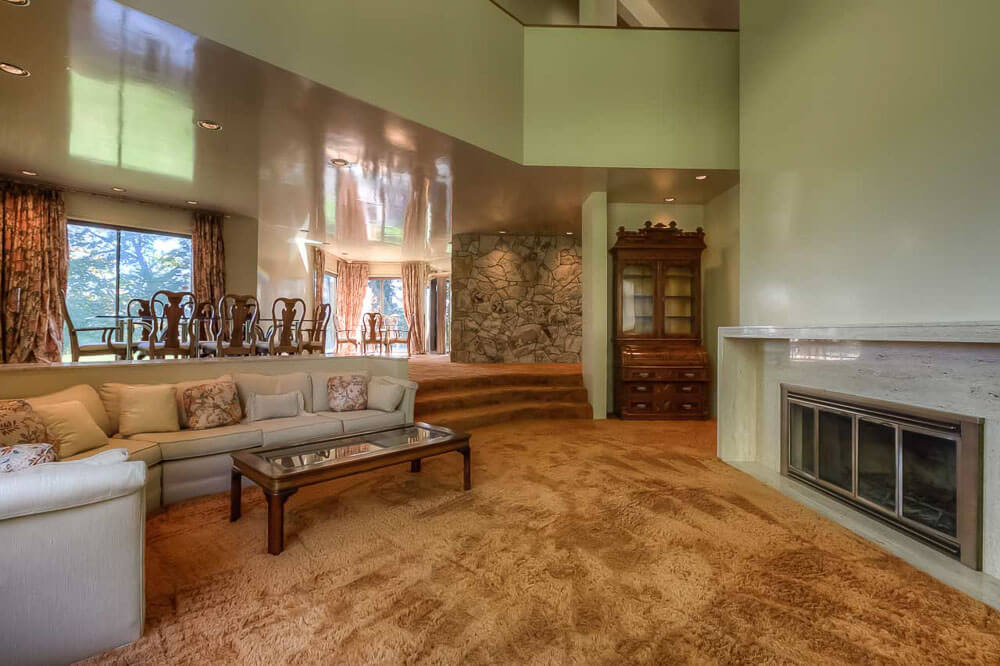
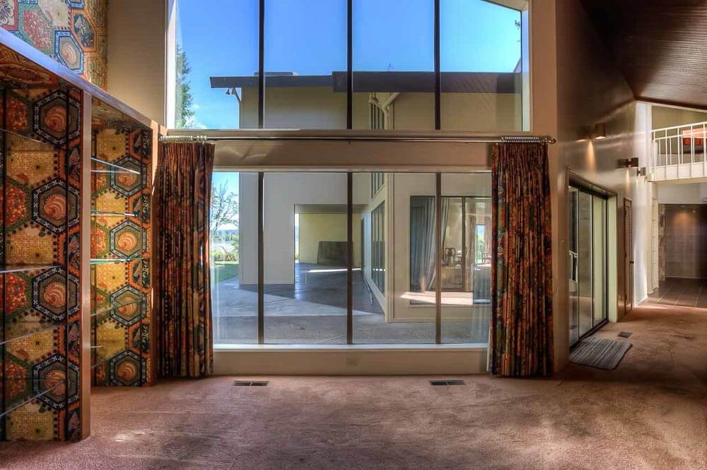
 Above: The sunken living room is lovely. And I love all the main rooms of the house seem to have views in multiple direction. Love me the rusty-orange carpet… the Flintstones rock wall… and note the lacquered ceiling int he dining room. Hmmm…. Are all the walls in this space lacquered?
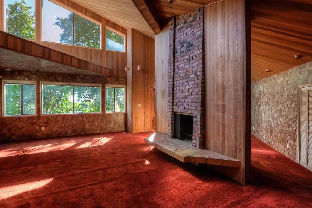

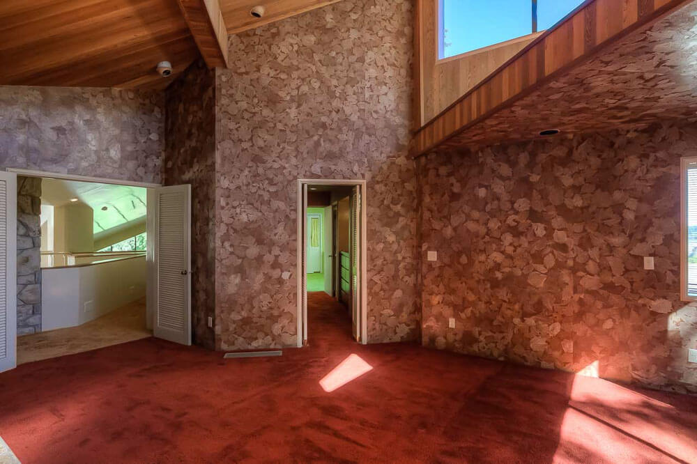 Above: I think this is a bedroom. Rust carpeting! And that wallpaper! And that fireplace!
 Above: I think this is the bathroom that does with that bedroom. But, it could also be off the kitchen — note the floor. I spy wallpaper on the sixth wall (e.g. the ceiling) in this room, too.

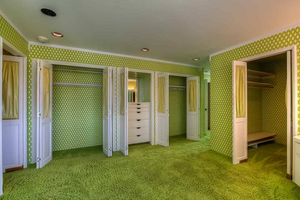
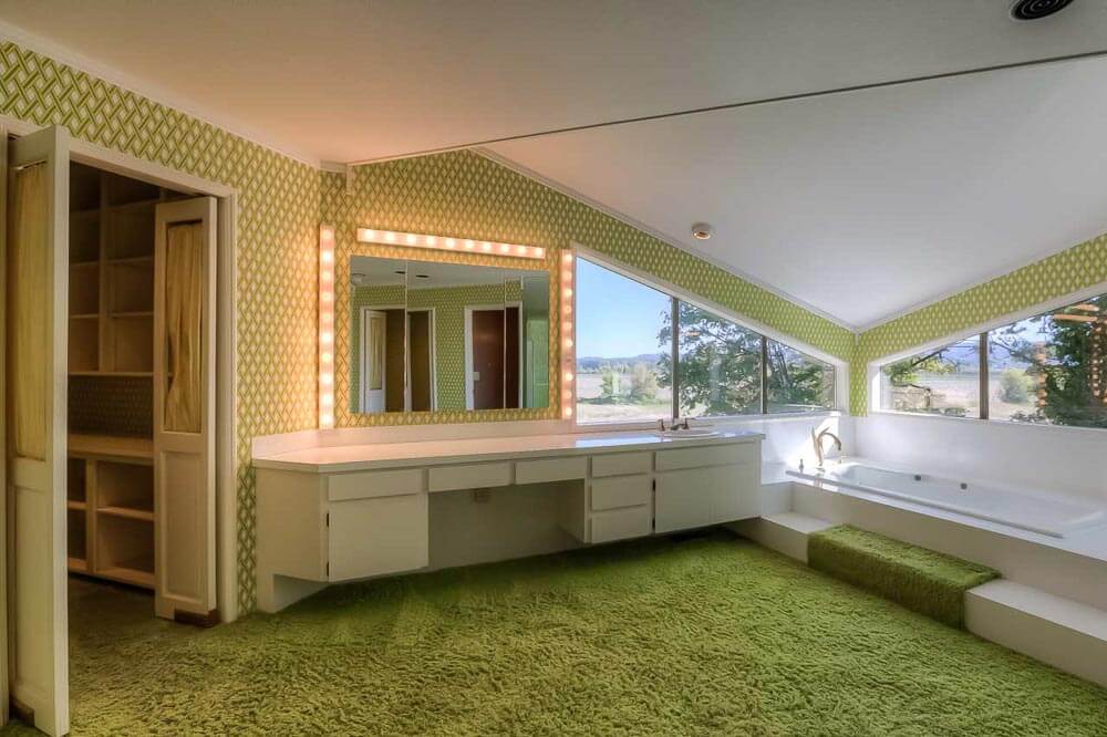 Above: The other bedroom, with coordinating bathroom.
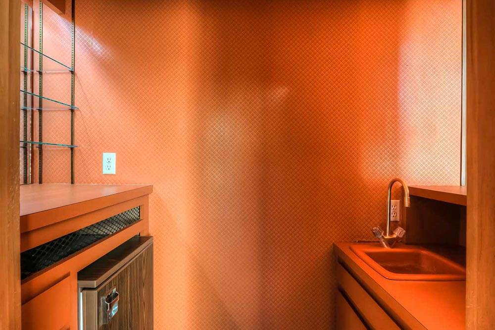 Above: A wet bar tucked somewhere. In bittersweet. Be still my 70s heart.
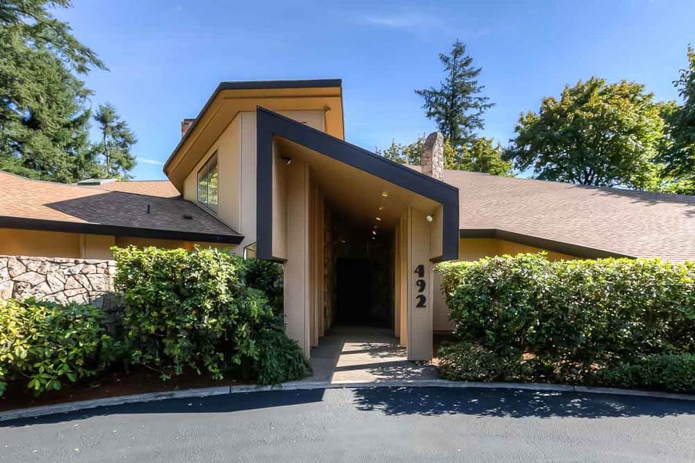
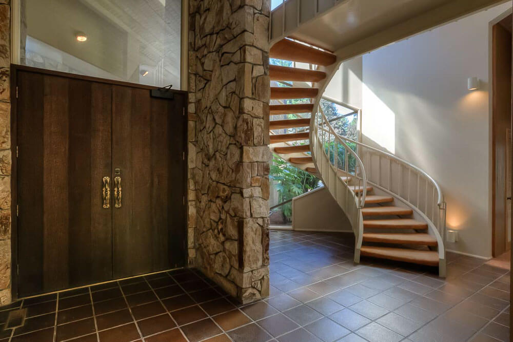
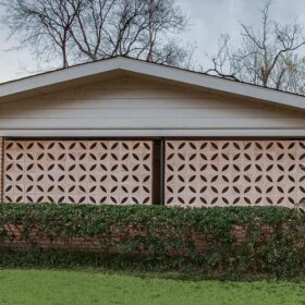
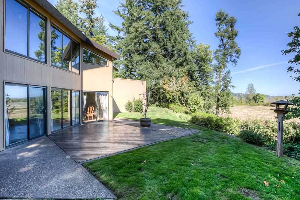 The slide show has more photos — takes on all the exterior angles… the dramatic foyer… and the sweeping views. All that said, once inside, I’d crank up P Funk and never leave the house.
So what do you LOVE about this house, dear readers?
On a scale of 1-100, where are you on digging ’70s design so far?
Link love:
- Ty Hildebrand and his team.
- Photos by Cal Curths of HD Open House.
- See all our Time Capsule stories here.
Photo gallery:


Linda says
I looove it! Imagine the dining room with Heywood Wakefield and the rest full of mcm goodness!
Kristin says
That entrance is amazing. I would feel so fancy coming home to that every day.
I don’t totally love the 70s (but am coming around more and more each day, good job Pam) but I can definitely appreciate when it is well done. This home was designed, not just decorated.
Tracy says
OK, I’ll be polite, the décor is not to my taste. But the architecture is divine
Kathy says
Correction, I checked the listing and despite its size, it is only a 2-bedroom built on a slab, but with 3 1/2 baths. About the only way it could be converted to a 3 bedroom would be to convert that fantastic dressing room or close off the formal living room. So perhaps it was designed for empty-nesters who like to entertain.
Too bad, I could really see a gaggle of kids running in and out of that kitchen, especially if a trapezoidal breakfast bar was added. Also didn’t notice at first the completely mirrored breakfast room with mirrored doors to the kitchen with the huge windows–what a wow little space that could be! Lots of cool usable nooks and spaces in this place.
Kathy says
Your warning made me think that the wallpaper must be really out there, but the main spaces are fairly neutral, and large enough to absorb even the really large scale pattern in the family room.
I agree with Jenya, I would swap out some of that carpeting to freshen it up a bit–especially the shag next to the bathtub. But the green trellis wallpaper is terrific–and that all bittersweet bar is fantastic. I think the pinky-beige carpeting in the family room is newer and it doesn’t match the yellow undertones in the wallpaper and woodwork.
I wasn’t sure about the kitchen at first, but when I looked at all the photos, the wood cabinets and white backsplash and counters and clerestory tone down all that pattern, and it really works. Very efficiently arranged and in excellent condition too.
I think the price may be low for the area, so I hope someone sympathetic to the original design scoops it up. Properly furnished, all these rooms could be some pretty outstanding spaces, and it would make a great home for a large retro-lovin’ family.
Mel says
While it’s a large home (by Oregon standards) and that would be low if it were here in PDX (my 1916 1560sq ft + basement bungalow on a tiny lot is now worth around $350K), Salem isn’t terribly upscale or $$$. So I’d say that’s about right.
I absolutely LOVE the house and while there are elements that aren’t entirely my “thing”, I wouldn’t change anything, either, because it all works so utterly flawlessly together.
Susan Halla says
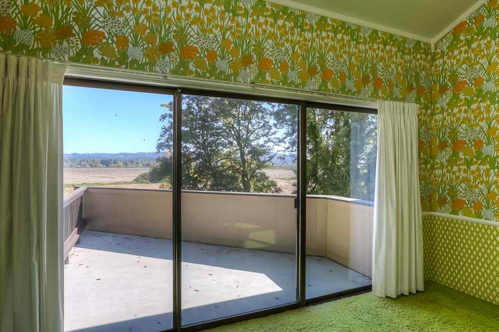
LOVE the window in the green bedroom – it even has two matching skylights. Maybe it’s the mathematician in me, but I just love those horizontal triangles made by the mullions.
This is a yummy place. Thanks for sharing, Pam!
Kathy says
Those angles would never get boring and that green room is to die for.
Jenya says
Pam, your evil plan is working. When I first started visiting the blog, I really did not like wallpaper. And the 70s represented my least favorite decade. But I LOVE this house. I love how well coordinated the walls and the floors are. I WOULD swap out the carpet–but only because I worry about what’s lurking in 40+ year old carpet. If I could find the same colors, I think I’d replace the carpet with the same.
Wallpaper on the ceiling is growing on me.
I would have to buy all new furniture to fit in that house…
pam kueber says
buwahahaha
Tut says
The greens! The oranges! Nothing boring here. Changing out that carpet is a sin and moonbat crazy.
Laney says
Swoon!
Scott says
Just wow. No one can tell me they didn’t pick that wallpaper to expressly to match the swordfish, its too perfect to have been an accident. The effort it must have taken to nicely wallpaper the ceilings is mind-blowing. Aside from perhaps a more lively but period correct color in place of the brown carpet, I can’t imagine changing a thing.
I also can’t imagine what I’d do with myself with 4,207 square feet… my house would fit inside 4 times with about 300 square feet left over!