

 Do you want the look of wallpaper in your bathroom — but without the hassle of paper and paste? Use paint and add a stencil design instead. That’s what Lindsay did to add drama to her vintage vintage pink, blue and black tiled bathroom. Now, everyone who visits — — even those who aren’t big on retro style — are buzzing, in love with the space.
 Lindsay writes:
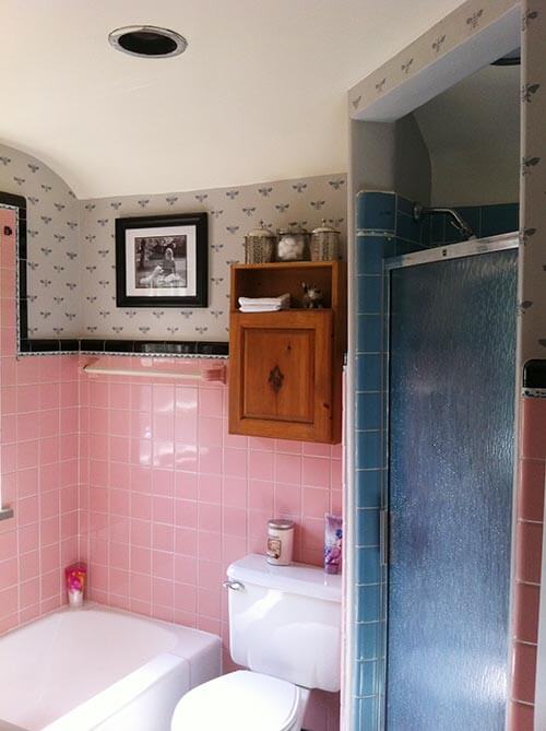
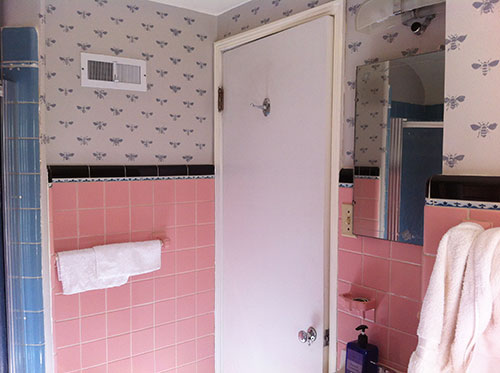
Attached is a picture of my beloved pink (and a little blue too) bathroom before and after I painted the upper walls grey and stenciled bumblebees on. I think the key to making everyone fall in love with the pink bathroom is strategic use of color. A decorator relative of mine told me that painting light grey and adding a stencil design would really help the pink be appreciated, even by those who don’t normally appreciate the retro. And it worked! Before the white walls/pink tile provided too much of a contrast, and the whole room had a different look/feel. Now, however, it is loved by all who visit it!
 Nicely done, Lindsay! We agree: The key to your success here was adjusting the contrast and then adding the pattern — together, these made an incredible difference in the “mood” of the space.
Evaluating contrasts and how they affect a room
The problem: While high contrast can work in some decorating situations, Lindsay’s small vintage bathroom felt a little too in-your-face with its mid-value pink tiles and especially, its dark black border tiles set right against a stark white wall color:
- This color configuration caused the dark bullnose and decorative liner tiles to pop off the walls — making them the first thing visitors noticed.
- And, since the walls were light, the charming curve over the window could not be “seen” and instead, what visitors noticed were the dark jagged lines of black tiles around the center of the wall and the pink tile field — which unfortunately is not a color that everyone loves.
The fix:
- Choosing a neutral color that was close in value to the pink tiles — in this case grey — to paint the upper portion of the walls, Lindsay lowered the contrast between the dark liner tiles, wall tiles and the rest of the walls.
- This darker wall color also allowed the charming curved ceiling detail to be easily seen.
- Adding the painted bee pattern in a darker shade of grey added more visual weight to the upper portion of the wall — creating a balanced look that achieves visual unity in the space.
- The dark bee pattern relates to the dark liner tile allowing it to “make sense” in the room’s design instead of just being a dark outline.
- The painted bee pattern also relates to the decorative liner tile. The positive and negative spaces in the liner tile are very similar in shape to the painted bees — which also adds to the cohesiveness of the space.
- When it came time for the finishing touches, Lindsay smartly added a few more dark elements to the wall — such as the thick black framed family photo — to make the room feel charming, balanced and inviting.
 Kudos to a job well done Lindsay — not only have you given your vintage bathroom a (relatively) easy and effective facelift — but you’ve also managed to convince your family and friends that vintage pink bathrooms can be just lovely. Bravo!
See more stencil projects:
- Retro wall stencils — patterns and tips from 7 reader projects


Nikki says
♡ it Lindsay, you made it so personal and fun. This is the why I love this site. Clever solutions to real problems that don’t involve a renovation❣❣❣
Susie Morris says
Love the bathroom !! What do you recommend for cleaning vintage pink tile ? I have a 1959 pink bathroom and cannot get the tile to look that nice. Thanks !
Pam Kueber says
Hi Susie, I would recommend contacting tile manufacturers to see what they recommend.
Marcia says
Hi. I have been a long time reader of your blog and have grown increasingly frustrated with pop up advertising. I’m not sure whether it is something that you have sanctioned or not. The moment I bring up your site, a pop up comes up. It is difficult to get rid of it. Then if I click on the heck yeah portion, I get another annoying pop up. What is this about? Is there a problem on my end? I’m so frustrated.
Pam Kueber says
Hi Marcia. I have been trying a few different things over the past few months. It’s ads that pay all my bills and make the blog possible… That said, I took down the pop up that appears between page loads sometimes. And I took up the little pop up on phone pages. You may still get a newsletter pop-up every 180 days or if you clear your cache.
Teri says
Adorable! And I think you just solved my dilemma of what to do with my ming green bathroom with beige floor tiles. The room has teak wainscoting half way up the walls (unpainted). I’m not a wallpaper fan. I think I’ll try painting the walls in a lighter beige and doing a coral or tangerine stencil. Thanks for the inspiration.
ineffablespace says
White is often the suggested choice by people who don’t “get” colored-tile bathrooms, and think white is the best way to deemphasize or neutralize them somehow–and really that’s a mistake.
Here, and in other examples I have the white ends up looking really yellow, especially with pink or blue tile, and it doesn’t really do the room any favors.
The grey and stencil shown here, or wallpaper, are a much better solution, I think.
mag says
Yay Lindsay! Their previous bathroom walls appear to be yellow-based white, like the walls and ceiling throughout our entire 1960’s house. I don’t understand the choices folks make sometimes, and if you see it repeating in a structure in other ways, one can easily come to the conclusion that these individuals just have no eye for aesthetics or colour.
The grey-on-grey is a huge improvement, and adds more whimsy. Are the blue tiles original, or was the shower area a later renovation?
Kate says
This is lovely! May I ask where you found the stencil you used?
Lindsay says
I was hunting for the right stencil and fell in love with the bees! I got the stencil from Etsy, I think it was from royal design stencils.
Bette Jean says
Nice job. Pam, my daughter-in-law did the same thing after I introduced her to RR. Her pink bathroom was in a rental. I have some after photos, but I don’t know how to show you.
Barbara says
Lindsay, not only does grey chime with pink, but teal, chocolate brown, black and believe or not, coral and white. The vintage barkcloth I purchased is just that and then some. I’m all about geometric! When I hung up my curtains in my 60’s bubble gum pink bathroom, POW…! I knew this is exactly what I was looking for. All the other accessories followed there after. It certainly made the rest of my decorating decisions easlier.
I did check out the stencil painting that Pamela introduced on her blog, and I’m still searching for a geometric design. However, your bumble bees are adorable!
Cute bathroom Lindsay! Oh, the arch over the window, well that goes with out saying. Now we can see what an arch can bring to the table. Even in our bathrooms!
Barbara
p.s. Thanks for sharing Pamela.
Bobbie says
Oh how cute! And can we just talk about how much I’m loving the pink and blue tile together!? Great room!