

 Elizabeth wants our help: Which tile should she choose for the floor for her 1963 blue bathroom Retro Renovation? And fun: The renowned architects of the house built the Austin, Texas, airport, and Elizabeth is taking the color of the still-standing control tower for her color cues.

Elizabeth writes:
Hi Pam! I’ve been enjoying your stories, as usual. I mentioned to you recently that my husband has bought a 1963 house in Austin that has nine bathrooms. I’m ready to beg for your and your readers’ assistance on the first one.
Be forewarned, there is nothing original in this house. We did get the original floor plans from the Austin History Center, because the architects are locally reknown. (There were only two bathrooms originally!).
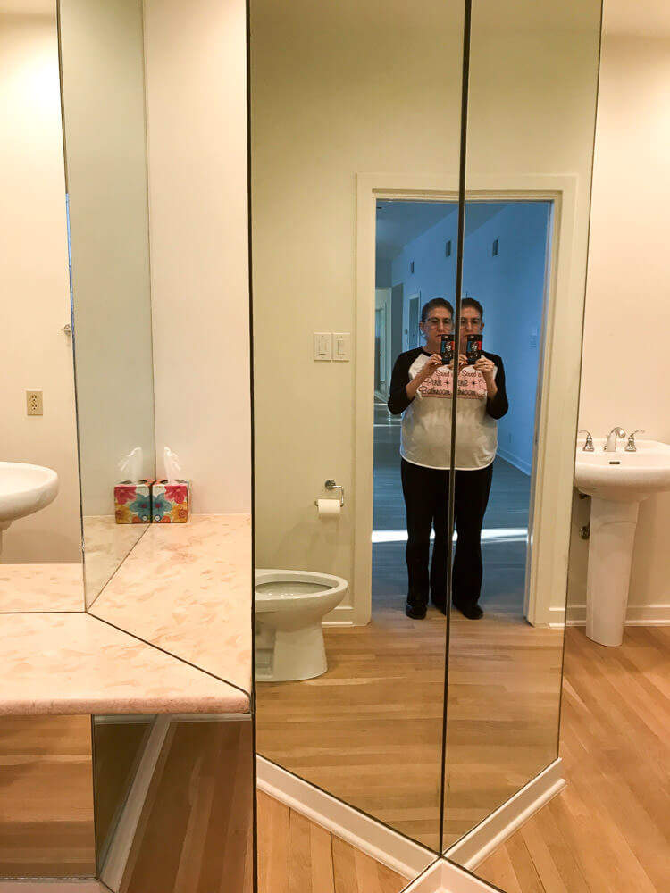
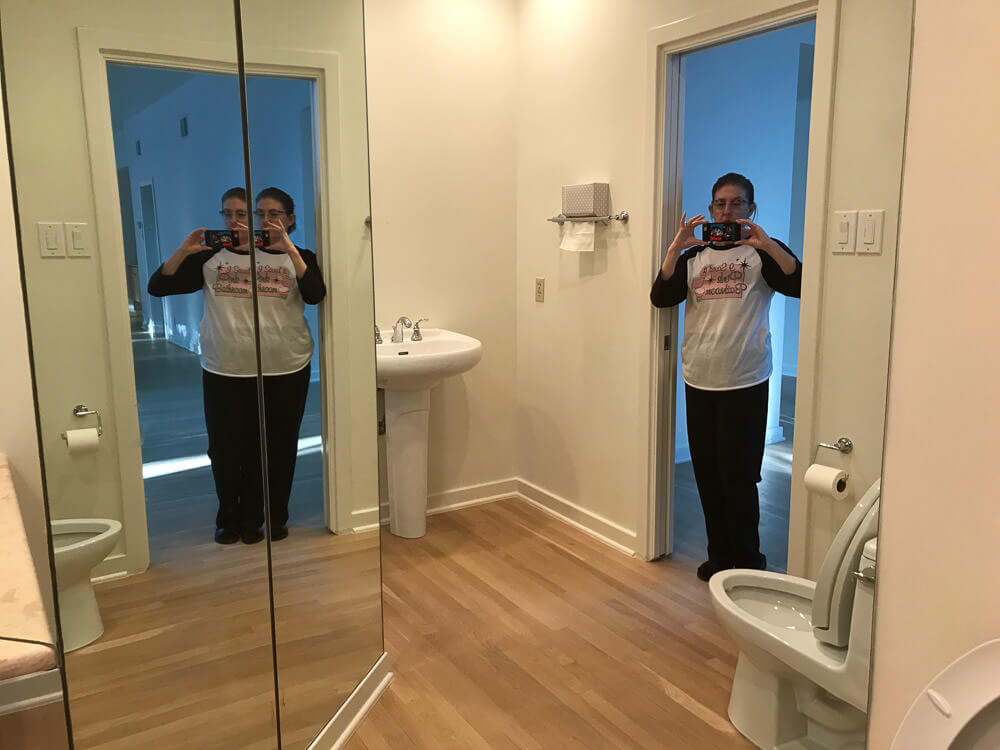
Here is the powder bathroom of the foyer. Many of the bathrooms will have to stay as is, because we do want to move in sometime this decade. But this, the only public restroom on the main floor, is going back in time to 1963.
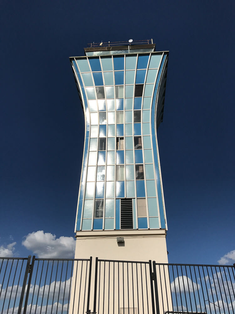
Our architects (Fehr & Granger) built our house in 1963. In 1961 they built the Austin airport, which is now gone except for the control tower. We are using the control tower colors as our theme for the house, which we named Sky Crest.
Here are the givens: new Dresden Blue toilet and sink from Peerless Pottery*; I think the sink that drops into a floating vanity. We definitely want the Blue field tile from Gardena, Calif., through Clay Squared. The sticky decision is the floors:
* Pam added link to Amazon, the blog earns a small commission for purchases completed.

#1 — shown above — Do we go with the Merola Crystalline Square Blue [See this tile in Pistachio on Kate’s floor] or …
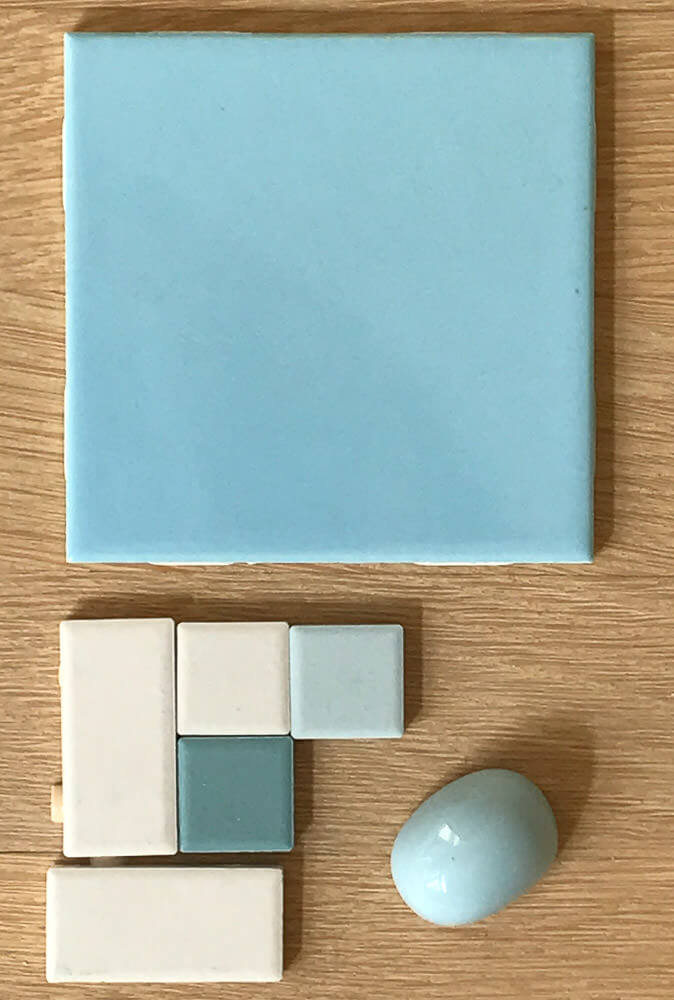
#2 — above — American Olean in a Pinwheel or Windmill pattern, using Glacier, Ice White, and Ocean Tide?
Thanks!!
Elizabeth
Thank you, Elizabeth, we love to decorate vicariously! And I LOVE that you are using the Austin airport control tower for color and pattern inspiration. Brilliant!
I have my own ideas, but I’ll let readers comment first.


Laura Ainsworth says
I have to go with the majority — the “spatter” pattern in those wonderful shades. I wish I’d seen this before I had to redo my own c.1955 bathroom floor!
MARIA says
No. 1, of course!
Kathryn says
I prefer no1. The Ocean Tide looks way too green in the photo. My pink bathroom has pink fixtures, wall tile and floor–each of the shades just enough different that it drives me nuts, even though original. Although many people don’t seem to notice.
Pam Kueber says
It is very interesting — our eye combines the colors! I had a panic attack at one point about the WHITES not matching in one my bathrooms! Now, I wouldn’t think twice.
Karin says
Number one for me guys.
NW Native says
The lighting in the two shots is so different judging color here is pretty tough. (The fact that many don’t know the field tile and fixture cap are the same kinda proves the point.)
Number two relates to the control tower more, if that’s an objective. 🙂
Erica Leal says
No 1 for sure! The blue of the big tile in the 2nd choice is too harsh.
judy h. says
WHICH ONE DID SHE CHOOSE? WHICH ONE DID SHE CHOOSE?!
Elizabeth from Texas says
Lol! Not only did we NOT choose one yet, but readers pointed us to more tile ideas so now we’re awaiting more samples to come in the mail!!! Specifically, the Merola University pattern, which I thought I was ordering originally but was actually ordering Academy. Plus three others!!!
Felicia Alexander says
Isn’t this fun, Elizabeth? Pam’s pull-all-the-tile-sources-together post a day or two ago led me to the Nemo Tile website, and I’ve ordered a couple of samples from them as well. If you don’t mind complicating your choices further, take a look at their XWEL 703, XWEL 704, and XWEL 714–Austin control tower colors in each of those. XWEL 716 is cool, too, but might be too dark for your windowless powder room; you be the judge. http://www.nemotile.com/tile/product/mixes-by-appiani/
Danielle Hanley says
Definitely the SPLATTER!!
My parents house was built in 1961 and they had a version of the splatter tile in all 3 bathrooms.
First floor had a gray-white-black tile.
One upstairs bath was in that kind of pink-coral splatter, with matching sink & toilet.
The second bath was the light green splatter also with matching green toilet and sink.
Super retro!
LB says
You will be happier with #1, it will hide dirt and it looks very retro.
Karen says
#1! Love the softer blue color and splatter mosaic, feels more retro!