

 Elizabeth wants our help: Which tile should she choose for the floor for her 1963 blue bathroom Retro Renovation? And fun: The renowned architects of the house built the Austin, Texas, airport, and Elizabeth is taking the color of the still-standing control tower for her color cues.

Elizabeth writes:
Hi Pam! I’ve been enjoying your stories, as usual. I mentioned to you recently that my husband has bought a 1963 house in Austin that has nine bathrooms. I’m ready to beg for your and your readers’ assistance on the first one.
Be forewarned, there is nothing original in this house. We did get the original floor plans from the Austin History Center, because the architects are locally reknown. (There were only two bathrooms originally!).
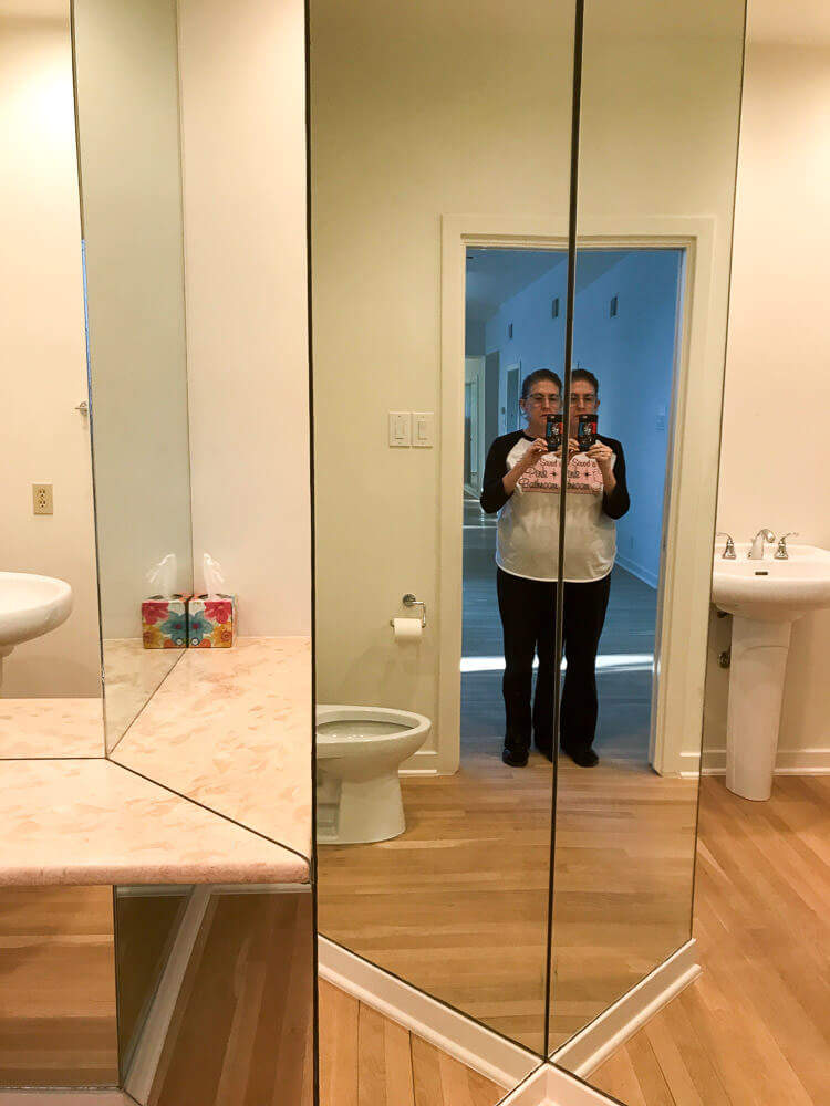
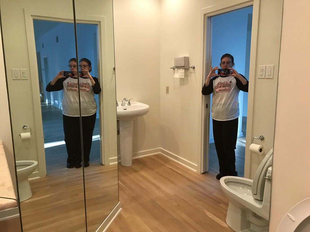
Here is the powder bathroom of the foyer. Many of the bathrooms will have to stay as is, because we do want to move in sometime this decade. But this, the only public restroom on the main floor, is going back in time to 1963.
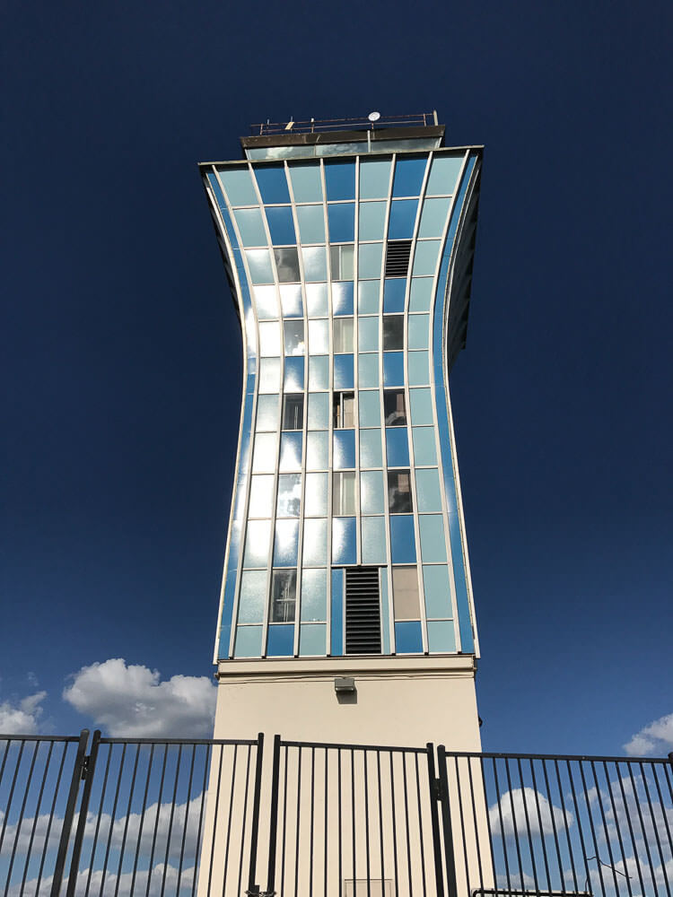
Our architects (Fehr & Granger) built our house in 1963. In 1961 they built the Austin airport, which is now gone except for the control tower. We are using the control tower colors as our theme for the house, which we named Sky Crest.
Here are the givens: new Dresden Blue toilet and sink from Peerless Pottery*; I think the sink that drops into a floating vanity. We definitely want the Blue field tile from Gardena, Calif., through Clay Squared. The sticky decision is the floors:
* Pam added link to Amazon, the blog earns a small commission for purchases completed.

#1 — shown above — Do we go with the Merola Crystalline Square Blue [See this tile in Pistachio on Kate’s floor] or …
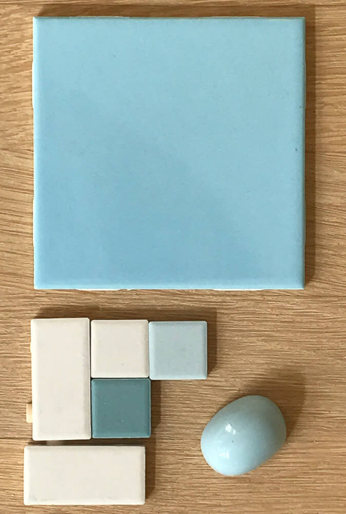
#2 — above — American Olean in a Pinwheel or Windmill pattern, using Glacier, Ice White, and Ocean Tide?
Thanks!!
Elizabeth
Thank you, Elizabeth, we love to decorate vicariously! And I LOVE that you are using the Austin airport control tower for color and pattern inspiration. Brilliant!
I have my own ideas, but I’ll let readers comment first.


Barri from Boise says
#2 seems to be less busy & more streamlined, I think. Tough choice though!
Elizabeth from Texas says
Thanks, Barri! This is the house that never gets finished–STILL awaiting our move-in of maybe March 18, 2019. I have a photographer/videographer paid for and waiting till it’s ready so he can come document its debut, a year and a half in the making!
Mary says
Definitely the second option! Love the blues.
Elizabeth from Texas says
Funny that you should reply today. Although this story originally ran Nov 2017, the house (and this bathroom) is still not completed! It’s getting close, though, and our estimated move-in date is Feb 9, 2019. The tile is complete—we used neither of the two choices here! But we still don’t have lighting. We’re going to have the house photographed and videoed as soon as it’s done so stay tuned!
Rick says
the first tile also came in gray tones in a pattern like that. I remember it because it’s what my dad put in the bathroom of our 1958 ranch when I was a kid. I never liked it, it was covering up the cute fish decals that were there from when my sister, brother and I were very little.
Elizabeth from Texas says
I was afraid of that, but will have to check it out when I get myself to a desktop instead of my “phonetop”, lol. Thanks!
Lynette says
Of the two options, I like the bottom one with the pinwheel pattern. But honestly, I would just recreate the pattern on the tower using the custom tile generator. That would be the coolest option. Or maybe the tower pattern could be a floor border or wall border. It is kind of hard to understand the layout of this bathroom with all the mirrors. I am pretty sure no one needs to see themselves in a full length mirror while they are sitting on the throne! (your results may vary)
Elizabeth from Texas says
That’s a great idea to use the random tile generator to try to reproduce the tower colors. It’s a very strange layout this powder bathroom has, but hallelujah, all the mirrors are gone! (Talk about disconcerting!!) For that matter, the sink and toilet are gone too. Currently it’s just empty while we make our final decisions and design a floating vanity to hold the blue sink. Thanks for the idea!!
Pam Kueber says
I am not sure you can get the colors you want in the size you want — 1″ x 2″ — on the Mosaic Tool. I think I looked. But… look!
rich says
I just re-read this and one detail i overlooked the first time around was “9 bathrooms” !
wow!
Elizabeth from Texas says
LOL, yes, that’s quite a number. Funny how they add up. The five downstairs are being left alone (they are late additions). The four upstairs are getting a little work. The powder bath is discussed here–although it wasn’t around in 1963, that’s where it’s going “back” to. My day bath is staying the same, but my night bath is getting a pink Peerless Pottery potty and husband’s bath is getting redone with a nod to 1963. We’re still working on deciding everything!!!
Maria says
I guess I’m the lone dissenter here. I much prefer the second color choice for the blue. The clear, less grayish tone is more appropriate for the era as is the lack of splatter tile which came in fashion in the later 1960s and 70s. At least that was my experience having grown up during these eras. Also I think the second color choice goes better with the tower colors. It almost has a hint of turquoise which is very appropriate for the early 60s. It’s not true robins egg blue.
Maria says
That was meant to say it’s a true robins egg blue.
Elizabeth from Texas says
Thanks, Maria. You’ve given me a lot to think about!!
Ashley says
I love the first choice with the splatter. It is definitely right for the era.
Julia says
We recently used that American Olean unglazed tile in a shower renovation. Ours is just black squares because we were matching an original floor in the rest of the bathroom. We have really liked the way it looks, and it works so well with our original unglazed tile.
David says
The blue splatter Merola is the period appropriate choice. Just a curve ball here, check out the Merola University tile, super retro patern. We’ve got a bathroom reno going on and that our front runner, pink no less. Good luck