

 Here’s a time capsule house of a different color: Not only is it designer-decorated, with every little detail carefully considered, color-coordinated, and matchy-matchy… but this house was barely lived in — for nearly 50 years! Yes, the owners had five other houses and only stayed here a few weekends each year. So pretty much every single element is: Original and pristine. Oh and: The house is for sale fully furnished! Let’s analyze the details — here’s how the late 60s / early 70s were done — in 17 photos >>
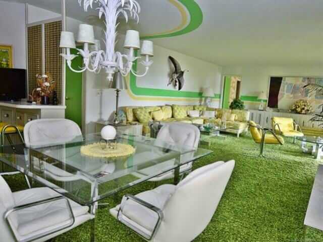
#1 (above): Oh my word, the lime green and yellow striping that leads you through the living room. What a snazzy way to connect the spaces in a large, long room.
Here’s the listing info:
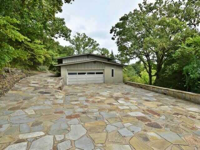
- This single family home located at 446482 E Fishermans Road, Gore, OK 74435 is currently listed for sale by C21/Wright Real Estate, with an asking price of $359,000. This 2,832 sq. ft. property was built in 1960 and has 3 bedrooms and 3 full baths.
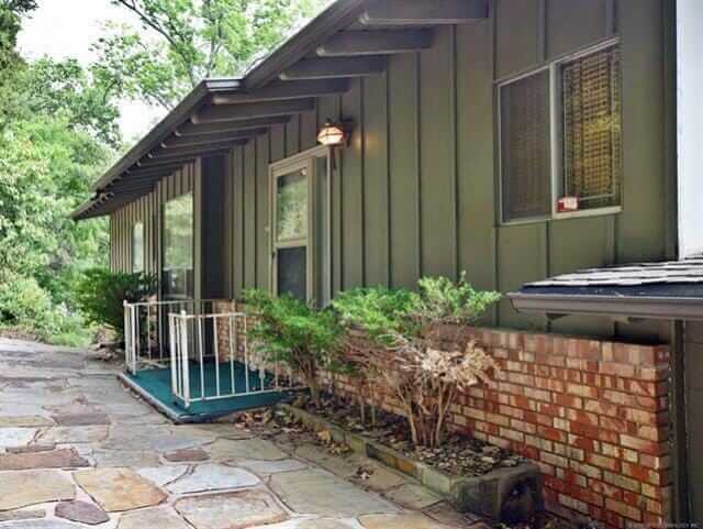
Yes, listing agent and Realtor Wes Nofire says that the decor we are looking at was conceived by a professional decorator hired by the second owners of the house, who bought it in 1970. The design of the original house also is a marvel, he said: The first owner was a World War II naval veteran, and designed the house so that all the plumbing, electric, etc. were accessible from one space — like inside a battleship. The home is three stories, with views to a nearby lake.
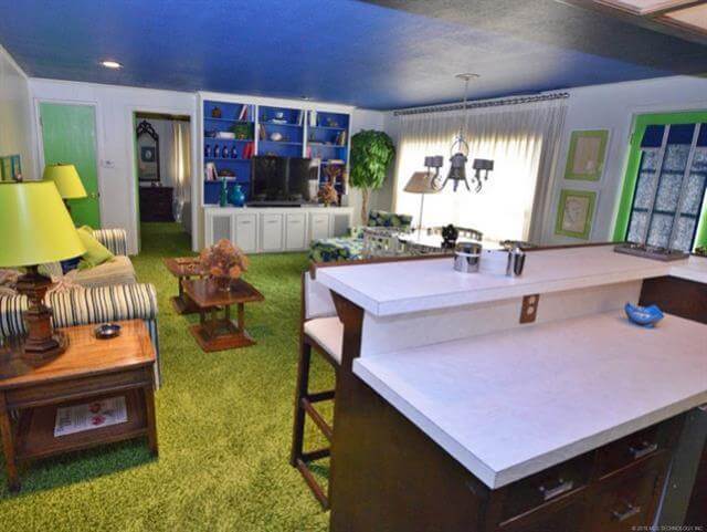
 #2 (above): The color palette in the living room is tightly controlled — lime green, sunshine yellow, and white. Note the yellow-back-painted shelves. The carpet has a hint of avocado to mellow out and ground the space.
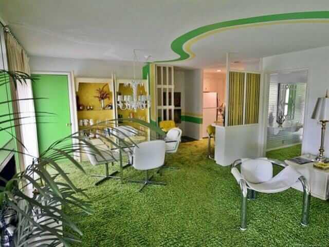
Peek: Into the dining room. Looks like very metallic silver foil wallpapear in there. I don’t have a photo, but Wes says he may be able to send me one.
Wes, who took these photos and generously gave me permission to feature them, says the only thing that has been changed in the house is that some of the white leather upholstery was reupholstered over time. All the appliances are original and they all work, he says.
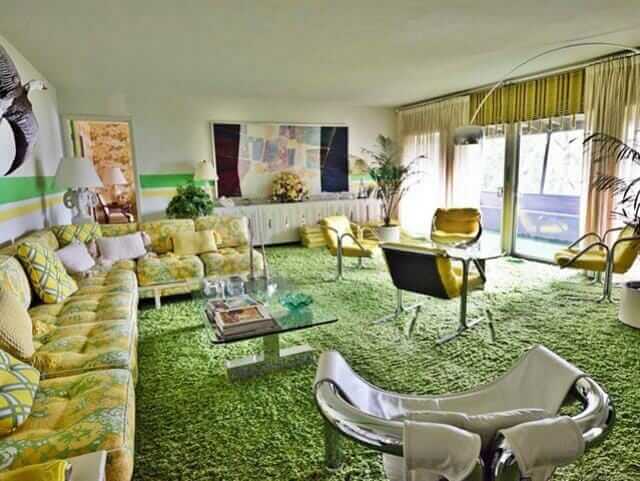 #3 — The sectional is wonderful. Notice the sheer pinch pleats are layered over what appear to be woven wood shades ala Beautie Vue.
 #4 — Tiny stools tucked under the mirrored sofa table. The fireplace (toward the back of this photo) also appears to be mirrored.
 #5 — Yes, carpet in the kitchen. No comments, please. It was the 1970s.
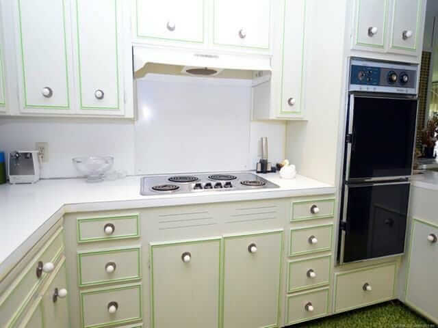 #6 — The cabinet door and drawer fronts have the look of some St. Charles’ I’ve seen, but I don’t think these are steel.
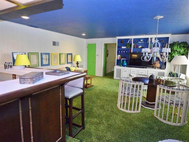 #7 — I’m thinking this is a family room. The color blue is now judiciously introduced — in the blue-painted ceiling, the back-painted cabinetry, the mats of the framed sketches above the sofa, and on the card-table chairs’ upholstery, methinks. Great card table chairs!
 #8 — I like how the doors are all painted. They are treated like geometric elements within each room, not whited out.
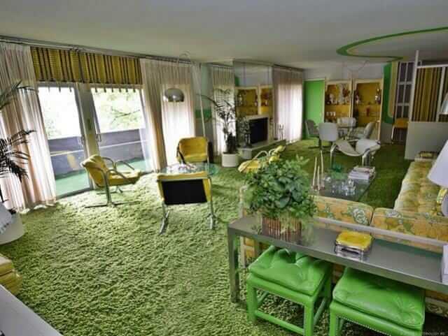
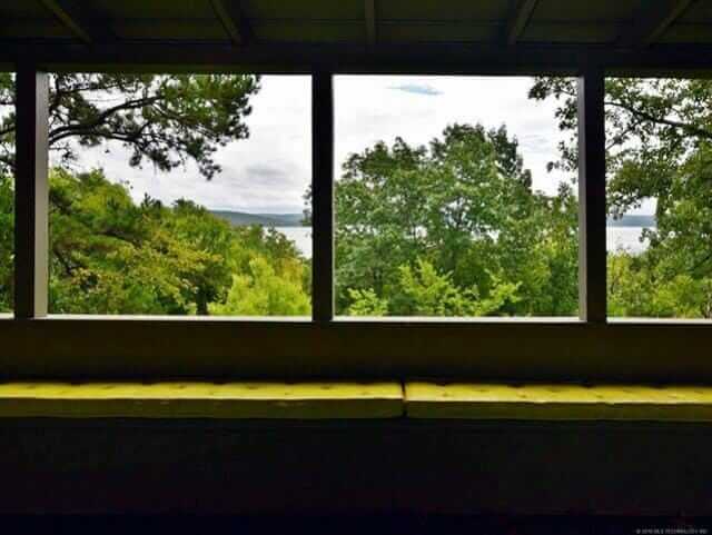 #9 & #10 — I’m thinking that all the living spaces are oriented toward the lake, with seating planned to enjoy the views.
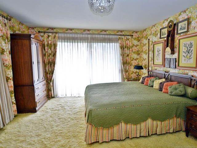 #11 — Fantastic master bedroom. Matching pinch pleat draperies and wallpaper… coordinated bedskirt and even piping. The little square pillows all in row == LUV.
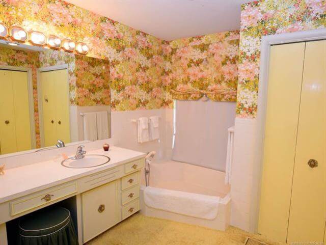 #12 — This bathroom goes with the master bedroom, same wallpaper. Again, I don’t wanna hear waah waahs, please, about the carpet in the bathrooms. It was the 70s.
 #13 — The yellow bedroom. The lime green dresser reminds me of Drexel Plus One sans the words. Flower-powered wing chairs are my new everything.
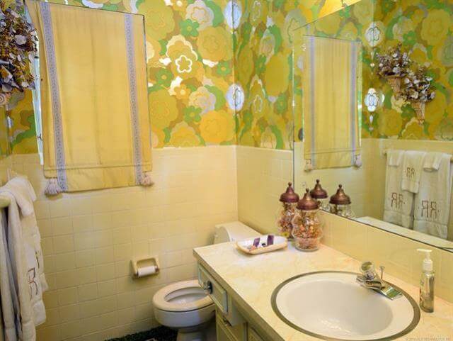 #14 — I *think* this is the bathroom that goes with the yellow bedroom. However, looking at photo #13, the wallpaper in the attached bathroom seems to match the wing chairs; I see blue. Me confused. P.S. Close yer toilet lids, people: Bad feng shui to leave them open, because your money energy is attracted to be flushed down that drain, and we don’t want that, do we?
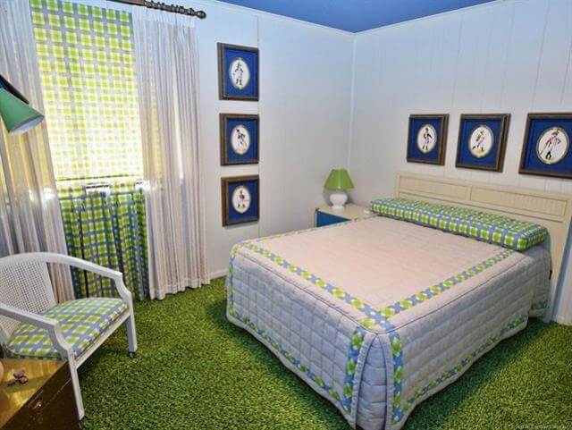 #15 — Every house needs a plaid bedroom. Notice: The window seems to be dressed with (1) sheer pinch pleats over (2) a plaid pull-down shade, which hangs over (3) cafe curtains that hang to ground, to line up with the pinch pleats. Now that’s attention to detail.
 #16 & #17 — You’d never know from outside, all the 1970s happy going on inside!
Link love:


Ethan says
What a cool house. I was hoping that the appliances were avocado but, the rest of the house makes up for it. Too cool!
Brenda says
This is spectacular! Yellow is not my color but I wouldn’t change a thing. Just embrace it! What a gem!!
Beth Pierce says
These time capsule homes built by architects with a professional decorator doing the interior are like works of art! Never realized the 70 s decor could be so bright and fun! No harvest gold, orange or avocado green (maybe a touch in the one room’s carpet) When will this present trend of No or little color end?
CarolK says
If you read the decor magazines, lots of higher-end clients have homes that are positively awash with color. Color to that the level is pretty specific to a client though. It might make it harder to re-sell. (Lots of designers will tell you not to decorate with re=sale in mind unless you know that re-sale is imminent.) One thing I love about the house that my oldest daughter bought is that there is so much color in it. She and her husband do too.
Pam Kueber says
Yes, the current higher-end and even mid-market magazines are full of color — at least that’s what I sense from what I read when I’m getting my hair colored or am in a doctor’s office. The mainstream consumer market will take a while to catch up, but it’s on its way. Finally. Hooray.
Jennie Williams says
Personal note to Pam: Think of all the time and money you would save if you stopped coloring your hair! Gray hair is trending.
Pam Kueber says
I’m letting the gray come in — in front of the color.
Taylor says
Interior design trends tend to follow heavily with fashion trends. Fashion is finally becoming colorful and fun again after many years of snoozy designs and colors. As our clothes get more colorful and fun, we will want to then add it to other areas of our lives like the houses we live in etc. I am so happy, because it makes it seem like everyone is finally able to be more individual. Lets just hope it stays for a while. Then people will fall more in love with these beautiful and individual looking homes.
Laura says
I think the carpet has faded and was originally lime-ier. When my parents’ green 1970 carpet faded, it turned into something very similar.
Jeff says
This house most likely is situated on Lake Tenkiller, one of the most beautiful lakes I’ve ever seen. It’s built in the foothills of the Ozarks in a heavily forested area. Anyone near eastern Oklahoma with the money should consider this beauty!
Jeff in Oklahoma
linda h says
This would be a good halfway meeting vacation house for our family coming from different directions. I LOVE it!
Andrea Withrow says
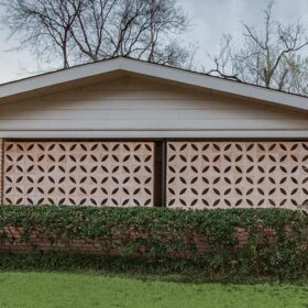
I like this house a lot. My husband and I searched for a few years for a time capsule house….. But we settled on the least remuddled. To find one that would come furnished. I cannot tell you how awesome that would be. The 70s are not a decade I gravitate to but I like the cheeky-ness of the decor. But once I saw the outside and the flagstones…ooh boy do I wish I could have seen the original intent of the house.
Thanks for showing us this house Pam!
Dan says
Wow! Looks like someone really took those Better Homes and Gardens decorating books seriously. I envision Pucci print caftans wafting through these glorious spaces, making sure everyone has enough cheese puffs. Tequila Sunrise, anyone?
We went through the carpeted kitchen and bath stage – ugh.
I remember trying desperately to convince my parents we needed one of those cantilevered chrome ball floor lamps, but it probably would have clashed with our green Herculon Sears faux- lonial sofa.
Tarquin says
Dan, that’s hysterical.
Ranger Smith says
“faux-lonial” – love that! Ours was also green, later to be recovered in orange/rust.
Melinda says
It is so cheerful and fun, i can’t imagine ever having a bad day in that house. I will never understand why anyone wants today’s colorless styles.
Tarquin says
Triple WOW!!! I LOVE West Palm Regency. Green and yellow are so happy, I dont think it’s possible to ever feel sad in this house. Nobody can convince me that the gray and beige of today is better than this!! I’d love to see a house all done in avocado green and turquoise. I saw it once in a vintage magazine and it was so bad it was so good. I yearn for it till this day.
Julie says
Totally agree on the avocado and turquoise combination–love it with mid-toned woods especially.