

 Here’s a time capsule house of a different color: Not only is it designer-decorated, with every little detail carefully considered, color-coordinated, and matchy-matchy… but this house was barely lived in — for nearly 50 years! Yes, the owners had five other houses and only stayed here a few weekends each year. So pretty much every single element is: Original and pristine. Oh and: The house is for sale fully furnished! Let’s analyze the details — here’s how the late 60s / early 70s were done — in 17 photos >>
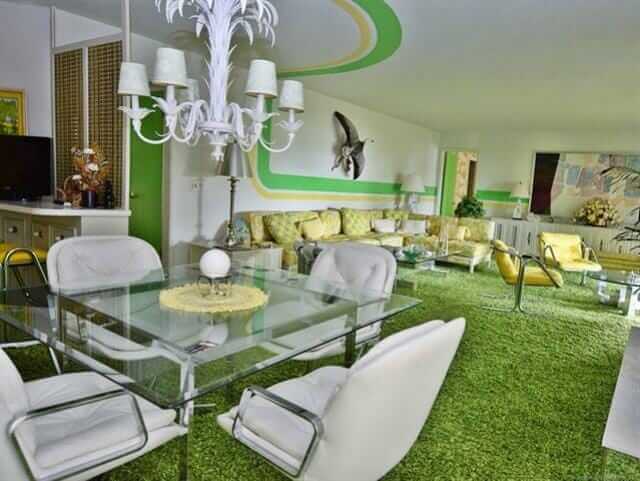
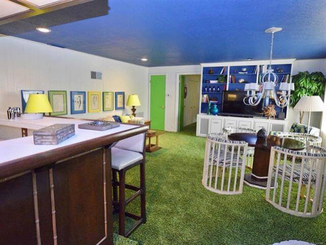
#1 (above): Oh my word, the lime green and yellow striping that leads you through the living room. What a snazzy way to connect the spaces in a large, long room.
Here’s the listing info:
- This single family home located at 446482 E Fishermans Road, Gore, OK 74435 is currently listed for sale by C21/Wright Real Estate, with an asking price of $359,000. This 2,832 sq. ft. property was built in 1960 and has 3 bedrooms and 3 full baths.
Yes, listing agent and Realtor Wes Nofire says that the decor we are looking at was conceived by a professional decorator hired by the second owners of the house, who bought it in 1970. The design of the original house also is a marvel, he said: The first owner was a World War II naval veteran, and designed the house so that all the plumbing, electric, etc. were accessible from one space — like inside a battleship. The home is three stories, with views to a nearby lake.
 #2 (above): The color palette in the living room is tightly controlled — lime green, sunshine yellow, and white. Note the yellow-back-painted shelves. The carpet has a hint of avocado to mellow out and ground the space.
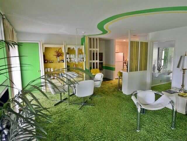
Peek: Into the dining room. Looks like very metallic silver foil wallpapear in there. I don’t have a photo, but Wes says he may be able to send me one.
Wes, who took these photos and generously gave me permission to feature them, says the only thing that has been changed in the house is that some of the white leather upholstery was reupholstered over time. All the appliances are original and they all work, he says.
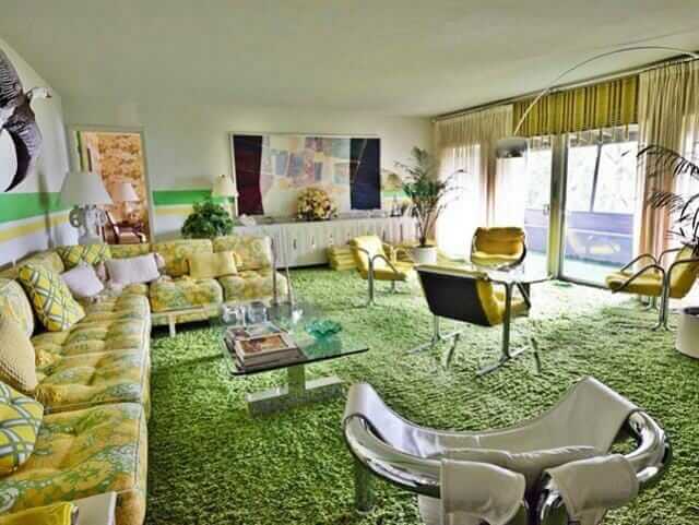 #3 — The sectional is wonderful. Notice the sheer pinch pleats are layered over what appear to be woven wood shades ala Beautie Vue.
 #4 — Tiny stools tucked under the mirrored sofa table. The fireplace (toward the back of this photo) also appears to be mirrored.
 #5 — Yes, carpet in the kitchen. No comments, please. It was the 1970s.
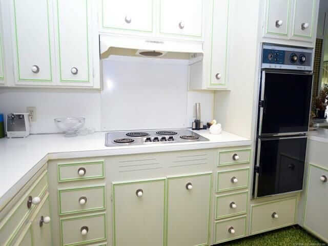 #6 — The cabinet door and drawer fronts have the look of some St. Charles’ I’ve seen, but I don’t think these are steel.
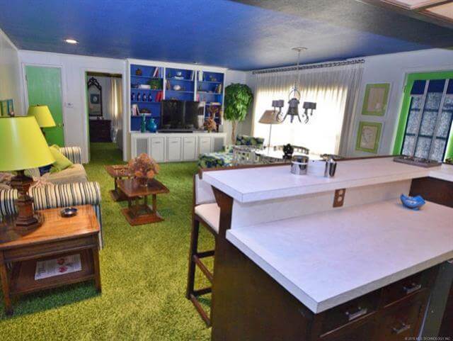
 #7 — I’m thinking this is a family room. The color blue is now judiciously introduced — in the blue-painted ceiling, the back-painted cabinetry, the mats of the framed sketches above the sofa, and on the card-table chairs’ upholstery, methinks. Great card table chairs!
 #8 — I like how the doors are all painted. They are treated like geometric elements within each room, not whited out.
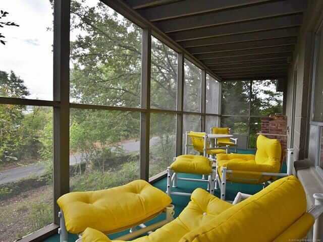
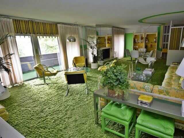
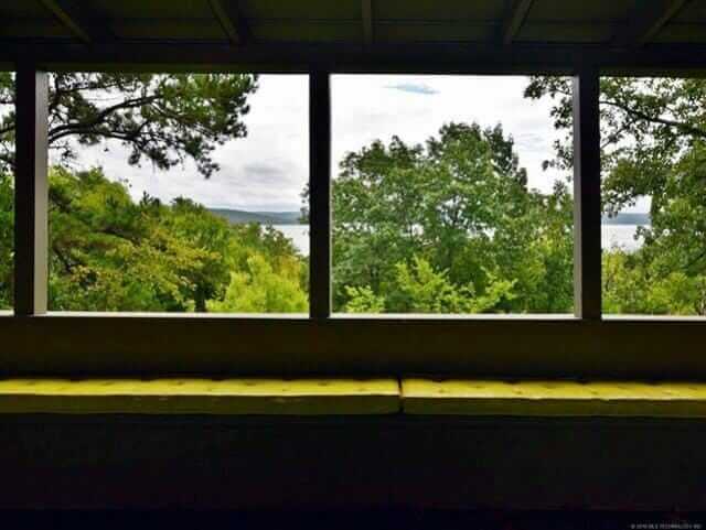 #9 & #10 — I’m thinking that all the living spaces are oriented toward the lake, with seating planned to enjoy the views.
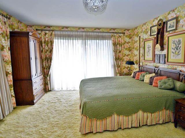 #11 — Fantastic master bedroom. Matching pinch pleat draperies and wallpaper… coordinated bedskirt and even piping. The little square pillows all in row == LUV.
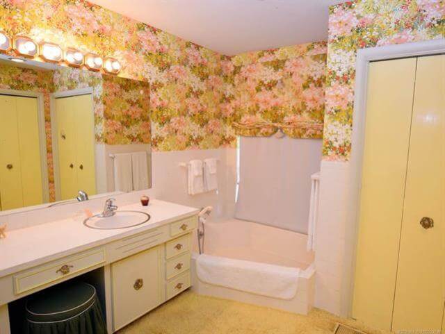 #12 — This bathroom goes with the master bedroom, same wallpaper. Again, I don’t wanna hear waah waahs, please, about the carpet in the bathrooms. It was the 70s.
 #13 — The yellow bedroom. The lime green dresser reminds me of Drexel Plus One sans the words. Flower-powered wing chairs are my new everything.
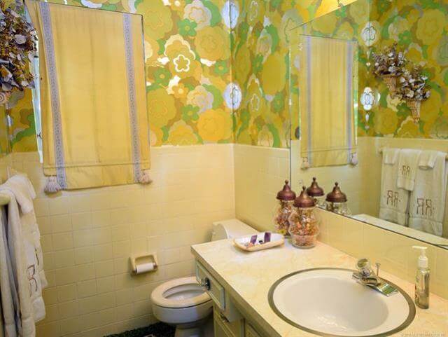 #14 — I *think* this is the bathroom that goes with the yellow bedroom. However, looking at photo #13, the wallpaper in the attached bathroom seems to match the wing chairs; I see blue. Me confused. P.S. Close yer toilet lids, people: Bad feng shui to leave them open, because your money energy is attracted to be flushed down that drain, and we don’t want that, do we?
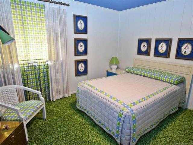 #15 — Every house needs a plaid bedroom. Notice: The window seems to be dressed with (1) sheer pinch pleats over (2) a plaid pull-down shade, which hangs over (3) cafe curtains that hang to ground, to line up with the pinch pleats. Now that’s attention to detail.
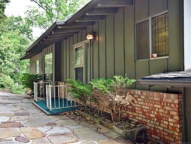 #16 & #17 — You’d never know from outside, all the 1970s happy going on inside!
Link love:


Robin, WA says
Oh my gosh, there are so many elements to this house that are just AMAZING.
1. I love the graphic design on the ceiling in the living room that flows down onto the walls. What a fantastic design element. So 70s modern.
2. I’m in love with how the curtain in the master bath matches the walls perfectly – matching valance and wallpaper with a white pull-down blind to match the tub and lower walls. WOW.
3. All of the bedrooms with their matchy matchy walls, drapes, and bedding. I wonder if this is even possible anymore.
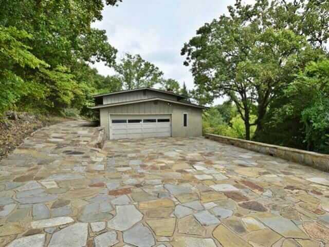
4. That driveway. Holy cow, that wasn’t cheap and it looks awesome.
I don’t know that the color scheme is my cup of tea but I love to see design like this where someone jumped in with both feet. Especially nowadays with everything being so greige.
cathie says
I’ll be the lone dissenter, here. While I can see the care that went into designing this home, there is nothing, nothing, that is worth keeping from the 70’s. I lived through them. It was ugly then, its ugly now.
Pam Kueber says
I lived through them too: The 70s were THE ABSOLUTE BEST! LOL, different strokes for different folks!
Phyllis says
I adore the supergraphic zooming around the living room….please take me back to the 70’s and leave me there
Tarquin says
Ummm. My Farrah Fawcett poster is GORGEOUS!!! Totally worth keeping.
CarolK says
I’m sort of in between cathie and Pam. I love the living room, but the bedrooms and baths are too busy for my taste and the sun porch overlooking the lake just looks messy. I do love the bright colors overall though. I do appreciate that they seemed to eschew the popcorn ceilings that were common in the 60s and 70s. I remember writing my initials in the popcorn ceiling of my form room at UGA in the late 70s. I didn’t know that most popcorn ceilings of the era had asbestos in them.
Pam Kueber says
I am not sure who is an expert on whether “most” popcorn ceilings contained asbestos or not — so whether your popcorn ceiling contains asbestos or other vintage nastiness: The only way to know for sure is to get it tested — get with a pro to assess what you have so you can make informed decisions: Be Safe/Renovate Safe https://retrorenovation.com/renovate-safe
KStacey says
GASP! Cast away such aspersions and libelous defamation of such a GLORIOUS era! Deliver us from the depraved plebeian pediculousness of the tedious monotone lifelessness being thrust upon us, crammed into every sensory outlet in a malicious attempt to deprive us of our very SOULS. Disco is eternally redeemable. Let us rejoice and be glad. Let us praise its greatness!
Yay, though I walk through the valley of the shadow of death, I will fear no evil, for you are with me. Thy laminate and thy shag, they comfort me. Amen.
Eliza says
My sister and I painted our bedroom that lime green when we were around 12/14 and we loved it!! Years later my older brother was renovating the house after we had moved out years earlier and turned it into a rental and he was horrified by the color of the walls in that bedroom and assumed the renters had done it. Nope, it was us and I’d do it again!
Tarquin says
HAHA. I’m not in the mood for tequila, but I will have some Folgers instant and Sara Lee carrot cake. Thanks. 🙂
Nikki says
Dan,
ROTFLOL! (Rolling on the floor laughing out loud) “I envision Pucci print caftans wafting through these glorious spaces, making sure everyone has enough cheese puffs. Tequila Sunrise, anyone?” Can’t get the caftan out of my head! thanks for brightening my day.
I do love the house! The colors just make me happy! Also, I wonder why the original owner’s vision of “one access” never caught one – seems brilliant to me, but then I’m not an mechanically minded at all.
Trixie says
So in love with this house! I have some 1970s/1960s decor booklets and this is exactly what was going on at the time. Madly in love with the yellow sofa, and the floral furniture.
I’m a color consultant and designer, and to be honest? I am SO sick of neutral colors! Grateful for high-end clients who are not afraid of color. I’ve had clients obsess for weeks, in tears, over the right greige. I see navy blue has started to inch its way into big box store decorating and HGTV shows that were filmed months ago. Definitely the consumer market is not quite ready for the colors…
Jay says
Yowza! Love all the green and yellow. Would have liked to see a few darker greens and some pinks thrown in as well. The décor did not come cheap, wonder what the other homes were like. I like the kitchen (sans carpet). That stone paved driveway – you don’t often see that. Thanks for sharing!
Phil says
I like that carpet, too bad I’m allergic! When I was growing up in the early eighties, my parents had to get rid of all the carpet they had at their home because of my allergies! They also had to stop using the wood stove in their basement because of my allergies. So I had to get used to cold floors which I hate!
KakiMack says
If I can’t live in the yellow bedroom, can I at least have the chairs? Seriously though, fab house.
Dan Hoyer says
All that shag! My rug-rake would be worn out in an month! I used to have to rake the shag rug in my parents house growing up…