50 best paint colors used on the walls of the Guggenheim Museum
Kate - Updated: May 17, 2021
Retro Renovation stopped publishing in 2021; these stories remain for historical information, as potential continued resources, and for archival purposes.
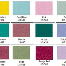
50 neutral paint colors taken from exhibition walls
150 pigmented colors taken from works of art
Have you ever walked into an art gallery or museum and wondered exactly what shade of off-white or light grey were on the walls? Have you ever put three — or six — or 10 — shades of off-white on your wall, had your head spin, tortured your significant other, finally chosen one, painted the wall — and it turned out too grey, too pink, too yellow, too – wrong. Luckily for us, the Solomon R. Guggenheim Museum in New York has partnered with Fine Paints of Europe to bring us a collection of 50 neutral paint colors that have been used in the Guggenheim and were chosen by curators, artists, and designers — including Frank Lloyd Wright himself. Also available is the Classical Color collection — with more vibrant hues taken directly from the works of artistic masters.
New York — For more than 50 years the Solomon R. Guggenheim Museum in New York has selected the perfect wall colors to complement the celebrated collection of modern art showcased in its Frank Lloyd Wright–designed home on Fifth Avenue.
Beginning in fall 2011, the Guggenheim will share these trade secrets with homeowners, interior designers, architects, and art lovers everywhere. Through an exclusive licensing arrangement with the Guggenheim, Fine Paints of Europe, Inc., of Woodstock, Vermont, will introduce two paint collections suitable for residential and commercial use. The Classical Colors is a set of 150 wall colors drawn from much-loved paintings in the Guggenheim’s permanent collection. The Gallery Colors are comprised of 50 hues favored by generations of Guggenheim Museum curators, artists, and designers—including Wright himself.
“We see color as an important aspect of the art experience at the Guggenheim, whether we are aiming to highlight a particular canvas or unify a wall of very different objects,” notes Karen Meyerhoff, Managing Director for Business Development at the Guggenheim Museum. “The museum has chosen to develop these new collections with Fine Paints of Europe because of the company’s expertise in recreating even the subtlest nuances of color. We also admire their philosophy of customer service, which is not unlike our own intensive design process: Fine Paints of Europe’s color consultants offer clients complimentary assistance in addressing a broad array of surfaces and environmental and other contextual conditions before assisting in the selection of specific colors.”
Vincent Van Gogh Mountains at Saint-Rémy (Montagnes à Saint-Rémy), July 1889 ?Oil on canvas, 71.8 x 90.8 cm ?Solomon R. Guggenheim Museum, Thannhauser Collection, Gift, Justin K. Thannhauser
Classical Colors reflects the color palette of paintings by Paul Cézanne, Vasily Kandinsky, Franz Marc, Vincent van Gogh, and other modern masters whose works are in the museum’s celebrated collection. Colors range from the lively yellow of Franz Marc’s Stables (1913) to the soft blue-gray found in the sky of Van Gogh’s Mountains at Saint-Rémy (1889).
For the Gallery Colors collection, the museum delved into its archives to find original colors used for milestone exhibitions and shades chosen by Wright, artists, and museum curators. The resulting spectrum is intended to guide homeowners in the presentation of art, whether the goal be to frame a painting unobtrusively or to achieve the mood of a distinct era or culture. These colors are the product of complex formulations designed to produce interactive tones far more interesting than conventional paint colors.
The hues in the Gallery Colors collection are the result of rigorous testing: Each time the Guggenheim mounts an exhibition, designers begin with small-scale models of the gallery space, sample wall colors, and tiny replicas of the artworks. The team then moves into the museum itself to view full-scale mock-ups. Because the final choice of wall color can influence how a museum visitor experiences the artworks, this testing phase is crucial to the museum’s color decisions.
The Classical Colors and Gallery Colors collections were both further refined in consultation with Fine Paints of Europe, whose specialists fine-tuned the selections for a variety of architectural settings and lighting situations, to precisely match each hue.
“We know our clients are serious about the integrity of their physical space,” says John Lahey, Founder, Owner, and CEO of Fine Paints of Europe. “They care about the beauty of paint itself: the depth of color, the touch, and the durability. So imagine how thrilled we are to be able to apply our own technical mastery to the development of these unique colors, drawn from one of the world’s leading collections of modern art.”
Being an artist myself — and believing that I’m not too shabby at picking paint colors — the amount of research that goes into choosing the right neutral for the galleries in the Guggenheim is astounding. With all the hard work and careful thought the color team at the Guggenheim puts into their wall color selection, surely you can benefit from their research and find a neutral — or classical — paint color that is just the perfect shade for your house.
I had no idea. On my next round of painting, definitely giving these a swirl. I am impressed with the research to come up with just the perfect neutral for a collection. The classical colors are pretty spectacular too. Thanks for the tip!
Annie B.says
To me, having paint colors on my walls which had been used in the rarified air of the Guggenheim would be worth paying $100 per gallon. How authentic can you get? My only problem with these collections would be making up my mind which colors to use. The Classic Colors in the sample at the top of the post would be perfect in a late ’50’s / early ’60’s styled room with Danish Modern furnishings, vintage ceramics, and metal sculpture. Mmmmmmm.
Kate, thanks so much for a great post.
Katesays
Glad you enjoyed it Annie B!
lyndasays
It does seem like a wonderful paint and I have been tempted to try it. Our local paint store carries the brand. However, it is over $100 a gallon. They have an explanation as to why the price is high on their site. http://www.finepaintsofeurope.com/faqs.aspx I wonder if any of you have personal experience with the paint? Colors are very beautiful and this is a very interesting article.
Katesays
I don’t have any personal experience with the paint, but I’m sure it is wonderful. If you watch the video that explains how they make it versus how other manufacturers make paint, it sounds like the paint is worth the price tag.


For the Gallery Colors collection, the museum delved into its archives to find original colors used for milestone exhibitions and shades chosen by Wright, artists, and museum curators. The resulting spectrum is intended to guide homeowners in the presentation of art, whether the goal be to frame a painting unobtrusively or to achieve the mood of a distinct era or culture. These colors are the product of complex formulations designed to produce interactive tones far more interesting than conventional paint colors.
The Classical Colors and Gallery Colors collections were both further refined in consultation with Fine Paints of Europe, whose specialists fine-tuned the selections for a variety of architectural settings and lighting situations, to precisely match each hue.


Just another Pam says
This is so exciting, now I’ll wait with baited breath until they come to Canada.
Rebecca@MidcenturyModernRemodel says
I had no idea. On my next round of painting, definitely giving these a swirl. I am impressed with the research to come up with just the perfect neutral for a collection. The classical colors are pretty spectacular too. Thanks for the tip!
Annie B. says
To me, having paint colors on my walls which had been used in the rarified air of the Guggenheim would be worth paying $100 per gallon. How authentic can you get? My only problem with these collections would be making up my mind which colors to use. The Classic Colors in the sample at the top of the post would be perfect in a late ’50’s / early ’60’s styled room with Danish Modern furnishings, vintage ceramics, and metal sculpture. Mmmmmmm.
Kate, thanks so much for a great post.
Kate says
Glad you enjoyed it Annie B!
lynda says
It does seem like a wonderful paint and I have been tempted to try it. Our local paint store carries the brand. However, it is over $100 a gallon. They have an explanation as to why the price is high on their site. http://www.finepaintsofeurope.com/faqs.aspx I wonder if any of you have personal experience with the paint? Colors are very beautiful and this is a very interesting article.
Kate says
I don’t have any personal experience with the paint, but I’m sure it is wonderful. If you watch the video that explains how they make it versus how other manufacturers make paint, it sounds like the paint is worth the price tag.