


 1960s flower power colors are ascendant in the mainstream design and decorating world. And here’s some of the latest: Kohler has teamed with Jonathan Adler and introduced four new real-colors for a narrow range of six contemporary-modern, enamel-on-cast-iron sinks.
UPDATE: Alas, now discontinued. But see our Kitchen / Sinks and Bathroom / Sinks subcategories for other possible options — there are other options out there, for now at least.
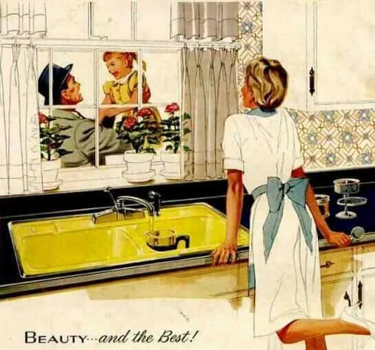
Alas, these colors are not available on the midcentury authentic, hudee-rimmed Delafield kitchen sink, or on the midcentury authentic, hudee-rimmed Tahoe bathroom sink. Even so, it’s nice to see some REAL COLOR FOR REMODELS. And, if you are doing a Modern-Retro look (rather than an authentic midcentury look), it’s good to have these choices.

Here is what Kohler says about the lineup:
For optimum color vibrancy, Kohler Co. is offering the four new colors only on six of its Kohler enameled cast iron kitchens and sinks. “The materials used in the enameling process are incredibly saturated and vibrant,” Kohler creative director Tristan Butterfield explains. “Such an exclamation of color in a space should be as rich as possible. And Kohler enameled cast iron allows us to achieve that.” The four colors are available on the following sinks, in limited quantity —>:
• Bath Sinks: Tides, Canvas and DemiLav Wading Pool
• Kitchen Sinks: Whitehaven, Riverby and Iron/Tones
Actually, I think those last two kitchen sinks — the Riverby and Iron/Tones are sort of “plain” enough that if you get the self-rimming model they get closer to “timeless” rather than “trendy” in terms of styling.
Here’s what Jonathan Adler says about the colors. Haha, this is always like reading critics’ descriptions of wine:
The following are the four KOHLER Colors Featuring Jonathan Adler:
• Greenwich Green captures the beauty of the perfectly manicured lawns of an English Estate—cultured and cultivated. “This is not dull avocado green,” Jonathan Adler says. “It’s bolder, yet timeless. So crisp and refreshing you can taste it.”
• Piccadilly Yellow evokes the riot of colors from London’s Piccadilly Circus. Exuberant and fun, a Piccadilly yellow kitchen or bathroom sink instantly fills the space with giddiness. Adler says: “There’s a very mod quality to Piccadilly yellow, especially when paired with white. It’s unexpected and will always feel fresh.”
• Palermo Blue is beautiful, serene splash of the Mediterranean Sea where it opens before the city of Palermo on Sicily. “A nice, crisp light blue is cool and refreshing,” Adler says. “Like taking a dip in the Med itself.”
• Annapolis Navy, an unconditionally classic hue, calls to mind the sailing city of Annapolis on Maryland’s Severn River. “Annapolis Navy epitomizes nautical chic. It’s such a classic color because it pairs so well with other bold colors,” he says.
Of course, I do not like that JA disses the Avocado Green. But then, I diss the greige so it’s kolor karma.


Sarah says
Aargh, where were these when I did my retro modern kitchen remodel a few months ago? They’re amazing!
Janet says
They are just bound and determined to get away from hudee rings, aren’t they? Sorry, Kohler, I got a turquoise rectangular sink with hudee ring and a matching tub (okay, a few scratches) from Habitat for Humanity. And they’re cast iron. And the whole deal was $100.
jay says
They can desbribe the colors any old way they want but I think the yellow and green are straight from the 70s.
Ana says
Love them and just wish they’d been available when I was fixing up my kitchen last year. I kept my vintage sink because I couldn’t find something that would work (and it’s in good shape), but if these had been around, I would’ve worked the aqua one in. Or maybe the yellow.
lynda says
Love the colors and the white faucet. The faucet is on the Kohler site. The faucet reminds me of a Kroin (now Vola) faucet I had in the 80’s. I spent a lot for the faucet that I bought through an architect. However, it did not hold up well. Luckily if you buy the faucet from Kohler, they will stand behind it for as long as you own it.
Sadie says
This made me squeal when I first saw them, then realized it might be a little too colorful for my taste…
Jon Hunt says
I love Jonathan Adler, but he coulda been an advocate for the redemption of avocado instead of throwing it under the bus. That green = avocado. Otherwise, LOVELY. I’m so glad to see color coming back!!
(PS: our avocado kitchen is anything but dull!)
Tikimama says
Sure looks like Avocado to me! Call it what you want, JA, you’re not fooling us! I love the aqua – I’d get the Iron/Tones double-bowl top mount in a heartbeat if I could afford it 🙂
Susie Q. says
The color that was called “avocado” in the 70’s was not the color of a real avocado though 🙂
Sara D says
i saw this post and instantly drool started forming in my mouth. That has never happened before. Not even while looking at hot celebrities. I can’t decide if I like the yellow or the turquoise best!!!!
Jane / MulchMaid says
These are such fun! The sink designs do feel pretty modern, but Pam’s right that they can integrate nicely into retro-modern decor. I’ll have to see to see Picadilly in person – it looks like a good match for my bath counter laminate.