


Here’s a good one — and a good followup to yesterday’s story discussing “when is it *okay* to let go of something original?” and introducing the Retro Renovator’s Creed. Karen wants our help. She wants to brighten up her 1954 kitchen … should she replace the ceramic tile countertops with something more sparkly? Read on for her entire story and question… then let’s confuse her some more with all our ideas and opinion –>
Pam, You ROCK! Thank you so much for hosting this retro reno PARTY!
I’m throwing my hat in the ring. While my dilemma is not new or particularly unique, I could sure use some help from all your retronistas. The simple problem is whether to replace a perfectly good, original, 1954 tile countertop with one that will add pizzazz.
We bought the house 20 years ago from the original owners. It had not been touched since a year before, and sneaking into it late one night, we were truly caught in a time warp. Back then, we were too busy raising three daughters to make any changes to a perfectly usable pink bathroom and all original everything else, apart from new carpet and the addition of a dishwasher. When I began to breathe and look around, I had no idea what I had or what to do with it.
Then, I found this Brown Saltman sideboard in a dirty old junk store. It had amoeba handles and the glass top, and I HAD to have it. After we squished it into the dining room and I saw the flow to the corner fireplace, it truly hit me as an epiphany: This house was one of those fifties retro houses! Seriously, this is 15 years after we moved in.
Then came a year of mad ebay, yardsale and junk store shopping. I’ve settled down on the buying, but still pass the counter tops with a sigh. While replacing them seems sacrilegious, the grout is a germ magnet, and the colors are drab next to the gorgeous ash cabinets, well, they will be gorgeous once I steam and refinish them.
I have my eye on some of that new glass tile for the backsplash and maybe a black formica counter? So, help. What do you think?
Any suggestions are soooooo much appreciated.


Thank you, Karen. But no: You ROCK. Your house is just lovely!
What do you think, readers?
Should Karen replace her original ceramic tile countertops?
If yes, with what?
If no, how to add the ‘pizzazz’ she seeks to this kitchen?
I will hold back and see what you say… but I for sure have some ideas.


Tom says
Hi Karen!
We have those exact tile colors in our master bath, and they are very common in 50’s houses around here for both kitchens and baths. While not my absolute favorites (try finding towels – besides white – that match), I vote for hanging on to it. If the idea of it being “germy” makes you squirmy, after you clean it you could swipe over it with a Clorox wipe. As for brightening things up, why not try some under-cabinet lighting? We used that in a former house and it made a BIG difference! If you use the florescent variety, I recommend backing it up to the wall so that the bulbs are near the center of the upper cabinet so that it won’t end up glaring in your face while you’re trying to work. And of course you could take it out if you don’t like it. Some recessed lighting in the kitchen ceiling might help as well. Good luck!
meesher says
Karen,
I think your house looks fabulous! I love so many of your choices, I love the table and the chairs in the kitchen, great lines and great fabric! Here’s my two cents-
The whole point of collecting things and decorating in general is to create a happy space for yourself. No matter what your style is the things you put in your house you pay money for because you love them or because they speak to you in some way that brings you happiness. So if every time you pass by your counter and it irritates you – that’s not garnering happiness! To me that bugging, irritating voice that says “Golly, I hate that thingamig” tells me that it’s time to satisfy my need for visual gratification. Surround yourself with things that make you happy!
As for the countertop – Go look at real countertops, go and touch them and feel them. Figure what you actually really want and need. I love this website but sometimes they push the retro angle so hard they forget that sometimes not everything has to be covered in a pattern! Sometimes simple, practical and clean look better. All I am really saying is do what suits you best.
And remember :Colour can ALWAYS be added with accessories, Colour on your countertop, however, means replacing the whole darn thing if you don’t like it in a year or two. I am not saying don’t take a risk, but don’t decorate retro for the sake of decorating retro. Decorate with things you love that will function in the way you need.
What can I say – I am a practical girl!
lynda says
You can take the cabinet doors over the peninsula off on both sides and take them to a carpenter to cut out the middle and put glass doors in the cut out. He will put trim around the glass so it looks nice. Then you can put vintage dishes in there. Maybe, for the color, Franciscan Desert Rose would be a good choice or even the Apple pattern. You could replace the wood shelves with glass and install some type of lighting in the cabinets for a little sparkle. I have helped people do this in a couple of houses. I don’t know where you live, but the Franciscan factory used to be in So. CA and lots of people bought the dishes. I bet you can find it pretty easily on Craigslist. Oasis and Starburst are more of the 50’s look in the turquoise colors.
pam kueber says
That’s a great idea, lynda!
Rick S says
I think you should clean/refinish your cabinets so they look their best and clean and seal the tile.
I like the idea of putting glass in the penninsula doors and displaying dishes. My mom had Franciscan Coronado pattern. They came in a great Aqua blue and creamy white. Other colors are yellow and pink. Maybe a set of mixed colors to highlight what you already have in the room.
As others have suggested add some great lighting in kitchen and dining area and repaint to make both areas brighter. With more lighting you may be able to use more saturated color on walls.
I like how the tile in kitchen and bathrooms carry the theme through your home. You can be proud of the job the original builders did.
karen says
Hi Lynda, Those are great ideas! I was wondering if I could do that to the doors. I grew up in Los Angelas, and my mom and aunt would cart my cousins and me off to the Franciscan factory at least twice a year. She left me full sets of the Desert Rose, Apple and Ivy patterns. I’ve given each of my daughters a set, but since they aren’t settled, I still have them. Next pic you see, there’ll be glass doors and probably the apple pattern on display. Thanks so much, all of you, for that idea.
lynda says
Lucky you to have the Franciscan! I have a set of the Floral that my youngest daughter wants and my sister has the Madeira. My set was bought by a friend that worked at the factory back in 1970. I also chased Lenox dishes at the factory in Mt. Pleasant, PA. Hartstone Pottery and Fioriware were bought at the factories in Zanesville, Ohio. Vietri has been collected from the distributor in No. Carolina. Dishes are a big weakness of mine! Good luck on the glass for the doors. And, BTW, I think handles to match the hinges would look nice. Especially since you are keeping the oven. Chrome would be fine too, but going with the original would look nice. I think the 3 Franciscan patterns you have go together nicely and they all might look nice in the kitchen.
(can’t go in microwave, though)
Helen says
I love your kitchen and if the tiles are in good shape, I say keep them. Replade the knobs, refinish the cabinets, if they need it, paint the walls a fun color (turqoise perhaps) and put down a colorful linoleum (not sheet vinyl) on the floors. Add pops of color with towels, clock, pictures, etc.
Our kitchen had pink tiles in the kitchen that were cracked and stained and no amount of scrubbing would get them clean. So we replaced the tile with tile the same size (4X4), and laid it in the exact same way as the tile we removed (on the diagnal). We put in a new sink that was tiled in with ceramic quarter round and found the same type of end cap that was there originally, too. I found a a cool ceramic tile with a mid century design that I used as the back splash.
I don’t know why so many people have an issue with ceramic tile in the kitchen; I obviously don’t. A little soft scrub cleanser does the trick keeping my tiles and grout very clean.
Also, LOVE your bathroom tile!!
karen says
Turquoise! I grew up in a turquoise kitchen with wood cabinets. I probably still have the curtains my mom made to go on the windows and door. Hmm, can I handle that? It’s definitely worth a thought.
Lynn-O-Matic says
1. No, do not rip out the cabinets over the peninsula. If you feel you need more light and flow between kitchen and eating nook, replace the cabinet doors with clear or opaque glass (depending on how cute what you store in there is). That way you maintain the storage space, and you also gain display space if you want.
2. I will not think less of you if you replace the tile, but personally I would keep it. I collect midcentury dinnerware as well as vintage fabric. Although those rosy shades of tan and medium brown are not my favorites by themselves, they are common in some pretty awesome fifties/early sixties color palettes. I have a vintage couch the color of your accent tile. By itself it’s not that eye-catching, but it does look amazing with the right colors.
I can’t find a single picture that sums it up, but if you spend a little time looking at midcentury pottery (Laurel of California, and also Russel Wright American Modern, e.g.), vintage barkcloth, and midcentury interiors, I’ll bet you’ll find some colors that work with your tile: very warm, muted midtones in teal/aqua/, chartreuse/olive, gray, and a golden tan.
3. Don’t forget to send pix when you are done! Happy retro renovating!
Lynn-O-Matic says
I mean, replace the doors with ones that have glass panels (as Lynda says below), not replace the doors with glass. Of course you want doors.
pam kueber says
Great idea to suggest doors with glass inserts for the wall cabinets between the dinette and the main part of the kitchen.
jeanne says
I did that exact thing in my last house. I had the panels in the cabinet doors replaced with reeded glass and it really let the light shine thru between the eating area and the kitchen, plus gave a vintage feel. Plus I had my colorful Fiesta ware dishes in that end cabinet, to add some color. I love your home, Karen! And your dog looks comfortable, too!
karen says
Thank you, Jeanne, Thank you everyone! I’ve had enough attention now to last a few years.
Patty says
I don’t worry about the cleanliness of the grout itself. I’m more of the mind that pets don’t belong on kitchen counters.
Keep the tile, really wipe down the cabinets and make them shine and change the cabinet handles, Rethink any and all accessories that are sitting out — and look for some that are bright and fun. Ask a talented friend to come over and help you decide what might work.
donna says
NOOOOOO- do not replace that tile! (unless of course it is cracked/broken) You might think I’m crazy- but leave the tile and paint/replace the cabinets. Aqua, pale turquoise or even white cabinets would brighten things.
lynda says
Pam has some good suggestions. I love the Heywood Wakefield table. I think it would look nice with some matching wood chairs with colorful fabric on the seats. The color will look nice with the newly refinished cabinets. I do like the idea of taking down the peninsula cabinets. Maybe wallpaper could go in the breakfast room to brighten the space. When the upper cabinets are down, perhaps a wonderful new marble slab would look nice sitting on that counter so you would have a work space and visually break up the look of the tile a bit.
Cathy says
I agree with Brian T…and
I think you should do all the other things that Pam suggests, and that your budget will allow, and THEN see if the tile still bugs you. I think you definitely would risk damage to the cabinets by removing the tile. I usually am no fan of tile, but I really like this, and I do think it’s neutral so that other areas can shine!
Brian T says
Thanks for agreeing with whatever I said. Looks like I got nuked, and I don’t know why. For quoting the homeowner’s opinion that the tile color is “d***”?
pam kueber says
I don’t remember nuking anyone, Brian…. I’ll check spam; sometimes stuff goes there. I get literally 100s of robot spam comments each day so I don’t usually go there….
pam kueber says
I have held out for as long as I could without blurting out my opinion. Here goes:
– I have never owned a kitchen with ceramic tile countertops, so I have no experience with their functionality or the cleanliness issue, but I think they look great — I really like the look. (I’ve actually been thinking lately how much I wish I had some sort of project that would enable me to put 4″ ceramic tile on a countertop or island or nook… somewhere!) And, yes, you also have this style tile countertop in your two bathrooms, so there is a pleasing room-to-room harmony — and in a high quality way, it seems. If it were my kitchen, I would do a whole bunch of other things to try to add pizzazz and get to a look I loved first, before trying to remove and replace those original, still-in-great-shape countertops and backsplash.
– I agree with another commenter that removing them is likely going to be a trial. Yes, they look mudset or set in some serious honkin’ way. I bet the walls will be ripped up something awesome — and yes, maybe the cabinets also would be damaged…Ugh.
– So here is what I would do or try, pretty much in rank order:
1. Yes! Take out the wall cabinets between your prep area and the eat-in kitchen. This will add a tremendous amount of light!
2. Get a new ceiling fixture for the center of the U-shaped prep area. I am sensing your style is retro-atomic. Maybe you can find a low profile sputnik light, the kind with arms that lay flat like a clock. I’ll try to look for some lights. Make sure the light really throws a lot of light.
3. Yes, refinish those cabinets stat. It sounds like you don’t want to paint them instead, but I am not personally “against” that option. The wood certainly is nice, though.
4. Put atomic hardware on the cabinets. Use the dish with star backlpage from Rejuv, there’s also another knob style, either one would work. http://www.rejuvenation.com/catalog/products/dish-star-backplate?category_id=4dfa4a8e9a866569d700000c
5. Yes, I agree with one of the comments to consider a colorful vintage dinette. The HeyWake table is gorgeous, and you know I love those chairs, but here’s a huge opportunity for you to bring in color and in a utilitarian way. I’m in the middle of writing this… is there a light over the dinette? If not, center the new/vintage one and hardwire a groovy light above it, too — another opportunity for bling.
6. Yes, wall colors with more hue (I think that’s the word) to them will “pop” the cabinetry and countertop. Or: Bradbury & Bradbury’s Atomic Doodle wallpaper? Even just against the back wall of the eat-in kitchen, with wall color to coordinate? http://www.bradbury.com/5w_atd_590.html. Note, though, I put this “after” the dinette — because I think the dinette you find will help determine a wallpaper color.
7. If you have some dough-re-mi left, how about a vintage style fridge from Big Chill or Northstar? In our small kitchens, I am very keen on fridges that set flush as possible to the cabinetry, see how these models would fit. Also, I tend to agree with the commenter who said that stainless steel might read better than the white. But now I’m getting to the end of my list (which you will notice, gets more expensive… so this suggestion is an “only if you want to consider”.
8. Amp everything up with coordinating window treatments (which you already have going on) and accessories. I am not so sure about excessive use of yellow. I think you need richer colors — to me, the yellow kind of blends too much with the wood and the floor. I think the kitchen looks pretty darn nice already — you know what you are doing!
Note: I did not suggest changing the floor — only because in our email exchange, you mentioned it had gone in recently. I agree that using color on the floor would have been an opportunity to add … color … but I think you can still get there with the ideas here and in many of the other comments.
You are getting all kinds of suggestions. It is YOUR kitchen, do what makes you happy. Goodness, you’ve been there 15 years and now you’re set free (somewhat, never “forever”) from the parenthood thing — make this the space YOU LOVE!
Good luck, of course we all want to hear how it turns out!
karen says
Pam, Thank you!!!! Now, should I get the rubbed bronze to go with the hinges, or should I get new hinges to go with the polished chrome? Yeah, that’s what I’m thinking. And, Pam, that turquoise wall paper was on the walls of the kitchen I grew up in; Mom loved turquoise. I think she even made some curtains in a matching cotton. I’m ready to take the doors down to a cabinet maker right this minute to have glass inserts installed. It can’t be too much. Oh this is such a break through in my design duldrums. Thank you so much!!
pam kueber says
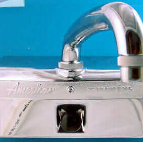
Decisions decisions. I think you could get one sample of each — and in place, see how they look. I tend to think the rubbed bronze doesn’t match your coppertone hinges anyway… and I don’t think darker is the way to go. I tend to think that polished chrome is what will work; and just leave the hinges you have in place – they are close to the color of the wood and kind of blend in. I don’t mind that they don’t match exactly. There is chrome elsewhere in the kitchen that the knobs “relate” to — your faucet, the hudee rings, parts of the stove, on your fridge (I presume). I like the brightness the chrome brings to the space…. Also, note that Rejuv has other shapes and sizes of the backplate-pull combo — really, your choice!
pam kueber says
You can also go onto ebay to look for vintage wallpaper that would work. If you do just the back wall of the dinette area, I can’t imagine you’d need much. Then… continue the “field” color of the wallpaper through the rest of the kitchen. That would be my first instinct. See what Hannah has — go to third carousel in this story, click in to get at all her listings https://retrorenovation.com/2012/06/20/metallic-wallpaper-gorgeous-fragments-by-jud-scott-hannahs-treasures/