

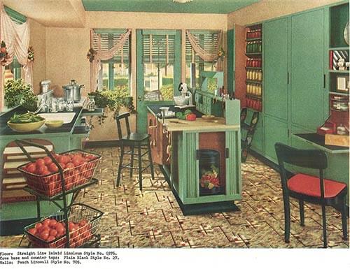
 We know that many of our readers love 1940s decor. To be sure, there’s a lot to like! For example, this 1940s kitchen — with its lovely green cabinetry, bits of red scattered about the room and that fantastic linoleum floor — is just calling me to come inside and spend an afternoon baking pies. For some, creating these kinds of rooms is easy — others may need a little help, especially if the room they start out with is less than ideal. Luckily this week’s vintage catalog provides lots of ideas and inspiration. The catalog was directed by Hazel Dell Brown — an amazing historical figure, the longtime queen of interior design at Armstrong.
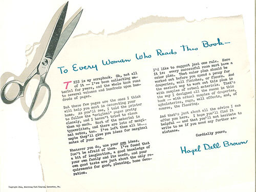 This vintage catalog is formatted to feel like a scrap book of ideas that Hazel Dell Brown has collected over time. She has “hand written notes” scrawled in the margins and little sketches here and there to illustrate her ideas. What a charming format for what is basically an Armstrong linoleum sales brochure.
 Linoleum floors were common in 1940s decor

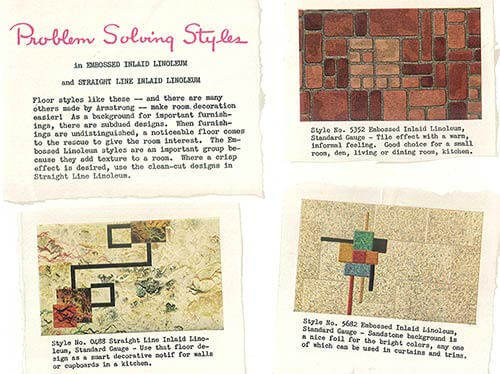
The catalog contains several ideas specific to linoleum patterns — which were super common in 1940s decor. Hazel points out that this flooring can come to the rescue when a room’s furnishings are undistinguished. Remember, in 1944, we were at war. Materials were scarce. From the sounds of this catalog, folks were making do with the furniture they had and adding spiff around the edges.
 The catalog also shows different ways that linoleum can be used — including on kitchen counter tops. Today, we hear often from readers who find remnants of vintage flooring in closets and at the bottom of cabinets.
Precautionary Pam notes: I also want to relate that in her book “Linoleum”, Jane Powell says that while linoleum is known today for its use of renewable resources (cork, linseed oil, namely), heavy metals such as lead may have been used in the manufacturer of old linoleum. So — Precautionary Pam repeats: Be sure to test the materials in your old houses for vintage nastiness like lead, asbestos and more — get with your own properly licensed professional to determine what’s in your house and its layers, so that you can make informed decisions about how to handle. Be Safe / Renovate Safe.
 But now on to the meat of the catalog — the decorating ideas. Today, some of these decorating ideas may seem… over the top. But remember, this was war-time. Homemakers likely only had paint, fabric and — yes, flooring — to spice up their interiors. Look at ‘most any magazine of 1940s decor aimed at the middle class, and the ladies were painting and stenciling and embroidering and slipcovering. There was a lot of applied embellishment. You made do.

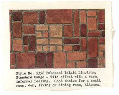 And here’s another example of the Pennsylvania Dutch style — shown with a brick patterned linoleum floor that amplifies the warmth from the fireplace across the entire room. Oh, how we wish we could get this floor — and even more so, the famous #5352 — today.
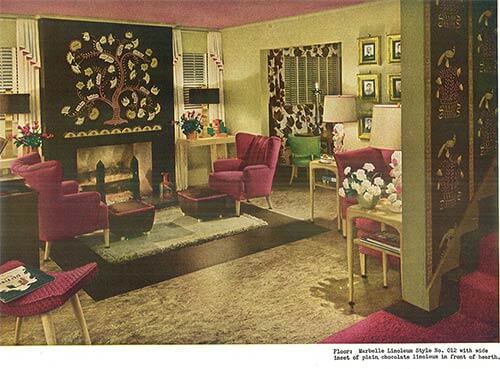 The use of warm and rich colors in this space — combined with the symmetrical arrangement of furniture — make for a calm, cozy and inviting living area. Of particular note — the way that linoleum inlays were used in conjunction with a small area rug to visually create one larger area rug. Using a small cloth rug with a less expensive linoleum floor inlay underneath is a smart way to “have a bigger rug” without the added expense.
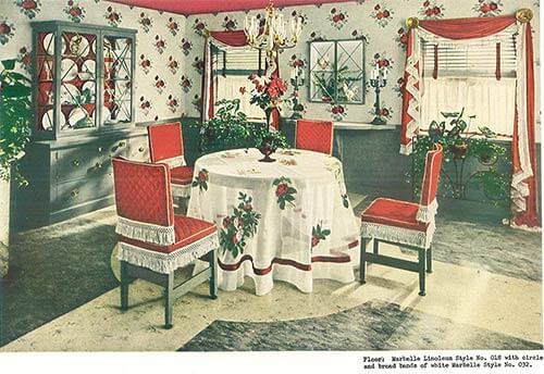 This example of a linoleum inlay works with the design and furniture layout of the room. We instantly know that the focal point of the room is the dining table and chairs — because it is in the center of the room and has been “pointed to” with the linoleum inlaid floor. It is only after we have taken in the table that our eyes wander to the red draperies, the pie cabinet and yes — the red ceiling. This room is so 1940s decorating style. It makes me want to paint a ceiling a bright color. What a fun idea.
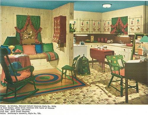
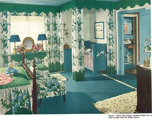 Here, Hazel cleverly uses curtains to add a space in the master bedroom for the new baby. Once again, notice the repetition of the scalloped shapes in the valance, on the curtains and the table skirt. One of the key elements of design is repetition, and Hazel shows us how.
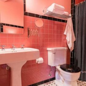
Four 1940s bathroom designs
 The bathroom above is my personal favorite from the catalog. The die cut rosettes and scalloped design that are inlaid into the floor are so sweet — to me, the epitome of 1940s decor. Notice how both the flowers and the scallops are repeated throughout the room — making for a cohesive and feminine space. There is an Armstrong linoleum product on the wall — “Linowall” — too.
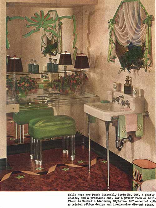 The star and ribbon inlay in this bathroom’s linoleum floor is so much fun — it is also interesting to note that the mirror seems to have been painted with a ribbon to coordinate. And, check out the vanity — is the counter simply made of layers of glass?
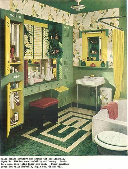 This sunny bathroom has a space for everyone — gym locker style — but is made to feel like home with thoughtful decoration, cheery colors, hanging greenery around the window and personalized names to label each family member’s individual space.
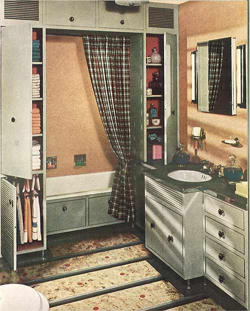 Here’s another thoughtful bathroom, packed with storage — notice how the tub is pretty much “built in” to the storage in front of it. This actually seems like a pretty darn good idea.
Two 1940s studio apartment designs
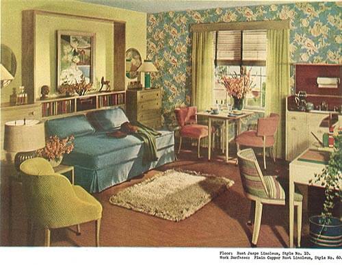 Look at all the function that is packed into this well designed and decorated space. This design — which is an extra bedroom the homeowner wanted to rent to generate extra income — made a room for rent into a one room apartment instead. A day bed — used for seating or sleeping — eating area, kitchenette, and office space as well as room for storage. With this design, Hazel teaches us that good design can add value. Awesome wallpaper accent wall, Hazel! And, the medium blue paired with chartreuse and just a touch of rose — gorgeous. This is a lovely, lovely room.
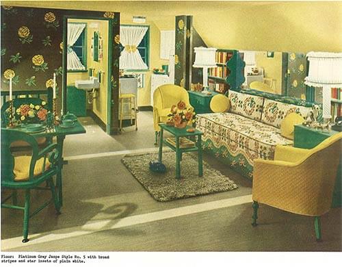 This last room is yet another example of remodeling a single space into a room that serves many purposes. This example is described as an unused attic space that was converted into a livable one room apartment — complete with bathroom and kitchen. You hardly notice the sloped ceiling due to a masterful visual trick — using a dark and bold wallpaper to accent the straight and tall walls at the end of the room — and painting the slanted portion of the ceiling a light-reflecting cheery yellow. Keeping the color scheme simple also unifies the various functional spaces and makes the room feel larger than it is.
To see all of Hazel Dell Brown’s thoughtful decorating solutions to common problems, view the slideshow below.
Special thanks to MBJ Collection and archive.org for making this vintage catalog available via Creative Commons license.
Tips to view slide show: Click on first image… it will enlarge and you can also read my captions… move forward or back via arrows below the photo… you can start or stop at any image:?


Pat says
And here I thought that lovely green color was mostly from the 30’s, guess it was popular a long time! I want that 2 tier basket!!
I have never seen this many photos of the 40’s decor, love it! The 30’s and 40’s have always been my favorite era for colors and decorating. My kitchen is full of red and blue prints, so fun!
Sorry, Diane in CO, but these photos DO make me want to go back and I didn’t see any colonial stuff. Now, just watch some Bewitched reruns and you will see colonial !
Diane in CO says
Perhaps I should have said Colonial Revival. To me, the braided or hooked rugs, rockers, ruffled pillows and curtains, candlesticks, fireplace treatment (in the photo w/ the blue Pennsylvania Dutch cabinets), 4-poster bed, and flowery wallpaper are CR influences – I could be wrong, but that is what I was referring to. It’s especially evident in the second photo with the blue cabinets.
I’m with you, I love the 30’s and ’40’s. 🙂
Diane in CO says
Love love love the Deco — thank you Pam! Linoleum is wonderful! But I have to say, the window treatments are especially h****** [edited] in most of these pictures.
I’m not into the “colonial stuff!” But it did come into vogue in the ’40’s.
Actually these images are a good reminder that we don’t want to “go back” — just borrow a bit, skim the cream off the top, eh?
pam kueber says
I love these images – they are chock full of inspiration.
Annie B. says
It’s the “Mr. Blandings Dream House” look.
Diane in CO says
Annie B., I love this movie too. This is a great website with tons of photos from the film and stories about the making of it. RKO Studios actually built that house – and 73 other replicas around the US which were raffled off to promote the film, according to this blog.
http://hookedonhouses.net/2009/11/15/mr-blandings-builds-his-dream-house/
There’s also a photo of how that house looks today – you wouldn’t recognize it. 🙁
Annie B. says
Isn’t this fantastic, Diane! In fact, I want to say that there was a recent post or comments on the movie house and its replicas. I’ll have to look this up.
One last note on this wonderful decor: over the weekend, I combed through old family photos and found one of Yours Truly smashing a doll into the top of a baby scale just like the one in the first bath photo.
(Must’ve been ’53 or ’54.) What a hoot.
nina462 says
We call it “Cooolonial” –
pam kueber says
Yes, we do!
Greeney says
I agree. I have not been a fan of the Colonial style, either. I did not realize before that they had it in the 40s. I remember it well from the 60s and 70s. I love all 20s, 30s, 40s styles, though, other than that one. My favorite house style , ironically,is the traditional Colonial with the centre hallway and French doors, but my decorating style is more Art Deco.
Jay says
True Colonial Revival started as a movement in the 20s when Rockefeller aided in the restoration of Colonial Williamsburg. It became fashionable for wealthy industrialists to construct and furnish homes in the style. DuPont made a hobby of collecting actual rooms to reconstruct in his Delaware home. This formal style carried over into the 40s and 50s when it filtered down to the middle class as a more relaxed style and morphed into 60s Early American and then into “Country”. It was popularized by Hollywood a la Philadelphia Story and Mr. Blandings builds his Dream House
The interiors in this brochure are inspirational for the era, great colors and flooring.
pam kueber says
I got two words for ya: Wallace Nutting.
Lorraine says
I love Wallace Nuttings photos! I picked one up recently at a yard sale for .50cents
tammyCA says
Nifty scrapbook. The 1940s is my favorite era, but I love so much anywhere from the ’20s to the early ’60s. They just weren’t afraid of color or pattern back then & there was so much to choose from, unlike today.
Love those plum colored chairs in front of the fireplace and I recently dragged home a green vinyl chair (only $5.99) like the one in the same picture. Need to reupholster since the cool vinyl torn but hope to make it plush & pretty.
Shannon says
I am overwhelmed by how wonderful this book is! It is giving me some great ideas not just about flooring but with room arrangements. Fabulous! Thanks so much for posting these 🙂
pam kueber says
You’re welcome!!!
Andrea says
I love the bathinette! My mom talks about her grandmother giving her little brothers baths in one.
Diane in CO says
OMG, you’re making me feel REALLY old…. your mother’s grandmother? Bathinettes were standard equipment in the 1950’s; I remember them. 🙂
lynda says
Yes, I remember my mom using one for my sister. We had it in the kitchen since our bathroom was not big enough. I think we filled it with a pitcher and drained it with a tube in the sink. It may have folded when not in use. I remember having one for my doll too. We had a baby scale too. Must have been standard baby equipment at the time. Interesting, if you type in baby bathinette on Goggle, they are still for sale, new! I found vintage doll bathinettes on the net too.
Cy says
We had one that I remember we were still using when my baby brother was born in 1966. It had already been through six kids. I was talking about it at a baby shower not long ago and no one knew what I was talking about!
These pics are awesome!
Sandra says
I always wonder if these represent the real colors, or whether it was really just the state of printing technology at the time, like early color TV, it was mostly that they only had the primary and secondary colors to work with.
pam kueber says
I’m pretty sure they were able to print with lots of colors… I think these were the colors truly in vogue. Hazel Dell Brown was very very inventive.
Janet in CT says
I am curious if anyone has found any remnants or walls of the “linowall” still remaining in a house. I would guess other than maybe in closets that almost all of it is long gone and replaced by now.
Scott says
The artistic eye floor installers had during the 1940s and 1950s never ceases to amaze me.
Annie B. says
There are more views of #5352 and its other great color combinations in Pam’s post of January 3, 2008. I’d forgotten it came in green – avocado, of course.
Libby says
I just discovered Style No. 5651 linoleum (from the above post) in my father’s crawl space in his 1940’s Cape Cod. I may have squealed 😉