

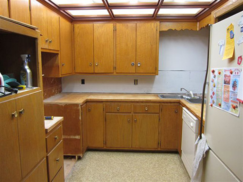
 Reader Rebecca’s 1963 kitchen is in need of some TLC. She already has come up with a great solution to swap a wall oven with a full size stove — which she documented on her blog, The Vintage Life. But now she’s stuck. Rebecca will use Formica aqua boomerang laminate on the counter tops… she has picked out a mosaic tile back splash… and she’s decided on a wall color. Her final dilemma: What color to paint or refinish the faded chippy wood kitchen cabinets?
 Rebecca writes:
We are redoing our 1963 kitchen and have decided on an aqua, orange and white palate. We are keeping the current cabinets and my dilemma is what color should the cabinets be. We are considering using the Rust-Oleum Cabinet Transformation product but I am stuck as to what color. Our thinking was that the cabinets needed a “refresh”. They are leaning a little yellow and yes there is some damage in a few places. I have attached a couple pics I put together from the Sherman Williams Color Visualizer. [Editor’s note – we did not show these photos – but we made our own, below.] They are crude but give a little bit of a vision of what it could be. One picture is with the cabinets in a darker color and one picture is with the cabinets staying as they are. We thought the painting of the cabinets at least in a darker color really made the other colors pop a little more. So that is what we were thinking. It would be easier to leave them alone but I really think we need to do something with them. We are open to your suggestions.
The counter tops are going to be the Formica aqua boomerang that we bought before they discontinued it.
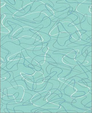
The back splash is going to be glass mosaic tile from Mosaic Tile Supplies. I used their tile maximizer to create my own blend of white at 70% then aqua and orange at 15% each. Here is a link to their site. Colors we chose are Snow white – KA077, Pumpkin – KD101 and Rochester – KB009. If you haven’t played with it before it is really fun.
We have an aqua oven and I was thinking of putting some of the Formica in the front of the dishwasher like the gal did with her Betty Crocker cookbook cover. We are looking at doing a cork floor in perhaps a lighter cork color. Any painted wall space will be in the Holiday Turquoise from Sherman Williams.
With all this in mind, what is your suggestion on the color of the cabinets?
Thank you for helping me get unstuck!!

5 ideas to repaint or refinish these old wood kitchen cabinets
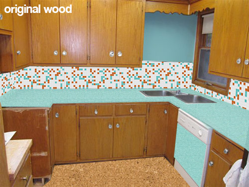 This first mock up (above) shows what Rebecca’s kitchen would look like with her new counter top, backsplash, flooring and paint choices while keeping the wood cabinets the same color they are now. While I personally like the current look of the natural wood cabinets — I understand her need to paint them — since my kitchen cabinets — which were a similar color and construction — were also heavily chipped and damaged. Using about a gallon of wood putty, several coats of primer and a fresh coating of paint really helped my kitchen feel cleaner and removed the “rough around the edges” feeling. If you want to replicate the look of the natural wood, yes, Rust-Oleum Cabinet Transformations might be great — you can add just enough glaze (maybe further diluted) at the end to bring out the natural grain after the painting.
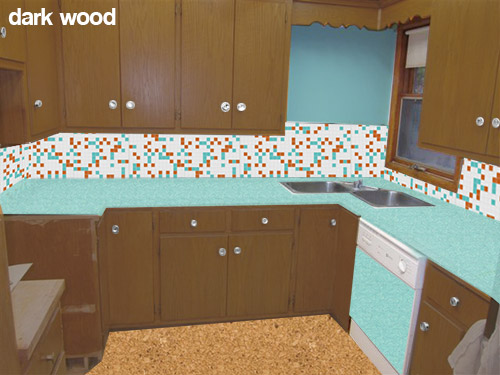 Rebecca also is considering painting her cabinets a darker wood toned color like the mock up above. While I like the idea of keeping a wood like finish on the cabinets — this darker color in combination with the other choices — makes me think of the 1970s more than the 1960s. This is fine if that is the look that Rebecca is going for, or if she likes this look — but I was under the impression that she is wanting a more late 50s early 60s look.
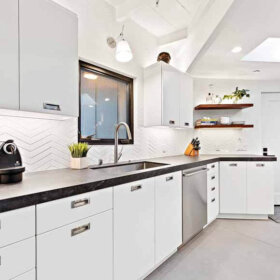
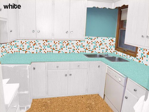 My initial thought — if the original wood tone cannot be preserved — was to paint all of the cabinets white. This will help the dishwasher be less obvious — though I would not use the laminate panel in this case. The all-over white will also substantially lighten and brighten the space and really let the fabulous aqua boomerang countertops, aqua appliances and mosaic tile backsplash take center stage. Because of the warm cork flooring it and other color on the walls — the space will not feel too sterile.
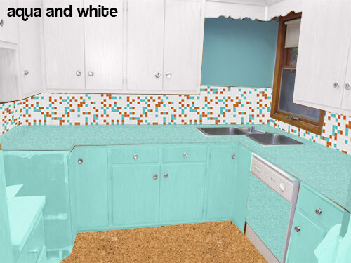 Pam suggested trying the mock up above — instead of painting all the cabinets white — paint the bottom cabinets aqua.
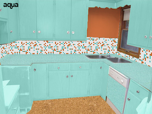 Or even going as far as to paint all the cabinets aqua (like the above mock up) and making the wall orange to match the tile?
Readers — what do you think that Rebecca should do with her cabinets?


seattle_sweetheart says
I would definitely paint those cabinets. From my own experience, those old cabinets with a varnish finish are hard to clean and it’s even harder to make them LOOK clean. I would pull the darker aqua/teal color from the design in the Formica and use that for the base cabinets to anchor the cabs under that beautiful aqua countertop. Then I would use a softer white or even a very pale orange tint for the upper cabs. The colors remain consistent with the original plan while adding a little more depth to the overall design.
Christie says
So curious what she did! Is there an update somewhere?
Here’s what I like … keep the original cabinets. The color reads “orange” which goes with her color scheme. The turquoise stove, counters, and tile accents pop with the original cabinets.
Peter says
That’s crazy talk. I would totally keep the wood cabinets and just replace the hardware. Then I would paint the walls a color that compliments the wood, like avacodo or a light blue (think franciscan starburst).
Jamie Majeske says
I would suggest allowing the turquoise oven/range (!!) and the countertops to “pop” in the room so I would stay away from those colors for wall or cabinet paint. I would contemplate a deeper (?burnt orange) lower cabinet color to play with the pumkin; and a milky white upper cabinet in order to tie it all together.
The empty area near the sink says “missing window” to me so I would consider making a mock window using mirror and framing it to match the existing window and bounce light into the room.
And I concur, the dropped ceiling would have to be immediately excused, in order to open it up with some delightful vintage lighting overhead.
I have a serious case of appliance envy!
Joe Felice says
I tend not to like the monochromatic look, no matter the color. And I love aqua. Is orange out on the cabinets? Would it be too bright? I like the idea of shelves in the corner above the sink. BTW, I love the corner sink!
Pat says
I would never paint nice wood cabinets, I would just refurbish them. Now, if they’re made out of plywood, go ahead and paint!
Patsi says
If it were our home, I would:
1) put in a lighter, brighter flooring and forget about the cork. If there’s something already there that could be painted or whitewashed or colorwashed, that would even be great. It looks like a small space, and lots of browntones so it needs some brightening up.
2) the tile backsplash being considered doesn’t seem to compliment the boomerang countertop; it’s very busy and the ‘squares’ fight the boomerangs. Doesn’t go well. Why not let the countertop be the highlight and use paint on the walls to keep it simple; i.e., paint color to match the countertop color. In a small space, simple feels more spacious.
3) if cabinet-painting is being considered, why not choose a color that works with the countertop; i.e., something like a white, or even pale yellow.
4) removing that dropped ceiling would also open up the area, and adding a simple ceiling fixture would lighten up and brighten up the kitchen.
It’s a small space to try to do too much, and the 3-colors, the tiles, and the countertop seem to be trying to do too much. And too much that doesn’t go together. I’d open it up with a lighter color flooring; brighten it up with using two main colors (turquoise/aqua and white, or turquoise/aqua and pale yellow) and the counter as the focal point; and would enlarge the appearance of the area by taking down that ceiling and adding a nice simple lighting fixture.
Have fun with your project!
Kelley says
What a cute kitchen! Loving the white cabinets. Looks like they do brighten the space, make the dishwasher blend right in without the added panel, and let the aqua range, countertops, and backsplash stand out. I’d also make the bit of wall space by the window white or take the tile all the way up as others have suggested – there’s not a lot of wall there and when it’s rendered differently than the cabinet color or backsplash tile it seems like it’s distracting the eye and taking attention away from the other inherent focal points. I guess what I’m trying to say is that it seems like if everything in the space is special, nothing will stand out as special – so I’d create a solid, quiet backdrop to the inherently interesting and colorful items in the space: range, countertops, backsplash. Also agree with previous comments that a darker color on the floor would work better, provided the lighter color wasn’t chosen to tone in with wood floors in adjacent rooms and create better whole house flow.
Pam from Nashville says
I would carry the tile all the way up the wall. I like the wood I think, followed by the all white. I might do white bottoms first & see if it looks good with the wood uppers! I think I might actually like that the best! I love the kitchen though. I’m sure that what u will choose will be great!
Guy H. says
It is a beautiful kitchen and I wish you well, whatever you decide!
I had a similar scenario in my home. The cabinets were damaged by smoke and needed to be refinished. My stove was close to your color as well (mine is turquoise).
I painted the kitchen light grey and the cabinets a darker grey. I got matching paint and painted my refrigerator and dishwasher turquoise. With the grey cabinets and walls, the appliances really stand out and look beautiful!
http://twitter.yfrog.com/h0vmluzj
All of the choices mentioned in the article look great! Anxious to see what it looks like when it is restored!