

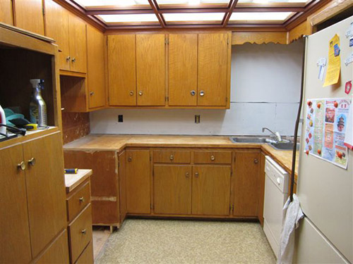
 Reader Rebecca’s 1963 kitchen is in need of some TLC. She already has come up with a great solution to swap a wall oven with a full size stove — which she documented on her blog, The Vintage Life. But now she’s stuck. Rebecca will use Formica aqua boomerang laminate on the counter tops… she has picked out a mosaic tile back splash… and she’s decided on a wall color. Her final dilemma: What color to paint or refinish the faded chippy wood kitchen cabinets?
 Rebecca writes:
We are redoing our 1963 kitchen and have decided on an aqua, orange and white palate. We are keeping the current cabinets and my dilemma is what color should the cabinets be. We are considering using the Rust-Oleum Cabinet Transformation product but I am stuck as to what color. Our thinking was that the cabinets needed a “refresh”. They are leaning a little yellow and yes there is some damage in a few places. I have attached a couple pics I put together from the Sherman Williams Color Visualizer. [Editor’s note – we did not show these photos – but we made our own, below.] They are crude but give a little bit of a vision of what it could be. One picture is with the cabinets in a darker color and one picture is with the cabinets staying as they are. We thought the painting of the cabinets at least in a darker color really made the other colors pop a little more. So that is what we were thinking. It would be easier to leave them alone but I really think we need to do something with them. We are open to your suggestions.
The counter tops are going to be the Formica aqua boomerang that we bought before they discontinued it.
The back splash is going to be glass mosaic tile from Mosaic Tile Supplies. I used their tile maximizer to create my own blend of white at 70% then aqua and orange at 15% each. Here is a link to their site. Colors we chose are Snow white – KA077, Pumpkin – KD101 and Rochester – KB009. If you haven’t played with it before it is really fun.
We have an aqua oven and I was thinking of putting some of the Formica in the front of the dishwasher like the gal did with her Betty Crocker cookbook cover. We are looking at doing a cork floor in perhaps a lighter cork color. Any painted wall space will be in the Holiday Turquoise from Sherman Williams.
With all this in mind, what is your suggestion on the color of the cabinets?
Thank you for helping me get unstuck!!

5 ideas to repaint or refinish these old wood kitchen cabinets
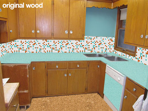 This first mock up (above) shows what Rebecca’s kitchen would look like with her new counter top, backsplash, flooring and paint choices while keeping the wood cabinets the same color they are now. While I personally like the current look of the natural wood cabinets — I understand her need to paint them — since my kitchen cabinets — which were a similar color and construction — were also heavily chipped and damaged. Using about a gallon of wood putty, several coats of primer and a fresh coating of paint really helped my kitchen feel cleaner and removed the “rough around the edges” feeling. If you want to replicate the look of the natural wood, yes, Rust-Oleum Cabinet Transformations might be great — you can add just enough glaze (maybe further diluted) at the end to bring out the natural grain after the painting.
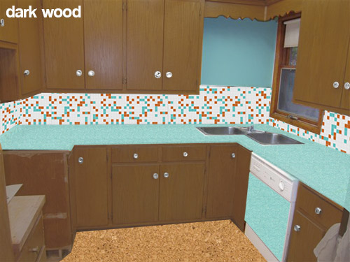 Rebecca also is considering painting her cabinets a darker wood toned color like the mock up above. While I like the idea of keeping a wood like finish on the cabinets — this darker color in combination with the other choices — makes me think of the 1970s more than the 1960s. This is fine if that is the look that Rebecca is going for, or if she likes this look — but I was under the impression that she is wanting a more late 50s early 60s look.
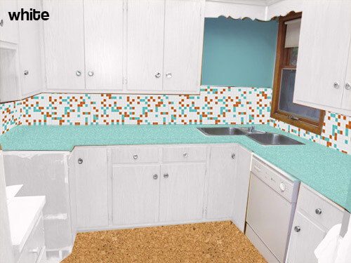 My initial thought — if the original wood tone cannot be preserved — was to paint all of the cabinets white. This will help the dishwasher be less obvious — though I would not use the laminate panel in this case. The all-over white will also substantially lighten and brighten the space and really let the fabulous aqua boomerang countertops, aqua appliances and mosaic tile backsplash take center stage. Because of the warm cork flooring it and other color on the walls — the space will not feel too sterile.
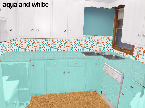 Pam suggested trying the mock up above — instead of painting all the cabinets white — paint the bottom cabinets aqua.
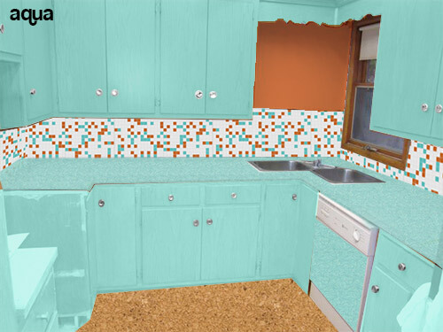 Or even going as far as to paint all the cabinets aqua (like the above mock up) and making the wall orange to match the tile?
Readers — what do you think that Rebecca should do with her cabinets?


Sarah says
I just put in some salvaged cupboards that look just like yours. Some were indeed rough around the edges, but I used some super fine steel wool and Restore-a-finish oil and wax and they look about a million times better. You might want to try that out before painting.
Good luck!
Scott says
I think the first option looks the most authentic. The richness of the Boomerang Aqua Formica and your gorgeous Aqua stove will really make the original honey-colored wood sing. If the wood is a little dull in spots like mine you’d be amazed what a good cleaning and light refresh with some Howard’s will do for it.
The only two little tweaks I’d make if it were mine:
Take that handsome tile all the way up the corner wall over the sink and suspend a snappy little accent light fixture there or even a hanging plant…
…and then possibly consider a more lively floor option, that would pull out one or more of your tile colors, especially the aqua. I think the wood and the cork both will look a tad dull.
Can’t wait to see how it comes out!
Amy Richcreek says
Love the color palette, but with such strong statements there needs to be balance. Stay with the original wood – you have cabinets custom made on-site! Painting them would be a sin! Pull the cabinet doors, and go through the agony of refinishing yourself. Or splurge and have the doors professionally dipped and refinished, and do the styles yourself.
Take a step back and look at all the options pictured – which cabinetry image balanced and pleasing to the eye? Which renovation would be a timeless investment? And – God forbid – life circumstances change and you suddenly have to sell, which renovation investment would pay off best in resale value, or be least costly to re-market? If you sunk your money only into orange/blue/white, you might be happy for a few years, then looking at another costly re-do, or marketing the home to the Miami Dolphins. Too much of a good thing is not a good thing.
Sharon says
Don’t paint the cabinets they were designed to be natural wood for that decade so stay true to that. Painting them sends the look to a more cottage style. Refinish them and you will be surprised how doing this will brighten the natural wood. There’s years of dirt and discoloration making them look so tired. Also I think the stark white in the tile is too severe and maybe go for a warmer white and it will compliment the wood tone better. Sorry to add another opinion to the list.
Christa says
I would suggest if you do go for refinishing, that you try a liquid shellac remover prior to/instead of sanding. If the cabinets are plywood, you can sand right through the veneer!
Christa says
Cute kitchen, love the tile and counters! I agree that the cork floors could be a bit darker – I think the darker is called Cocoa or Tobacco. I like the cabinet sample pic shown with aqua lower cabinets and white uppers the best of all the samples shown.
If it were my kitchen I would want a quieter tone for the cabinets, a soft pale tone that lands somewhere between aqua and nuetral/soft white. Something like Farrow and Ball Light Blue.
stacy says
Maybe white cabinets on top and original finish on the bottom to balance the colors?
susan says
Sand and a clear sealer is best, BUT if you MUST paint, consider cream instead of white. Something like the color of vanilla ice cream.
Helen says
Wow! So many suggestions! I think the white on the cabinets complements the Formica the best and also ties in the white dishwasher. It also will help the room feel bigger especially as it has only one small window. I’d use a gray on the floor to go with the awesome cabinet knobs and the gray in the Formica. Armstrong makes great, inexpensive retro looking tile (not the stick on kind) that can be custom ordered in lots of colors. You could even get a few orange tiles and cut them in half to outline the floor. Love, love, love the turquoise stove! I’d only be tempted to swap the orange for a more 50s coral, but it ain’t my house! Good luck! Looking forward to seeing the transformation!
JKaye says
Hi Rebecca. Thanks for sharing your cool kitchen. I love the ceiling. I like the wood look, but, is there a way you could make them look lighter, for a Danish modern look? If you go to the Kitchens tab at the top of the page, then go to Cabinets, there is a 1958 Sears catalog featured that has some cabinets in it called Limed Oak. Maybe there is a liming treatment that could be done on the cabinets that would leave the wood grain but make the cabinets look lighter.
Also, those two cabinets on the back wall seem to overpower the room at the moment. Maybe you could get glass doors for them, or, take off the doors completely and have an open shelving look. You could paint the inside of the cabinets coral or aqua, and display pretty dishes and things in them like some Fiestaware.
Please share the finished results!
pam kueber says
GREAT idea to add glass to the cabinets on the back wall (the wall with the opening next to the sink everyone’s also been discussing). If so, should Rebecca also paint the insides of these “display” cabinets. What color, given her palette?
TLP says
The open area by the sink needs a clock, there is plenty of cabinet space. I would leave the cabinets since the countertop and tile will make the kitchen busy enough. We painted over the peach colored paint the previous owners of our 1950s kitchen had added and wish they had really left the paint off so we could just strip and reseal them. Good luck!