

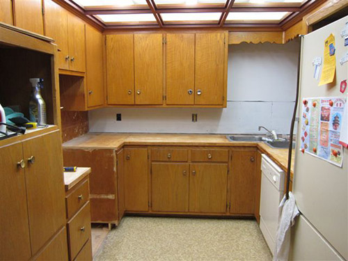
 Reader Rebecca’s 1963 kitchen is in need of some TLC. She already has come up with a great solution to swap a wall oven with a full size stove — which she documented on her blog, The Vintage Life. But now she’s stuck. Rebecca will use Formica aqua boomerang laminate on the counter tops… she has picked out a mosaic tile back splash… and she’s decided on a wall color. Her final dilemma: What color to paint or refinish the faded chippy wood kitchen cabinets?
 Rebecca writes:
We are redoing our 1963 kitchen and have decided on an aqua, orange and white palate. We are keeping the current cabinets and my dilemma is what color should the cabinets be. We are considering using the Rust-Oleum Cabinet Transformation product but I am stuck as to what color. Our thinking was that the cabinets needed a “refresh”. They are leaning a little yellow and yes there is some damage in a few places. I have attached a couple pics I put together from the Sherman Williams Color Visualizer. [Editor’s note – we did not show these photos – but we made our own, below.] They are crude but give a little bit of a vision of what it could be. One picture is with the cabinets in a darker color and one picture is with the cabinets staying as they are. We thought the painting of the cabinets at least in a darker color really made the other colors pop a little more. So that is what we were thinking. It would be easier to leave them alone but I really think we need to do something with them. We are open to your suggestions.
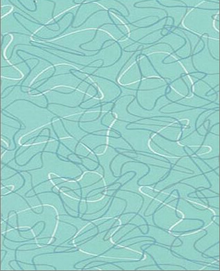
The counter tops are going to be the Formica aqua boomerang that we bought before they discontinued it.
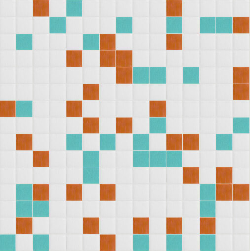
The back splash is going to be glass mosaic tile from Mosaic Tile Supplies. I used their tile maximizer to create my own blend of white at 70% then aqua and orange at 15% each. Here is a link to their site. Colors we chose are Snow white – KA077, Pumpkin – KD101 and Rochester – KB009. If you haven’t played with it before it is really fun.
We have an aqua oven and I was thinking of putting some of the Formica in the front of the dishwasher like the gal did with her Betty Crocker cookbook cover. We are looking at doing a cork floor in perhaps a lighter cork color. Any painted wall space will be in the Holiday Turquoise from Sherman Williams.
With all this in mind, what is your suggestion on the color of the cabinets?
Thank you for helping me get unstuck!!
5 ideas to repaint or refinish these old wood kitchen cabinets
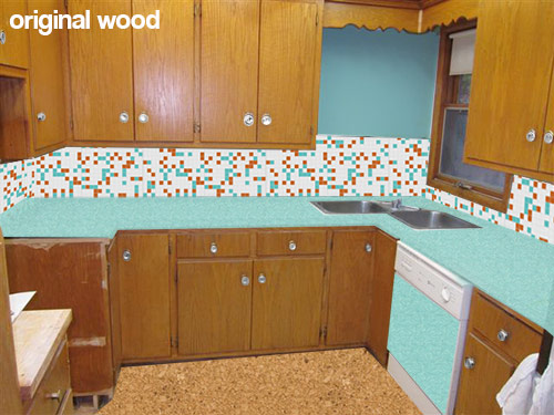 This first mock up (above) shows what Rebecca’s kitchen would look like with her new counter top, backsplash, flooring and paint choices while keeping the wood cabinets the same color they are now. While I personally like the current look of the natural wood cabinets — I understand her need to paint them — since my kitchen cabinets — which were a similar color and construction — were also heavily chipped and damaged. Using about a gallon of wood putty, several coats of primer and a fresh coating of paint really helped my kitchen feel cleaner and removed the “rough around the edges” feeling. If you want to replicate the look of the natural wood, yes, Rust-Oleum Cabinet Transformations might be great — you can add just enough glaze (maybe further diluted) at the end to bring out the natural grain after the painting.
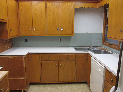
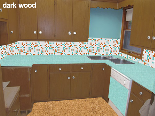 Rebecca also is considering painting her cabinets a darker wood toned color like the mock up above. While I like the idea of keeping a wood like finish on the cabinets — this darker color in combination with the other choices — makes me think of the 1970s more than the 1960s. This is fine if that is the look that Rebecca is going for, or if she likes this look — but I was under the impression that she is wanting a more late 50s early 60s look.
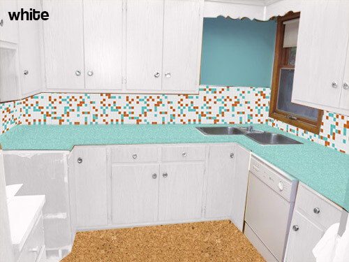 My initial thought — if the original wood tone cannot be preserved — was to paint all of the cabinets white. This will help the dishwasher be less obvious — though I would not use the laminate panel in this case. The all-over white will also substantially lighten and brighten the space and really let the fabulous aqua boomerang countertops, aqua appliances and mosaic tile backsplash take center stage. Because of the warm cork flooring it and other color on the walls — the space will not feel too sterile.
 Pam suggested trying the mock up above — instead of painting all the cabinets white — paint the bottom cabinets aqua.
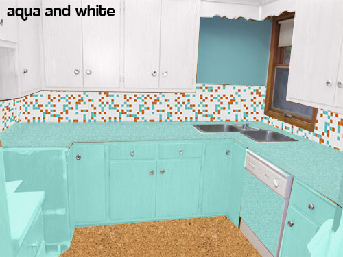
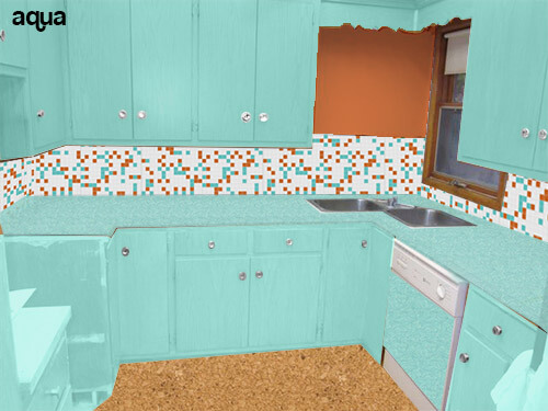 Or even going as far as to paint all the cabinets aqua (like the above mock up) and making the wall orange to match the tile?
Readers — what do you think that Rebecca should do with her cabinets?


Lena_P says
A little late to the party here, but I have a slightly different take that I don’t *think* has quite been put out there yet. If someone has put this suggestion out there, sorry I missed it! Great minds think alike, right? 😉
How would it look to go with the all white kitchen, but paint the outside of the cabinet frames and the fascia thingy orange? The inside of the cabinet boxes and the fronts would be completely, crisply white, with the orange delineating them and giving the kitchen a greater contrast. Your kitchen isn’t really small, but it does feel very enclosed and almost closet like, so outlining your cabinets would give definition to the space and expand it visually. It would also create a third “warm” point, along with the orange tile and cork floor, coordinating those elements.
I do love your choice of colors, though! The dynamically paired accent colors grounded with neutral fields really make a room more energizing to be in, which I love to see in kitchens especially! I need as much energy as I can get to tackle dirty dishes!
Marianne says
All white cabinets, absolutely. The aqua cabinets conflict with the wall color, the oven, the formica. Too much!!
I would go for a lacquer paint, though, something glossy.
I would remove the doors, and spray paint — otherwise risk seeing the brush strokes.
**Maybe take the doors to a body shop, and have THEM spray paint them with an industrial type glossy paint?
is it too much out of the budget to Replace the doors, with a white laminate? I hate to say it, but like the Ikea doors?
as for the cork floors: for that retro look, i would get a nifty linoleum. It would brighten the room …. and the kitchen is last place you want cork. try mopping cork — a nightmare!
Best of luck!
Paulie says
I sincerely hope my comment came across in the fun, helpful & educational spirit I meant it in. I applaud you redoing your kitchen!!!! Good luck guys, you can do it!!
Paulie says
OMG don’t paint them! BUT if you HAVE to then here’s some color theory advice.
NOT being condescending. I’m writing this so everyone can understand it.
Complimentary colors
red—>green
Yellow—> lavender
In this case
Orange—–> blue
(The opposite color on the color wheel)
Now the colors on the left I mentioned are warmer colors and appear “closer” or “lighter” to you.
Now the colors on the right are “cooler” colors and appear “further” away or appear “heavier”.
This is why the lighter cork floor doesn’t work. It appears “lighter” than the “heavier” blue. Heavy is heavy, it goes on bottom.
(This is also ((if i may be so bold to assume)) why Pam suggest blue on bottom only.) it appears heavier.
So now you know about heavy and lighter colors. You can make sense of where that idea would naturally work in an area. So on to complimentary.
If blue is your main color. Then it needs a balanced secondary color. In this case it’s some variation of orange. (Like the orangey glow of your wood cabinets already!!) Use that!! Neutrals are just that….neutral. Ugh. Neutrals should only serve to draw your eye onto an area of color! Neutrals are NOT a “pop” color and are not an accent color!
Neutrals are;
Black. (Heavier/cooler/receding)
White, (lighter/warmer/advancing)
Grey, (grey is mixing white and black)
Brown. (Brown is when you mix 2 complimentary colors)
So by painting so much white in there. Yeah it looks clean but it also draws your eyes right to something else. Like that dishwasher or that floor texture or the sink full of dishes. Etc. find the things you want to accent, force the eye to those places!
So in summation here. In this case here’s another opinion.
LEAVE THE WOOD! Re stain it instead. Maybe a rich light honey.
Use the blue patterned counter tops. (The pattern will break up the visual “flatness” created by big fields of honey wood) creating contrast!!!
Use a light neutral for the back splash with a darker neutral liner tile or EVEN BETTER a liner tile that has a real “POP”. By that I mean it has something that is only found there, say like a gold or pearl Inlay! (This creates texture and a focal point against the neutral. While still pushing your eyes to the overall color palette.
Create harmony with your appliances by using the same accent throughout the room. What I mean by that is, if you use chrome hardware then use chrome banding on the counter tops, and maybe a chrome accent on the dishwasher (maybe use the same banding from the counter top edging to separate a complimentary two tone color acheme for your dishwasher)……I’d use a neutral and a “POP” (like a stainless against black or white. Separated by accent used throughout)
Finally the floor should be darker or heavier UNLESS you want to push complimentary more by using say…..6×6 tiles with horizontal pattern (for texture..and make 100% sure you alternate the “grain” like a chessboard if all the tiles have a similar pattern). You could do another kind of complimentary fleck in the tiles with the main neutral (in this case the neutral should be the biggest surface area), excuse me, with the floor neutral matching the neutral from your backsplash. You could go say a neutral light grey floor with darker green pattern with a pink fleck to compliment the green!
It’d visually separate the floor from the cabinets. Make sense visually because it’d be heavier (cause the green is a darker value than the blue. With a complimentary color—-> Pink and would be unified because of the same neutral on your backsplash.
Thank you for indulging me. Good luck with whatever you choose.
pam kueber says
Paulie, normally I would heavily edit a comment like this because it questions way more of a reader’s choices than she asked for our opinion on. But I left it – since you seem to be offering a “primer” rather than specific advice. Some of it I agree with, some of it I don’t. For example, her liner tile choice DOES pop. And it works her complementary colors.
Also, I don’t agree with the generality that a floor must always be darker.
Thanks for playing! Lots of useful concepts here!
Cindy Wolford says
HOnestly she could go crazy and do orange…I just redid my metal kitchen cabinets in bright red with b&w linoleum floor, stainless steel appliances, and a stainless steel counter top. The red is SUPER awesome so I’m all for bright color! Or orange on bottom, white on top like your aqua + white pic.
susan says
Hi! What a great little kitchen. My opinion- Don’t paint! I stripped the paint off my 40’s cabinets and it was a huge improvement. My plan is to put an aqua formica counter top and full backsplash. Paint will always scratch, chip, or get dirty. My suggestion is to remove the doors and hardware, sand and seal with clear sealer in your choice of sheen. Then put your glorious aqua counter top on and viola! It will be gorgeous.
Trina says
I vote for white cabinet with a few surprises. How about painting just the edges of the doors and drawer fronts? Or maybe add some color to the backs of the drawers. Add a little flair!
As for the corner wall… tile all the way up and add narrow glass shelves. The glass shelves will work better with the window and not block the view.
Can’t wait to see what you decide!
nina462 says
I would try to refinish the original cabinets first. But if that doesn’t work, then I’d go with the white. I painted my kitchen cabinets in my old house (they were a dark wood – ala 1975). I made sure that #1) removed the doors #2) sanded the wood a bit #3) used KILZ or some other primer #4) then painted white. It took about 2 weeks to do – as I remember, I had 9 cabinets. Would’ve been faster if I didn’t have to work during the day (ha). They turned out really nice – I also had a light blue walls (not turquoise).
Pam, when you do a blog on wood kitchens – I will share my photos as well. I have original wood cabinets, handles & sparkly countertops.
Maybe an Photo Uploader is in order so we can all share?
Sara says
I really like the white. And the aqua. If you decide to paint, I’d imagine you’ll have to prime the cabinets and that will probably be white. You could always prime, then put some of the drawers back in and lean the cabinet doors up and see what you think. If it looks too boring, then go with the aqua. The great thing about paint is that you can always change it later!
Patty says
I’m wondering if the tile is going to compete with the counter?
I would consider using the Rustolean paint product and match to the original cabinet color. I think they have a nice warm feel. A lot of old kitchens used white tile with a small accent. You could even use a white subway tile.