

 Angela’s 1956 kitchen is a charmer — and today she wants our help with paint, flooring and retro decorating ideas to make it the happiest family space possible. Yes: It’s Retro Design Dilemma time — let’s hear what you think she should do with this space.

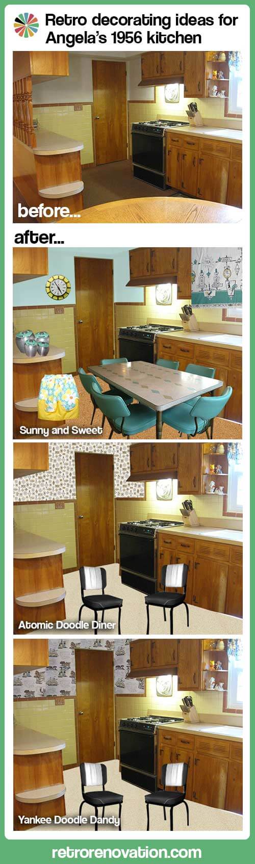
Reader Angela’s 1956 home was in original condition when she and her family bought it from the original owners in 2005. Since then, the family of five has been working to retain the original details, while putting their personal stamp on the house one room at a time. Angela kept the original tiles in the bathrooms and also wants to keep the original yellow and brown tiles in the kitchen. But, she’s looking for our help with retro decorating ideas that will make sense given this color palette. She wrote:
Hi Pam and Kate,
My name is Angela and my husband, Jim and our three sons have lived in our 1956 ranch since 2005. We lived in our “starter” home for 17 years and when we outgrew that house, we found this one. We doubled our living space and got a great deal, it was an estate sale and the previous owners never had children and did not change a thing since the house was built. It was truly a “time capsule house”. We have updated every room in the house and saved the kitchen for last because I just don’t know what to do with it! We kept the original tiles in the bathrooms, so I would like to keep the tile in the kitchen, even though I really don’t like yellow tile and brown trim, but it is in very good condition, so I can’t see ripping it all out. We are also going to keep the plywood birch cabinets. I bought a wood cleaner and they cleaned up very nicely. I had to use a wood bleach on some of the cabinets to get rid of nasty black stains that I assume are from the metal handles and water over the years. I plan on rubbing on a stain to blend in with the rest of the cabinets and then putting a coat of poly on them to protect them. As far as the copper handles and hinges, going to take them off and spray paint them black and put them back on.
Where my table is in the corner, I was thinking of getting a L shaped bench with a square table and 2 chairs on the other sides. One other thing, I will not be putting the wooden dowels on the island back up, they also match the “valance” that is across the top of my window. I would like to have a shaped wood valance like I have seen in other mid-century homes. Maybe I can find a reader who will trace an outline of theirs so my hubby can make me one!
So, here is my question, what color should I paint the top half of my walls, and what kind and color of floor should I go with? I would like a floor that is low maintenance and kid friendly..(I have two teenage boys, soon to be three!) I wanted to go with a granite counter top in a dark color, but we may just go with Formica that looks like stone because of the cost and the low maintenance.
Any advice you could give me would be greatly appreciated!
Angela
Thank you, Angela — what a happy space!
Kate’s retro decorating ideas for Angela’s kitchen — Sunny and Sweet
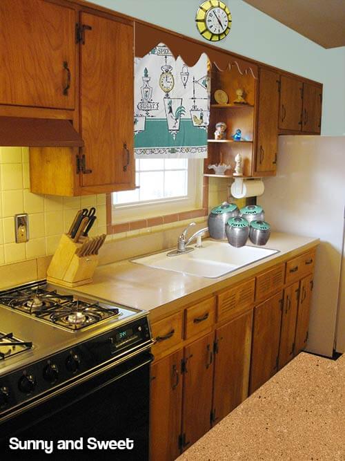 Angela mentioned that she wasn’t a fan of the spindled valance over the sink — and I agree. Substituting the spindles for one of the scallop designs available from Randall Manufacturing — from Pam’s story — Scalloped wood molding — 6 ready made designs for retro cornices — would be a great solution. Angela mentioned changing out the countertops for a dark granite or laminate that looks like dark granite. I would not recommend doing this — adding dark countertops in the kitchen will make it feel darker — and I quite like the laminate counter tops that she currently has — which look to be a beige linen pattern. If those counter tops are in acceptable condition, I would not touch them. However — there will be an issue if Angela is removing the wooden spindles from the curved section of counter top — as this removal will leave square holes in the laminate. To solve this problem — Angela could either try to carefully patch the holes with something — wood, another laminate, cork — or have just the top of that counter redone in a laminate that coordinates with the original counters. If the laminate is in bad shape — I would choose a light colored laminate style — perhaps in the light beige, white or tan family.
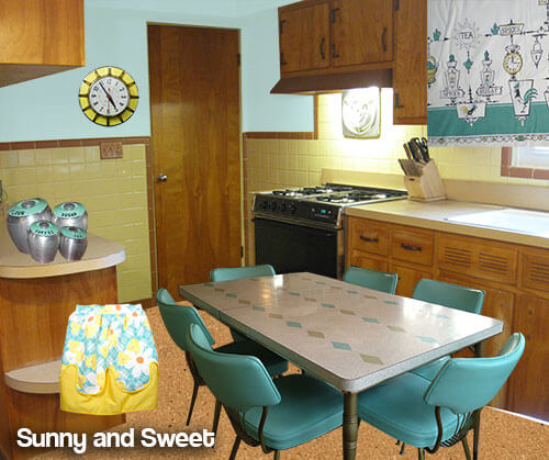 When it comes to the walls, I would make the space cheery by painting the upper part of the walls a light aqua. To tie in this new color — a rectangular dining set with a light topped table and aqua chairs like the set above — submitted from a reader in our vintage dinette uploader — would add some cheery color to the room. One of the short ends of the table could be placed up against the wall, creating a booth-like set up that would still allow for 5 chairs to be placed around the table. For the floor, a medium colored cork tile — like this natural colored cork from Home Depot (link now gone) — would not show dirt and would stand up to all the foot traffic. Then it is just a matter of bringing in some cute vintage accessories in aqua and yellow to complete the look (update: links now gone):
- Vintage turquoise aluminum Kromex Canisters from Ebay seller cat01150
- A cheery retro yellow clock like this one from Ebay seller amazingstuffllc
- A vintage 1960s Floral print apron from Ebay seller jezebeltree
- Using vintage tea towels or a table cloth, such as this vintage teal and gold patterned table cloth from Ebay seller stored_treasures would work great to make custom cafe curtains for the area around the window.
Pam’s retro decorating ideas for Angela’s kitchen — Atomic Doodle Diner
You know me, when it comes to adding color and pattern to a vintage kitchen, I am a ginormous fan of using wallpaper. And happily today, due to the dramatically increased popularity of mid century modern and modest decor, you can find an abundance retro wallpaper patterns both vintage and new — see all our stories in the Wallpaper Category.
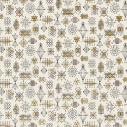
In my first mood board, above, I immediately thought of Bradbury & Bradbury’s Atomic Doodle wallpaper in Taupe. You’ll need to order a sample to check in the real environment of the kitchen, but I think the color ways and design of this wallpaper pattern would be nifty in this kitchen. The Doodle is a googie pattern – so it would inject some space age into this traditional space, which I think is just fine. Also, that looks like a really nice stove — you lucked out there. For wallpaper, I would try to find a pattern that picked up on the strong graphic of the black in the room. For the floor, I thought of 6′ wide sheet — the Corlon pattern (alas, now seemingly discontinued) that reader Nancy recommended in this story. Mind you, I have not seen this terrazzo-mimic flooring live, but it looks like an excellent possibility for our retro houses. I liked the light look of the Limestone colorway with your kitchen, at least online. Finally, you will see in this first mood board, I thought to paint the fridge black — or buying a counter top depth fridge in black — or a Big Chill fridge, even — to coordinate with the stove. And, I like the idea of painting the coppertone hardware black. Again — going “graphic” usually appeals to me.
Like Kate, I would not spend money to change the counter tops. In “humble” mid century kitchens like this, I think “humble” materials like laminate just seem so much more appropriate that luxe granite (or faux luxe granite). I recently created a new page all about retro kitchen design, in which I talk more about this issue. In addition, your laminate counter tops sound like they are in excellent shape. And, while I do not have data to prove it, I really think the “old” laminate was stronger and more durable that today’s laminate. Also, the beige color is so perfectly neutral — so easy to decorate with.
Sources for Pam’s first mood board above:
- Bradbury & Bradbury Atomic Doodle wallpaper in Taupe
- Armstrong Corlon flooring in Limestone (link now gone)
- Counter depth French door refrigerator in black
- Diner chairs from Heffron’s in black
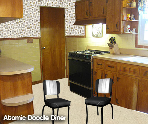 Above: I love your idea of a booth — or even a small round diner-style table. I might go for black and white — you could even pipe in some yellow! One thing, though, I would not choose a unit that seemed too “big” or else it might looked jammed into the space. Getting the right scale will be important to making this work, aesthetically. You can see, I chose smallish chairs to spotlight. However, depending on the size of your three teenage boys, you might choose to go bigger — for comfort. Make it comfortable space where everyone wants to hang out — first and foremost!
Disclosure reminder from Pam: My recommendations include some products from current advertisers (Bradbury & Bradbury, Hannah’s Treasures, Heffron’s and Big Chill.) While I am grateful for our advertisers, my including their products in mood boards like this are not included as part of their advertising deal. They did not and do not pay for me to write about them or include their products in these stories; there is no quid pro quo for editorial coverage. Read here about how we make money on the blog..
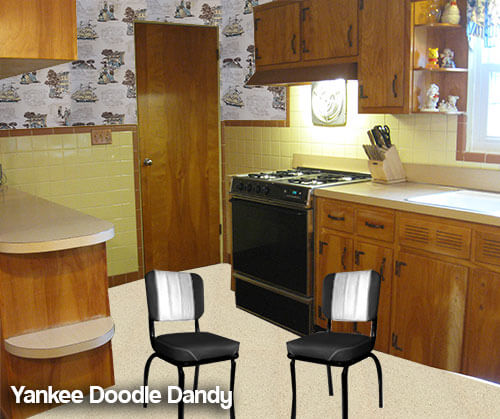
Pam’s second mood board of retro decorating ideas for Angela’s kitchen — Yankee Doodle Dandy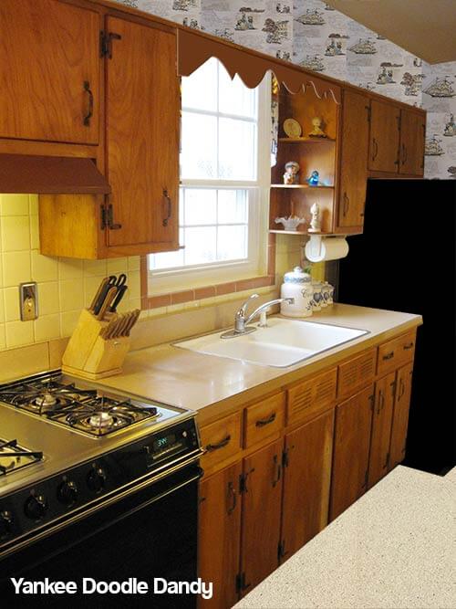
Same idea as above, except this time, I found a kitschy 1950s vintage wallpaper from Hannah’s Treasures. It looks like it has all the right colors (interestingly — including the same blue that Kate chose for her paint color… blue and yellow work well together, it’s clear)… appropriate graphic punch… the scale looks right… and it’s a homey hoot.
 So there are our ideas…
Readers — what are your paint, flooring and retro decorating ideas for Angela’s kitchen?


Patty says
One question I have is does Angela want a totally retro look, or is she trying to keep some of the retro feel while bringing it a little more into the present day trends?
I would skip the wall paper and table and chair choices if she’s wanting to bridge the time warp.
Angela says
I am looking for the retro feel while bring it up to date if that makes any sense.
Patty says
That’s what I thought.
I’d do that with fabric and accessories that you love. I think that’s what a lot of people do – me included, and it can more easily be changed if your taste changes or you need to sell and neutralize it a bit.
You can create something that is not so cookie-cutter like what is now sold to us all as what we should all covet – granite countertops, sleek, modern etc.
Lauryn says
Oh how I love reading all the wonderful ideas for this great little kitchen! I definitely lean towards the sunny and sweet idea, but I also think wallpaper is a fabulous way to brighten up a space. (Thanks, Pam, for selling me on the idea of wallpaper!) Your kitchen has a lot of neutral aspects to it, so the wall paper could add some life to the space. I also have to chime in for linoleum on the floor. The colors are so rich and have so much texture (not to mention how lovely it feels on bare feet) that you could create a lovely depth that would compliment the neutral aspect of this kitchen. We love, love, love our marmoleum floor. If the counters are in good shape, I say keep them!
And I think an L-shaped booth might be a nice way to save some space. There’s something very cozy about bench seating and in this case it would probably open up that corner. And with the spindles gone, you can have some breakfast bar type seating there if you needed more places to sit.
Good luck with it! You’ve got great bones and an original kitchen in what looks to be pretty darn good shape. Not everyone is that lucky!
Pamela says
I couldn’t tell the color of the trim but re-read and see that it is a ‘brown’. Maybe to me it looks like more of a terra cotta or perhaps coral??? it looks like the color my mom had in her bathroom… (snicker)
Here’s what I would do. I would paint the walls the yellow of the tile, maybe try some wallpaper (a happy retro style not floral) for above the cabinets with the brown color faintly in it. I’d lean toward coral/brown/terra cotta color cabinet tops (maybe quartz or laminate) I’d extend the back part of the island to make room for barstools. I’d use more of the ‘brown’ in accents in the kitchen what I can’t find in that color I’d paint. For the floor? I think I’d bring a lot of samples home and see what works, you have a lot of colors going on in there.
I’m with you, ditch the spindles. they are just u*** [edited] and get dirty.
You may not be absolutely retro – or absolutely modern – or absolutely anything, you will however have a nice kitchen.
Pamela says
why did you edit out u***? Is that a bad word? Just wondering.
pam kueber says
Yes. We don’t use that word here. Key rule of commenting is: “No one can be made to feel bad for their choices.” I don’t edit excessively, but usually when I see the words “ugly”, “hate” or “hideous”, out they go. There’s a big discussion post somewhere on the blog but I gotta figure out where it is. I’ll add it here when I find it. Don’t take it personally. I HAVE DONE IT! I then had to edit MYSELF!
Cindy says
I like the Sunny and Sweet — turquoise is a favorite and I like what it does to that particular yellow.
I would also consider pulling a color scheme from vintage barkcloth, using it for a window curtain.
Like these:
http://www.etsy.com/listing/107534138/vintage-barkcloth-fabric-1-yrd-1950s?ref=sr_gallery_12&ga_search_query=barkcloth&ga_view_type=gallery&ga_ship_to=US&ga_vintage_rewrite=vintage+barkcloth&ga_original_query=2&ga_page=3&ga_search_type=vintage
http://www.etsy.com/listing/128429174/fab-vintage-barkcloth-fabric-with-wild?ref=sr_gallery_44&ga_search_query=barkcloth&ga_view_type=gallery&ga_ship_to=US&ga_vintage_rewrite=vintage+barkcloth&ga_original_query=2&ga_page=2&ga_search_type=vintage
http://www.etsy.com/listing/121862075/vintage-barkcloth-thistle-6-yards-unused?ref=sr_gallery_32&ga_search_query=barkcloth&ga_view_type=gallery&ga_ship_to=US&ga_vintage_rewrite=vintage+barkcloth&ga_original_query=2&ga_page=6&ga_search_type=vintage
http://www.etsy.com/listing/129896939/vintage-floral-barkcloth-fabric-panel?ref=sr_gallery_35&ga_search_query=barkcloth&ga_view_type=gallery&ga_ship_to=US&ga_vintage_rewrite=vintage+barkcloth&ga_original_query=2&ga_page=6&ga_search_type=vintage
Brian T says
Interesting that, in the original, the trim tile looks like a featured color and the cabinets look like a dominant color to be designed around — but in the aqua-themed suggestion, the trim tile and the cabinets both step back and seem like background neutrals. Even though I prefer the Atomic Doodle design, I’d like to commend that aqua design for showing that you can bring in lots of different “colors” without being overwhelming or disjointed, or looking like a crayon box. (My own kitchen is largely yellow, but you can also see plenty of green, pink, and red.) I think a lot of people today are too timid about committing to even one color, which is why we see so many “spa-like” all-white or gray kitchens and baths. Asking them to coordinate two or three colors in a kitchen would terrify them, yet Kate’s “Sunny and Sweet” makes a variety of colors look balanced and natural.
TerriHD says
Wow, for a moment I thought I was in my own kitchen! I really like the Sunny and Sweet — I have identical cabs, similar color scheme (yellow, brown on walls) and am bringing in some turquoise. (Already have red accents from cookware.) Caveat on cork: Comfy but requires maintenance. I just pulled out mine to reveal original lino — darker than my preference, but it works. Also: Don’t fear granite, especially for limited counter space. We have in our kitchen: modern and utilitarian; doesn’t look out of place.
lynda says
You could also look at the Traffic Master Allure luxury vinyl plank in a cork “look” at Home Depot. Can go over original floor and is a diy if you are so inclined. I think it comes in three colors. It would be easy to take care of and yet look right for the era. I remember a friend’s mom in the 50’s was so proud of her new cork floors. However, we were always told to be careful when we were in the kitchen.
Sandy says
I’d go with vintage wallpaper. If you don’t like the yellow tile, look for a paper that doesn’t use yellow as a primary color in the design, but instead blends well with yellow but features colors you prefer. (the examples above do the opposite.) A great wallpaper is the easiest way to take the focus off what you dislike, and yellow blends with many other colors.
tammyCA says
Cute kitchen! Personally, I would never put in granite as I am not a fan & and I bet it too will define this decade & be “dated”.
I do love shiny copper and I would keep the handles as is and light fixture…you can find vintage kitchen items, like canisters with copper lids.
For color…I am thinking of the colors of vintage barkcloth fabric & Mid century pottery…there are colors of yellow, brown, teal, coral pink, tan that all work together and look fabulous…just put in color keywords in pinterest & ebay to get ideas for fabrics and pottery.
The lighter neutral background of the counters is good so you can accessorize (love your window shelves and this is where I can see some pottery vases or what I have – a glass piggy bank with shiny pennies).
Or you could go for a more ’70s inspired style…something like this cool fabric:
http://www.hancockfabrics.com/Teal–Yellow–and-Brown-Swirls-Rayon-Challis-Fabric-Apparel-Fabric_stcVVproductId150983778VVcatId538864VVviewprod.htm
Catherine says
My 1956 kitchen has the same tile color scheme! The cabinets are the same style, with different hardware, and the floor is more like Pam’s suggestion (the flooring continues into the attached knotty pine porch, which was added at the same time the kitchen was done). I have a double-drainboard sink, and what little other countertop there is is wood–not butcher block, just the same wood as the rest of the cabinets (no, I have no idea why).
I just moved in a few weeks ago, and I’ve thought about painting the kitchen walls, which are also white/off-white. But I actually like the existing color more now that I’ve painted the dining room, which opens to the kitchen. Maybe it just needed a little more contrast. I haven’t really done anything else with the kitchen yet, other than replace the electric stove with gas. We have the original gas stove in the basement–maybe a future project, but I suspect the switch to an electric stove dates to the 1956 remodel. The house was an estate sale, and we asked for the rooster plaques on the wall, which are the same as these: http://www.etsy.com/listing/109514135/iron-rooster-plaques-vintage-chicken. The previous owner had had a small kitchen table and chairs with a tan formica top and tan vinyl chairs. So although I wasn’t too sure about the tan bullnose on my own tile at first, it’s growing on me–clearly, the person who chose it was also really trying to play it up.
pam kueber says
Awwww, I love how you asked for the rooster plaques, Catherine! I bet that made the previous owners so happy! Your kitchen sounds like a dear… and your story is a good one about “waiting a while” before making big (expensive) changes.
Robin, NV says
Aw, what a CUTE kitchen. If it were up to me, I’d keep it as is, including the spindles along the counter. I’d change just a few small things to liven it up a bit.
1. I agree with everyone who mentioned wallpaper. The white walls above the tile are just too white and some pattern would help give the kitchen a little pizzazz.
2. The floors definitely need some love. I’m really liking Marmoleum these days. My two favorite colors would both work great in the kitchen – Spring Dance and Pool Party.
3. For the counters, I’d definitly go with a laminate as opposed to a granite. Matching the colors of the tile with similar colors (brown and yellow) would be darn near impossible, so I’d pick a contrasting color – blues or reds.
I firmly believe the kitchen needs some wallpaper. I’d pick a pattern I really liked and pick floor and counter colors that play off what’s in the wallpaper.
Robin, NV says
I really like Kate and Pam’s ideas. Aqua always seems to be the go-to color for retro-remodeling. Personally, I’d like to see the counters in a red or bittersweet. I will be painting my soffits in an aqua, yellow, and orange argyle pattern (yes, by hand! I’m crazy) – something like that might work for Angela’s walls too but in reddish orange, yellow, and dark blue. Others mentioned stenciling atomic stars on the walls. I like that idea too.
LOVE Pam’s sailing ship wallpaper.