Retro Renovation stopped publishing in 2021; these stories remain for historical information, as potential continued resources, and for archival purposes.
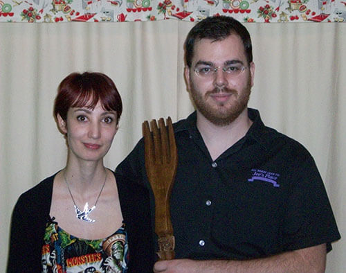
Mr. & Mrs. Vegebrarian channeling American Gothic.
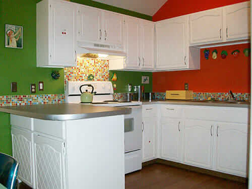
Reader Vegebrarian and her husband had to move into their 1980s split level home in a hurry, when their previous home was on a city block that had been acquired for demolition. But, being forced to move didn’t put a damper on Vegebrarian’s cheery disposition. Making the best of their situation, they decided to makeover their 1980s “blank palette” kitchen to reflect their mid century tastes and inject their happy, fun sense of humor through the use of bright colors and kitschy wall art. They accomplished their mini renovation with some good old fashioned elbow grease and a mere $800 — including tools. Wow, what a difference some color makes.
Vegebrarian’s kitchen before. She says: “The before shots were taken not long after we moved in, which is why the counters are littered with various items. The photo was take of someone in the kitchen, who had to be cropped out, which is why they are such a strange size.”
Vegebrarian writes:
My husband and I had to find a house in a hurry after the block we lived on was acquired for demolition. Many of the mid-century houses in the city where I live (near Omaha) are tiny, slab houses like my first home, without any of the wonderful mid-century modern features Retro Renovation readers love. I wanted to stay in the city, so we ended up in a split-level built in the early 80s. It sits on a sunny corner lot and has cathedral ceilings in the kitchen, living and dining rooms.
Mr. Vegebrarian and I knew going in that the kitchen was going to get a makeover and that we wanted to do the work ourselves using eco-friendly alternatives where possible, looking at linoleum, bamboo, and recycled paper counter tops first. And by “do the work ourselves,” I mean my dear husband did most of the work. I am crafty, but I don’t mix well with power tools!
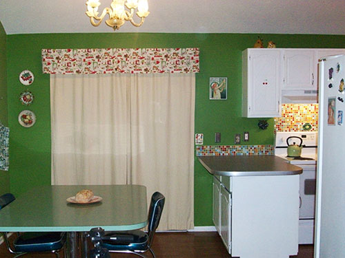
The dining room, which shares walls with the kitchen, is green, which left two beige walls. Ever enchanted by my grandmothers’ kitchens, one of which had day-glo daisy wall paper, I knew beige was not an option! In the end, we went with orange for the remaining walls. I wanted to give the kitchen a 50s feel since time constraints had not allowed us to keep shopping until a mcm-styled house came on the market.
Ultimately, my husband and I decided linoleum had everything we wanted for the counter tops, including a price within our budget. I was inspired by Dave and Frances’ story on Retro Renovation as well. Hubs and I ordered a giant roll of blue-gray Marmoleum and adhesive from a local store called Kelly’s Carpet.
After looking at a lot of photos of mid-century kitchens, I knew metal edging would achieve the look I was going for. A smooth, aluminum trim was purchased from Eagle Mouldings. The biggest challenge was the “peninsula” with its rounded corners. We called my brother, a tool and die maker, to see if he could shape the aluminum in one of his machines. He came over to investigate, and discovered our particular trim was easy to mold around the curves using his own weight. Afterward, my brother cut all the pieces to spec and hubs snapped them in with a bit of glue for added staying power.
The floor in the kitchen/dining area is medium brown laminate, which we will eventually replace. With green and orange walls, white cabinets and gray counters, it took a while to find the right backsplash tile. I only knew I wanted glass tile. One day I spotted an ad for Modwalls (on Retro Renovation, actually!) and decided to take a look. Their Brio Blend #9 was perfect — a blend of all our colors with pops of red and turquoise. I couldn’t order it fast enough. Since we only wanted the back splash to go about six inches up the wall, we got the job done with fewer sheets of tile. We used a low odor, VOC-free grout sealer called Safecoat to finish the tile.
I am a hoarder lover of wall art, but decided to rein it in a bit in the kitchen. I put up my collection of smiling chalkware fruit, a framed portrait of Cookie Monster, & a few small knick knacks. I smile every time I walk into our retro modern kitchen; all of the colors play nicely together – I think I would shrivel up or dissolve on contact with a beige and granite kitchen!
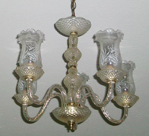
80’s chandelier that Vegebrarian wants to replace with a more mid century modern styled fixture.
The whole project came in under $800, including some tools we had to purchase, like router bits and tile cutters. I am really proud of my husband’s work. We learned a few lessons – you need a special roller to smooth down the Marmoleum for even glue distribution, and it is not the best idea to put up tile the night before you are expecting company. We are still shopping for lights to replace the very 1980s fixtures. I want a sputnik for the dining room, but have not decided on a replacement for the kitchen light as the sloped ceiling will require a pendant.
Kitchen materials sources:
Paint colors are Thyme Leaf and Shocking Orange by Behr
What a cheery space, Vegebrarian — you and your husband did a fabulous job. I can’t imagine you could ever feel sad in a kitchen this colorful with a framed poster of Cookie Monster. Thanks so much for sharing your story, photos and resources with all of us here on the blog!
I work at Lowe’s check out the light section! We have the Sputnik floor, semi flush and other.
vegebrariansays
I’ve had my eye on the sputnik at Lowe’s!
Stacey Williamssays
They are now stock items for the moment, at first they were in and out items.
Fo-Josays
Amazing, Amazing! Please come do mine!!
Joe Felicesays
Interesting color combo. A little-too bright for my taste, but they pull it together well with the trim and fabric accents. I would like to know how they got the diamond pattern on the cabinet doors.
Heather Colesays
I’m especially taken by the trim. I remember trim from the ’40’s that was, somehow, grooved, and impossible to keep clean. Good for you!
May I ask how you came across the breadbox? Looks suspiciously like you beautified it inimitably, and that it is unique, but one can always hope!
Thank you for this look inside your adorable kitchen.
vegebrariansays
Hi Heather,
That is the exact reason why we chose smooth trim – I just pictured all sorts of baking debris getting into the grooves.
That breadbox is actually from Target. I didn’t see it on their site, but a quick search of “Target breadbox” on ebay brought up a turquoise one.
Mary Elizabethsays
Hi, Vegebrarian,
Yes, the breadbox is a retro style, so it surprised me that it was on Target. It looks like you also have an old Copco kettle–or are they coming out with olive/avacado green again?
This is a cheery kitchen with great colors & use of space!
The best part of the story for me, though, is believing I have a kindred spirit in vegebrarian–BEST USER NAME EVER!
vegebrariansays
aww, shucks ~ thank you, I have grown rather attached to my user name!
Jamiesays
This is inspiring. We’re under contract on a house from the 1940’s with remnants of an awful 1980’s kitchen. I say “remnants” because there’s one section of counter with the sink…and then two smaller sections of (non-matching) counter with lower (non-matching) cabinets that are just sort of floating against one wall: not attached to anything. I’ve been trying to decide if there’s a way I can repurpose the existing cabinets, and use one of those free floating lower cabinets to create a peninsula…but it would mean that the doors on on the outside of the peninsula, instead of facing in toward the rest of the kitchen. But here we are, with your peninsula exactly that way!
vegebrariansays
I actually love having the cabinets on that side! There is another cabinet door on the peninsula near the oven, but the other access point makes it easier to stash a lot more goodies inside. Best of luck with your project.
Nicely done and on a budget. “Good morning!” (it says every day if kitchens could talk).
Mary Elizabethsays
Well, I think that kitchen does talk–and sing! The fruit faces add to the color choices to create a sparkling feel. Yes, that would make you very happy to go into in the morning. Good job on a budget.
vegebrariansays
Thank you. The kitchen really is a pick me up. I love to sit at the table when the sun is shining in through the back door and have all those faces smiling back at me!
Kudos on the kitchen. Just goes to prove you don’t always need a lot of money to make a kitchen look great. I love the colors and how you pulled them all together in the backsplash. Great job!


After looking at a lot of photos of mid-century kitchens, I knew metal edging would achieve the look I was going for. A smooth, aluminum trim was purchased from Eagle Mouldings. The biggest challenge was the “peninsula” with its rounded corners. We called my brother, a tool and die maker, to see if he could shape the aluminum in one of his machines. He came over to investigate, and discovered our particular trim was easy to mold around the curves using his own weight. Afterward, my brother cut all the pieces to spec and hubs snapped them in with a bit of glue for added staying power.
The floor in the kitchen/dining area is medium brown laminate, which we will eventually replace. With green and orange walls, white cabinets and gray counters, it took a while to find the right backsplash tile. I only knew I wanted glass tile. One day I spotted an ad for Modwalls (on Retro Renovation, actually!) and decided to take a look. Their Brio Blend #9 was perfect — a blend of all our colors with pops of red and turquoise. I couldn’t order it fast enough. Since we only wanted the back splash to go about six inches up the wall, we got the job done with fewer sheets of tile. We used a low odor, VOC-free grout sealer called Safecoat to finish the tile.
I am a hoarder lover of wall art, but decided to rein it in a bit in the kitchen. I put up my collection of smiling chalkware fruit, a framed portrait of Cookie Monster, & a few small knick knacks. I smile every time I walk into our retro modern kitchen; all of the colors play nicely together – I think I would shrivel up or dissolve on contact with a beige and granite kitchen!


Stacey Williams says
I work at Lowe’s check out the light section! We have the Sputnik floor, semi flush and other.
vegebrarian says
I’ve had my eye on the sputnik at Lowe’s!
Stacey Williams says
They are now stock items for the moment, at first they were in and out items.
Fo-Jo says
Amazing, Amazing! Please come do mine!!
Joe Felice says
Interesting color combo. A little-too bright for my taste, but they pull it together well with the trim and fabric accents. I would like to know how they got the diamond pattern on the cabinet doors.
Heather Cole says
I’m especially taken by the trim. I remember trim from the ’40’s that was, somehow, grooved, and impossible to keep clean. Good for you!
May I ask how you came across the breadbox? Looks suspiciously like you beautified it inimitably, and that it is unique, but one can always hope!
Thank you for this look inside your adorable kitchen.
vegebrarian says
Hi Heather,
That is the exact reason why we chose smooth trim – I just pictured all sorts of baking debris getting into the grooves.
That breadbox is actually from Target. I didn’t see it on their site, but a quick search of “Target breadbox” on ebay brought up a turquoise one.
Mary Elizabeth says
Hi, Vegebrarian,
Yes, the breadbox is a retro style, so it surprised me that it was on Target. It looks like you also have an old Copco kettle–or are they coming out with olive/avacado green again?
vegebrarian says
I also purchased the tea kettle at Target. I have seen it on Amazon as well, http://www.amazon.com/1-3-Cavalier-Green-Kettle-Copco/dp/B008PDBTHW/ref=sr_1_1?ie=UTF8&qid=1370901051&sr=8-1&keywords=green+copco+kettle
Susan K. says
This is a cheery kitchen with great colors & use of space!
The best part of the story for me, though, is believing I have a kindred spirit in vegebrarian–BEST USER NAME EVER!
vegebrarian says
aww, shucks ~ thank you, I have grown rather attached to my user name!
Jamie says
This is inspiring. We’re under contract on a house from the 1940’s with remnants of an awful 1980’s kitchen. I say “remnants” because there’s one section of counter with the sink…and then two smaller sections of (non-matching) counter with lower (non-matching) cabinets that are just sort of floating against one wall: not attached to anything. I’ve been trying to decide if there’s a way I can repurpose the existing cabinets, and use one of those free floating lower cabinets to create a peninsula…but it would mean that the doors on on the outside of the peninsula, instead of facing in toward the rest of the kitchen. But here we are, with your peninsula exactly that way!
vegebrarian says
I actually love having the cabinets on that side! There is another cabinet door on the peninsula near the oven, but the other access point makes it easier to stash a lot more goodies inside. Best of luck with your project.
Isabelle Kessler says
I LOVE THIS KITCHEN!
Rebecca@MidCenturyModernRemodel says
Nicely done and on a budget. “Good morning!” (it says every day if kitchens could talk).
Mary Elizabeth says
Well, I think that kitchen does talk–and sing! The fruit faces add to the color choices to create a sparkling feel. Yes, that would make you very happy to go into in the morning. Good job on a budget.
vegebrarian says
Thank you. The kitchen really is a pick me up. I love to sit at the table when the sun is shining in through the back door and have all those faces smiling back at me!
Terri Polick says
Kudos on the kitchen. Just goes to prove you don’t always need a lot of money to make a kitchen look great. I love the colors and how you pulled them all together in the backsplash. Great job!