

In a recent Retro Design Dilemma — Retro design ideas for Cathy’s yellow and maple St. Charles cabinets — the retro modern moodboard solution used half inch tile mosaic for the backsplash. Reader Doug saw this tile recommendation and recognized it instantly — since he had just installed copious amounts of the exact same tile — Merola Tile Cosmo Pixie Almond mosaic (update: now discontinued, I believe…) in his retro modern kitchen.
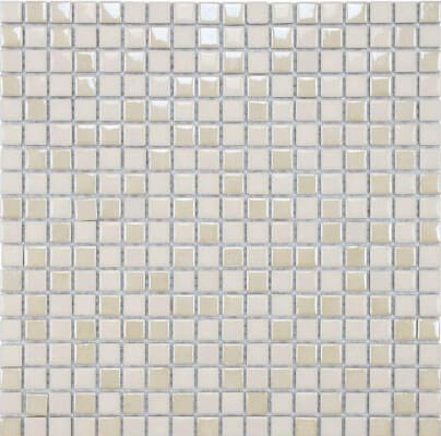
Doug says the half inch tile mosaic is a big hit with visitors — and he loves the tile so much that he is even using it in his ongoing bathroom remodel. The tile is neutral and reads as a subtle textural backdrop that allows Doug’s colorful cabinets to take center stage.
 Doug writes:
Hi Pam,
Almost three years ago I bought a little low-slung concrete block house in Florida a block and a half from the beach (a “periwinkle,” in local parlance). If the previous owners had left the original kitchen alone, I would have been very content to “love the house I’m in” and probably would have done everything I could do to save it.Sadly, sometime in the 1980s, out that kitchen went, and in went characterless and cheap oak-trimmed laminate cabinets along with a countertop that was rotting from the moisture from the dishwasher. So, when I sold my house in the Hudson Valley (not far from you, actually, in Hillsdale) last year I decided to treat myself to a new kitchen.
I’m not the type that has to have a kitchen in which everything is authentic and period perfect. When I told people I was renovating I said I wanted a kitchen like what the architect of the house might design today, if he had a better budget. While searching for inspiration, I came across a 1959 ad for a Hotpoint kitchen that knocked my socks off. It was both practical (tiled walls) and handsome, with a great punch of color from a tiled accent wall containing the turquoise (!) wall oven. While I ultimately decided a wall oven wouldn’t work for me, I think I’ve ended up the with a kitchen that honors the inspiration.
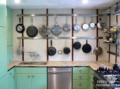
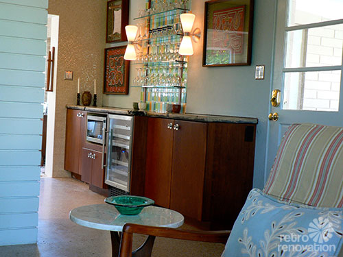
Remember Julia Child’s famous kitchen — with all her pots hanging on peg board, close at hand? With his pretty pot-hanging design, Doug is channeling a bit of the Julia, for sure — just be sure to keep the pots scrubbed clean!
Because I live so close to the beach, salt in the air is a concern (this part of the Florida coast has the second highest airborne salt concentration in the world, next to Saudi Arabia), so I decided for practical purposes that I needed stainless appliances, and pretty good ones. (Plus, I like to cook and had determined I was going to treat myself to a good stove.) That meant that the logical way to bring the color I wanted in the space was through the cabinets. After looking at the big box places and realizing the compromises I would have to make in terms of color and size, I found a great local cabinet maker who actually beat their price and gave me exactly what I wanted.
The color is Plymouth Green from Sherwin Williams’ sadly discontinued Suburban Modern collection, matched for my cabinet maker by Benjamin Moore, which makes a near lacquer-like product that results in cabinets that almost look like they were made from metal and is a very durable finish.
I called the cabinet maker — TCB Cabinetry in Stuart, Florida –to ask a little more about the finish that results in them looking like they’re metal. It’s a product called Plasticolor, which he then puts a clearcoat of conversion varnish on top of.
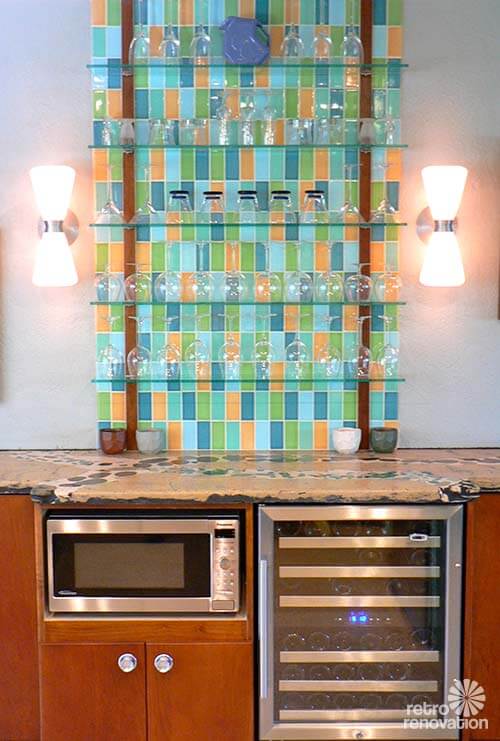
Because part of the kitchen is visible from the living room, one wall of cabinets is done in a cherry veneer, stained to blend with the American of Martinsville pieces I picked up on Craigslist. The vertically oriented tiles on that wall are a custom blend made by Clayhaus Ceramics in Portland.
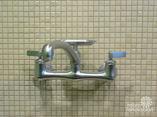
The cabinet knobs and the sconces are from Rejuvenation. The faucet is a Kohler Clearwater wall-mount faucet. .
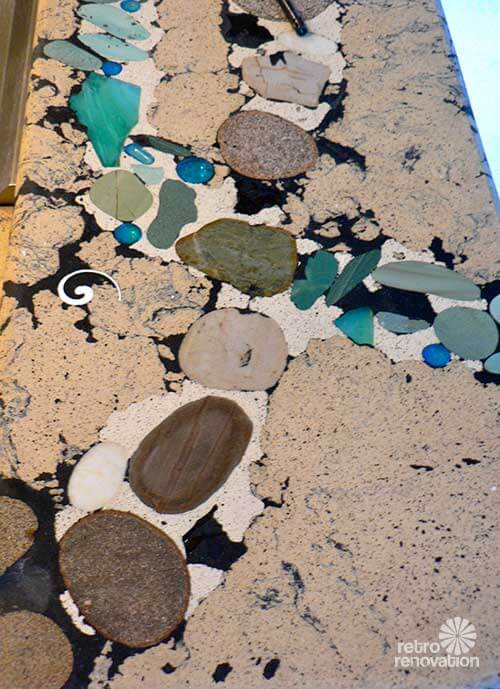
The countertops were made from concrete by a local artisan, Bud Gilbert, aka the Cement Guy, in New Smyrna Beach.
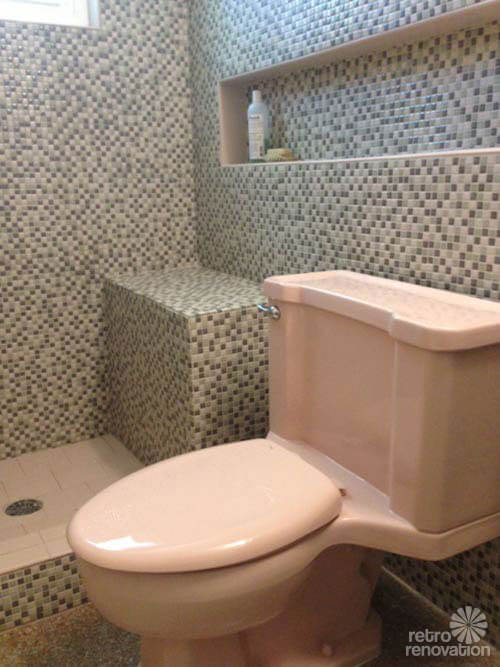
Doug liked the small 1/2 inch Merola tile that he used in the kitchen so much that he used a similar style of tile from another maker (Wayne Tile, sadly discontinued style) in the bathroom. Doug wrote:
I also used a lot of 1/2 inch tile in a bathroom re-do. It’s not completely finished, but the photo will give you a feel. I saved the pink toilet and sink!
For me, it was definitely a selling point that there was a pink bathroom. I loved the fixtures, but the background tile was white with little dirty flecks in it, and over the years about six shades of pink had been involved as soap dishes, towel bars, etc. had been replaced. So I ripped out all the old white tile, tiled floor to ceiling with what you see, then put the pink fixtures back (minus the tub). The pink looks a lot better than it ever did against that white, which just read as dirty.
Doug, you certainly have a designer’s eye — one that knows how to exercise restraint to create a feeling of balance in a space. In both the kitchen and bathroom, it would have been all too easy to go overboard by choosing a more “busy” tile for your backsplash. The neutral color and slight tone variation in the half inch tile backsplash that you chose adds a subtle “wow” instead of smacking the viewer in the face with bold pattern. All of your color choices coordinate nicely, and the way you used vivid color in only a few places (cabinets, bar backsplash and a few bits in the countertop) while using neutral textures (tile, wallpaper in dining room, concrete counter tops and steel appliances) really makes the space feel cohesive. Kudos to you on a job well done.
Mega thanks also for sharing your kitchen and bathroom with all of us here on Retro Renovation — this is a gorgeous and inspiring space!


