

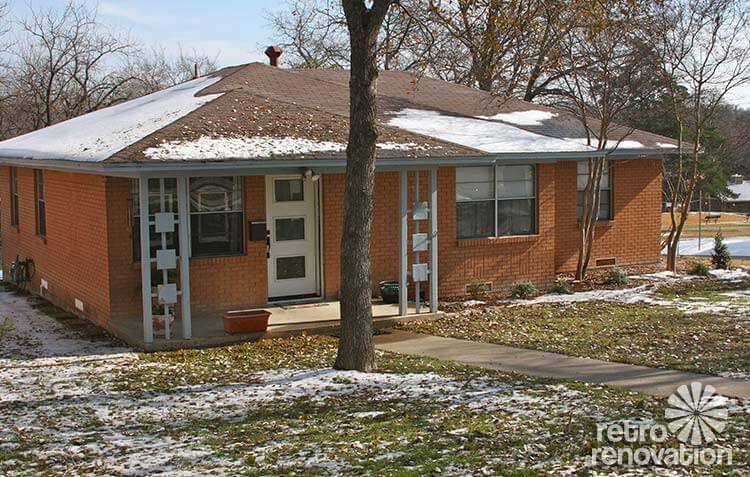
 Reader Laurie has been hard at work fixing up her 1966 ranch house. She’s been working to get the interior painted and clean up the yard and even found new mid-century style doors at Lowe’s and had them installed. Now Laurie is ready to pick paint colors for her front door and trim. She has a few ideas, but wants our input and help to decide on a color scheme so that when painting weather rolls around this spring she can get right to it. What colors do you recommend?
Laurie writes:
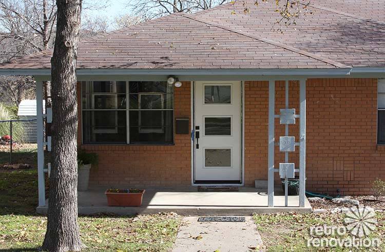
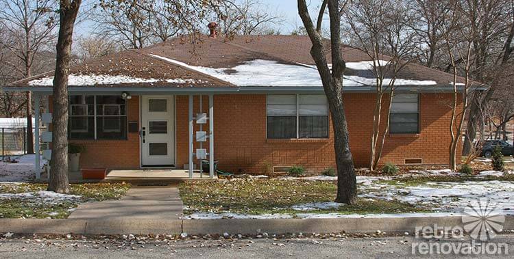
My house was built in 1966. I bought it last year and spent time painting the interior and fixing up the yard so the house didn’t look abandoned. I need some help choosing proper paint colors for the exterior. I bought new doors at Lowe’s that were just installed a couple weeks ago and the weather is such I can paint the doors soon. The trim will have to wait until spring, though, I think.
I was leaning towards white for the trim and blue/green (not turquoise) for the door.
The shrubs in the front will grow to be three feet tall and stay green all year.
I just painted the inside this fall. Tackling the outside next. This house has been a lot of work for me the past year. It’s coming together though. Thank you for your help.
Laurie
Readers — what colors would you choose for Laurie’s mid century brick ranch exterior?
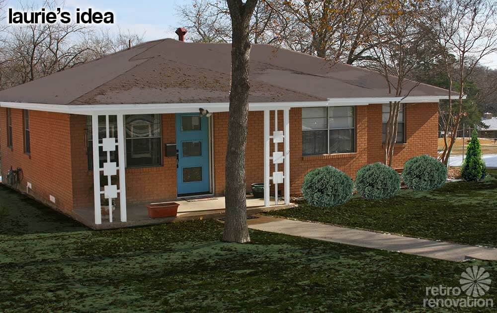 Laurie already had some ideas on how she wants to paint the trim on her house. The mock up above is my guess at how Laurie is envisioning her house will look after she paints all of the trim white and the door a “blue/green (not turquoise).” Did I get the door color right Laurie? To get a better idea of how the new paint will look in summer, the snow on the roof and yard was minimized using Photoshop and larger shrubs were added where Laurie already planted some that she says will get to be three feet tall.
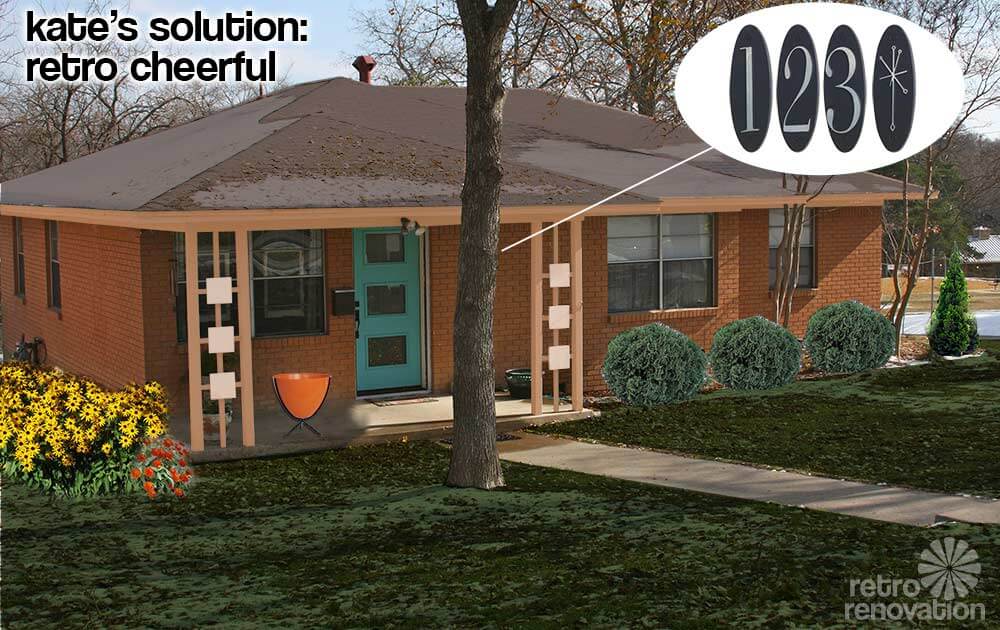
Kate’s solution: Retro cheerful
My look for Laurie’s exterior is retro, playful and full of cheer. For the trim on the soffits and most of the porch columns, an earthy peach blends nicely with the orangey brick without being too stark of a contrast.
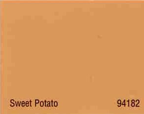
My color suggestion reminded Pam of a house color scheme she profiled back in 2009, painted with a combination of Copper Haze and Sweet Potato. The same colors would work well on Laurie’s exterior — using Sweet Potato for the trim and soffits and Copper Haze on the six squares on the porch columns. This would make the decorative squares stand out a little without screaming too loudly. For the door, a medium aqua tone really pops off the color of the brick and makes Laurie’s new door the focal point of the front of the house. Adding some fun accessories like a hot orange bullet planter from Hip Haven that could be filled with anything from flowers to decorative grasses and the retro oval metropolitan collection house numbers from Home Depot really makes it feel like 1966 again. To add even more happy to the front of the house, brightly colored flowers like Black Eyed Susans or Zinnias make the entry feel even more inviting. Once the front porch is fixed up, Laurie is going to want to sit out there more often, so finding a comfortable patio chair or two like these vintage Homecrest rocker chairs from Etsy seller Moderninspiration should also be high on her list.

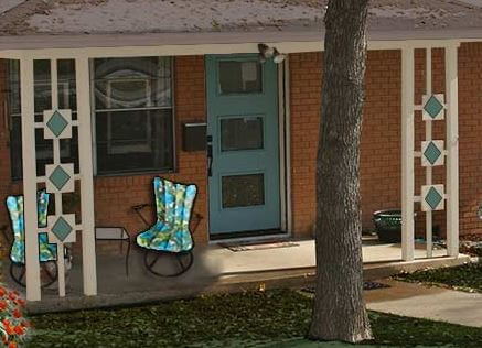
Pam’s solution: Front porch focus
What a lovely house you have, Laurie — and it is lucky to have found you as an owner! Looking at your house, my key idea is to really play up the front porch and particularly the front porch columns, which are keepers. Their geometry actually reminds me of breeze blocks.
#1 — Add square-diamond trim to the front porch columns: As you can see, I suggest you add a second layer of square trim to the front of each of the three decorative squares on each column. You know those square toppers they put on wood fence posts? You might just be able to buy those and screw them on — that would sure be relatively easy and inexpensive. Something like this (I found this at Lowe’s) — but not too dinky — you may need to look at the larger ones, okay? You want to pretty much fill that square with a diamond, I think:
 #2 — Slate blue for the front door and diamond trim — As for paint colors for your new diamond trim pieces and for your new front door, Kate and I played with her Photoshop until I found a shade of slate blue that I thought I looked good with your brick. Not too neon… toned down, greyed out a bit. As you can see, I selected this color for the door and the decorative fence cap.
 #3 — Outline the diamonds in the roof color — See how the diamond trim has a bead on the outside edge? Kate and I even put a DIFFERENT color on that bead — to “outline” the diamonds and make them pop. Try the roof color grey-brown from the fascia trim for this color — you may need to darken it up a bit to “see” it on the diamonds from the street — you’ll need to eyeball this.
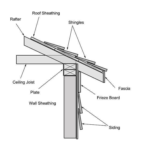
#4 — Color for the fascia trim — Use the roof color: For the house trim, I wanted to see what it would look like with the roof color painted onto the fascia — that’s what the trim right under roof edge is called. I think my idea here was to keep the line of your house overall long and lean and to not call excessive attention to the trim along the roof line.
#5 — Color for the frieze board and porch trim — Use the color of your concrete porch with the sunlight hitting it: Okay, so now I know that I am sounding like Mrs. Blanding choosing paint colors, but that’s how it works. For some reason, on this house, I think I would not use Super White for the trim. Because the house is relatively small and not tall, I am thinking an off white with a hint of gray-brown ala the roof color. So, I had Kate copy the color of your porch at a spot where the sunlight hit it.
#6 — Decorate the porch — I found two vintage Homecrest patio chairs on ebay that might look good on the front porch. I liked the upholstery because it played up your colors… and because it added some 1960s flair to the area. Be careful not to overdue the decorating, though, or the small front porch will start to look cluttered.
Thanks for sending us your Dilemma, Laurie! Be sure to send us “after” photos!


Kelly Wittenauer says
Cute house! Reminds me of the first one my husband & I ever bought. A late 1940s ranch of that same color brick with white trim in need of paint. Ours still had the original varnished doors, which we kept. We painted the trim a straw color & used dark brown shingles on the roof. During the prep work we found mint green & pastel pink under the white!
I agree with those who suggest painting the door a vibrant color & the squares on the posts to match. I wouldn’t use white for the trim, as it shows dirt too much – especially those posts which people will be inclined to touch.
And please, Laurie, & Pam – post pics here of the finished product. It would be fun to see how these Design Dilemmas turn out!
Becky from Iowa says
If you don’t want turquoise, how about a dark teal? There’s a nice MOM house near us that color, with a deep aubergine trim. Sounds grim, but it isn’t!
Joel says
Well, can’t say I disagree with the posters here, but in the interest of throwing some other ideas in the mix-
Taking a cue from 50’s kitchens- Deep beige on the posts and trim. On the squares, butter yellow, petal pink, and soft pale turquiose…. matching pale turquiose door with the mouldings around the windows painted the deep beige.
Charcoal gray trim. On the posts, just the thin tubing connecting the squares to the posts and each other painted a orangish red. The door flat black witht the orangish red pinstriped around the door’s windows.
But really I would probably go with the greyed teal for the front door. I would paint the trim and posts a very deep taupe. I would then paint the horizontal portions of the gutters the same greyed teal to give the effect of pinstriping the dominant horizontal line of your house. Finally, I would get 6 4″ ceramic tiles, paint them the greyed teal and attach one in the middle of each of the squares on the posts with construction adhesive. You could always pry them off and sand the reminents of any adhesive off without doing any permament damage. I have to say I love that design detail on the porch posts.
Dee says
I ADORE Kate’s solution!! Retro Cheerful, indeed! I find my eye drawn to just the white trim, and then the door separately, in the other mock up photos. Kate nailed it… warm and inviting 🙂
Marcia says
I like Kate’s too!
Wendy in St. Louis says
Me three!
Amy Richcreek says
Pam’s retro look with the diamond trim is absolutely tres chic! If it’s too turquoise-y, you could grey it down some, or deepen it into a teal tone.
Roundhouse Sarah says
And I agree with the other commenters, the squares on the posts are begging to be painted the door color.
Jackie says
Tangerine and cream
LauraRG says
A red door is always so inviting… how about that cherokee red that Frank Lloyd Wright often used? Id go with a neutral steel grey or white for the trim. I’d throw caution to the wind and paint the squares on the post three different colors – the same red as the door, plus eggplant and a deep rich yellow. I’d add window boxes to balance the porch, with three square trim pieces across each. I’d paint the window boxes the same red as the door, then choose one of the other colors for the squares.
Your house is adorable… it will look great no matter what you choose!
Scott Swank says
Since the brick is an orange color I would go with the natural complement of orange, blue. If all blue seems like too much I would go with a combination of blue and white.
Good luck,
Scott
Kimberley says
Orange brick, hmm, I would go with white trim. However, if you think outside the box, I would consider painting the brick a green and then use white trim and a darker shade of green for the shutters and door. However, you have to consider the shingles as well and I can’t really tell what color they are. They go well with the orange brick so green might clash with the roof.
The windows are screaming, “Shutters please!” I would find solid shutters with three raised panels to match the fabulous door.