

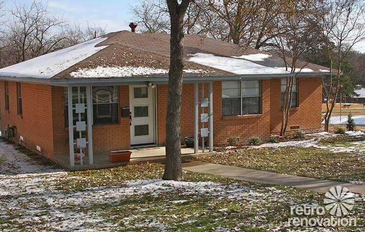
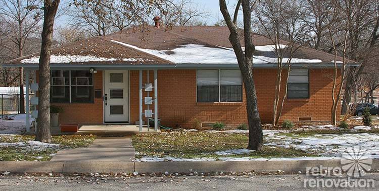
 Reader Laurie has been hard at work fixing up her 1966 ranch house. She’s been working to get the interior painted and clean up the yard and even found new mid-century style doors at Lowe’s and had them installed. Now Laurie is ready to pick paint colors for her front door and trim. She has a few ideas, but wants our input and help to decide on a color scheme so that when painting weather rolls around this spring she can get right to it. What colors do you recommend?
Laurie writes:
My house was built in 1966. I bought it last year and spent time painting the interior and fixing up the yard so the house didn’t look abandoned. I need some help choosing proper paint colors for the exterior. I bought new doors at Lowe’s that were just installed a couple weeks ago and the weather is such I can paint the doors soon. The trim will have to wait until spring, though, I think.
I was leaning towards white for the trim and blue/green (not turquoise) for the door.
The shrubs in the front will grow to be three feet tall and stay green all year.
I just painted the inside this fall. Tackling the outside next. This house has been a lot of work for me the past year. It’s coming together though. Thank you for your help.
Laurie
Readers — what colors would you choose for Laurie’s mid century brick ranch exterior?
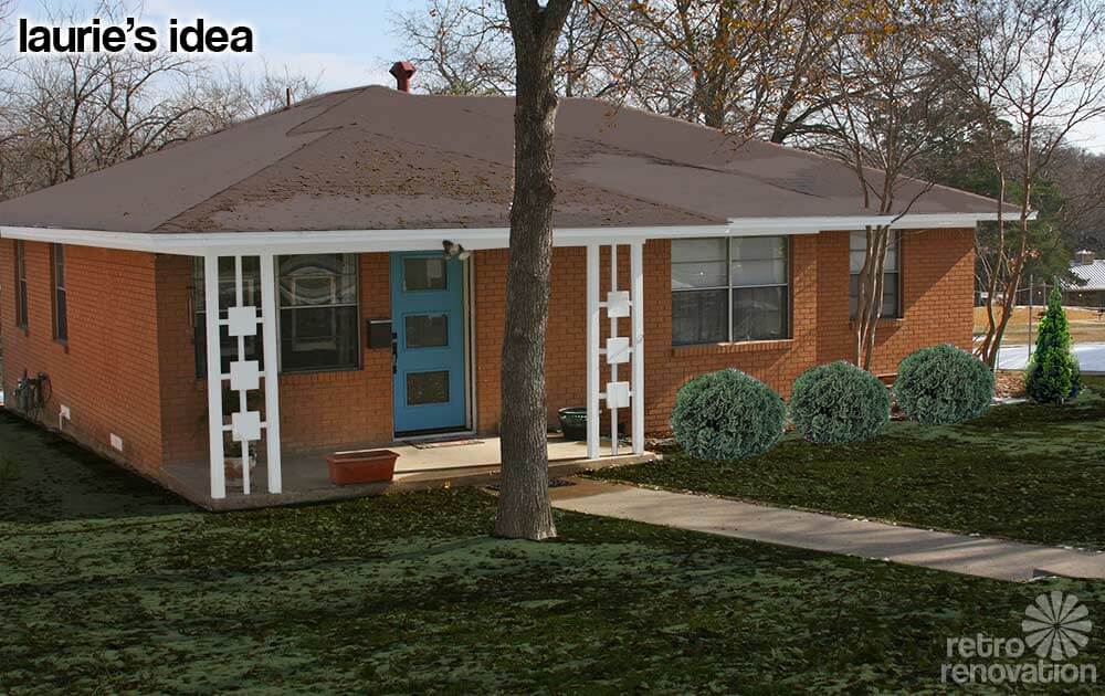 Laurie already had some ideas on how she wants to paint the trim on her house. The mock up above is my guess at how Laurie is envisioning her house will look after she paints all of the trim white and the door a “blue/green (not turquoise).” Did I get the door color right Laurie? To get a better idea of how the new paint will look in summer, the snow on the roof and yard was minimized using Photoshop and larger shrubs were added where Laurie already planted some that she says will get to be three feet tall.
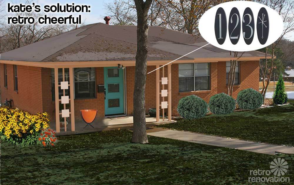
Kate’s solution: Retro cheerful
My look for Laurie’s exterior is retro, playful and full of cheer. For the trim on the soffits and most of the porch columns, an earthy peach blends nicely with the orangey brick without being too stark of a contrast.
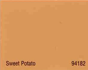
My color suggestion reminded Pam of a house color scheme she profiled back in 2009, painted with a combination of Copper Haze and Sweet Potato. The same colors would work well on Laurie’s exterior — using Sweet Potato for the trim and soffits and Copper Haze on the six squares on the porch columns. This would make the decorative squares stand out a little without screaming too loudly. For the door, a medium aqua tone really pops off the color of the brick and makes Laurie’s new door the focal point of the front of the house. Adding some fun accessories like a hot orange bullet planter from Hip Haven that could be filled with anything from flowers to decorative grasses and the retro oval metropolitan collection house numbers from Home Depot really makes it feel like 1966 again. To add even more happy to the front of the house, brightly colored flowers like Black Eyed Susans or Zinnias make the entry feel even more inviting. Once the front porch is fixed up, Laurie is going to want to sit out there more often, so finding a comfortable patio chair or two like these vintage Homecrest rocker chairs from Etsy seller Moderninspiration should also be high on her list.

Pam’s solution: Front porch focus
What a lovely house you have, Laurie — and it is lucky to have found you as an owner! Looking at your house, my key idea is to really play up the front porch and particularly the front porch columns, which are keepers. Their geometry actually reminds me of breeze blocks.
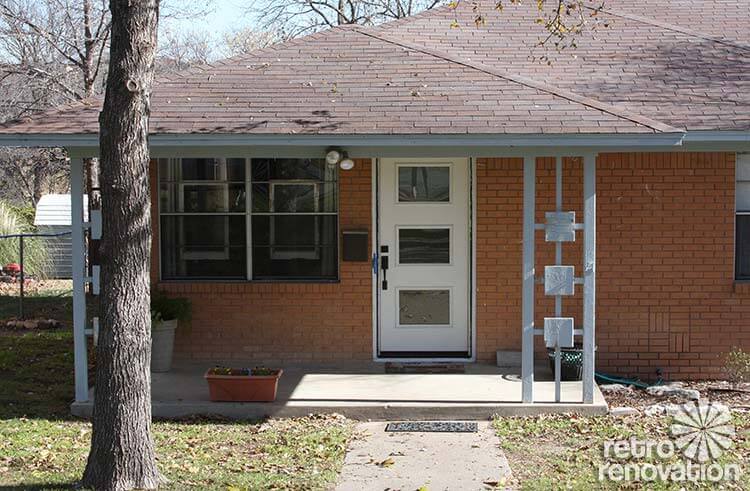
#1 — Add square-diamond trim to the front porch columns: As you can see, I suggest you add a second layer of square trim to the front of each of the three decorative squares on each column. You know those square toppers they put on wood fence posts? You might just be able to buy those and screw them on — that would sure be relatively easy and inexpensive. Something like this (I found this at Lowe’s) — but not too dinky — you may need to look at the larger ones, okay? You want to pretty much fill that square with a diamond, I think:
 #2 — Slate blue for the front door and diamond trim — As for paint colors for your new diamond trim pieces and for your new front door, Kate and I played with her Photoshop until I found a shade of slate blue that I thought I looked good with your brick. Not too neon… toned down, greyed out a bit. As you can see, I selected this color for the door and the decorative fence cap.
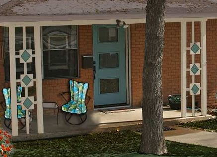 #3 — Outline the diamonds in the roof color — See how the diamond trim has a bead on the outside edge? Kate and I even put a DIFFERENT color on that bead — to “outline” the diamonds and make them pop. Try the roof color grey-brown from the fascia trim for this color — you may need to darken it up a bit to “see” it on the diamonds from the street — you’ll need to eyeball this.
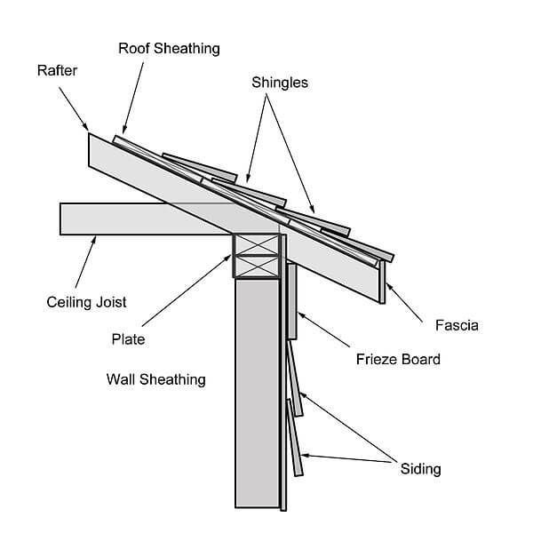
#4 — Color for the fascia trim — Use the roof color: For the house trim, I wanted to see what it would look like with the roof color painted onto the fascia — that’s what the trim right under roof edge is called. I think my idea here was to keep the line of your house overall long and lean and to not call excessive attention to the trim along the roof line.
#5 — Color for the frieze board and porch trim — Use the color of your concrete porch with the sunlight hitting it: Okay, so now I know that I am sounding like Mrs. Blanding choosing paint colors, but that’s how it works. For some reason, on this house, I think I would not use Super White for the trim. Because the house is relatively small and not tall, I am thinking an off white with a hint of gray-brown ala the roof color. So, I had Kate copy the color of your porch at a spot where the sunlight hit it.
#6 — Decorate the porch — I found two vintage Homecrest patio chairs on ebay that might look good on the front porch. I liked the upholstery because it played up your colors… and because it added some 1960s flair to the area. Be careful not to overdue the decorating, though, or the small front porch will start to look cluttered.
Thanks for sending us your Dilemma, Laurie! Be sure to send us “after” photos!


Karen says
I love Pam’s example and the Homecraft chairs are a great touch! Especially love the diamonds in the front porch panels. I’m curious to know the name / brand of that door at Lowe’s if that’s possible?
Thank you!
pam kueber says
See our Exteriors category — we have a couple of sources for mid mod style doors now —
lynne says
I second that request! Can you give any info on the door? I went to the lowes site but couldn’t find anything even close.
pam kueber says
Therma-Tru: https://retrorenovation.com/2013/05/06/retro-doors-therma-tru/
pam kueber says
Doors: https://retrorenovation.com/2013/05/06/retro-doors-therma-tru/
Sandy says
If I was handed the keys to this little beauty, I’d move right in, and not change a thing. Love the exterior and color !. Great choice 🙂
Laurie says
Wow! So many ideas for me. 🙂 I have looked into every color that has been suggested here. Too funny. I can see (thanks to sloppy painters) every color this house has ever been painted. White, dark green and the current color, which is a grey/blue and doesn’t go with the brick at all.
In the time it took for this post I chose a door color and painted my new doors. I have chosen a trim color, but don’t have the paint yet.
http://www.behr.com/consumer/PaletteDetailView/QE-43,PPU7-6,500F-6,W-F-510
I painted the doors Water Surface and want to do the trim Silver Sky. I think white is too stark for the house.
I love the idea of painting diamonds on the squares!! I am going to try that. I will look into the house numbers too. I had thought about these in a darker color: http://www.homedepot.com/p/The-Hillman-Group-5-in-Steel-Number-7-843087/100538865#.Us2hdmRDtvk
I was wondering about painting the squares to match the door…. Should the trim around the door be painted to match the trim or the door?
I also found some chairs someone put out as give aways to use on the porch. They need to be painted and I am leaning towards a cinnamon brown.
The front of my house faces west and is very shady. It makes it hard to find flowers to grow here. I am in zone 7b/8a in Texas.
Here are the photos of what I have done so far.
http://i245.photobucket.com/albums/gg73/ElfEars_photos/IMG_1751_zps30bf7cff.jpg
http://i245.photobucket.com/albums/gg73/ElfEars_photos/IMG_1749_zps9e6110bb.jpg
http://i245.photobucket.com/albums/gg73/ElfEars_photos/IMG_1758_zps62fd801a.jpg
Robin, NV says
Laurie – as far as the door trim, I’d match it to the roof color. It will frame the door and make it pop more. Also, if you go forward with Pam’s diamond idea, the color will also be used to outline the diamonds, tying the two elements together.
With the lighter, more neutral colors you picked for the door and trim, you could have fun with the color of the diamonds. And, by the way, the nice thing about paint is that you can just paint over it if you don’t like it so don’t sweat your choices too much. I was amazed to learn that a gallon of paint would more than cover all of the trim on my entire house.
lori says
Could you tell me the name of your door? I can’t find it on Lowe’s website. I need that door Thanks!
Laurie says
My doors are by Therma-Tru. They aren’t on the Lowe’s website but they do have them in a book at the store.
Martha says
Simple house needs a simple color scheme. With that color brick, I think of clay. While a strong color, it can easily look washed out with the wrong trim or baudy with the wrong accents.
The trim needs to be strong such that it acts as an outline. I suggest Sherwin-Williams Fairfax brown (#2856), which compliments the orange as it contrasts it. Fascia, posts, etc.
The door can be an accent color without being in your face. With brown, I love a pumpkin orange as an accent. But since your brick is similar, I think a green is a good choice. The soothing S-W Sage Green Light (#2851) is a good choice to complete a more earthy scheme. You could accent the squares in the posts with this same color. I would not choose a third color for the squares.
I hope you like these choices. Drop me a line if you do. Historic paint colors is my specialty.
Robin, NV says
I like Pam’s design the best. Brick houses are so hard to add color to since you’re really only able to work with the trim. Because of that, drawing attention to those awesome porch supports is the way to go. The slate blue looks fabulous on the door.
Nancy B says
I just love to see your creative juices flowing!!!! This is why we love you both & read your blog daily!!
Happy New Year!!
George says
Anything in the blue green family will make a nice contrast. Just pick a personal favorite.
I would get the gold yellow orange palette out to the landscaping. Some golden evergreens. Brown orange or yellow carex would work well. The brick exterior is so nice that I would limit foundation plantings to 3 feet. Nuke those trees near the foundation.
The more I look at that house the more I think that the landscaping is the weakest link.
Tami says
Ooh, I really like Pam’s ideas!
But I’m not really the person to ask about paint. Plants, I know. And, while your shrubs are still little, can I persuade you to dig them up and move them out a little from the house? If they’re going to be 3′ high at maturity, then I’m going to assume they’ll also be 3 – 4′ wide? I can see from the photos that they are then planted way too close to the house (as are those river birch). They will soon be nestled to the brickwork. You want to plant them so that there is AT LEAST 1′ between your shrubs to allow maintenance access and to encourage air circulation next to your siding. You don’t want that brick to get all moldy and the moisture to begin crumbling the mortar, do you? Also, make sure you don’t plant anything that will block those air vents to your crawlspace.
If you’re going for that mid-mod ‘parsley-around-the-turkey’ look with the landscaping, try expanding your border out by a couple of feet and plant it up with layers of mounding/spreading shrubs with contrasting texture and color. There are some lovely miniature evergreens that you could use. Try to avoid horribly invasive stuff like barberry, burning bush, and honeysuckles. And, since I’m a beekeeper and always recommend it, you can set off your new paint scheme with pops of contrasting colors in blooming perennials.
Have fun!
Laurie says
Please see my post below on my bushes.
MCM Kate says
Love both the idea’s that Kate and Pam shared, what a difference a little paint will make. I love the advice that comes from this blog.
I want to ask for advice on revampimg my large fireplace wall.