 Reader Renee loves her 1956 home because of its many mid-century design details such as the walls of windows and exposed brick. What Renee is not loving: the lack of light and the closed off feeling in her mostly original kitchen. She has been pondering how to make the kitchen seem brighter and more open and has considered painting or possibly removing some of the cabinets. Now Renee has asked for our help to choose the right paint color and give her ideas to make her kitchen feel more light, bright and cheery.
 Renee writes:
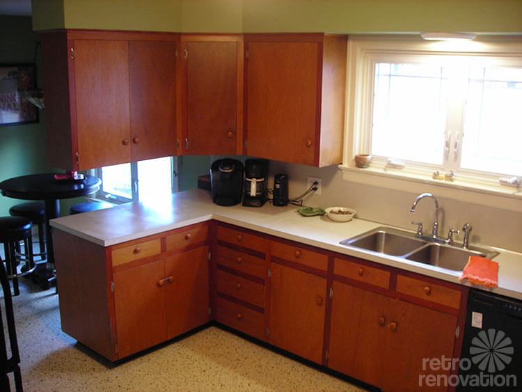
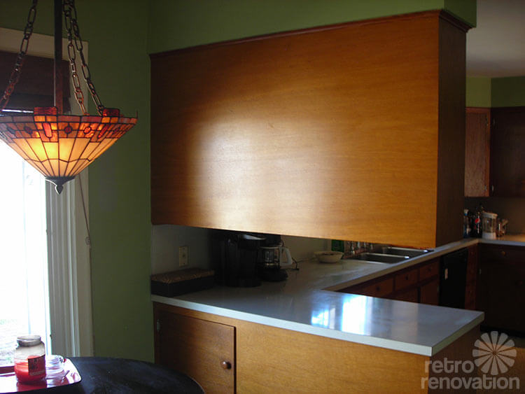
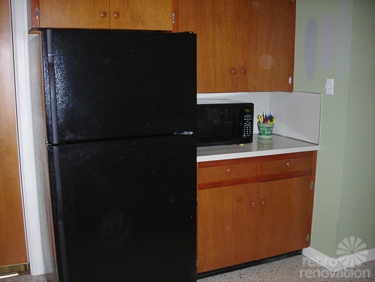
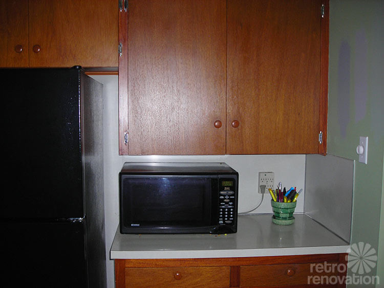
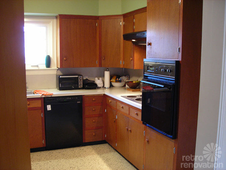
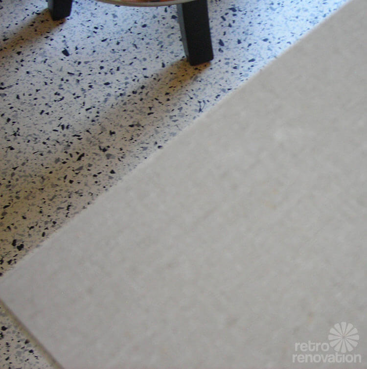
My husband and I bought our 1956 home because we thought it had a “Frank Lloyd Wright” feel to it, with walls of windows in the living room and master bedroom and lots of exposed brick. I have a completely original 1956 kitchen. It has “carrera marble” patterned linoleum floors, light gray Formica counter tops and backsplashes with stainless steel trim. The wood cabinets were built on site and are very solid, and still fit beautifully.
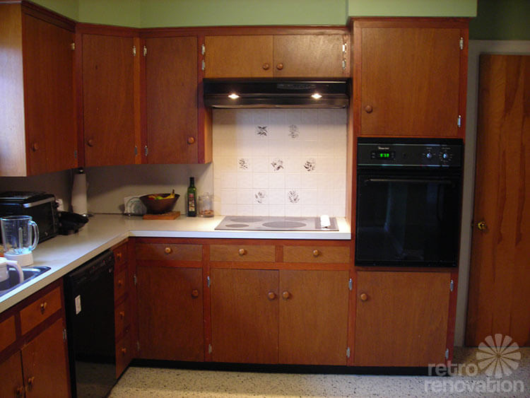
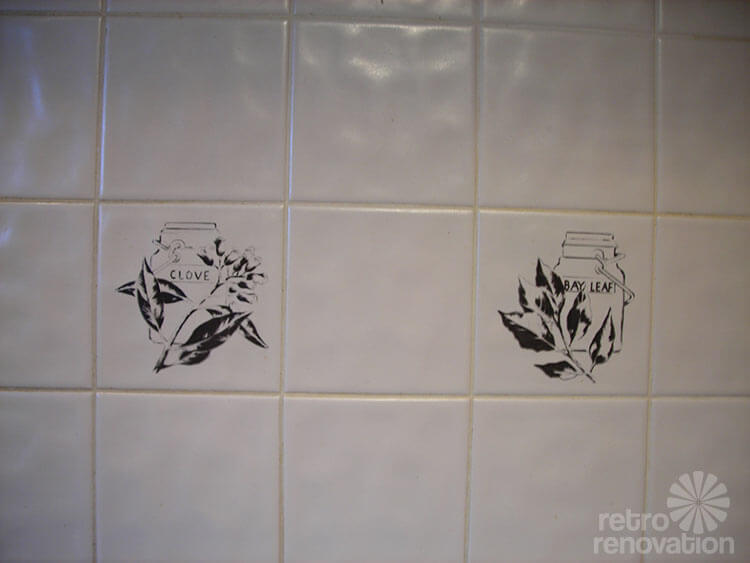
There are two different shades of wood used in them. I don’t think the small tile backsplash behind the stove is original; it doesn’t seem to fit.
I will be painting the kitchen soon and thought I would go with a light gray paint.
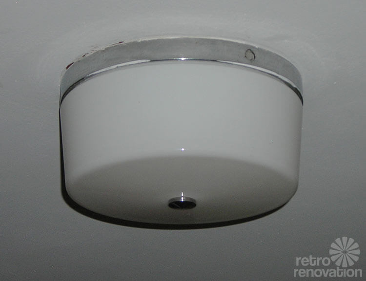
I also enclosed a photo of the original overhead milk glass light, and the u*** thing over the kitchen that was put up by a previous owner to replace the square recessed milk glass panel.
I can’t wait to see what everyone comes up with. I definitely need some help!

Noticing a contradiction in Renee’s plea for help, Pam replied:
I do want to ask: Are those GRAY paint samples on the wall? But you want to “jazz up” the space which is overloaded with brown and gray, right?
In response, Renee writes:
Yes, those are gray paint samples because I was thinking of painting the cabinets as well, although the wood is beautiful for the most part. I was thinking light gray on the walls and darker gray on the cabinets. Now I’m not so sure. If there’s a way to keep the wood cabinets as they are I am completely open to that idea. I had painted the kitchen green – I wanted a sage-type green but chose the wrong color. What is on the walls now is more of a spring green. I think the original paint color was a peachy coral because I can see it on the walls inside of the cabinets.
Readers — how would you make Renee’s kitchen feel brighter and more open?
What would you use as a backsplash or wall color?
Kate’s Solution: Kate’s sunny yellow and solar tubes
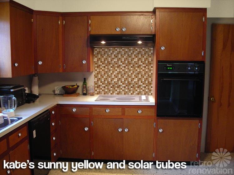 My kitchen cabinets are constructed in the same way as Renee’s — custom built-on-site wood cabinets. A few years ago, we needed to remove the cabinet above the refrigerator so that the new, taller refrigerator we purchased would fit in the space. Since the entire wall of cabinets was built as one large piece, it was VERY difficult to remove only one of the cabinets without damaging the neighboring cabinet. My cabinet doors were not in good shape so I knew I’d be painting them and thus, could hide any damage with wood putty and paint. Since Renee’s cabinets are in great shape, and painting or removing these kind of kitchen cabinets is a tedious job, I’d keep them as is and just give them a good clean and polish.
Renee doesn’t like how her cabinets block the view of the breakfast area. While removing the offending cabinets is probably not a great idea, due to the likely difficult nature of the job and the loss of storage space, I did notice that the table in the breakfast area is bar height. I would replace this table and stools with a standard height kitchen table and chair set in a lighter color. This way, people sitting in the breakfast bar will likely be low enough so they can see through the space between the counter top and cabinet and whoever is working in the kitchen will only have to duck slightly to make eye contact.
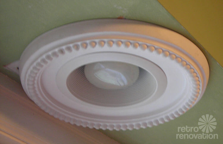
If Renee’s house is a single story ranch house, adding solar tubes — like Sarah did in her mid century kitchen — would be a great way to give the business side of the kitchen more natural light. Adding some recessed can lights would also help brighten up the kitchen without interfering with the clean lines of the space.
Since you are trying to make the kitchen feel lighter and brighter, I wouldn’t go too dark with paint. I chose a pale yellow for the walls — something like Sherwin Williams “Morning Sun” to add a sunny glow to the space. If Renee wants to replace the white tile backsplash behind the cooktop for something jazzier, I would suggest a small mosaic tile blend like Merola Tile Tessera Square in Amber. Yes, this is a slightly modern choice, but the different textures and colors in the tile blend pick up the warm tones from the cabinets nicely while adding interest to the space. To bounce even more light around the room and break up the monotone wood, I’d replace the wood cabinet knobs with some affordable mid century style chrome dish knobs — with or without backplates — like I used in my kitchen. If new appliances are in your future, I’d replace the black appliances with a lighter color — like white or stainless — which will also help the space feel brighter.
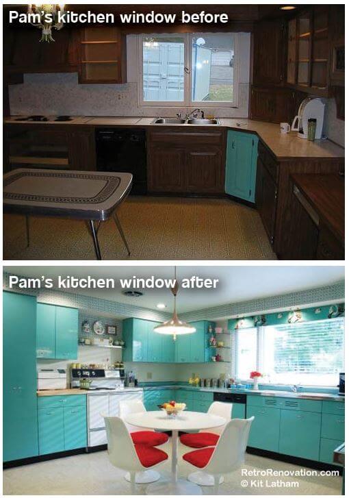
Pam’s solution: Move the cabinets, enlarge the window
Hi Renee,
My idea does not include a mock up, because I fear it would take Kate an entire day of work. But let me give you my ideas in a numbered list:
-
- I agree with your notion that removing the wall cabinets that hang over your peninsula is a good idea. Obviously, doing so will allow the light from the larger window in the dinette area to flow into the working area of the kitchen. To make this change, you are going to need a skilled craftsperson who can work very carefully with your seemingly gorgeous, original cabinets. As Kate suggests, this might prove a tedious chore — you may need to build ‘new’ cabinets from the old to craft one or two more cabinets along the long wall to the left of the sink — but I think you would have enough wood to work with.
-

Sometimes, “fixing the architecture” can make a transformational difference. Before you put this plan in motion, you might also consider whether it’s desirable and of course, possible, to enlarge the window over your sink — which would also mean moving the wall cabinet to the right of the sink. I designed a larger window into my kitchen — and it made an amazing difference. See my story “Should you fix the architecture?” Obviously, there are critical limits to this sort of plan, especially: What’s happening on the outside wall… and of course, the cost/benefit equation.
- I very much agree with reader Cellen’s comment this morning: “You have a lighting problem – not a paint color problem.” Something you could do with minimal fuss: Swap out that dinky milk glass light fixture for a ceiling fixture with four bulbs and which can accommodate a goodly amount of wattage. The diffuser (the glass shade part) should have limited opaqueness — you want to allow maximum illumination into that working area of the kitchen!
As to style, I suspect you like the Prairie style of the pendant/chandelier over the kitchen table.However, that Prairie style fixture does not seem to be throwing off a lot of light — you might also consider changing that out to something with more illumination as well as a cleaner, whiter light. If you take both of these suggestions, the two light fixtures could be coordinated — a matching chandelier for the breakfast nook coordinated with the ceiling fixture for the working area of the kitchen…. You know how I like my matchy-matchy, especially in relatively small spaces. You also can get fixtures with more bulbs and also ones that shine the light both up to the ceiling and below too (via the diffuser) — I think this style of light would be great for your situation — again, though: One ceiling mounted, one hanging like a chandelier. - Also consider new lighting for above the sink. That recessed can light is not providing much general illumination; better, I think to get a fixture with two bulbs that sits outside the soffit and that throws a lot more light.
Note: One of the things I *think* I have learned over the years: Recessed can lighting does not throw as much light into a space as an external mounted fixture with several bulbs that illuminate a broad swath of the ceiling AND the area below (through the diffuser). If you NEED light — see if you can make at least one external mounted fixture in each area work BEFORE you default to recessed can lights. - Paint everything gray? I suspect you may be a newish reader who has not read my several rants “Resist the Greige Nation.” I DO enjoy the color gray and seriously, as a decor color, I have no issue with it. BUT, this trend of painting enormous swaths of a room gray as if the nation were living in a mausoleum or a vampire TV show (see, don’t get me started again, I’m trying to be restrain myself this year) — is a 2012 trend — a 2012 fashion. Mid century houses did not have gray kitchens — they did have warm (not icy) gray tile bathrooms with happy wallpaper, though! I cannot imagine how adding more dark colors to your kitchen will lighten it up. Stick with your gorgeous wood cabinets, they are a treasure!
- In fact, the neutral color combination of your cabinets, flooring and counter tops is very versatile in regard to choosing coordinating paint colors for the wall and decorative accents. I love Kate’s yellow suggestion. I also am entertained by the idea of dialing the sunny yellow up to chartreuse — although admittedly, chartreuse is not a particularly “appetizing” color. For our most tried-and-true color palette, see our PDFs of the Sherwin-Williams Suburban Modern paint palettes. For additional, mind-numbing choices: 20 Historic Paint Color Collections.
- Get yee some window treatments — in fact, I might start my color journey by looking for fabric with a decorative pattern that pleases me immensely — and then choose my wall colors from there. Fabric will soften up the space. If you want to minimize frou frou, even simple valances will do. The colors on the fabric should include hints of brown and colors from your floor — fabrics and/or wallpaper are fabulous for pulling all the colors in the kitchen together. How about something like the Haley’s Comet reproduction barkcloth design from Full Swing Textiles (now discontinued). It has a “richness” that to me, suits your kitchen. Wall color in this case would be: the green. Or get more light into your kitchen, yes, you could even paint the walls light gray! That little green Hall planter by your fridge — play up that accent color!
- Finally, I do not think the backsplash tile behind your range top is original to 1956. I think those wavy field tiles are a 1980s-1990s thing. If I had the opportunity to retile a backsplash like this, I would run (not walk) to World of Tile to see if I could find some New Old Stock real deal vintage tile to play with. As Kate has suggested, I like the idea of keeping the backsplash tile harmonious with either the cabinets or the laminate (rather than queuing it to a wall color, for example); this will enable you to change out wall colors in the future.
It looks like readers are also providing numerous other excellent suggestions! Thank you, Renee, for putting your neck out there to let us pummel you with all these ideas. Good luck — and let us know what you ultimately decide to do! Your house looks like a real beauty!