


 About a year ago, Diane bought a lovely 1960 ‘granny ranch’ in Florida. She’s been having fun decorating the original pink bathroom with vintage goodies from her mother’s collection, but now she is having problems deciding on a paint color for this kitschy space. She hopes Pam and me — and our wonderful readers — can help. Retro Design Dilemma time!
 Diane’s request (edited):
Hey Pam & Kate, I have a design dilemma for you. We bought a 1960 “granny ranch” a year or so ago in Florida with some money my late mother left us — as an investment and also in part to honor her and give me a place to put many of her vintage things with which I wasn’t yet ready to part (yes, I unashamedly claim the title of sentimentalist & vintage hoarder!)
Now I am trying to figure out what to do with the walls of my pink tiled bathroom there — paint, or maybe wallpaper?
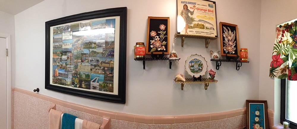
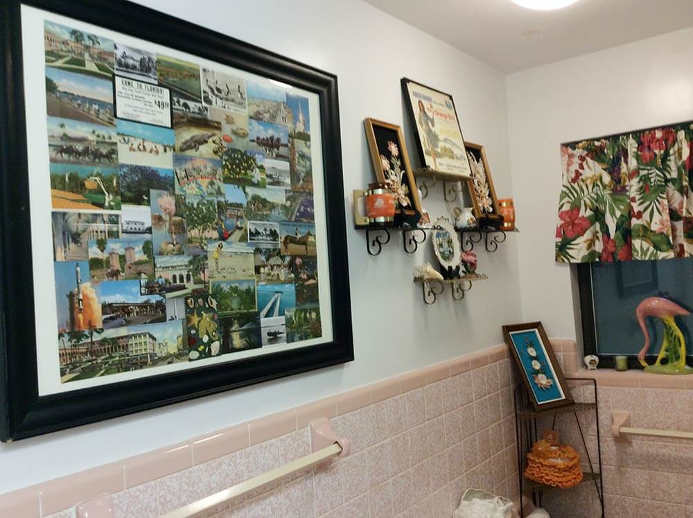
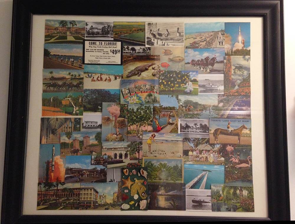
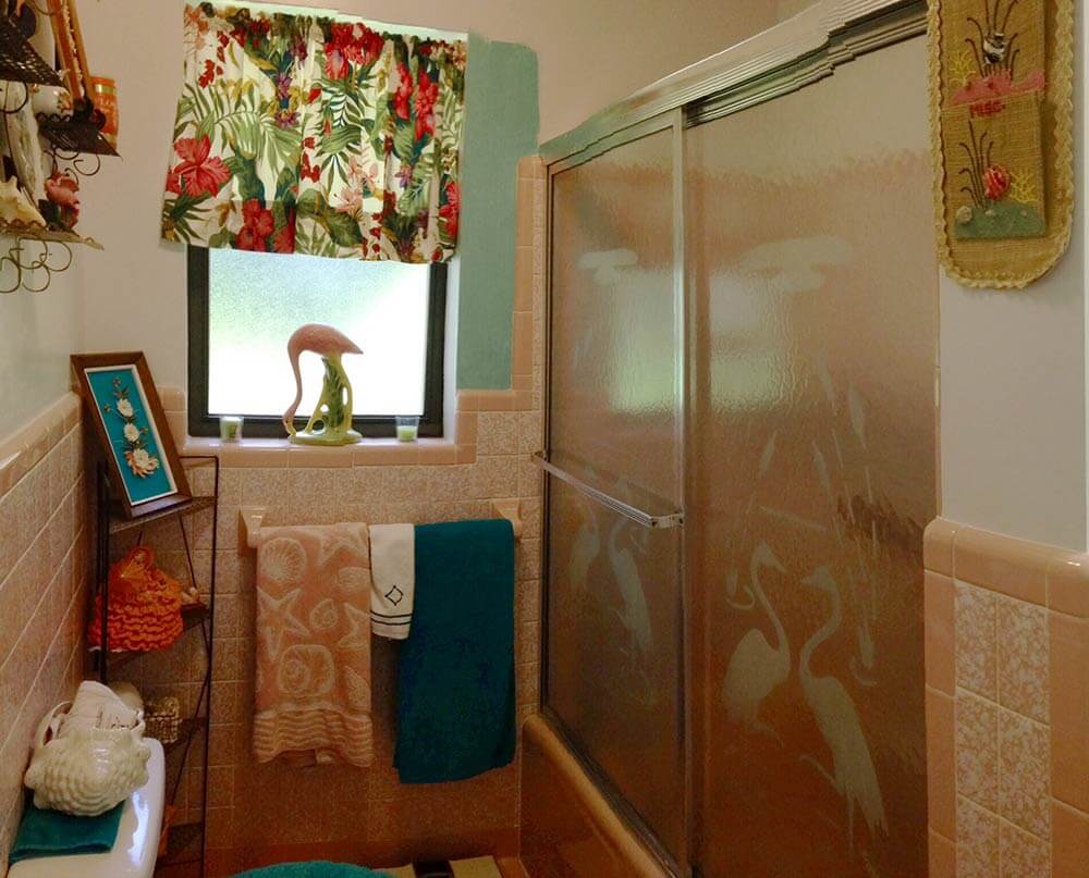
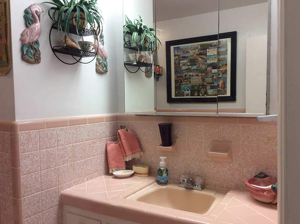
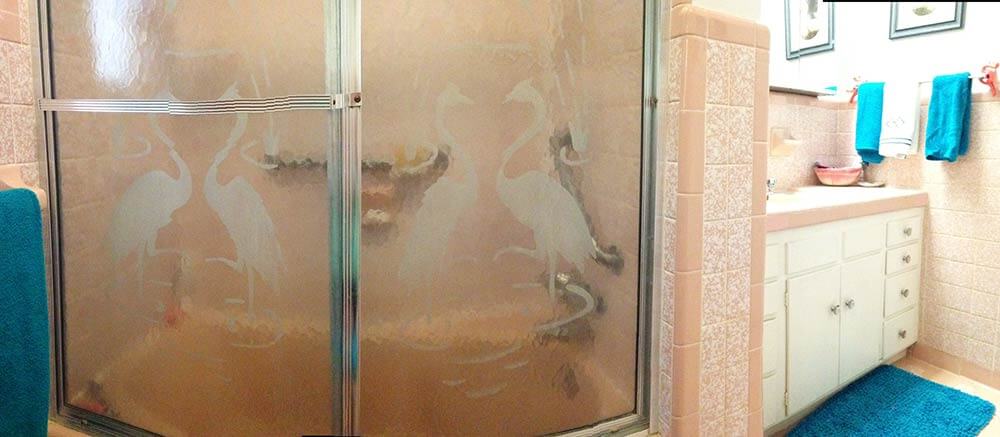
I am going with a kitschy florida theme for the decor, spring boarding off of the vintage etched flamingo shower doors and a huge homemade collage I put together of old florida postcards from family members dating from the 40s, 50s & 60s, which I had discovered among my late mother’s things.
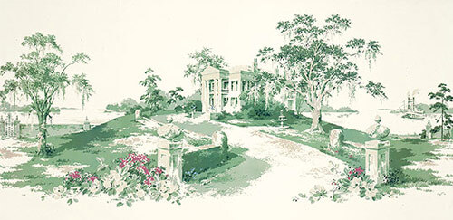
I am also thinking about using the great vintage wall paper mural “Magnolia Hill” (which I bought from your recent link to Steve’s wallpaper & blinds recently) in the hallway off of the bathroom.
- There are still some of this murals left, read our story — Thibault wallpaper murals in 11 designs
Anyway, I had initially thought that a contrasting color of Sherwin Williams “Holiday Turquoise” from their Suburban Modern collection would be just the ticket for the bathroom walls. However now, after applying a small swath of it on the wall, I am having second thoughts. Just the one coat seems to make the room appear darker — I’m worried what a second coat might do! Think you or your readers might be able to help me out with some suggestions? I’m open & up for almost anything! Much thanks!
Ok readers — what should Diane do with the walls in her vintage pink bathroom? Wallpaper? Paint – and if so, what color?
Kate’s ideas for decorating this pink bathroom:
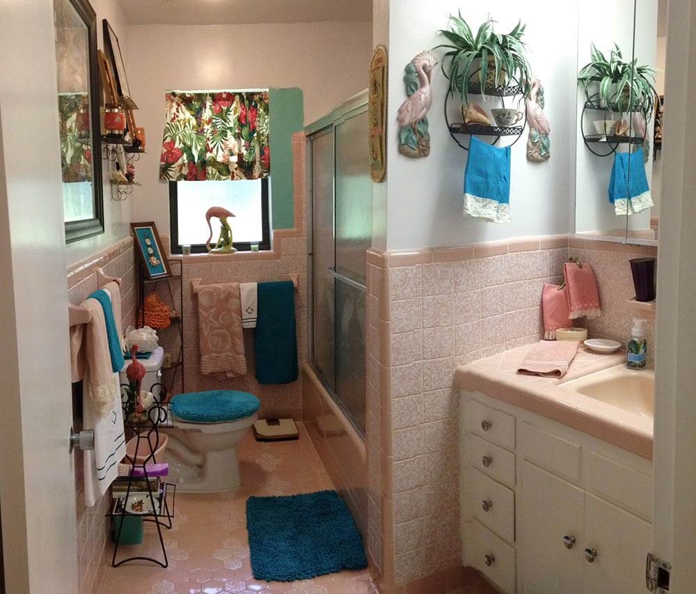
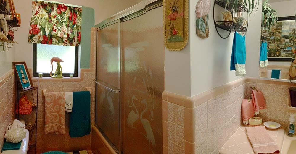
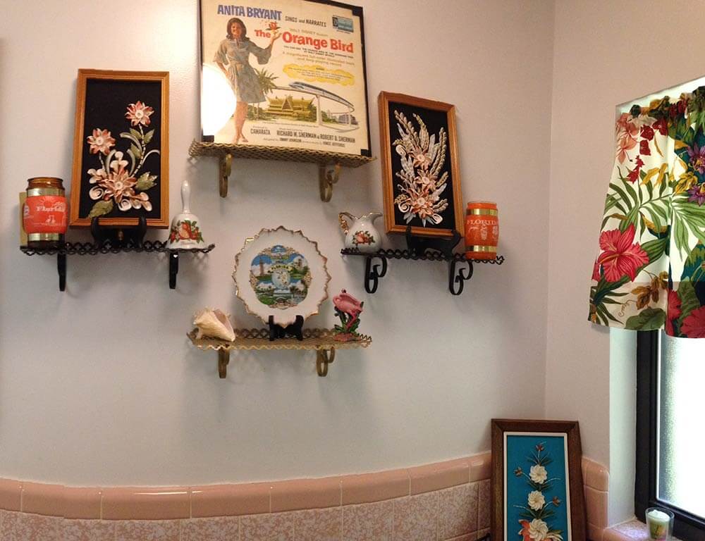
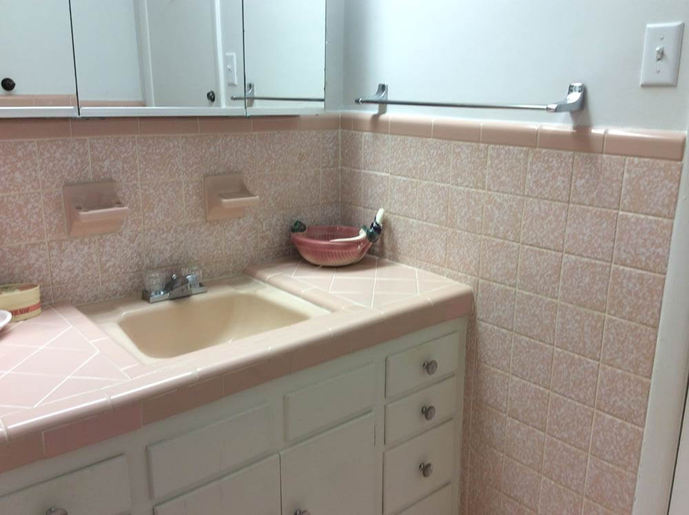
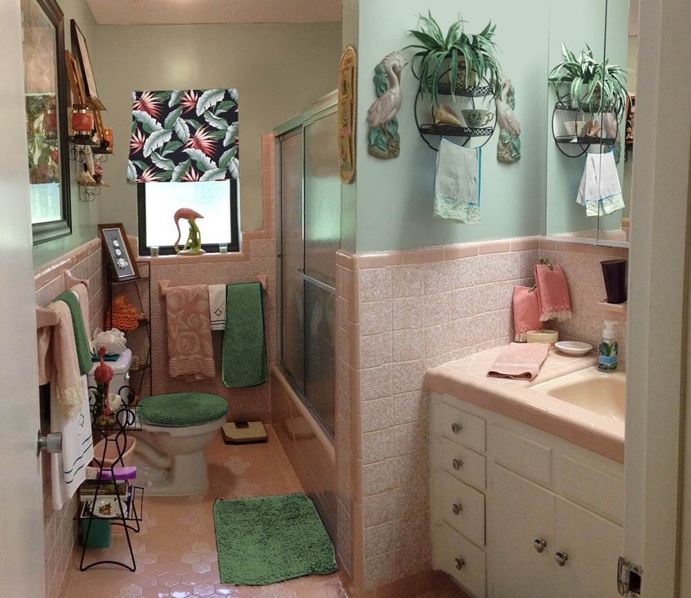
My first thought when taking a peek into Diane’s 1960 pink bathroom — after I ooohed and awwwed over that gorgeous original tile — was that the deep teal blue towels, bath mat and toilet seat cover weren’t quite right for the space. Because they are so saturated with color, and much darker than most of the other decor in the room, the steal too much attention away from the fun, kitschy vintage accessories and delightful original tile. Also, because there is already a lot going on in the small space, simplifying the color scheme will help unify the space overall. For this same reason — that is, so much wall decor, both Pam and I agree you can skip the wallpaper — paint is the answer and yes, a real color will be better than off-white, grounding the wall decor better.
 Above — First, I tried using the Sherwin Williams ‘Holiday Turquoise’ paint that Diane was contemplating, which looks much better with matching turquoise accessories instead of the deep teal towels.
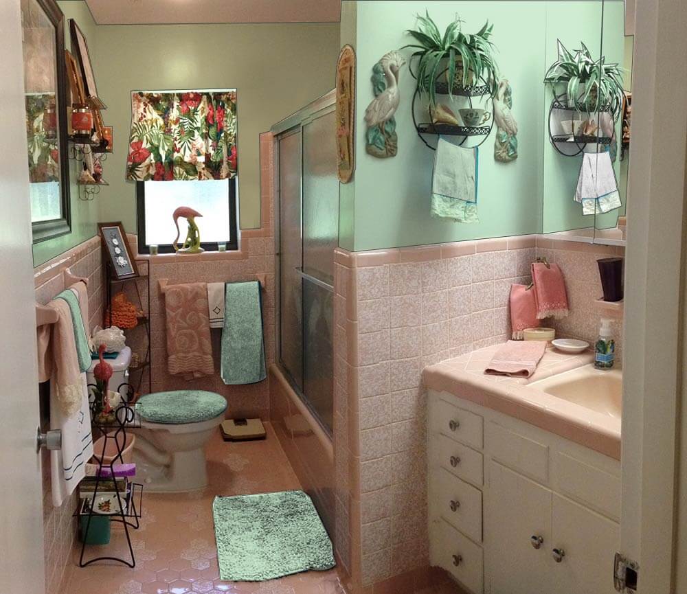 Next, I tried a light green paint, pulled from the tropical print barkcloth curtain on the window. I think this color works well in the space without making it feel too dark overall because it helps harmonize the tropical barkcloth printed window curtain and complements the pink. Pink is basically light red and the complementary color of red is green — a combination that is very pleasing when done correctly. Adding a similar shade of green towel, bathmat and toilet seat cover helps disperse the green around the room.
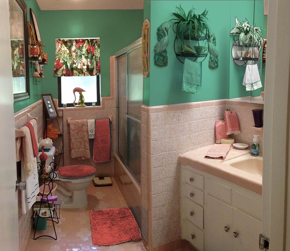 Alternately, if Diane wants to add some major kick to the space, choosing a deeper teal green would create a tropical, ‘vintage miami’ feel in the space. Adding red bath towels and accessories help make the barkcloth curtain pop and make visual sense in the room.
Pam’s additional suggestions:
 I very much agree with Kate’s key suggestion — that the royal blue linens are detracting from making this beautiful bathroom come together beautifully. I would take her suggestions even one step further and say: Change out the curtain. I think it would be relatively easy and inexpensive to find a similar, tropical styled fabric — but one that is in pink and green or blue pastel tones rather than the stronger primary tones of your current tones.
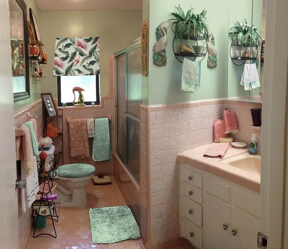
For example, above: Kate photoshopped Diamondhead Fabric’s Molokini (Sage) cotton bark crepe into the window and oooooh, I quite like how it looks. The pink really makes this pop. Then, choose paint colors and towels from the fabric itself. In general, I really like it when the field color of a fabric and the wall color are the same. Of course: You will probably want to get a real sample of the fabric first to test.
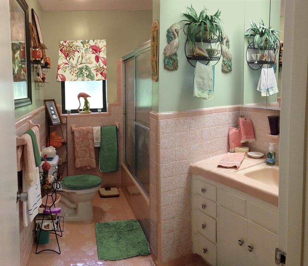 Above: Diamondhead’s Akaka (Natural) also has pink tones. I am less thrilled about this curtain, because of the natural field. In any case, we included it so you could get another idea of how a pink pastel-based fabric could look.
Of course, you can also look for vintage fabric. Living in Florida, you could probably find 50 different options with one trip to a local antique mall, I bet!
Finally, in response to many readers who suggested a more neutral paint color — a grey or ivory or lighter shade of the pink — I very much agree those could work too — and again, would coordinate the wall color with the field color of your window treatment. Honestly, ‘most any color could work done with a deft hand. That said, I think — and I think that Kate agrees — that you can make shades of aquamarine or green or blue work just fine — in particular because this is a kitschtastic Florida space where, hey, less is not more — more is more! We all respond to color differently — so do what sings to you! Paint is relatively cheap — it’s the perfect medium with which to take some chances… to push some design limits!
Good luck, Diane, and let us know how it turns out!
 UPDATE — Above:Pam asked me to make a mock up with the Diamondhead Fabrics Molokini (black) cotton bark crepe fabric suggested by commenter James of the Woods — looks pretty good!


Karin Jeffrey says
The fun accessories and their placement are spot on. Well done, Diane. It must have taken a good while to acquire them all, so show ’em off! Yes, the dark blue towels are not quite blending. The barkcloth suggestions are breathtaking. I vote for paint, because wallpaper is hard to fix if you change your mind, and may not be the best idea for a high use bathroom. The colors selections are so well thought out that I’d be hard pressed to pick one. I’m sure whatever is picked will sing. Since paint is such a relatively inexpensive fix, why not keep all of Pam and Kate’s suggestions on file and change it up every so often? Of course, this would entail having the matching towel, curtain and bath sets on hand. This may sound a little nuts, but if you’re anything like me and actually enjoy changing the decor every once in a while (especially after seeing great RR reader stories), you’d be able to try them all, LOL. Oh, and that heavenly etched flamingo shower door…don’t get me started.
Julia Shields says
Speaking as someone who was setting up housekeeping in that time, the walls should be white or some pink to match a pink in the tile or even a bit deeper, though I realize that is not the look you are trying to achieve. It would be a much easier look to live with, though. And a lighter background without so much contrast on a curtain covering either the lower half of the window or the full window. The towels would be matching in whatever color you want for accent, But go ahead and have the fun of doing whatever you want.
tammyCA says
What I keyed right on was the vintage flamingo pottery on the sill…such beautiful colors in it and that would be my inspiration. I’m collecting things for my eventual flamingo pink tropical ’40s type bathroom so I’m gonna throw my ideas at ya. You have those fabulous vintage flamingo shower doors so going vintage Florida is the right thing to do. I’d also say look for a vintage fabric for the valance (definitely look for the real thing ‘cuz the reproductions just don’t have that ’40s/’50s color tone or design shapes…go to the flea markets and check out the authentic & you’ll be able to tell)…and for a valance you don’t need very much. Or go with matchstick bamboo shade.
Also, you can find great vintage towels at estate sales & ebay, looks like your pink seashells is vintage…they have that great cut textural design.
My suggestion is that you have a lot of black going on with frames, shelves and to me it seems to darken the theme. I like bamboo frames (again, I love bamboo & easy to find at thrift stores), and they have that lightness and tropical feeling.
Maybe, par down the shelves & magazine stands. I do love the circular shelf, so I’d keep that one in & it won’t be so overpowering with too much black.. keep the items simple on it, little flamingos, seashell box, small bamboo plant.)
Paint would be choice, and again taking my cue from the flamingo either pale green or pink like the tile…or grasscloth (I saw recently a pretty soft aqua grasscloth online, but I always need to see things in person to decide). I’m also partial to a warm shade of pale yellow next to pink but I think your mottled pink tile might not work with that..so hard to tell until you experiment, but that’s the fun of it! 🙂
pam kueber says
Yes, I love vintage towels, too! I have purchased some New Old Stock — and they ROCK. Vintage from estate sales, too. I use them every day. They are better than today’s towels.
Geronimom says
Ha! Vintage towels – yes, I’ve definitely got those, thanks to my mom who never got rid of anything (and yes, the seashell towel was one of hers!)… Unfortunately, the color matching thing when trying to put together a set is a tad more challenging. And don’t even get me started on when I was trying to find just that perfect shade of pinky brown! I actually traveled with an old washcloth just that color in my purse in case I dropped by a thrift store and spy something that might work.
pam kueber says
Traveled with an old washcloth in your purse! That is a GOOD ONE!!!!
Mary Elizabeth says
You mean everyone doesn’t do that??? That’s what I did when shopping for towels for my pink bath. And I agree the old towels (and old style jacquard ones I found) are better than new ones. Sometime in the 1980s and ’90s, Americans got enamored of huge, fluffy towels that look as though they should be absorbent but aren’t so much. My pink towels don’t look thick and “thirsty,” but they actually absorb more water and dry faster than thicker ones. Of course, they stopped selling them the same year I bought them because people just didn’t get that.
pam kueber says
Totally agree!!!! Now, I am off to etsy, cuz I feel the need to hoard all the NOS towels I can, before our secret is really truly discovered and proliferated.
tammyCA says
Yes, the vintage are so much more absorbant…I hate those new puffy ones that feel “slick” when you dry off (my sis has them and I actually dig into her linen closet for the old tattered absorbant one). 😀
carol says
My Mom buys $4 Kmart towels because they are like the older ones. They are standard looped terry. They are much smaller than the big towels on the market, but they dry fast and are more absorbent than the new breed. She says the newer towels are heavy, and they are. When I was a kid she had the velvety towels and they were awesome. With 6 people in the family, they sadly just wore out. My next round of “everyday” towels will come from Kmart.
Joe Felice says
I don’t like over-sized, over-fluffed towels, either. They may feel great, but don’t really dry all-that well. And isn’t that the purpose of a towel? I guess they’d be great to sleep on, however, and the cats sure like them.
Judy H. says
I meant to tell you, I have a pink bathroom in my 1950 house as well. After much deliberation, consternation, argumentation and pain, I happened to find a small ceramic tropical fish at a thrift shop. The only difference was, he was painted in pastel colors, mainly pink and pale butter cream yellow. He has some aqua, a bit of lavender and some gold outlining. We brought him home and put him on the counter in the bathroom. We painted the walls a pale shade of butter cream yellow and the rest of the bathroom just kind of came together.
pam kueber says
Pink is a wonderful color — plays so nice with others!
Joe Felice says
Buttercup was a very-popular color in the ’50s. It could be used where canary yellow would have been too bright, especially on exteriors.
Judy H. says
I adore the Akaka (Natural) Fabric. I think it is a “must have” in your bathroom. I also love the pale sea
foam color in the very last picture of your post. I think taking everything out of your bathroom, (except the fabric), but wall art, towels, rugs, any decor at all, will give you a better idea of what you like best with the gorgeous tile. My personal opinion is that you would want to stay within the pastel family. I just think it plays better with your pink tile than brighter colors. Choose a color first, then start bringing in items that compliment or contrast nicely with that color. I think it will come together for you very easily.
Laurie Louise says
Wonderful bathroom! I see a couple of different things…the right wallpaper could unify the space–something muted, small pattern, maybe tone on tone creamy pinky. To pick up and (sort of) extend the pattern of the tile. I also love the soft green paint. With either, I’m seeing white/off white towels (depending on what works–we can’t really see true colors) and bath mats. Hand towels too. With a nice texture. They would add some brightness without being too visually demanding, or detracting from your collection. And I’d like to see the curtain reach to the bottom of the window–again, I think the vertical lines would add more of a sense of unity. Maybe paint the shelves bright pink or turquoise? The collection may not need editing as much as rearranging…to help the eye flow through the space. Whatever you do, I’m sure it will be wonderful…and I hope we get to see a follow-up post!
pam kueber says
Yes, I take back what I wrote in the story: A small pattern tone-on-tone wallpaper also could look fabulous! What a fun room — and yes, I agree, Diane has got a great eye — as demonstrated by her collections — and will surely do a great job.
J D Log says
I like the lighter green picture with the different Curtin. A light bright grey would work. A bright yellow really pops and is not for the faint hearted, although never had a yellow wall bathroom as people say it makes you look sick.
I would get rid of some of those floor shelves I would be tripping over these with my big feet. Please do not paint the walls pink even a different shade have some pity on the males of your family
KateStevens says
I like green with those colors too. We had a pink and maroon bath in our old house and we painted the upper walls a soft yellow green (Valspar – I think it was called Spring Green). The color complemented everything and it receded, which made the room feel bigger and brought the tile out in its full glory. I miss that bathroom!! Sad ending: the buyers gutted it and replaced everything with sleek beige and gray. Sigh.)
Carol says
Like the pale green combo a lot, however, to me the pink is a very hard color to find a complementary wall color. This may sound crazy but I would paint the walls about the color of a pair of Bass bucks in the chalk color. Tint the white ceiling paint pink. This will make the bathroom glow against the tint of grey on the walls. The ceiling paint could also be tinted with the aquamarine. I saw a home in a magazine that was midcentury and the walls were stenciled with a silver sharpie. The wall was a silvery purple the color of a concord grape and lines were drawn to create harlequin diamonds. the diamonds were elongated and you literally could place a hand in it. Where the lines intersected, they placed a freehand X (or cross) about an inch past each line. The wall looked like uber expensive wallpaper, was very subtle, and did not compete with the furnishings or the art. It would look very elegant and work well with the chrome in the bathroom. It would make a great background for everything that is on the walls already. It sort of looked like a Park Ave. version of atomic wallpaper. Lol. As far as complimentary colors, I’m lost except for grey and white. I’m a minimalist by nature but enjoy looking at EVERYTHING. Pink is oh so pretty but challenging.
Gwen says
OK…..THIS gets my vote for a paint job and the mirror is a MUST.
http://media-cache-ec0.pinimg.com/236x/d6/7e/a3/d67ea365ffb7bcd9dcf7589cc81f058a.jpg