


 About a year ago, Diane bought a lovely 1960 ‘granny ranch’ in Florida. She’s been having fun decorating the original pink bathroom with vintage goodies from her mother’s collection, but now she is having problems deciding on a paint color for this kitschy space. She hopes Pam and me — and our wonderful readers — can help. Retro Design Dilemma time!
 Diane’s request (edited):
Hey Pam & Kate, I have a design dilemma for you. We bought a 1960 “granny ranch” a year or so ago in Florida with some money my late mother left us — as an investment and also in part to honor her and give me a place to put many of her vintage things with which I wasn’t yet ready to part (yes, I unashamedly claim the title of sentimentalist & vintage hoarder!)
Now I am trying to figure out what to do with the walls of my pink tiled bathroom there — paint, or maybe wallpaper?
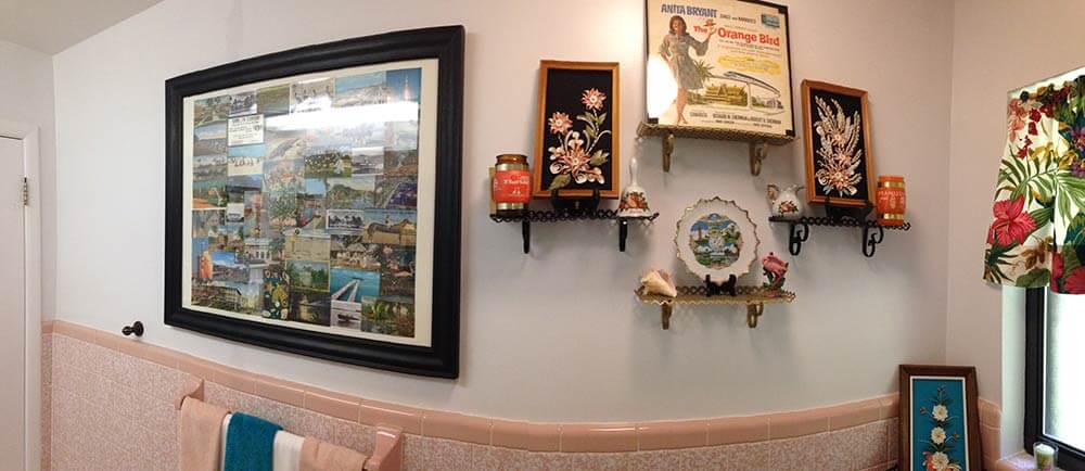
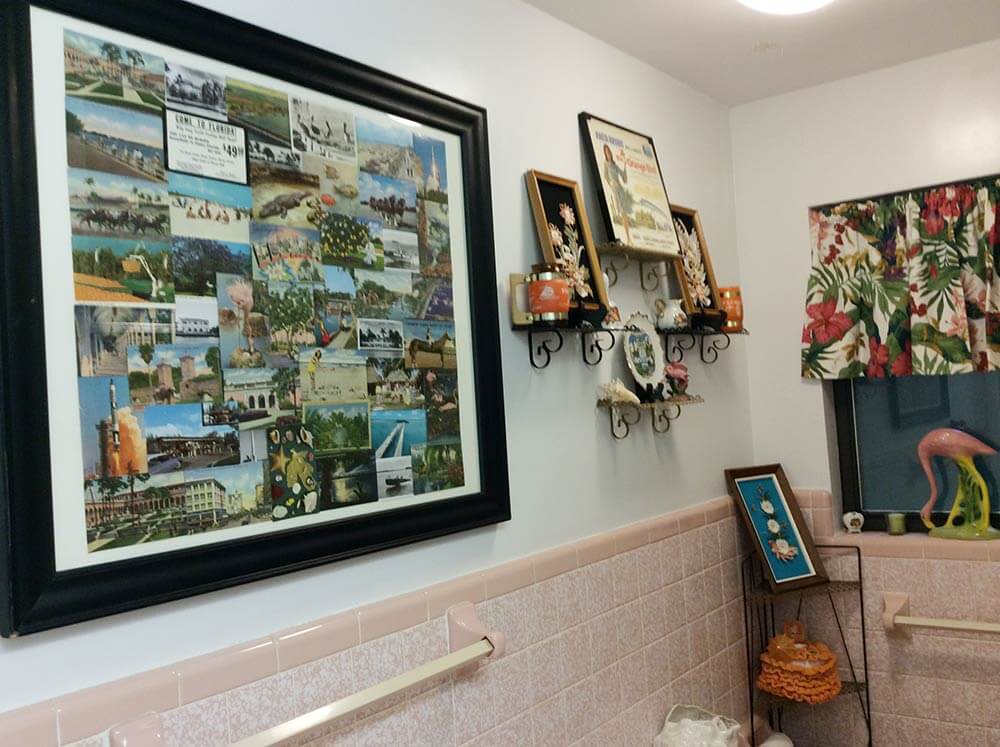
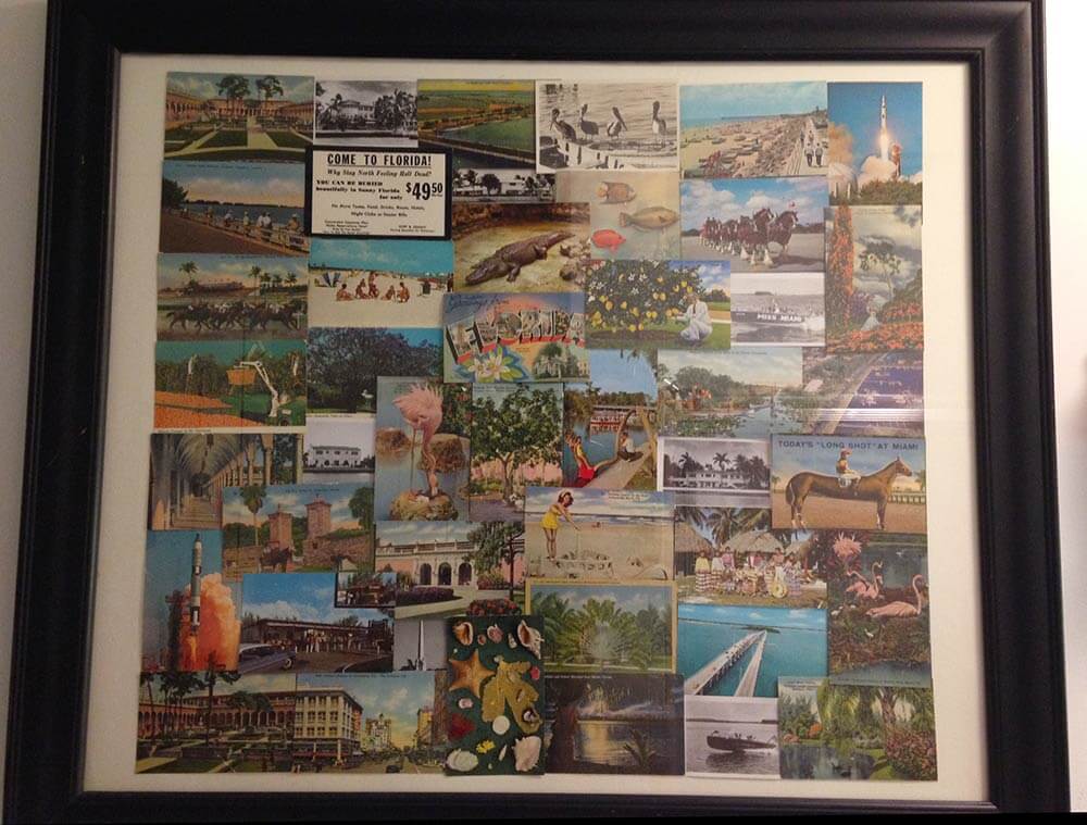
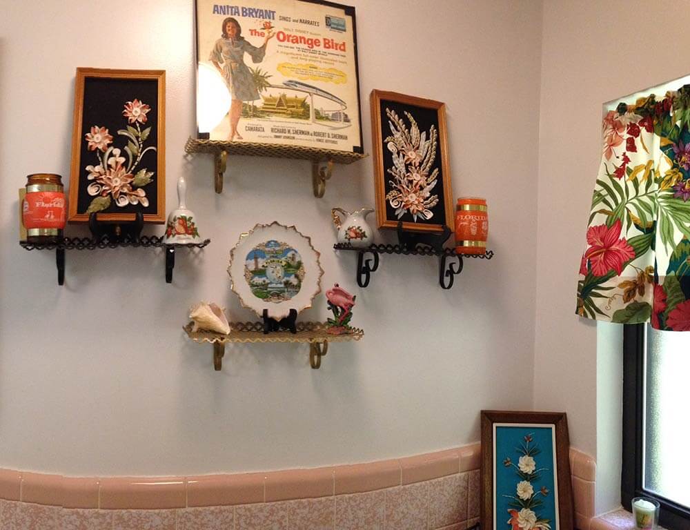
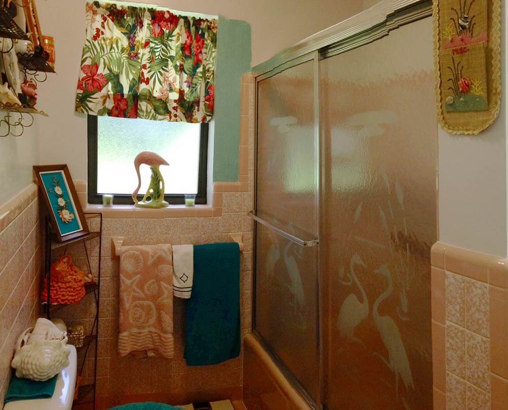
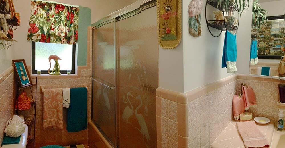
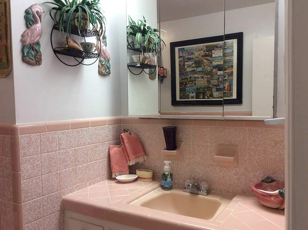
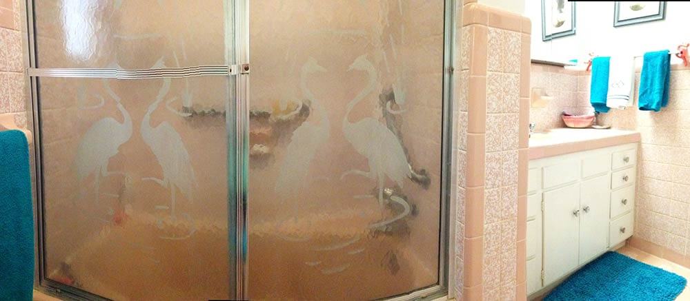
I am going with a kitschy florida theme for the decor, spring boarding off of the vintage etched flamingo shower doors and a huge homemade collage I put together of old florida postcards from family members dating from the 40s, 50s & 60s, which I had discovered among my late mother’s things.
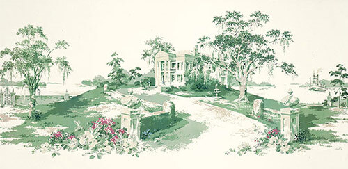
I am also thinking about using the great vintage wall paper mural “Magnolia Hill” (which I bought from your recent link to Steve’s wallpaper & blinds recently) in the hallway off of the bathroom.
- There are still some of this murals left, read our story — Thibault wallpaper murals in 11 designs
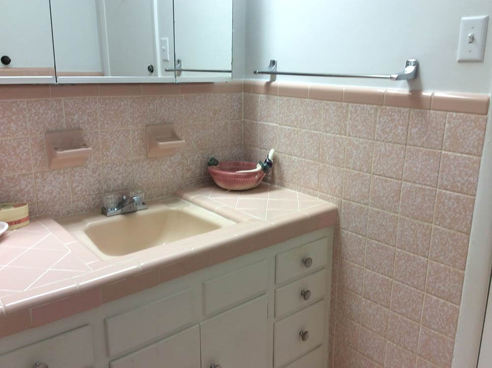
Anyway, I had initially thought that a contrasting color of Sherwin Williams “Holiday Turquoise” from their Suburban Modern collection would be just the ticket for the bathroom walls. However now, after applying a small swath of it on the wall, I am having second thoughts. Just the one coat seems to make the room appear darker — I’m worried what a second coat might do! Think you or your readers might be able to help me out with some suggestions? I’m open & up for almost anything! Much thanks!
Ok readers — what should Diane do with the walls in her vintage pink bathroom? Wallpaper? Paint – and if so, what color?
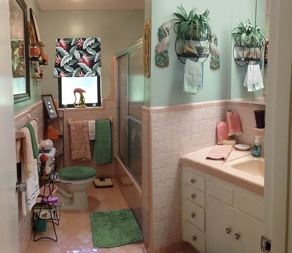
Kate’s ideas for decorating this pink bathroom:
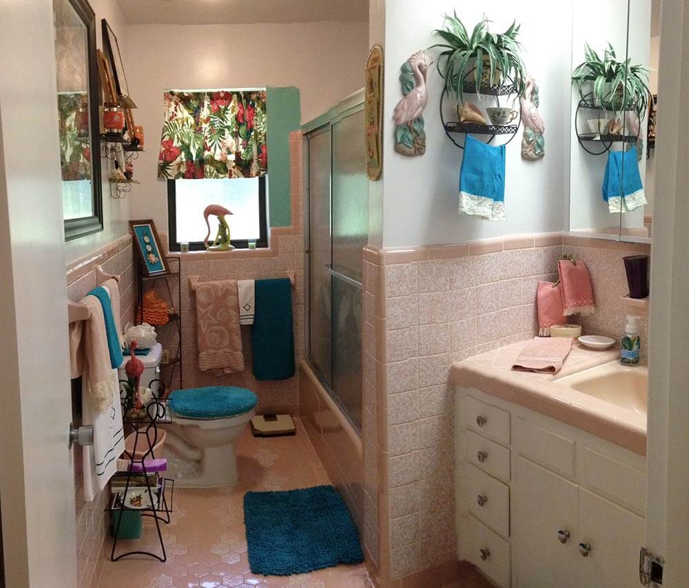
My first thought when taking a peek into Diane’s 1960 pink bathroom — after I ooohed and awwwed over that gorgeous original tile — was that the deep teal blue towels, bath mat and toilet seat cover weren’t quite right for the space. Because they are so saturated with color, and much darker than most of the other decor in the room, the steal too much attention away from the fun, kitschy vintage accessories and delightful original tile. Also, because there is already a lot going on in the small space, simplifying the color scheme will help unify the space overall. For this same reason — that is, so much wall decor, both Pam and I agree you can skip the wallpaper — paint is the answer and yes, a real color will be better than off-white, grounding the wall decor better.
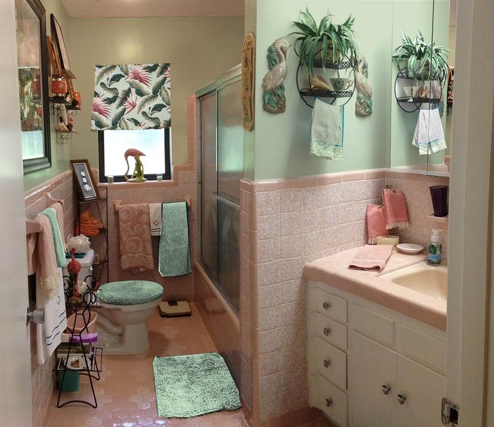
 Above — First, I tried using the Sherwin Williams ‘Holiday Turquoise’ paint that Diane was contemplating, which looks much better with matching turquoise accessories instead of the deep teal towels.
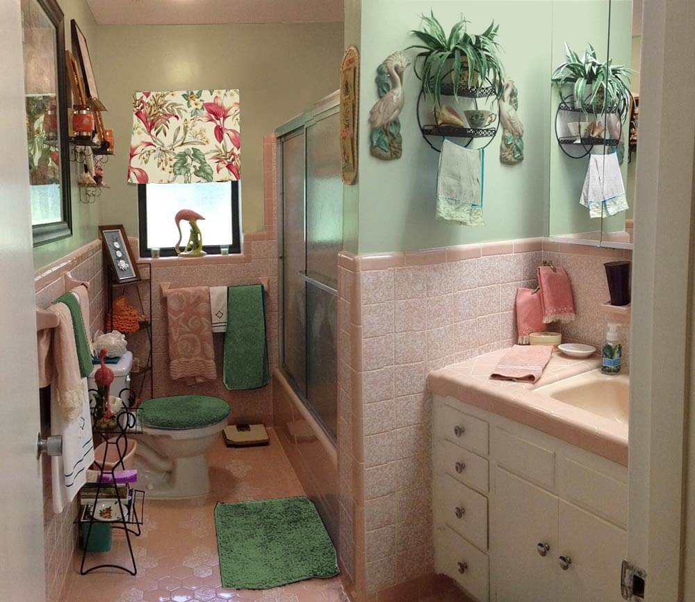
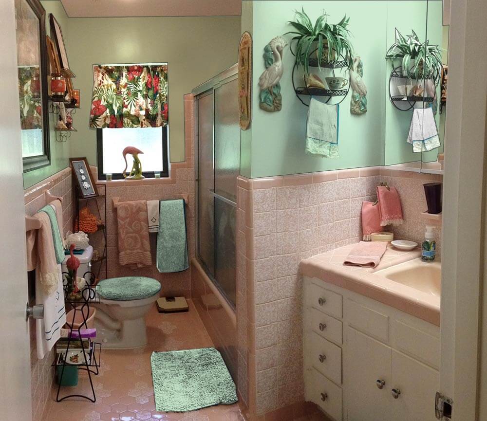 Next, I tried a light green paint, pulled from the tropical print barkcloth curtain on the window. I think this color works well in the space without making it feel too dark overall because it helps harmonize the tropical barkcloth printed window curtain and complements the pink. Pink is basically light red and the complementary color of red is green — a combination that is very pleasing when done correctly. Adding a similar shade of green towel, bathmat and toilet seat cover helps disperse the green around the room.
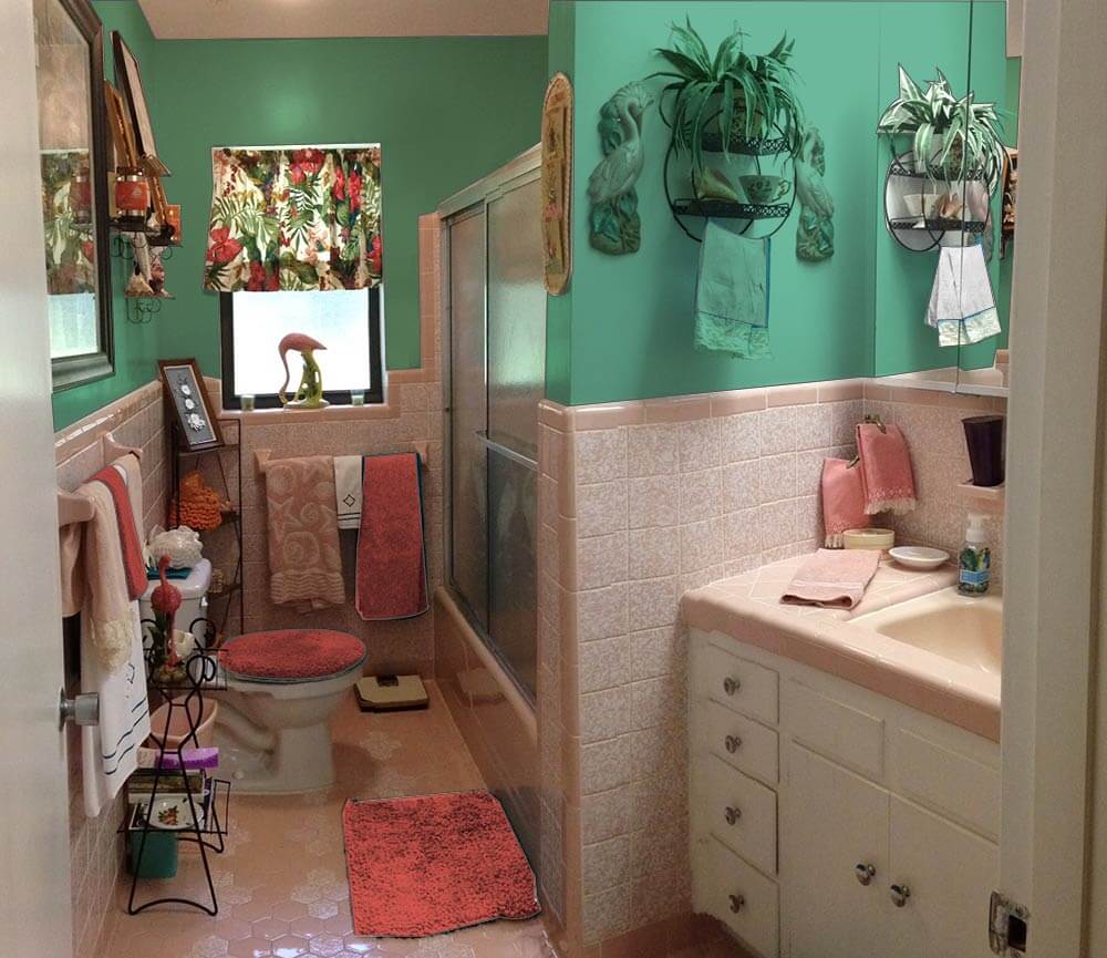 Alternately, if Diane wants to add some major kick to the space, choosing a deeper teal green would create a tropical, ‘vintage miami’ feel in the space. Adding red bath towels and accessories help make the barkcloth curtain pop and make visual sense in the room.
Pam’s additional suggestions:
 I very much agree with Kate’s key suggestion — that the royal blue linens are detracting from making this beautiful bathroom come together beautifully. I would take her suggestions even one step further and say: Change out the curtain. I think it would be relatively easy and inexpensive to find a similar, tropical styled fabric — but one that is in pink and green or blue pastel tones rather than the stronger primary tones of your current tones.
For example, above: Kate photoshopped Diamondhead Fabric’s Molokini (Sage) cotton bark crepe into the window and oooooh, I quite like how it looks. The pink really makes this pop. Then, choose paint colors and towels from the fabric itself. In general, I really like it when the field color of a fabric and the wall color are the same. Of course: You will probably want to get a real sample of the fabric first to test.
 Above: Diamondhead’s Akaka (Natural) also has pink tones. I am less thrilled about this curtain, because of the natural field. In any case, we included it so you could get another idea of how a pink pastel-based fabric could look.
Of course, you can also look for vintage fabric. Living in Florida, you could probably find 50 different options with one trip to a local antique mall, I bet!
Finally, in response to many readers who suggested a more neutral paint color — a grey or ivory or lighter shade of the pink — I very much agree those could work too — and again, would coordinate the wall color with the field color of your window treatment. Honestly, ‘most any color could work done with a deft hand. That said, I think — and I think that Kate agrees — that you can make shades of aquamarine or green or blue work just fine — in particular because this is a kitschtastic Florida space where, hey, less is not more — more is more! We all respond to color differently — so do what sings to you! Paint is relatively cheap — it’s the perfect medium with which to take some chances… to push some design limits!
Good luck, Diane, and let us know how it turns out!
 UPDATE — Above:Pam asked me to make a mock up with the Diamondhead Fabrics Molokini (black) cotton bark crepe fabric suggested by commenter James of the Woods — looks pretty good!


Ranger Smith says
Looks great Diane. Kudos for being bold and having fun!
Geronimom says
Ranger – If there’s one thing I’ve learned in my 52 years of life, it’s not to take it too seriously all the time and to try to have some fun with it where you can! It’s JUST a bathroom – and can be easily changed. So why not go a little out on a limb with it, eh?! Am I totally in love with that color now that it’s up? Truthfully, no. But with the right accessories (I’m kinda leaning now toward going even crazier & making a valance from a Lilly Pulitzer daiquiri pink shower curtain & maybe using their flamingo bath rug – and then playing with those fun, bold colors – May even consider removing some of the black metal & adding some bamboo!), I can envision some potential. And after all, isn’t it all really about the fun you have in the process? And with hubby’s and my quirky personalities, I imagine this will not be the last change this little room undergoes in the future!
pam kueber says
Life’s a big canvas, throw on a lot of paint!
Ranger Smith says
Excellent attitude Diane! When in doubt, paint!
Amy A says
OMG !! Diane !!
I have the exact same heron shower doors AND the strange bubbly pattern pink tile in my 1957 bathroom in SW Florida.
From what I can see, even the vanity looks eerily similar….
Am wondering if you are close to me. Could we have the same builder? There must be some connection.
I painted my bath a light spring green almost 15 years ago and still love the color. The walls are egg shell and the ceiling is the same green but in high gloss. (there’s more to that story, but I digress)
I am in Palmetto just north of Bradenton.
Amazing!!
Geronimom says
That is TOO funny, Amy! Does it even have the same, unusual floor pattern and weird toilet placement? I doubt it was the same builder, tho, as our home is built in 1960/’61 and is located up in the panhandle. Then again, I’ve been in several of the similar era homes in this neighborhood, and although none of the bathrooms were pink, many of them did have that same speckled tile thing going on. Perhaps because my home was one of the first built in that neighborhood? My bathroom floors however, are the only ones I’ve run across here that have that inlaid tile pattern thing happening, and not those smaller mosaic-like floor tile ( forget what they are called).
Joe Felice says
My parents retired to Florida, and my sister still lives there. I live in Colorado, and one thing I have noted is that most Florida homes look alike and have many of the same features inside. You all simply do not have the diversity of styles that we in Colorado have, but I also add that even here, differences are becoming less and less, as everyone seems to gravitate towards what they see on HGTV. Up here, you can readily tell when a home was built, as there are definitely more “period” styles that change, while, down there, they tend to vary less. And this is not to be critical. It just is what it is.
Geronimom says
Bathroom update: So after reading all of the comments & suggestions and thinking about what direction I wanted to go, I went to the paint store and, after much hemming and hawing, Sherwin William’s “Gleeful” spoke to me the most. Someone had made a suggestion of going with a chartreuse paint color. Someone else had reminded me of all the vivid, fun Lilly Pulitzer colors. The paint description said “Gleeful from Sherwin Williams is a fun, tropical green that has just a bit of ZING!”. Hmmm… Sounds like it could be the look I’m after. (As if one can really go by paint color descriptions!). SO… I picked up a sample, headed home & asked hubby if he would paint a swatch of it on the wall wall I was at my hair appt. Well, after 16 years of marriage, I should have known better. Upon returning from my appointment only a few hours later, I found that my hubby, who is a lifelong sufferer of “Can’t-Ever-Sit-Still-itis”, and despite his having received several stitches in his leg from an encounter with a saw the previous day, had not only acted upon my request, but done me one better. Not content with just painting the one swatch, he removed all the hardware and then decided to go ahead and paint the ENTIRE bathroom!! So, yeppers, our lovely loo is now pink and a chartreusey kind of green. And surprisingly, despite it being QUITE bright (it will certainly wake you up in the morning!), I don’t actually hate it. I quickly threw together whatever complimentary colored accessories I happened to have on hand and stepped back. I think I can live with it for at least a little while. Hopefully the right colored towels & curtain will help. And when it starts to drive me to distraction, at least I know that in only a couple hours, we can paint it again to something else! Now – off to the thrift stores in search of some chartreuse or lime green towels – who knows? Maybe I’ll get lucky & find a contrasting flamingo red/pink one as well!
Joe Felice says
Just checked out “Gleeful,” and it is not-at-all garish. I’m trying to picture it with the pink. This will need to be a visual.
Mary Elizabeth says
OK, we are not married to the same man, as my DH is only 5’5″. But they obviously went to the same school of “Finish What You Start,” as the exact thing happened to me once when I said, “Just try a patch and see. . . .” I’m sure it will be lovely. Send photos.
Geronimom says
Well, I did take a few photos – some in the late afternoon, and some in the morning. It’s probably a bit my camera’s fault, but depending on the lighting, that color REALLY changes in this small bathroom! They should have called it camellian! I’m not sure if I am able to embed photos here, but this is the link to my photobucket album which will hopefully give you some kind of idea of what I mean. Bear in mind that I definitely still need to do something about the towels, toilet seat, etc.! http://img.photobucket.com/albums/v296/DianeLu/Pink%20and%20green%20bathroom/imagejpg1_zps4e844858.jpg
Mary Elizabeth says
What is interesting about the photos is that the green towels also change color with the walls. It’s definitely the light. I wonder what would happen if you changed out the yellow-y fluorescent bulbs for cool white (or modern equivalent in energy-saving bulbs). Would that mean changing your light fixtures?
One thing I noticed was that now that the walls are green, the tropical curtain colors go perfectly in the room. I can now see the light pink in the fabric as well as the other colors. But I wonder if it would be better if you shortened the curtain to valance length, maybe just a few inches longer than the kitchen valance you put up. The window is small.
Joe Felice says
It is so true that some colors, more than others, seem to vary in shade under different ambient circumstances. That’s part of the fun of colors. Have you ever noticed how-different colors appear in the store than they do at home? I honestly don’t understand why they have those bright, garish lights over the paint chips in the store. In order to find out what a true color is, I usually take the chip outside, not in direct sun and not in the shade, but just under normal daylight. I know there are lights that are described as “daylight,” but that’s usually a measure of brightness, and not really the light during the day outside. There are colors of cars that actually look different under different lights at different times of the day. I call them “iffy colors.” I often wonder “Is that car gray? Or is it green? Maybe brown? But it has some blue in it. And when I’m driving behind it, I could swear I see some yellow.” How do they do that? I suspect it is in the metal flakes in the paint. But how, on earth, do they ever hope to match that color when panels have to be repainted following an accident? And have you ever noticed how, when you touch-up a wall, even with the same can of paint, under certain light, you can always see the touch-ups. I never cease to be amazed.
pam kueber says
Fun!!! This bathroom is a bowl full of jelly (jello?!) fun. Go for it color!
Kennyt123 says
I’d paint the walls white, that way your beautiful pink tile will show better. Also it provides a neutral background for all the lovely kitsch.
You could use that lovely magnolia hill wall mural and use that little bit of purple in the mural as the accent color.
My pink bathroom has lemon sorbet walls to match one of the colors of the tile in the floor. Absolutely gorge!!!! I love my pink bathroom.
laurie says
We have vintage yellow tiles in our 1940s coop in nyc…we went with a slightly lighter version of our yellow tone..saw one with slighly darker tone in my building and both work beautifully..
I say go for vintage window covering! Enjoy and congrats!
Joe Felice says
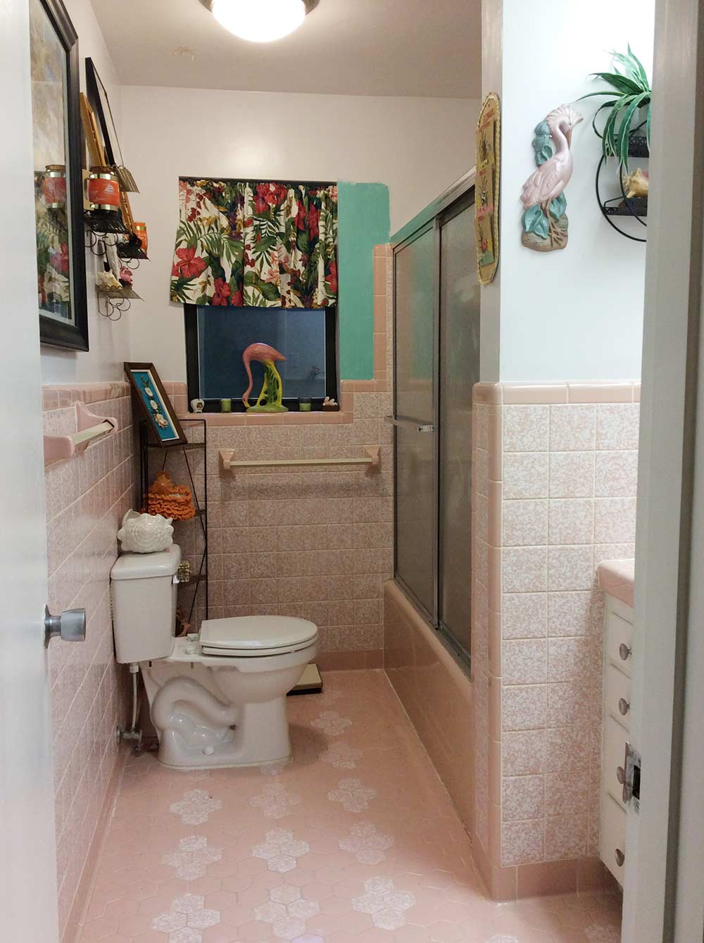
I agree with Kate. The dark turquoise (almost peacock, really) is too much. The aqua is more soothing. I would never use a “neutral” color in a mid-century room, especially this one. My recollection of home interiors from the period is that they were bright and colorful. And there was a set palette of colors that were standardly used. So, don’t be afraid to dial it up, just not too much due to the small room size. I actually like this bathroom a lot, and I especially like the flamingo curtain and accents. I would use a wallpaper that matches or coordinates with those. Wallpaper was very popular back in the day, and we have seen it used with amazing results in various renovations on this site. My one issue is with the toilet. It does not belong where it is. It almost looks like someone built the bathroom and then said “Oops, I forgot to put in a toilet, so let’s just stick it here.” And it needs to be of a color as close as possible to the other porcelain fixtures. (Is that really pink, or more of a flesh tone? It’s hard to tell on the Internet, where colors do not portray accurately.) If there is nowhere else to move the toilet, I would at least put it against the wall under the window, where it wouldn’t be so conspicuous. I have never seen a mural in a bathroom, and the one pictured does not evoke a mid-century vibe. Murals are usually used in large rooms, like in the living room, above the sofa. And I really am not a fan of wall art in bathrooms, but I realize that is a personal thing.
Geronimom says
Oh, yes – that stupid toilet – or, as some hilarious commenter on the F/B thread called it, the “Bathing Observation Throne”! It is the bane of our existence…WHAT were the idiots who decided to place it there thinking?! Hubby is 6’2″ with long legs – when sitting there, his knees actually hit the edge of the tub! I have no idea why it wasn’t placed below the window – a more obvious choice- unless plumbing was an issue. Regardless, it is an issue that probably be addressed at some point. In the meantime, I guess we will just change the lid out to one in a some kind of similar pinky beige color – if I can find such a beast!
Joe Felice says
They’ve highlighted some places to get vintage-colored toilets on this site. I assume there will be pics of the new color on the walls. The only problem with moving the toilet is the hole in the tile floor. If you hire the right tile craftsman, he could probably use the cut-out from the new location to fill in the hole, but don’t change the floor. That is classic! I hope you realize that many of us would die for a bathroom like this, flamingos and all! I have grown to love them ever since I acquired a Turner flamingo mirror, but alas, have no pink in my home. The mirror doesn’t stick out, but the pink and black lamp ’50s lamp I bought to go with it sure does. Then a friend donated a 1949 (same age as I!) Admiral radio with record player that goes perfectly right under the mirror.
Reece says
Add some grey, especially with that curtain. What fun it is to decorate……..
Richard Douglass says
Hi Diane,
I agree with Jim. I would empty out the room and pick a neutral complimentary paint that makes the pink tiles pop. Have you considered a narrow line (maybe 1″) of dark paint trim just above the tiles to jazz up the neutral wall color paint? In this room, paint is better than wallpaper, because what you really want to stand out are all the fantastic things you have collected and will return one by one after the room is painted. Any wallpaper pattern will compete with things like the collage. And yea, unfortunately all those dark blue thingies and the window curtain have to go.
mary says
why paint all the walls.. maybe only paint the wall facing us in the pic the color and leave the other walls white?
Marilyn says
I lean towards the vintage Miami look…all the colors seem to come together…for me…Anything you feel comfortable with is what I say go with….have as much fun as you can and it will bring back lots of memories of good times….I love all the tips on the older and K-mart towels…I hadn’t really thought of that…..from now on, I’m checking out the towels at the auctions that we go to…absolutely love the bathroom…