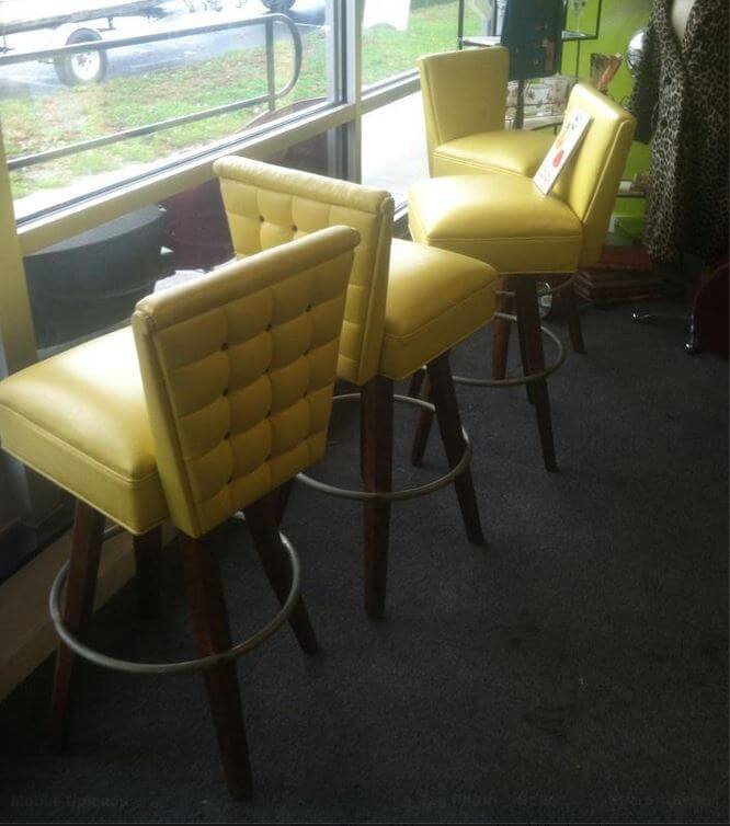
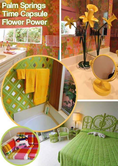
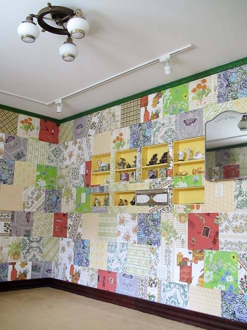
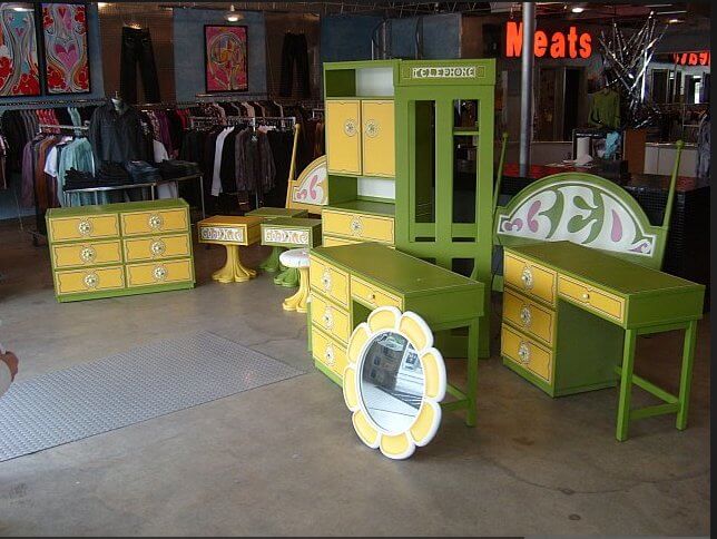
 Announcing our Color of the Year 2015: Flower Power Yellow. No other color-of-the-year organization (they are all “self proclaimed” … this is all marketing fleww flawf) would follow Harvest Gold as a color of the year with Flower Power Yellow as a color of the year. That would be too [yellow] peas in a pod. But, I prefer to flout all “rules.” Indeed, I made this choice on a whimsy: The moment I saw the fabulous vintage bar stools in Retro Genie’s shop, I was entranced — oh beauteous yellow pleather! So Flower Power Yellow it is, for our 2015 spotlight. Ish. Because we may throw other, similar yellows — especially acid yellow muted down a tad — into our Peace-Luv-mix. And anyway, this is all just for fun — we love most all colors (nix Greige, on principal).
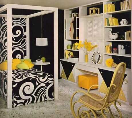

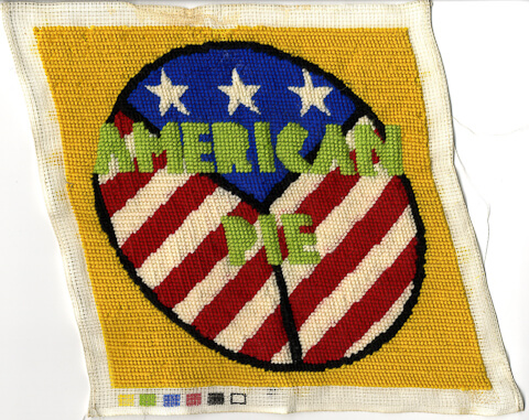
Above: I must have needlepointed this in in 1976. Hehe, bicentennial chic.
Above: Winnebago is calling the yellow in their 1966 revival model crimson-n-clover.
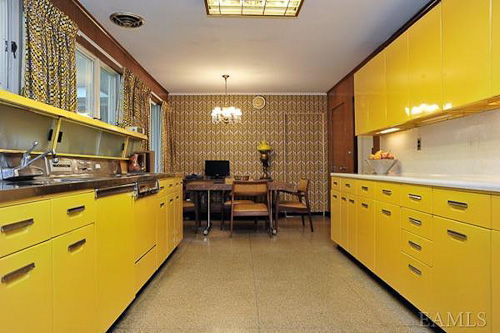
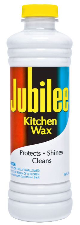
Above: Want just a dash of retro sunshine for your kitchen? Buy some Jubilee (affiliate link) back on the market in 2013.
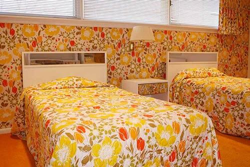

What do you think, dear readers, of our 2015 Color of the Year?
Have you successfully integrated this color in your house — how?
Our Colors of the Year past:
- 2014 Color of the Year: Harvest Gold
- 2013 Color of the Year: Broyhill Premier Chapter One rich lime green
- 2012 Color of the Year: Bitossi Rimini Blu
- 2011 Color of the Year: Orange






Lizzy says
omg! Granny painted the most of inside of the plantation house screaming yellow in… 1970? With lots of Lilly Pulitzer fabric, the original amazing stuff. And antique furniture in an 1815 house. And it works. Still. My father just had big parts of it repainted – the same color. So you don’t need all museum like period pieces match match to do this, just a good decorator. Lots of really old houses have layers of design trends. At our house though, there’s plenty of sun streaming in and big windows onto green. And that hideous yellow works so well!
Jodie Davis says
Yeah for YELLOW!
It is after all the color of Rubber Duckies. I vote for happy every day!
Margie C. says
The May 2014 issue of Traditional Home magazine, page 30, has an article about this kind of yellow, showing fabric swatches, paints, and decorative items in the color.
pam kueber says
Yes, marketers today are using this color to try to enliven the Greige Nation they have wrought.
Zann Gates says
Yessssss!!! I’ve been obsessed with screaming lemon yellow lately. Our Eichler is currently shades of sage and grey (going to change the sage to something deeper next year.) Cue screaming lemon yellow front door and panels to come! And, I have yellow touches throughout the house. 🙂
Janet Switzer says
Check out Fine Paints of Europe’s “Van Gogh Yellow” – http://eaglepaintandwallpaper.com/store/index.php?main_page=product_info&cPath=54&products_id=1598.
Their Hollandlac Brilliant is expensive, but it gives extra posh to rich colors like this.