

 Announcing our Color of the Year 2015: Flower Power Yellow. No other color-of-the-year organization (they are all “self proclaimed” … this is all marketing fleww flawf) would follow Harvest Gold as a color of the year with Flower Power Yellow as a color of the year. That would be too [yellow] peas in a pod. But, I prefer to flout all “rules.” Indeed, I made this choice on a whimsy: The moment I saw the fabulous vintage bar stools in Retro Genie’s shop, I was entranced — oh beauteous yellow pleather! So Flower Power Yellow it is, for our 2015 spotlight. Ish. Because we may throw other, similar yellows — especially acid yellow muted down a tad — into our Peace-Luv-mix. And anyway, this is all just for fun — we love most all colors (nix Greige, on principal).
 Above: A bus-stop yellow GE Wonder Kitchen in a gorgeous 1960 time capsule house just outside New York City. The person who decorated this entire house was immensely talented. In this room, she or he recognized that this much yellow, this saturated, would look great if treated graphically — hence the chevron wallpaper and draperies (?). Haha LOL not: I swore to never show chevrons on this blog — because they have been soooooo overdone in the mainstream design world today and moreover, because I think they’ve been poorly done — the scale is too large. But here, done in 1960: Yes!
 Above: Yes — flower power yellow is GRAPHIC. From a 1967 Sherwin-Williams paint brochure in my personal collection. Flower power yellow may not be an “easy” color to work with, but to be sure, used deftly, it can have an amazing impact.
 Thumbnail at left: I loved the interiors in the movie American Hustle. But, the photo-use rules said that I could use the photography except to promote the movie. So here’s an itsy bitsy teeny weeny yellow polka dot bikini thumbnail photo of character Sydney’s amazing acid yellow tone-on-tone bedroom. Jump my story about all the interiors in American Hustle to see fabulous Hollywood designer Judy Becker’s take on this color. Note: JeLa’s bedroom is rich with gold. Oh, the interior design in this movie!

Above: I must have needlepointed this in in 1976. Hehe, bicentennial chic.

Above: Winnebago is calling the yellow in their 1966 revival model crimson-n-clover.
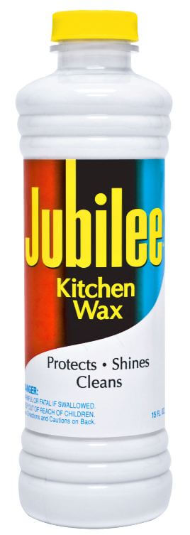
Above: Want just a dash of retro sunshine for your kitchen? Buy some Jubilee (affiliate link) back on the market in 2013.
 Above: Flower power yellow plays nicely within a bittersweet orange-melon-and-light olive palette in this 1975 time capsule house. I LOVE the matchy-matchy-matchy bedspreads+ wallpaper + pinch pleats — and is the drawer front done up, too, or is it mirrored? Oh and: Orange carpet!
 Above: The Palm Springs time capsule condo that reader Rebecca discovered, photographed, and shared. Oooooooh, this was probably in my head when I wallpapered my office…
 Oh, yeah, I painted the cubbies flower power yellow.
 Jackie and Todd’s Shaggin’ Chalet has lots of flower power yellow inside — and out.
 Above: Drexel “Plus One” furniture, circa 1970 — one of my all-time favorites. I was age 11 in 1970 — and color of this ilk are my very favorite. Peace, out!
What do you think, dear readers, of our 2015 Color of the Year?
Have you successfully integrated this color in your house — how?
Our Colors of the Year past:
- 2014 Color of the Year: Harvest Gold
- 2013 Color of the Year: Broyhill Premier Chapter One rich lime green
- 2012 Color of the Year: Bitossi Rimini Blu
- 2011 Color of the Year: Orange


Joe Felice says
That first kitchen is a whole lotta yellow! I don’t think school-bus yellow (aka traffic-marking yellow) will ever be the color of any year. Besides, I got lead poisoning in the ’80s while painting the fire lanes in our complex without gas mask. Heck, those were only for chemical warfare in those days. I wonder if that paint still has lead in it. Of course, at the time, there were warnings about using the paint indoors, but NOTHING about using it outdoors, where one would think there would be plenty of fresh air. Do you think I can sue? LOL It triggered 25 years of migraines. So, all you DIYers: Listen to Aunt Pam when she tells you to take precautions, or, better yet, hire the work done by professionals. The interesting thing is that I discovered this paint dries on the surface, and doesn’t soak in, so it flakes and chips off easily, and had to be redone within a year. So I tried regular old latex paint on the concrete curbs, and it actually soaked in and lasted a lot longer. So there you have it. Now onto other shades of yellow. Canary yellow was HUGE in the ’50s, and, for some reason I really like that one. (My aqua kitchen is accented with that.) Buttercup (very-muted yellow) was also in vogue. I found the colors of the ’70s to be a bit brash, but hey–why not flower-power orange while we’re at it? It went so well with the dark brown of the day.
Scott says
Great choice. I’ve been finding when you have a shade of yellow, gold, amber, or orange as one of your key colors in a room you can pull in objects from a much wider time span that otherwise might not play well together. A Lime-to-avocado range makes for a great bridge to multiple decades too.
Alice says
Well, I’m thrilled that it is the color of the year, since it is still the color of my Geneva kitchen! retrorenovation-com-staging.enwf9w61-liquidwebsites.com/2008/…/ideas-for-alices-yellow-geneva-kitchen/
tammyCA says
I’m glad I’m not the only one who is so over seeing the current chevron craze!
Love yellow, the happy color..the color of my house & living room walls, ‘tho a soft shade. But, recently found a bright yellow ceramic lamp at the thrift that followed me home..gotta make a statement shade for it.
Goes along with my yellow spine Nancy Drew books.
Flower power era was fun, optimistic..everybody had color (and the icon yellow smiley face) in clothes, home and cars. Now it’s all somber town lack of color & going for sophisticated, whatever that is suppose to be.
tammyCA says
Oh, that English…”Supposed to”
pam kueber says
tee hee tammy C, you get double extra brownie points for reading !
in addition, I’m now seeing lots of darkish grey with acid yellow. an immensely displeasing — “dispeptic” is the word that comes to mind — color combo. It’s because marketeers don’t know what to do with those oceans of gray. They keep trying to add colors to perk it up. How about: Get rid of it. The oceans, that is; I am not fundamentally anti-gray; although I continue to be puzzled by the mass of Americans who say that first and foremost they want “lots of light” in their homes and then proceed to put gray — a color that soaks up, rather than reflects light — on walls and floors and furniture and cabinets and countertops and… well, you get my drift. MASS MARKETING HYPNOSIS. I received a Restoration Hardware catalog last week; ugh ugh ugh ugh ugh.
*breaking my own rules rant* sort of but not really because this is aimed at marketeers.
Diane in CO says
OMG, I received the same catalogue, Pam, and had the same reaction. Nothing in there appealed to me (bor-ing!) and although I love to hang onto catalogues for a while, that one went right into the recycle bin. LOL!
pam kueber says
I liked the colorful pinball machines… I guess that’s the only true burst of color they will allow…
Mary Elizabeth says
Pam, do I get brownie points for pointing out your misuse of the word “flaunt”? You “flaunt” your gorgeous turquoise kitchen and tiki attire, meaning you show them off with a flourish. But you “flaut” rules, meaning you opening disregard them. And I just noticed that the spell check on this site doesn’t allow the word “flaut,” but thinks it should be “flaunt,” so you may be forgiven for being tricked by a machine.
I think of those automatic spell-and-grammar-correct programs the same way I do the machines at carnivals and in old diners–the ones into which you put a quarter and then try to pull out a stuffed animal with a giant claw. They are there to trick you into thinking you’ll get something (a stuffed animal, a correct word or sentence) easily, without using your brain.
Mary Elizabeth says
Of course, I meant “openly,” not “opening.” Anyone who noticed that gets all my brownie points. 🙂
pam kueber says
Wow. Good catch. It’s spelled flout, heheh
Mary Elizabeth says
We are SO even, Pam! I had the right definition, you had the right spelling. 🙂
Becky says
Oh, the happy memories all this yellow brings up for me. My beloved Nana’s favorite color was yellow. She and my step-grandfather lived in a wonderful brick ranch that was painted yellow, with black shutters. Her small kitchen opened up into a breakfast area and family room/den – EVERYTHING was yellow. The walls, her kitchen cabinets, the rattan furniture (breakfast table and chairs, sofa, ottoman, a large china cabinet – all yellow. The contrast color was blue (her second favorite color was navy) – oriental rug with lots of blues in it, blue and white china in the cabinet, blue and white lamps, etc. It was such a happy room to spend time in. This is making me realize I do not have enough yellow in our apartment, it’s time to hunt for some fun retro pops of yellow to brighten things up! : )
virginia says
The coior of our first floor and larger bathroom. This yellow with light blue tile and black tile borders in the shower and tub area. Makes me feel slightly better about having chosen it years ago. Two thirds of the room this color, including all of the ceiling. Some days I like, some I wonder what I was thinking. Yellows can pack a real punch.
Love all these photos though — Terrific looking kitchen.
Kate says
The little yellow couch that was my Nana’s is flower power yellow!
http://retroranchrevamp.com/2012/02/22/cool-retro-stuff-my-mom-gave-me-the-little-yellow-couch/
pam kueber says
oh my word, CUTE OVERLOAD of you at one on that couch! Can I use that one as lead photo?
Kate says
Sure! 🙂
Mary Elizabeth says
It really is an adorable photo and a great story. Want photos of my yellow curtains in the knotty pine kitchen?
pam kueber says
Sure! Send photos!!
Pen says
Just painted half the kitchen in my “mid-century modest” home a bright basic yellow. (Elizabethan Yellow by Valspar) It is next to my aqua dining room where my yellow vintage dinette set resides.
After I painted the kitchen, I was wondering if I went too deep a yellow and should have picked something a bit more pastel and buttery. It seems, from this article, I was right on trend.
By the way, it’s really hard not to smile when standing in my kitchen now.
Janet in ME says
Well, can’t say I have it now, but the kitchen in my 1957 ranch here in Maine has the gray tile with black trim four feet up the walls, and had yellow paint above. I was going to repaint another color but hubby likes the yellow, so it may stay! I had a lot of it in my bedroom before I got married. I had a gold, avocado green, and orange shag (yes it was a shag rug), yellow pin striped wallpaper, two yellow twin bedspreads, and lamps with yellow daisy decorated glass shades. I still have the bedspreads, four lamps, and a set of the twin sheets. I even have a wild yellow and gold flower power vinyl covered shoe box in my closet now that I bought back then. Somewhere I think I still have a heavy Wearever aluminum pot which is harvest gold and decorated. I save way too much stuff! Yes, the yellow is so cheerful, I always loved it. So hmmm, maybe we will stick with it in the kitchen, but the worn golden floor has to go!
Janet in ME says
Hey, Pam and Kate. I think an upload of everyone’s yellow and flower power colored stuff would be really fun! It is supposed to be a tough winter all over the country and I think we will need some bright sunny photos to cheer us up in the next few months!
midmichigan says
Fun post, Pam. Yellow was really big from Woodstock to Disco. I painted a snowplow yellow and stuck on some of those big, hippie, flower decals and called it the “flower plower”. A bold decision to make it RRCOTY (retro renovation’s color of the year) and I like it!
pam kueber says
Haha, Flower Plower!
pam kueber says
oh and they probably were: Rickie Tickie Stickies, which I adore and which are still available, vintage, in abundance!