

 Do you want your kitchen or living room or (fill in the blank) to be lighter and brighter? I have two key suggestions for where to start: (1) Paint your ceiling white and add a ceiling light that directs lots of light upward on to it, and (2) Get to know and consider the LRVs of the paint colors and other finishes (cabinets, countertops, flooring) that you are considering.
Understanding how paint lightens and brightens — or conversely, how it sucks light away — is lots easier once you understand the concept of Light Reflectance Values: Every paint color is assigned an LRV — its Light Reflectance Value — and this number will help you determine how much light the paint will reflect / absorb. The scale is black/zero to white/100. A low number means dark, a high number means light — and bright!
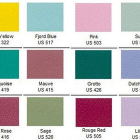
The LRVs of Sherwin-Williams retro paint colors:
Sherwin-Williams’ Suburban Modern paint palette [see the entire palette and also our secret to get big samples here] is a go-to favorite here, so I want to take a look at the LRVs of some of those colors. Regarding the Pink Flamingo above: Were you surprised at its relatively meager light reflectivity? I was! And lookie this…

… The LRVs of Flamingo Pink and Classic French Gray — the same, at an almost-lowest 25th percentile of 27. Want a lighter, brighter kitchen? Stay clear, let’s aim to get your paint above a 50!
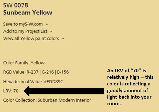 Above: Not surprise, Sunbeam Yellow is a bright 70.
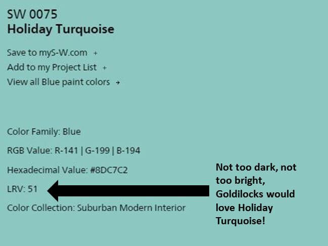
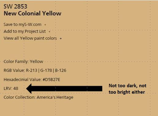 Above: Goldilocks might choose Holiday Turquoise or New Colonial Yellow.
How to use LRVs to choose a paint color:
This article by color experts Lori Sawaya and Albert Sawaya II offered the best info and guidance that I could easily find online. I encourage you to read the entire article, but here are my key takeaways:
- A common guideline for homeowners is to choose mid-value colors, they say. I assume that having a not too bright but not too dark colors gives you maximum control over varying the ambiance. Or could be, it’s a recommendation meant to keep us from making mistakes — as in, choose the happy middle and you want end up with a room that is neither too dark nor too light. But I am only guessing about the “why”… Are there any trained interior designers among us who can give us a clearer understanding regarding this recommendation?
- Beware the yellows! When choosing a yellow, you must also pay strong attention to the intensity (a different thing than a value) because yellow is so light reflective that it bounces light off the other yellow walls and intensifies the entire effect. Yes: Yellows are tricky!
Update: Lori Sawaya saw traffic coming to her site from this post and very kindly responded directly to my questions about the 50% recommendation. Here’s what she said:
Hi everyone – thanks Pam for linking to my LRV article!
Hopefully, I can answer some of the questions y’all have.
50% LRV as a guideline for residential interiors is about balance, visual ergonomics, and creating a human supportive environ. Mid-range paint colors tend to ‘average in’ among the other contents in the room, which means there are no harsh or super dramatic lines of contrast. The result is an atmosphere that’s easy to live in and colors that are easy to live with. [emphasis Pam’s]
LRV for exterior is super duper important. I get a couple emails per year from homeowners seeking expert assistance because their house literally melted. The last one hired an in-store color consultant who decided they needed a custom exterior color. Custom color means the color hasn’t been measured for LRV, tested for light fastness, etc. It was a darkish taupe new paint color over an existing pale yellow siding. The entire house buckled and warped. Homeowner is suing the store to have the siding replaced. So, LRV is particularly important to understand for exteriors. Always check manufacturer’s specs before you paint any exterior door.
Sherwin Williams is one of very few brands that puts LRV on the back of their chips. Most brands you have to look it up in the fandeck index or look it up online.
Hope that helps! Thanks again for sharing, Pam.
Above: Lori’s video takes us through the basics quickly.
Thank you, Lori — yes it does! Makes total sense!
And this article by Sherwin-Williams points out:
- Gloss level also affects the appearance of the color. The higher the gloss level, the higher the light reflectance. I’ll add: Gloss level also affects the visibility of wall imperfections — high gloss and you see the boo boos, flat not so much.
- Use LRVs to help plan how to bring light deeper into a room: For example, for a recessed nook off a main room, painting the walls in a lighter tint of the color used in the main room would lighten up the area while still maintaining a sense of flow and coordination.
- There’s also a big discussion about how the direction of light entering a room affects the color… and even, how different light bulbs affect the color. Argh, my color-loving head just exploded!
I have now become a fan of LRVs — I feel so much smarter! How about you?


Lori Sawaya says
Hi everyone – thanks Pam for linking to my LRV article!
Hopefully, I can answer some of the questions y’all have.
50% LRV as a guideline for residential interiors is about balance, visual ergonomics, and creating a human supportive environ. Mid-range paint colors tend to ‘average in’ among the other contents in the room which means there are no harsh or super dramatic lines of contrast. The result is an atmosphere that’s easy to live in and colors that are easy to live with.
LRV for exterior is super duper important. I get a couple emails per year from homeowners seeking expert assistance because their house literally melted. The last one hired an in-store color consultant who decided they needed a custom exterior color. Custom color means the color hasn’t been measured for LRV, tested for light fastness, etc. It was a darkish taupe new paint color over an existing pale yellow siding. The entire house buckled and warped. Homeowner is suing the store to have the siding replaced. So, LRV is particularly important to understand for exteriors. Always check manufacturer’s specs before you paint any exterior door.
Sherwin Williams is one of very few brands that puts LRV on the back of their chips. Most brands you have to look it up in the fandeck index or look it up online.
Hope that helps! Thanks again for sharing, Pam. 🙂
pam kueber says
Thank you, Lori! I especially appreciate getting a better understanding of the rationale behind the 50% LRV guideline for residential interiors — totally makes sense!
Re exteriors: I tend to think most of my readers are not putting vinyl siding on their midcentury houses!!!! But, good to know!!!!
Many thanks! Pam
Karin says
Very interesting! I agree with the statement that yellows can be very tricky. I moved into an art deco apartment once and picked out what I thought was an an appropriate buttercream yellow for my walls. What a mistake! It turned out that the reflected light from a nearby building cast a strange color on the yellow. You really have to see the wall color at all hours of the day. Swatches! Also, I LOVE LOVE LOVE the Holiday Turquoise. Thank you for bringing it to my attention. The young woman at my local Sherwin-Williams store said, “This is a very old color”, but added that she loved it and would have to try it. It really sings. It’s warm and cool at the same time.
ineffablespace says
I believe that red based colors tend to have low LRVs. I think one of the reasons that in many places fire trucks and other emergency vehicles switched from the traditional red to bright yellow is that unlit, red reads very dark.
I think yellow is very tricky and weird things happen to yellow under artificial lighting. I see an awful lot of really garish yellows in the real estate listings (which I check every day), and I can’t think that it looks like that in real life, at least in the daytime.
pam kueber says
ineffable, why do you think the experts linked to in this story said ‘mid-range’ is a good guideline for homeowners? what do you think of my theories?
ineffablespace says
Mid range is probably good because too high of an LRV could cause some glare and too much contrast, I would imagine. A very bright white paint tends to be in the upper eighties LRV wise and black is not really 0, it’s more like 5.
I think the issue with yellow is a combination of the relatively high LRV, which can approach ninety, and the spectrum of bulbs that are used for artificial light. I personally think it’s a mistake to pick out paint colors, or any colors really, under a different light source under which they will be seen most frequently. Some reds, for example, look great in daylight but are sort of dead under fluorescent lighting. I think anyone wanting to paint a yellow room should actually pick it out under the conditions that are most UNflattering to the paint chip itself, which is probably at night with whatever the lighting in the room will be a night.
Melinda says
lightbulbs make a HUGE difference on how your paint looks. That’s why it is so important to sample. Paint will never look the same in the store as it does in your home.
If you haven’t looked a lightbulbs in a while, the choices are staggering. I recommend going to hardware or lighting store with a good display. Not only do we have all the different type bulbs, but each type comes in different “colors”.
claire says
Would this apply to exterior colors also?
pam kueber says
Yes! In fact one of the articles that I link to warns, for example, about choosing vinyl siding in colors that are too dark for a hot climate. The dark vinyl absorbs light/heat — and can warp, apparently!
tammyCA says
Interesting about the LRVs. I tend to guess on paints & then after it’s on the walls I have to “feel if it’s right”. Yes, yellow is tricky & I once had dh repaint a kitchen when that particular yellow I chose “just didn’t feel right”..the second yellow hit it on the mark even ‘tho it wasn’t too different from the first. I also think geography, the angle of the sun coming in & the seasons play into colors..I’m very sensitive to colors & light so even ‘tho I super love yellow I’ve been in homes where it felt depressing or garish instead of uplifting..that’s because yellow needs windows with sunlight!
And like all colors there’s warm tones & cool tones..that’s why I like the paint chips with several gradient colors so I can see if, say, a yellow has cool green tones in it or warm orange tones. I should’ve remembered this when I chose a pink for bedroom (note: to self don’t pick colors based on cute paint color names) & now I can’t get past the “cool” tone it imparts when I wanted the opposite.
(Oh, duh, just now saw the article by SW explaining all this!)
oh Holland says
Great info, totally new to me. Referring to the LRV of colors to consider will surely save me many future do-overs!
Jordan says
Great guide here! It’s super important to know how reflective a paint is going to be – it can make or break a room. You can’t just trust that the swatch will be exactly what your room will look like!
Jennifer says
Wow–who knew the info was right there on the paint chip? How helpful!
pam kueber says
I did not necessarily find it on the paint chip – I had to go online under “Color Details” — I had to look for it. But apparently it is in the paint decks…
Jay says
Thanks for clarifying that, I wondered where the LRV info was derived from as I never recalled seing such info on paint chips. My impression is that the current color trend is towards darker/deeper shades not unlike many from the mid century. The deeper shades tend to absorb light. Yes, I do feel smarter now, thanks!
Robin, NV says
Great article! Thanks so much. My “new” kitchen counters are very similar to the sunbeam yellow above and I’m constantly amazed at how cheery and bright they make my kitchen. When I picked them out, I just liked the color – I had no idea they would brighten my kitchen so much. I sure got lucky!
claire says
Yellow in the kitchen! Yes! We took a shotgun kitchen that had been painted dark brown and used a color called Butter Cookie for the walls and Linen for the cabinets, which are 1950 plywood and also that awful dark brown. The difference in light was amazing. This particular shade of yellow doesn’t “bounce” too much and gives the kitchen a warm glow. Would love some Formica turquoise burst with gold flecks for the counters!
pam kueber says
I love Linen for walls. For all the wainscoting in my dining room/living room/hall and all the trim, too, I started with Linen then kept taking out yellow until I got it “right”. Even so, in afternoon sun, it goes yellowish.