

 Do you want your kitchen or living room or (fill in the blank) to be lighter and brighter? I have two key suggestions for where to start: (1) Paint your ceiling white and add a ceiling light that directs lots of light upward on to it, and (2) Get to know and consider the LRVs of the paint colors and other finishes (cabinets, countertops, flooring) that you are considering.
Understanding how paint lightens and brightens — or conversely, how it sucks light away — is lots easier once you understand the concept of Light Reflectance Values: Every paint color is assigned an LRV — its Light Reflectance Value — and this number will help you determine how much light the paint will reflect / absorb. The scale is black/zero to white/100. A low number means dark, a high number means light — and bright!
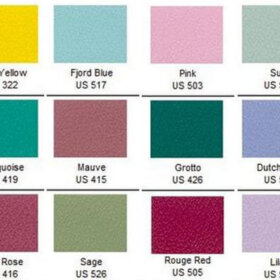
The LRVs of Sherwin-Williams retro paint colors:
Sherwin-Williams’ Suburban Modern paint palette [see the entire palette and also our secret to get big samples here] is a go-to favorite here, so I want to take a look at the LRVs of some of those colors. Regarding the Pink Flamingo above: Were you surprised at its relatively meager light reflectivity? I was! And lookie this…

… The LRVs of Flamingo Pink and Classic French Gray — the same, at an almost-lowest 25th percentile of 27. Want a lighter, brighter kitchen? Stay clear, let’s aim to get your paint above a 50!
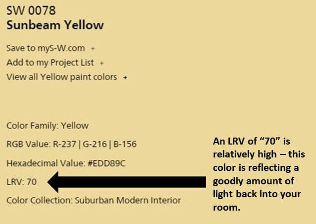 Above: Not surprise, Sunbeam Yellow is a bright 70.
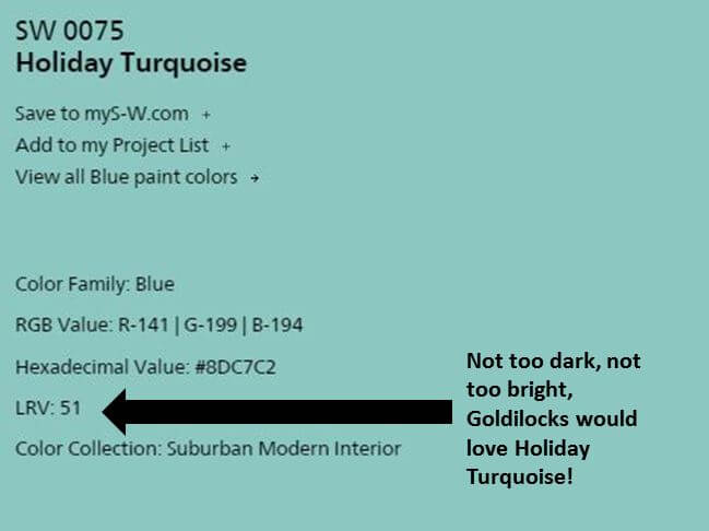
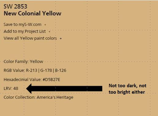 Above: Goldilocks might choose Holiday Turquoise or New Colonial Yellow.
How to use LRVs to choose a paint color:
This article by color experts Lori Sawaya and Albert Sawaya II offered the best info and guidance that I could easily find online. I encourage you to read the entire article, but here are my key takeaways:
- A common guideline for homeowners is to choose mid-value colors, they say. I assume that having a not too bright but not too dark colors gives you maximum control over varying the ambiance. Or could be, it’s a recommendation meant to keep us from making mistakes — as in, choose the happy middle and you want end up with a room that is neither too dark nor too light. But I am only guessing about the “why”… Are there any trained interior designers among us who can give us a clearer understanding regarding this recommendation?
- Beware the yellows! When choosing a yellow, you must also pay strong attention to the intensity (a different thing than a value) because yellow is so light reflective that it bounces light off the other yellow walls and intensifies the entire effect. Yes: Yellows are tricky!
Update: Lori Sawaya saw traffic coming to her site from this post and very kindly responded directly to my questions about the 50% recommendation. Here’s what she said:
Hi everyone – thanks Pam for linking to my LRV article!
Hopefully, I can answer some of the questions y’all have.
50% LRV as a guideline for residential interiors is about balance, visual ergonomics, and creating a human supportive environ. Mid-range paint colors tend to ‘average in’ among the other contents in the room, which means there are no harsh or super dramatic lines of contrast. The result is an atmosphere that’s easy to live in and colors that are easy to live with. [emphasis Pam’s]
LRV for exterior is super duper important. I get a couple emails per year from homeowners seeking expert assistance because their house literally melted. The last one hired an in-store color consultant who decided they needed a custom exterior color. Custom color means the color hasn’t been measured for LRV, tested for light fastness, etc. It was a darkish taupe new paint color over an existing pale yellow siding. The entire house buckled and warped. Homeowner is suing the store to have the siding replaced. So, LRV is particularly important to understand for exteriors. Always check manufacturer’s specs before you paint any exterior door.
Sherwin Williams is one of very few brands that puts LRV on the back of their chips. Most brands you have to look it up in the fandeck index or look it up online.
Hope that helps! Thanks again for sharing, Pam.
Above: Lori’s video takes us through the basics quickly.
Thank you, Lori — yes it does! Makes total sense!
And this article by Sherwin-Williams points out:
- Gloss level also affects the appearance of the color. The higher the gloss level, the higher the light reflectance. I’ll add: Gloss level also affects the visibility of wall imperfections — high gloss and you see the boo boos, flat not so much.
- Use LRVs to help plan how to bring light deeper into a room: For example, for a recessed nook off a main room, painting the walls in a lighter tint of the color used in the main room would lighten up the area while still maintaining a sense of flow and coordination.
- There’s also a big discussion about how the direction of light entering a room affects the color… and even, how different light bulbs affect the color. Argh, my color-loving head just exploded!
I have now become a fan of LRVs — I feel so much smarter! How about you?


Lizzy says
The stories above made me laugh – these are what the sample cans of paint are for. I thank my stars I tested aquas before painting the whole kitchen – My front runner reflects strange orange fuzzy under incandescent light. Best to know about this before tackling the whole job.
Any color paint will have strange reflective possibilities depending on what pigments are used to mix it. And all of them will shift when the light source changes. Put up big patches of all your finalists, and watch them for a couple days. It’s surprising! Even different latitudes will affect paint color because the daylight mix changes from tropics to northern latitudes, and then shifts seasonally. Looking at that paint on your wall in your house is revealing, and the best way to do this. You get what you want.
A good paint job is 95% prep work. Samples are part of that.
Karen Collins says
The moment I saw the title about LRV, I thought “they need to talk to Lori Sawaya!” She is a good friend of mine and an expert on paint color and their LRV and the affects it will have on the space.
Great article!
Ben Sander says
One thing you can do to pair colors together is to use a 50% solution of a paint color you’re using on the walls for the ceiling, or use the 50% solution on the walls and a true color on the trim. A 50% solution is 1/2 gallon of the color you’ve chosen mixed with 1/2 gallon of white. This gives you a tint of your color that coordinates with it perfectly and is often lighter than the lightest swatch on the sample strip.
Maria says
So true! I was coming in to say same. Designer trick: use the lightest shade of color on fan deck or the above for ceilings vs. white and the room will look much more pulled together. Because of the angle of light through windows, white ceilings can easily go gray or look dirty. Using a light shade of the wall color will envelop you in the room without looking like you’ve got a sheet hanging above your head.
Brandy says
Question: I want to paint my living room Coral and am having a hard time choosing a shade. I want it to be “liveable” even though it is a pretty bold color. I don’t like how a lot of the shades I see are brownish. I liked Joan’s living room in mad men but my style is not quite as formal. anyone have any fav corals/advice I would mucho apreesh.
Ruth Ann Kuntz says
Also be aware of white paint. Most often they have gray tones. The cool tone may not look right with a warm color.
Gerry says
Commercial lighting designer here. This is why downlights (high hats, recessed cans, etc.) are terrible for kitchens; you’re just lighting the floor! At least some fixtures should throw out light at high angles so you can see into the upper reaches of your cabinets. Any fixture which glows and casts light around itself on the ceiling is a good candidate for this.
pam kueber says
Thank you for adding your insight, Gerry. Sound like you and Martin Holladay are on the same page.
Carol says
I very carefully picked a neutral taupe color to paint the gabled ends of a “brownish” brick ranch. I was diligent when choosing a color not to have a pink or yellow undertone. It looked wonderful and I was perfectly happy until my hubby announced that it looked like chocolate milk. It does, and it’s staying put until I need to paint again. The sides of the house look like a chocolate milkshake with whipped cream (white trim). I used Sherwin Williams Duration and I wish I could paint the interior of the house with this brand of paint. One coat coverage and beautiful paint but smells too much to use indoors. Very impressive stuff. Colors can be tricky so I’m happy to know about LRV’s. I have a couple of dark rooms to paint.
Jenny says
Once I bought a nice taupe color for our stairway that goes to the second floor and the upstairs hallway. It looked beautiful, until the next day when the morning sunlight came into the window at the bottom of the stairs, and the nice taupe paint turned pink! I finally figured out that the sunlight was bouncing off the newly finished hardwood floors and stairs, which were stained a red maple, and made the walls look pink. The paint must have been absorbing that red colored light. I got another brand of paint in a very similar color, and it did not occur with this paint.
pam kueber says
Yup! This is what happens! Colors bouncing off of other colors off the light etc!
Susie Q. says
I’ll add my two cents re why mid-range colors are recommended:
Because the color has a medium value it neither absorbs nor reflects as much light as higher or lower numbers: therefore, the value you see on the card is pretty much what you’ll get — what is you see is what you get. There’s not as much chance of being “surprised” by a color (there’s not as much chance of it’s looking totally different on your walls). Does that make sense?
pam kueber says
Yes, that makes sense…
J D Log says
There is only one colour I have been caught out on it is called Grape Sherbet (mauve) by Watyl I painted the lounge room of my 1st house this colour.
It is great looking colour in daylight but by night it just sucked up the electric light. I have used it again in my guest bedroom in my current house which has bigger windows and is not a main room.