


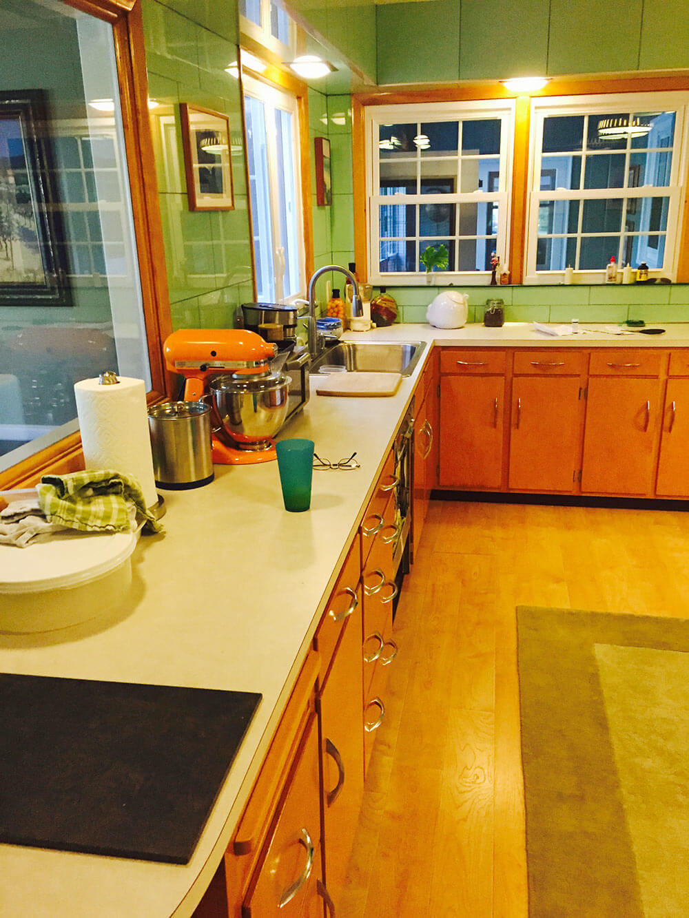
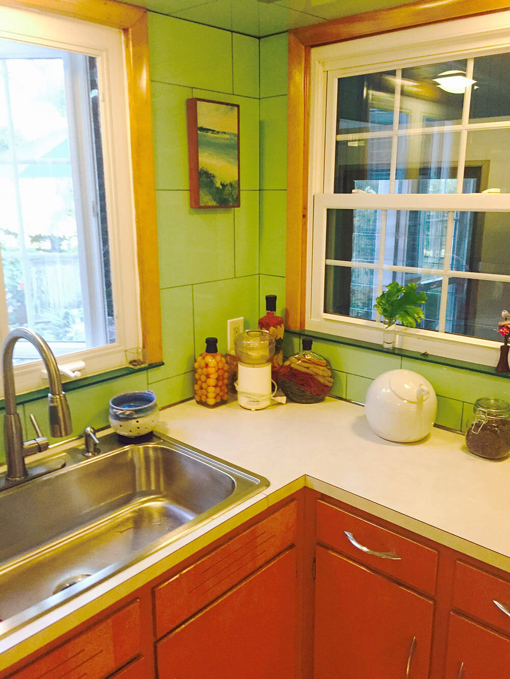
 “We have been told that the kitchen is a cross between ‘Betty Crocker’ and a morgue,” reader Alan says, adding a “haha” in his email to us. But maybe… not so funny. So today, a Retro Design Dilemma: Let’s help Alan with ideas to make his 1953 kitchen more homey, less clinical. Ooo la la: Lookie all the Vitralite glass wall tile — this one will be fun!
 Alan writes:
Help! We have an original 1953 kitchen featuring Apple Green Vitralite glass tile. The tile is in almost perfect condition — but we’re at a loss as to what to do with it. Part of me says “gut” and start over, but many tell us to “save the Vitralite.”

We’ve been in the house for five years and have been stumped for five years as to what to do with this kitchen! The green Vitralite is so overwhelming — even though we’re used to it. We have been told that the kitchen is a cross between “Betty Crocker” and a morgue. haha.
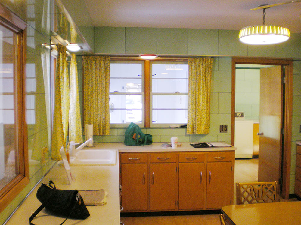
 Above: Adjacent laundry room, with more of the tile, and some black trim.
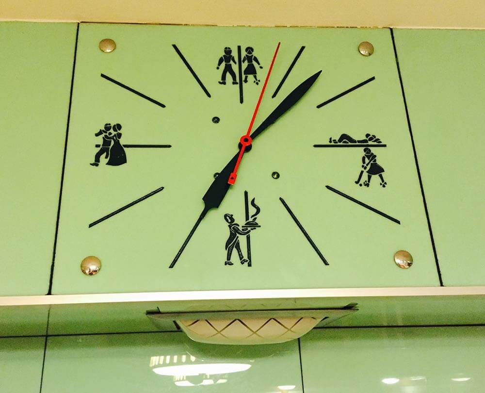
Nom nom, we adore that vintage Vitralite! Hmmm… We spy a very interesting-looking clock in the initial photos that Alan sends and ask him for some closeup. Oh my word, look at this stunner:
 Alan replies:
And yes, the clock in the soffit… omg, it’s wild. At 12, 3, 6, and 9, it shows pictures of what families in the 1950s should be doing! 3 p.m. is playtime… 6 p.m. is dinner… 9 p.m. is dancing… and 12 p.m. is sleep!
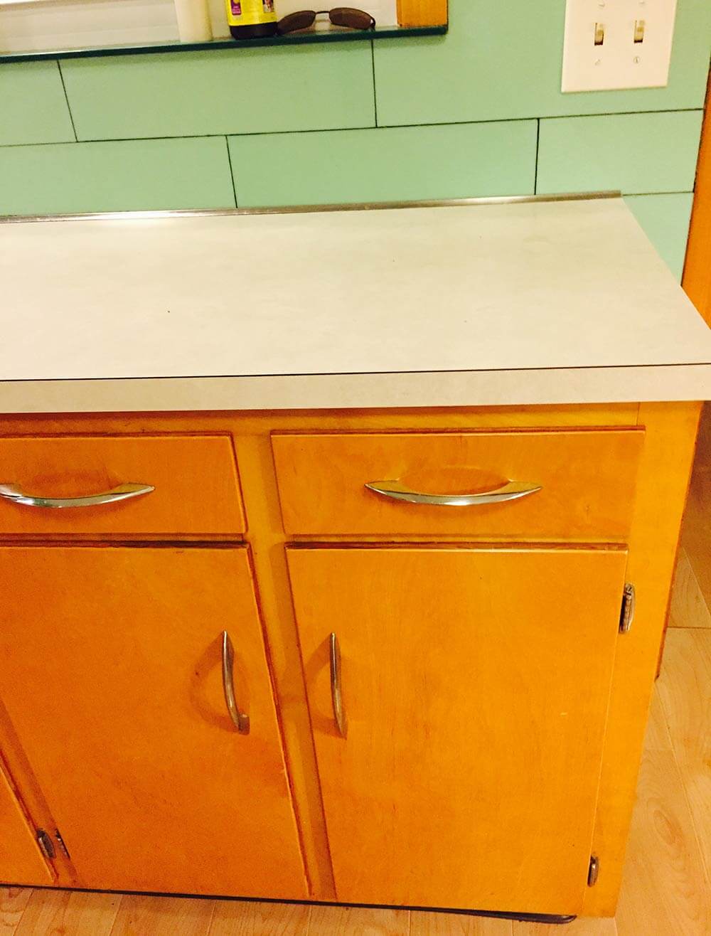
I’d love you to help update this kitchen by giving us some ideas about countertops and floors! Currently, the counter tops are a Formica that is probably late 70’s — off white and a mess. The floors are a “plastic” laminate – trying to look like hardwood.
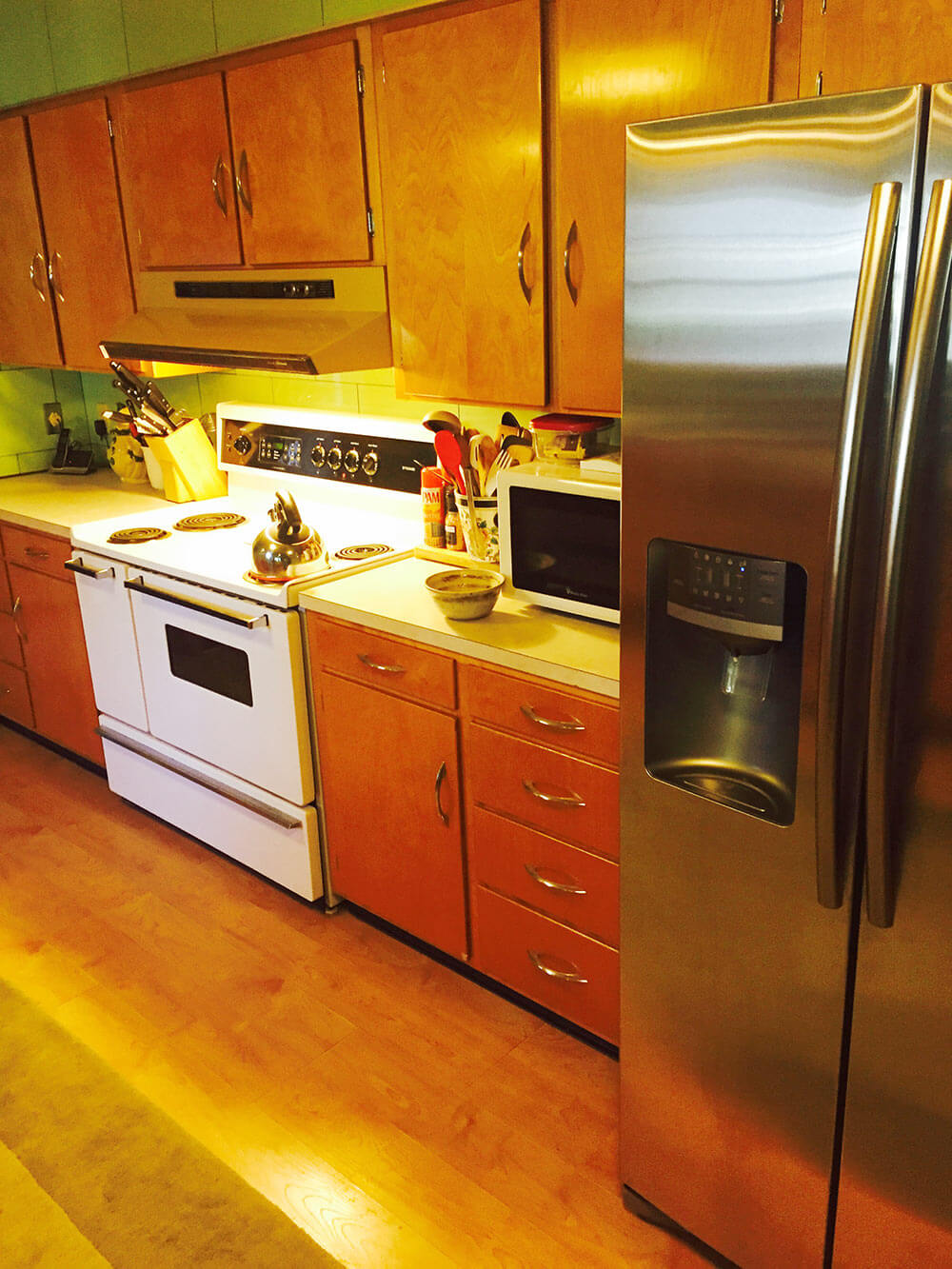
Our thought is to replace/upgrade the counters with stone (but we can’t figure out what that would go with the green vitralite), replace the cabinet hardware, remove the original light fixtures and install can lighting, replace the gold dishwasher for stainless, replace the white stove for stainless and call it a day! We just cant figure out what to do with countertops and the floor.
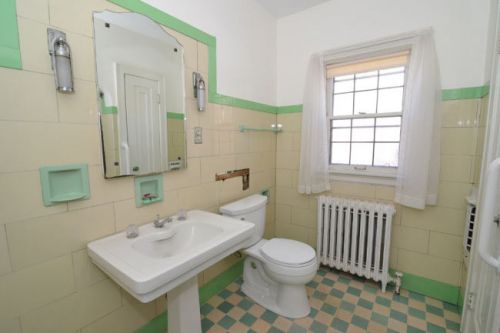
Vitrolite bathroom!
Readers, let’s hear your ideas for this Retro Design Dilemma:
- Okay, readers: Let’s hear your ideas for this dilemma! We will be back tomorrow morning with our design board and analysis.


Sara says
Be still my heart! The Vitralite is beautiful!!! And that clock! Wow! If you want to go for stone, what about quartz countertops? Maybe in white, grey, or black with just a little texture? And I agree that Marmoleum floors with a pattern and colors to accent the Vitralite would be fantastic. I also think red would be a great accent color. As for the cabinets, maybe sand them down and re-stain in a less yellow-y tone? Your cabinet hardware is pretty darn awesome so I would keep that. I hope you do keep the Vitralite. It’s so unique and the color is lovely. I can’t wait to see the finished project!
Tracy says
Love the glass tile and definitely need to keep it. The clock is hoot. But get rid of all the yellow varnish. I’d paint it in a color to compliment the green. Get all appliances in the same color, and put down a linoleum floor. I hate stone counter tops and don’t think they work at all in mid century. I’m match counter to new floor .Replace the fan with a more modern, streamlined one.
Steve H says
Oh my gosh, that wall tile is incredible! You just gotta embrace it and love it! I agree that the trick here is to really be mindful of the lighting (it’s critical in any kitchen). Although I’m not a huge fan of granite counters, I think that black granite with minimal to no pattern/grain/figuring would actually compliment the tile quite well. A more period appropriate choice would be linoleum. The flooring doesn’t look bad in the pictures and warms up the space. You might consider replacing it with either real wood or cork tile.
vintigchik says
I work at a cabinet/countertop shop. Black is one of the most difficult colors to live with on a top. Especially once with little to no color variation.
ineffablespace says
In a general sense, the green vitrolite is not something that can be “compensated for” or apologized for, in the re-design. It is *the* salient design feature of the kitchen, and as a relative rarity, I would want to highlight it, not downplay it. I don’t think you need to create a 1953 museum, but on the other hand there are very few common/popular 21st century finishes that will do this kitchen any favors.
Tina R says
Those walls are amazing! I’d start with replacing the ceiling fan with a stainless steel one to connect with the door pulls but if he still wants to get read of the cabinet pulls and they’re in decent shape, consider selling them. My 1940s kitchen that was redone in the 1970s and 80s would love them. Also paint the ceiling really bright white and perhaps a checkered pattern design on the floor to pull a little bit of focus from the walls.
Kate H says
If it were me, I’d go with the flow and get someone to design a wild, multicolored lino floor (like the woman in Calif did) that will allow all the green to compliment the floor. And I’d get some atomic formica for the countertops.
Take a look at the pictures of the Marjorie Merriweather Post house kitchen (it’s called Hillwood, it’s in DC if you are on the east coast, it’s worth a visit). She had the very same color of green and it was redone in about 1950, so about the same period as your kitchen. She didn’t have vitrolite, but she did have green metal cabinets and green/white lino.
Stacia says
You need to bring in a third color. Red would be perfect. If you do cherry red and have the bucks for it you could get red appliances. Or a bit more subtle rusty red in a laminate counter. If you are set on stone go for soapstone and bring in other black/red accents to match the laundry room. Either way, bring the red in on your curtains, etc and it will pop and the green will recede. It would be fun to design a tile floor using those colors as well. Good luck!
Elizabeth says
Red is calling to me too. The photo with the yellow curtains made me cringe. Those windows are shouting for something bright, like white with red trim. If you have the moola, I would try to replace the fridge with one that is white so that it coordinates with the stove, which has to stay! You can paint the hood over the stove white so that matches the stove as well, rustoleum is your friend. White porcelain pulls on the cabinets would pull it together more too. I would then go crazy with the countertops and go with red laminate with silver edging. This is the red I’m thinking of, hopefully this link works – https://www.flickr.com/photos/jocomuseum/5081105123/in/album-72157625038915043/
Lynne says
I’ d go with a watery blue/green theme. Paint the cabinets a pale shade of blue green, get a Marmoleum floor, same for countertops or laminate. No stone. White appliances. I know there are purists who won’t want to paint the cabinets, but it’s the orange and green that are causing the problem. In my mind, it’s the tile or the cabinet color that has to go, and I love the tile. Please let us know what you end up doing!
ineffablespace says
Could you make it an uploader so we could post finish boards?
Robbie Kendall says
First things first, I would start with the ceiling kitchen and work my way down: rather than the two hanging fixtures and fan that are there now, I would replace these three items with three identical up-light fixtures that bounce the light off of the flat (or eggshell) white ceiling using spectrum corrected bulbs. And if these fixtures were copper, so much the better. Also, I know that Pearl Paint, in New York, used to carry a white paint imported from the Netherlands that had a very slight blue tint to it so that as it aged, the yellowing counteracted the blue and the white became purer over time. My point here is that with these, beautifully, overpowering walls, it is best to let the look be highlighted by pure spectrum lighting and not degraded by standard yellowed tungsten or too ‘clinical’ compact fluorescent bulbs.
Also, the more copper you can get in the kitchen, the better. This strikes me as the perfect complement to the wall color. I have no idea for the counters, however. I will leave that to Pam and Kate. Good luck!
pam kueber says
Thanks, Robbie, I don’t know anything about this issue — I appreciate the info, it sounds good!
lexavline says
RIP Pearl Paint, NY. It is missed.