


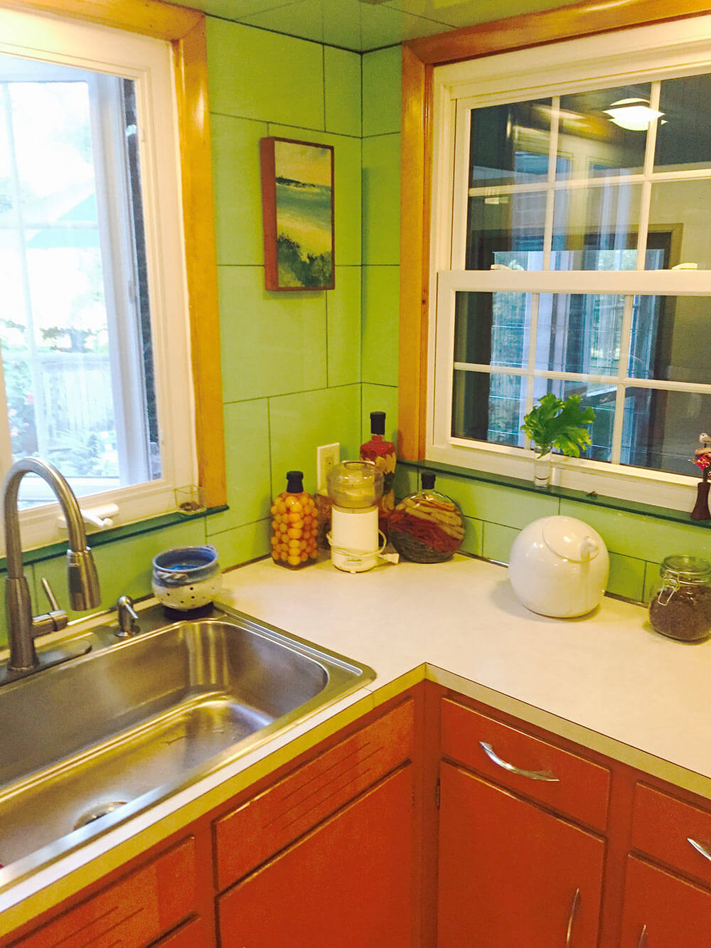
 “We have been told that the kitchen is a cross between ‘Betty Crocker’ and a morgue,” reader Alan says, adding a “haha” in his email to us. But maybe… not so funny. So today, a Retro Design Dilemma: Let’s help Alan with ideas to make his 1953 kitchen more homey, less clinical. Ooo la la: Lookie all the Vitralite glass wall tile — this one will be fun!
 Alan writes:
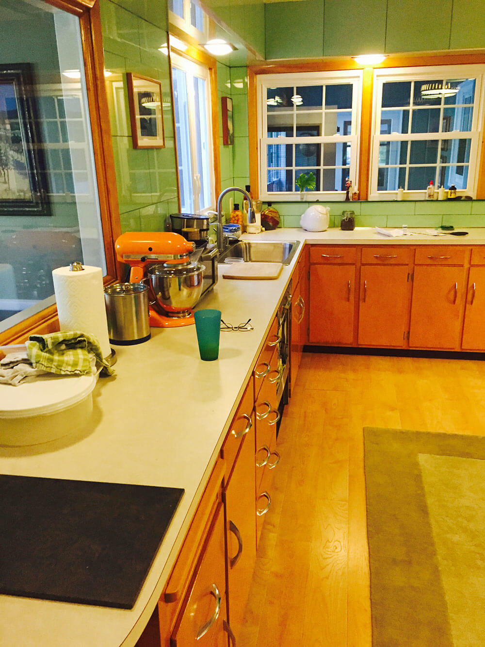
Help! We have an original 1953 kitchen featuring Apple Green Vitralite glass tile. The tile is in almost perfect condition — but we’re at a loss as to what to do with it. Part of me says “gut” and start over, but many tell us to “save the Vitralite.”

We’ve been in the house for five years and have been stumped for five years as to what to do with this kitchen! The green Vitralite is so overwhelming — even though we’re used to it. We have been told that the kitchen is a cross between “Betty Crocker” and a morgue. haha.
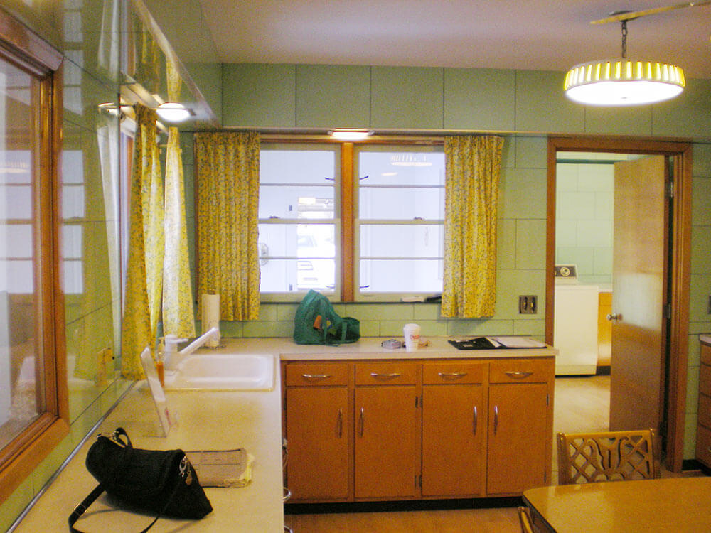
 Above: Adjacent laundry room, with more of the tile, and some black trim.
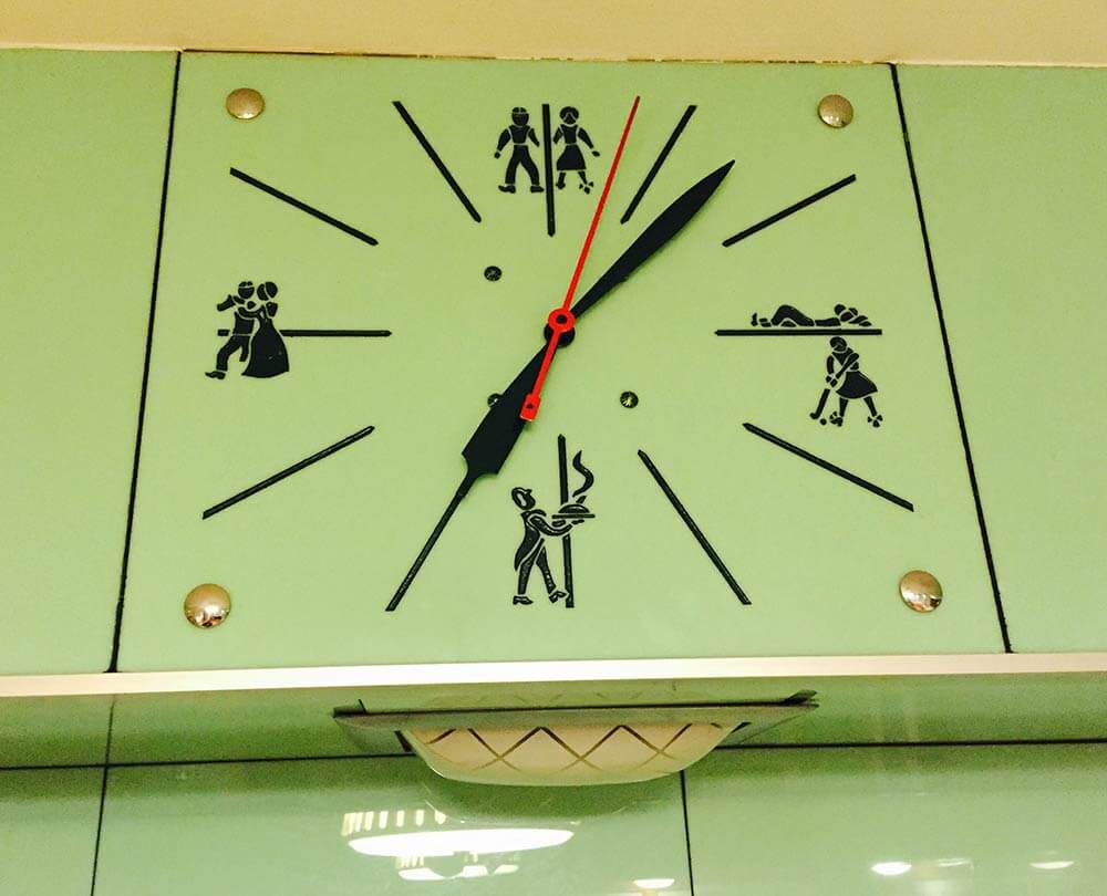
Nom nom, we adore that vintage Vitralite! Hmmm… We spy a very interesting-looking clock in the initial photos that Alan sends and ask him for some closeup. Oh my word, look at this stunner:
 Alan replies:
And yes, the clock in the soffit… omg, it’s wild. At 12, 3, 6, and 9, it shows pictures of what families in the 1950s should be doing! 3 p.m. is playtime… 6 p.m. is dinner… 9 p.m. is dancing… and 12 p.m. is sleep!
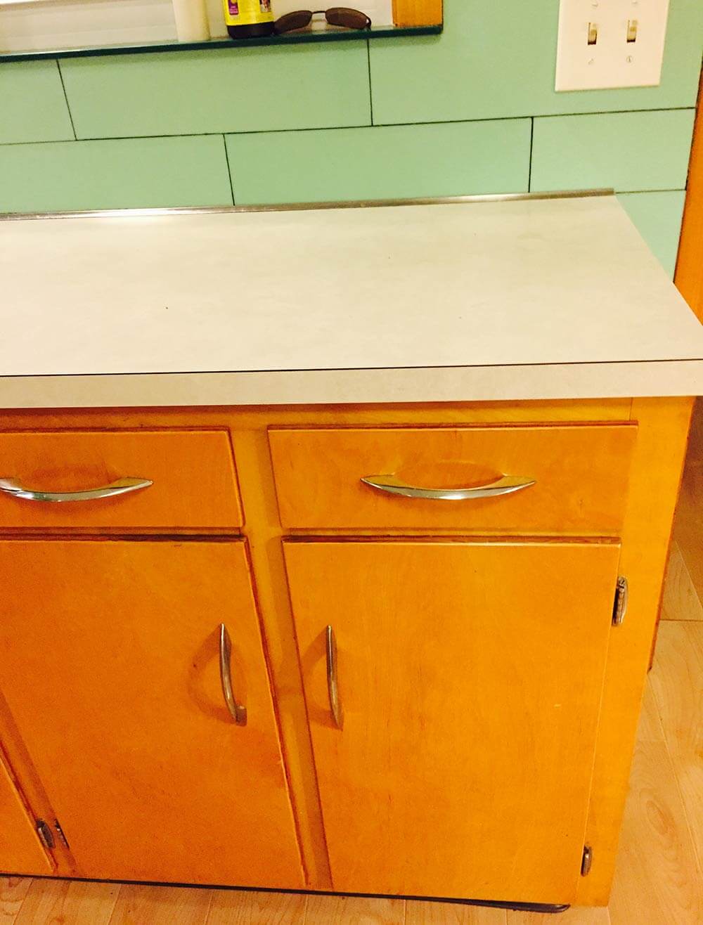
I’d love you to help update this kitchen by giving us some ideas about countertops and floors! Currently, the counter tops are a Formica that is probably late 70’s — off white and a mess. The floors are a “plastic” laminate – trying to look like hardwood.
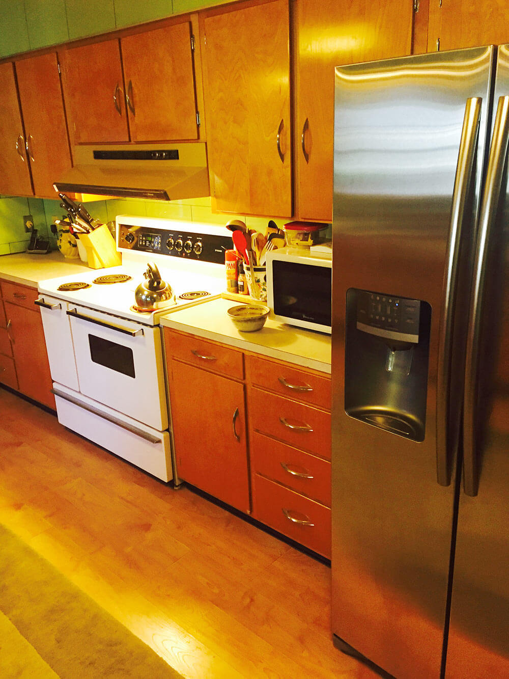
Our thought is to replace/upgrade the counters with stone (but we can’t figure out what that would go with the green vitralite), replace the cabinet hardware, remove the original light fixtures and install can lighting, replace the gold dishwasher for stainless, replace the white stove for stainless and call it a day! We just cant figure out what to do with countertops and the floor.
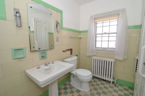
Vitrolite bathroom!
Readers, let’s hear your ideas for this Retro Design Dilemma:
- Okay, readers: Let’s hear your ideas for this dilemma! We will be back tomorrow morning with our design board and analysis.


Mary Elizabeth says
Yes, I think the lighting needs to be fixed so it doesn’t bring out the yellow in the tile. I would keep the tile, although you might consider taking it off the soffits (except for the clock) and painting them the same color as the ceiling. That will make it look less like a morgue or abattoir and a little more like a Betty Crocker test kitchen.
Although I love yellow and green together, this green needs some cooler colors with it, don’t you think? I like the idea of black and white and red as the accent color.
Lino or marmoleum floor, but not checkerboard–too many square and rectangle shapes. Definitely a “sailor course” or liner strip one tile in from the edge, echoing the black liner in the laundry.
This is one of the few kitchens I’ve seen with wood cabinets where I agree they should be painted. But not black. That’s too hard to undo in future.
The countertop should be laminate. I wonder how it would look with gray boomerang Formica?
If there was ever a space that needs the softening effect of curtains, this is it. Even though you ditch the yellow ones, you can pick some interesting print, maybe in black, white and red, if there isn’t a definite print on the countertops that clashes with it.
Craig says
This space doesn’t need a renovation, only tweaking! Ditch the ceiling fan, or go with a more flush mount fan in a stainless. I can see on of those mini Sputnik lights in here, the ones that hug the ceiling. I agree with another commenter who said to paint the window trim black and dress it up with coordinating atomic cafe curtains. In fact, I think a black solid surface counter would look fab in this space. The black and existing green combo would be stunning. The cabinets and tile are beautiful, PLEASE don’t touch those. Maybe create a fun rug in the center with funky carpet squares in a mosaic. Such good bones here to work with!
Carolyn says
Re-reading Alan’s story, it appears they want to keep the tiled walls but not bring it back to the original/retro look and bring it into the 21st century. But not remuddle it worse than the previous owners.
The morgue reference seems to be a thread in the comments – by having all stainless AND black countertops, this will enhance that vibe (remember the biology/chemistry lab tops?) The pulls also feed into that by being utilitarian.
What was done in the laundry room? Why does that work? What do other adjacent rooms look like so you aren’t jarred moving from one style to another? What is the house telling you?
I agree with ineffablespace to have an uploader to actually see some of these visionboards.
Red seems to be the go-to accent color. And painting the woodwork is an option since they seem to be staying here long-term. Whoever purchased the house after them would still have to do something with the varnish if it isn’t holding up well over the years.
Can’t wait to see!!!
Robin, NV says
Ooh!! How lovely are those walls and cabinets!! They are definitely keepers in this awesome kitchen.
I actually don’t mind the neutral white countertops. I would try to find a replacement that is close to that color OR try out a grey or buttery yellow laminate. No matter the countertop color, aluminum trim would look nice. Keep the countertops relatively low key and let those amazing glass tiles take center stage. I would definitely swap out the floors for Pam’s favorite Azrock flooring in a nice neutral white. For me though, the biggest issue is the cluttered ceiling. I kind of like the swag lamps but the ceiling fan has got to go. Another commenter mentioned can lighting, I think that would be a good option too. Oh and sorry, but I would ditch the behemoth stainless fridge for something smaller and white to match the vintage stove.
Anna says
Awesome. In Toronto, we call that subway tile 😉
http://www.blogto.com/city/2013/12/what_the_original_ttc_subway_station_tiles_looked_like/
vintigchik says
This kitchen begs for laminate tops.
Gwen says
I say leave the cabinets and hardware but change the counter tops. Black Quartz/stone, or funky retro laminate, or stainless would be fab.
The white windows throw me off but since it looks like those are new, I think the wood trim should be painted black. Also the trim around the door and the big vent on that one wall.
Windows need atomic curtains and use colors from that to incorporate kitchen accessories. There definitely needs to be a strong third color to make the kitchen fun.
Floor would looks nice in vinyl tile or cork. Pattern or not depending on other choices. If there is a concrete sub floor, paint or stain on the concrete could be a fun choice.
Martha says
Wow, what great tiles on the wall and that clock…be still my heart! I’m going out on a limb here, but I would paint the cabinets in black and keep all the hardware (it’s beautiful and sleek). Get all appliances in stainless steel. I think the countertop could be a neutral formica with black and soft green accents (boomerangs if they have them); same with the floor, bring in a 3-color pattern, a neutral with green and black. Finally, I’d bring in a red for small accents such as toaster, dish towels, etc. You’ve got a great kitchen, good luck with your design and let us see the results!
Mary Tatum says
I’m a fan of quartz countertops for durability. Very simple, heat resistant, and it comes in many colors. He could take home samples and decide what is best – although I like the idea of black mentioned above for granite. Maybe black quartz. I think I’d also make a decision on the color of the appliances. I like white appliances in older houses, but can see how black countertops and SS appliances would give the place a very contemporary vibe with the green. And don’t forget awesome lighting – including under counter. It will make working in the kitchen easier, and highlight the luminous tile.
JKM says
Very interesting space indeed. Betty Crocker/Morgue combo is a hilarious description but…hmm…I can see it. Nevertheless, avoid granite of any sort – too pedestrian for such a unique space. I’d go with black Silestone countertops with square edges (thin) – they’d tie in with the black trim in the laundry room, the black in the fab clock, and tie in with what looks like the thin black window sills already there. The walls are sleek/crisp in appearance so I think I’d continue with stainless replacement appliances. I’m stumped on the floor right now. The walls are dominate with a grid pattern so I think I’d go with something with minimal to no visible pattern – maybe a sheet material or vinyl tile that is uniform in color. Overall you have a really cool, unique space.
JKM says
I forgot a couple things – change out the lighting to cans and, if you must keep it, the fan to something sleeker like aluminum. This would “clean up” the ceiling and minimize overhead clutter. Finally, the colonial 6 over 6 window is the wrong style. It appears it was changed out at some point since the original photo indicates a different style but I’d swap it out, too.