


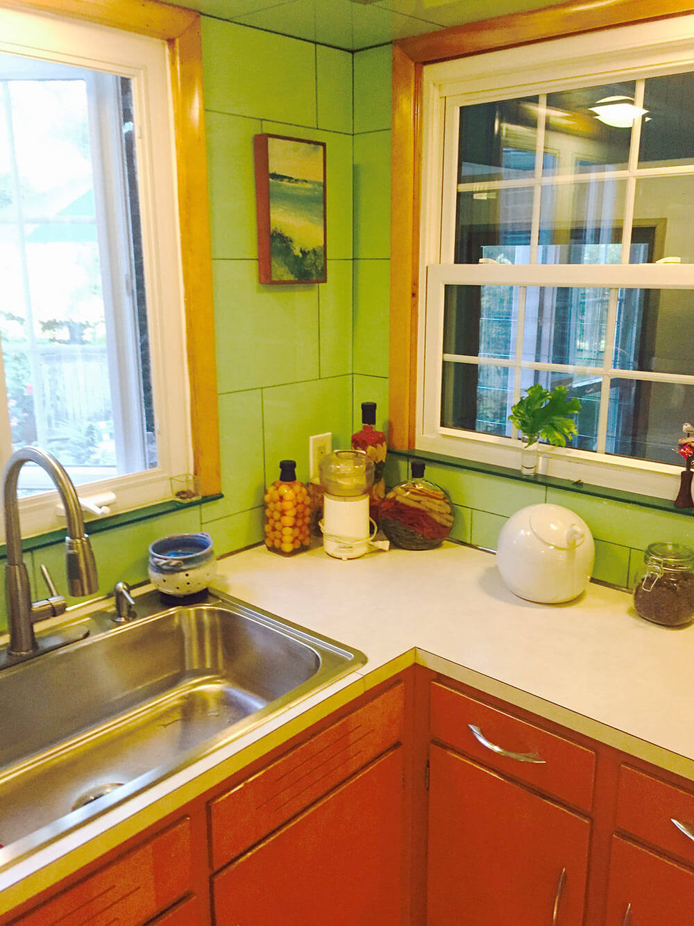
 “We have been told that the kitchen is a cross between ‘Betty Crocker’ and a morgue,” reader Alan says, adding a “haha” in his email to us. But maybe… not so funny. So today, a Retro Design Dilemma: Let’s help Alan with ideas to make his 1953 kitchen more homey, less clinical. Ooo la la: Lookie all the Vitralite glass wall tile — this one will be fun!
 Alan writes:
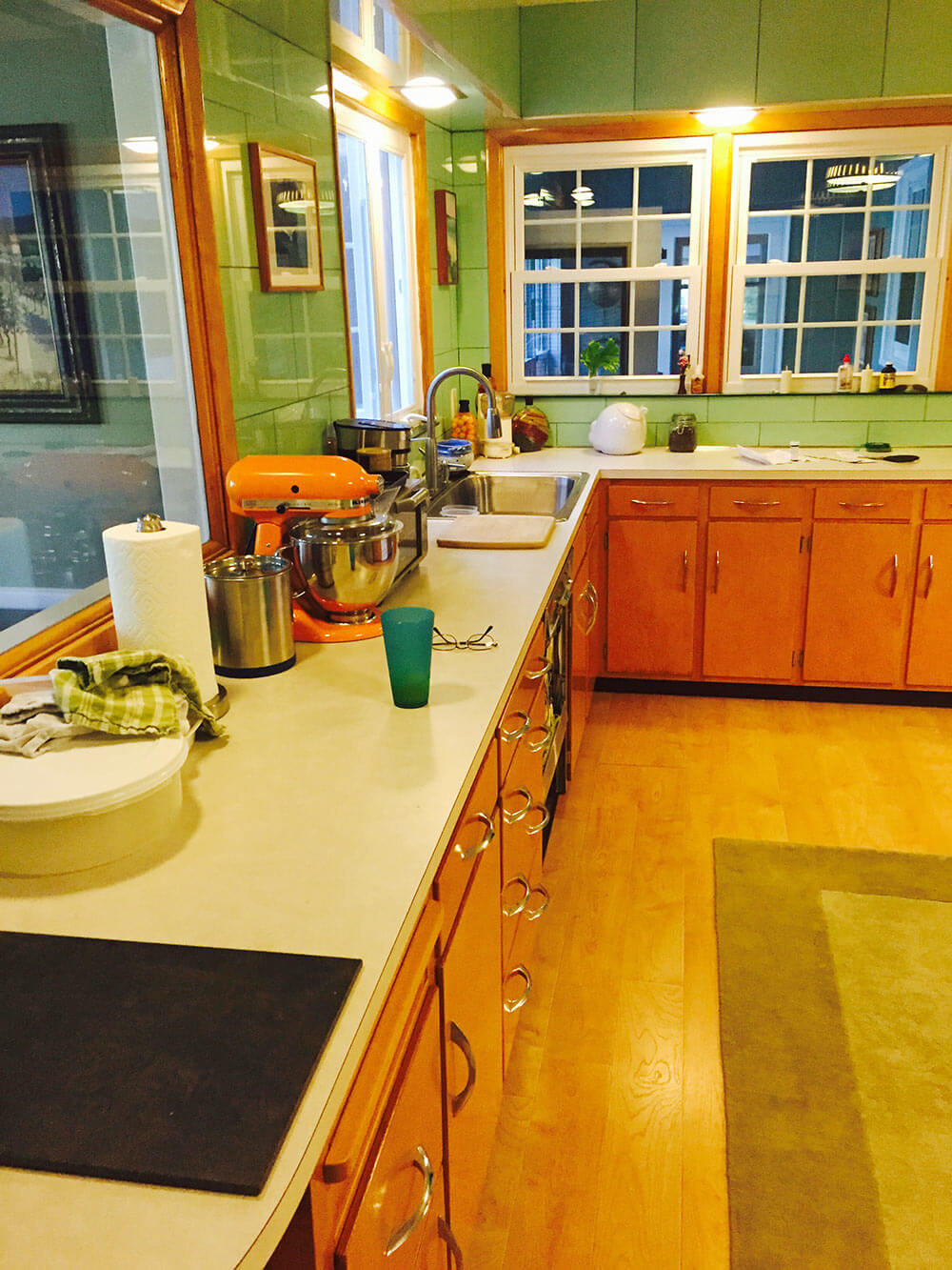
Help! We have an original 1953 kitchen featuring Apple Green Vitralite glass tile. The tile is in almost perfect condition — but we’re at a loss as to what to do with it. Part of me says “gut” and start over, but many tell us to “save the Vitralite.”

We’ve been in the house for five years and have been stumped for five years as to what to do with this kitchen! The green Vitralite is so overwhelming — even though we’re used to it. We have been told that the kitchen is a cross between “Betty Crocker” and a morgue. haha.
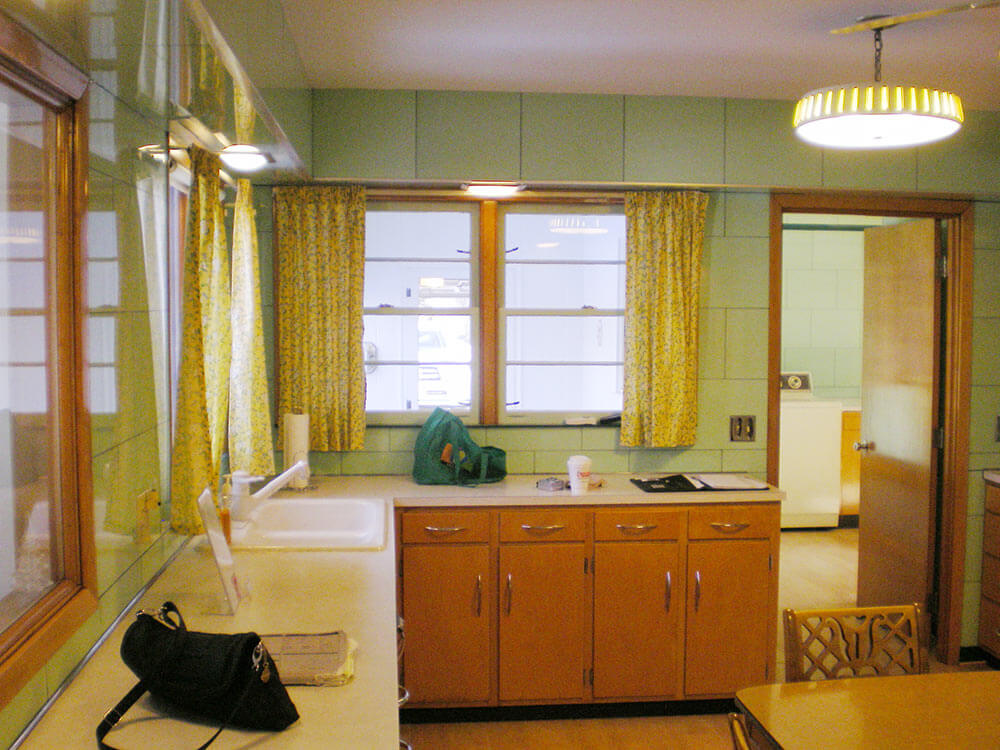
 Above: Adjacent laundry room, with more of the tile, and some black trim.
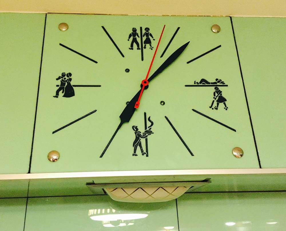
Nom nom, we adore that vintage Vitralite! Hmmm… We spy a very interesting-looking clock in the initial photos that Alan sends and ask him for some closeup. Oh my word, look at this stunner:
 Alan replies:
And yes, the clock in the soffit… omg, it’s wild. At 12, 3, 6, and 9, it shows pictures of what families in the 1950s should be doing! 3 p.m. is playtime… 6 p.m. is dinner… 9 p.m. is dancing… and 12 p.m. is sleep!
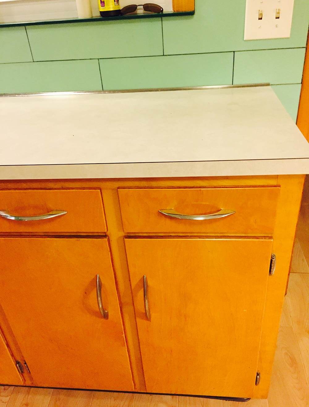
I’d love you to help update this kitchen by giving us some ideas about countertops and floors! Currently, the counter tops are a Formica that is probably late 70’s — off white and a mess. The floors are a “plastic” laminate – trying to look like hardwood.
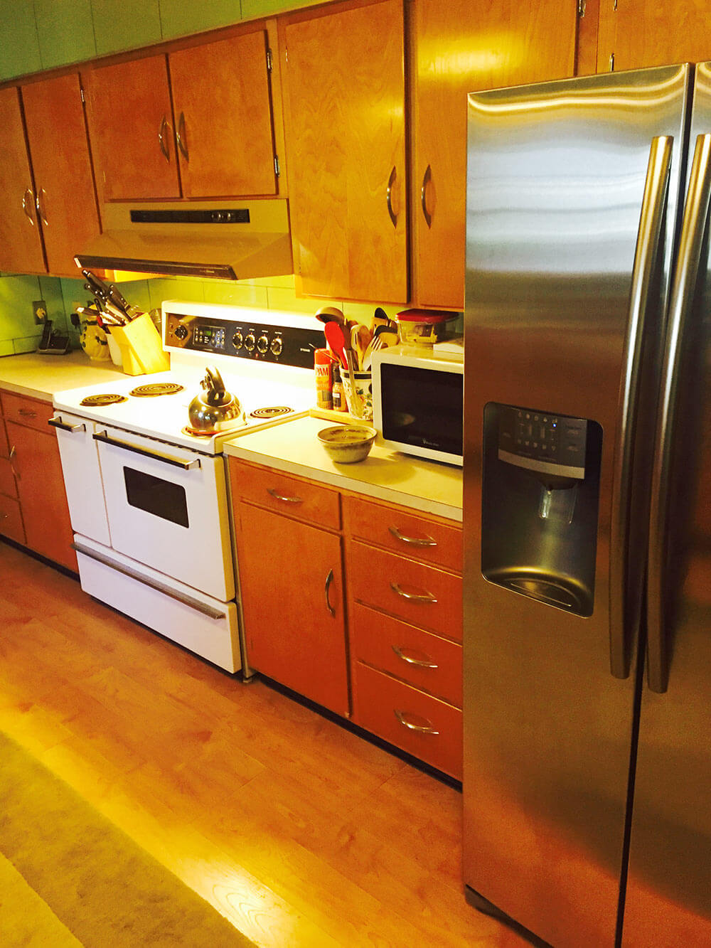
Our thought is to replace/upgrade the counters with stone (but we can’t figure out what that would go with the green vitralite), replace the cabinet hardware, remove the original light fixtures and install can lighting, replace the gold dishwasher for stainless, replace the white stove for stainless and call it a day! We just cant figure out what to do with countertops and the floor.
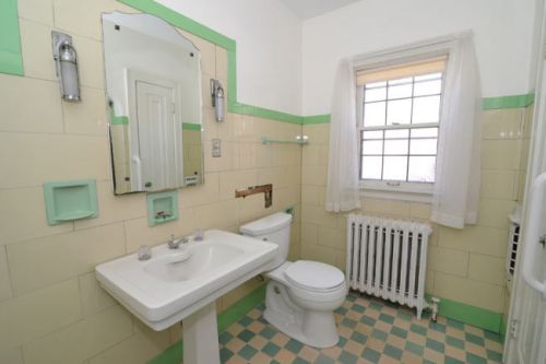
Vitrolite bathroom!
Readers, let’s hear your ideas for this Retro Design Dilemma:
- Okay, readers: Let’s hear your ideas for this dilemma! We will be back tomorrow morning with our design board and analysis.


Sally says
Don’t touch the cabinets (& handles) or the tile! You gotta think like they did back then, NOT letting yourselves be limited to the Home Depot/HGTV mindset of replacing lights, hardware, & appliances.
This cottagey green was often balanced with red. How about red, patterned formica countertops and/or linoleum (it’s anti-bacterial!) flooring, and some vintage (or repro/retro new fabric), whimsically patterned kitchen curtains. The wood cabinets & green tile will melt perfectly into the background & the room will look softer & less sterile.
Also do *not* use fluorescent or halogen lightbulbs! You need a *warm* light spectrum in this room in particular. Incandescent bulbs still exist (online) & make all the difference. If you need more light, consider *xenon* under-cabinet lighting. (Bonus: it doesn’t get hot like halogen.)
Definitely eschew the current stainless & granite trends–they are already dated (screaming 2010). You don’t have to live in a museum, but embrace the happiness of the era it represents–we had won the war, all things were possible, the great economy had everyone dancing in polka dots! Embrace that mindset!
Dan says
The vitrolite is not the problem – there are just too many other things going on in this kitchen, including two wood tones, two styles of window, two styles of ceiling fixture, and different color appliances. Embrace the vitrolite and simplify everything else.
It looks like that sash window opens onto another room. Let’s fill it in with display shelving. If it is an exterior window, replace it with the same style window over the sink.
Paint all trim doors the same shade of green as the tile. That will alleviate the chopped up look.
Purists will shudder, but unless you are in love with the stove, I’d replace it with stainless steel to match the fridge, the buttons on the clock, the trim on the lamp below it, and that wonderful cabinet hardware which you must keep.
I like the idea of stripping the cabinets and doing them in a cleaner, less yellow finish, perhaps something closer to birch.
Again, many will cringe, but I would look into some of the new countertops made of recycled glass, looking for one that is light but with bits of green in it.
Cork flooring could work, but I think tile is more in keeping with the style of the room. You don’t want too busy a pattern that would look dizzying with the wall tiles. If it is out there, neutral squares to complement the new cabinet tones, laid diagonally with small green squares inset at the corners.
I’d get rid of the ceiling fan and replace the other two fixtures with deco-ish milk glass pendants to complement the milk glass fixture under the clock.
Finally, I’d love to see the figures on the clock used somehow. Perhaps similar figures could be silk screened on fabric for window treatments!
Mintrad42 says
If it were mine.
I’d lose the ceiling fan, get red Formica or dyed red concrete countertops, and for the floor, that beautiful smudgy Marmoleum in a combo that brings all the colors together.
JeffK says
Great kitchen, I’m also on the side of keeping the tile.
I like Robbie Kendall’s comments regarding the ceiling and light fixtures.
I agree that too much is going on and I think it is the window and door trim that is the culprit. The cabinets may be okay to stay as is with some neutral tones.
Paint the window/door/duct cover trim a neutral light gray about the same tone as the tile. Match an atomic style countertop with a matching neutral gray. Paint the stove hood to match the range below.
And then Kate H had a nice idea about the floor.
Menk says
I’d say run with it. Lots of vermillion or red to warm it up, like blender, teapot, and rug. Swap that ceiling light out with some wild, like a sputnik. Lots of fun, bright, geometric vermillion colored paintings (in white frames). The wall will melt into the background.
Don’t gut, for sure. that kitchen is amazing.
PAppel says
Flooring: Marmoleum in a colorful pattern the green of the tilet and the countertop color in it along with a third color.
Countertop: I would go with a black granite in a honed finish or soapstone. The soapstone has some white in it which echoes the stove.
It’s an awesome kitchen. Love the tile and the cabinets. Looking forward to all other suggestions.
Kris says
Hi Alan and Scott. This tile is magnificent!! I have seen it in person. It needs black or dark cabinets and an amazing soap stone counters. Or if you can’t save it all, leave the full wall where the clock is and design around it. You should see their bathroom tile.
L.B. says
This is a really cool kitchen! I’m going to dare and suggest removing some of the tile. Not all of it, just some. Bring it down to a half wall with black tile trim. Of course, the clock stays!
Red would be a nice third color. You could bring it in with either curtains, wallpaper or a red formica countertop.
If you are not wedded to the cabinets being wood I would suggest painting them a soft white. I like your white range and would suggest a white refrigerator to match. The stainless steel is more a millennial style and white appliances may go better with the period and hence soften the green tile.
Lastly, I would suggest Marmoleum floors. White and green matching the green tile or white and red bringing in that extra color.
Jay says
Wow! I would love that green glass tile for a cooktop backsplash! You have a great 40s/50s vibe going on in your 53 kitchen. If you want stone counters I second what others have suggested – solid white or black quartz. If you are into retro then new laminate counters would be the way to go along with a new floor of linoleum or vinyl sheet goods with an all over pattern (think commercial). Today, many people think such common finishes are “cheap” but oh so appropriate for your kitchen. The ceiling is top heavy with the two lights and fan. Maybe one decorative fixture for the table (dimmable) and new can lights or cove up lighting; you want to avoid shining light directly onto the glass tiles. Nice clean looking 40″ stove. I think a lot of RR fans wish this was their kitchen, at least me. Looking forward to Pam & Kate’s suggestions.
Melinda says
I would definitely not go with stainless appliances. This, in my mind, would add to the “morgue” feel. I also feel can lights will be a little too clinical in the space. I would search for a couple of matching period ceiling fixtures and instal some discreet under cabinet lighting for function.
With the abundance of tile I do feel like choosing a color opposite, such as red or pink will balance things out.
Plenty of fabrics such as curtains, decorative towels and throw rugs will do a lot to soften this space.
Best of luck and I look forward to seeing some pictures when you’ve got I’d done.
Lisa says
I really agree with these comments about the stainless appliances. They are very cold looking and do contribute to the morguey feel. They also reflect the green tile + yellow light giving everything a kind of seasicky hue. You can see that greeny reflection on the floor in front of the refrigerator. Many of us love your stove but if it’s not your cup of tea sell it to someone who would. I’d replace it with a white stove or the jadite green reproduction ones. (and a fridge to match). I think red countertops would look smashing. Add the chromey edging to match your cabinet pulls.
Also, those glorious chrome cabinet pulls are to die for. They are just like pretty jewelry. I agree with the comment to pick up reds and pinks. Such a great space with so much potential. Enjoy decorating. 🙂