


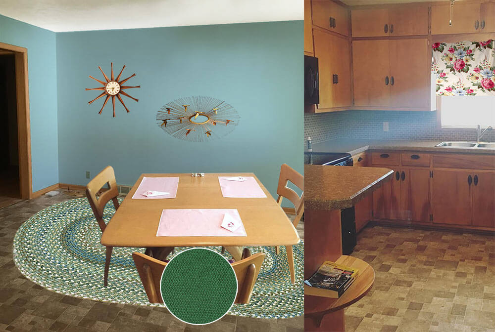
 Reader Paige needs our help — she and her husband Dustin recently bought a 1960 ranch house, and they are struggling to decide what paint color would help liven up the brown, brown and more brown found throughout the kitchen and connected dining room. She isn’t a fan of the brown backsplash, flooring and countertops, but they will have to stay for now. Can we give Paige a few paint and decorating ideas to help add some color her kitchen?

Paige writes:
I’ve been a follower of Retro Renovation for a long time and have seen you help fellow readers with paint! My husband and I just bought a 1960 ranch, and I am really struggling with what color to paint the kitchen/dining room.
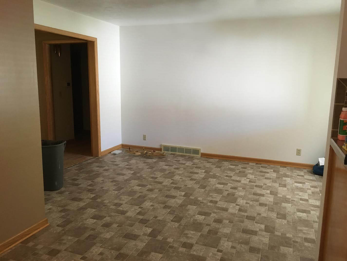
Our kitchen is open to the dining room, and unfortunately the brown back splash and brown floor will have to stay for a while.
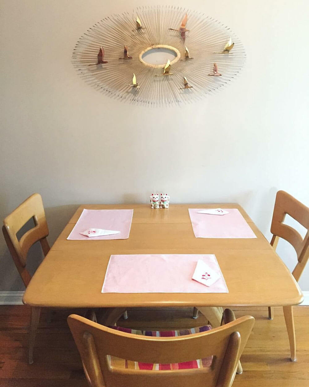
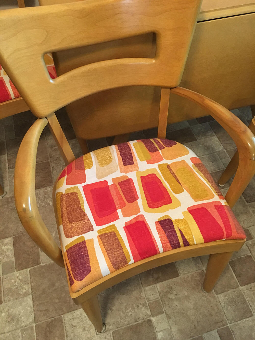
That, paired with the blonde woodwork and a wheat Heywood Wakefield table and chairs are really giving me some issues! I’m not attached to the upholstery on the chairs so that can be changed if need be! I definitely want to go with color in the kitchen but everything I pick seems to clash with the floor. Any advice would be greatly appreciated!
So, what can we do to help liven up all of that brown? We think there are a few key changes that can make a huge difference and up the happy factor in Paige’s kitchen:
- Light: Adding additional sources of bright light — like new, brighter ceiling lights — will help the space feel more cheery right away.
- Color: Between the brown wood cabinets and trim, brown tile floor, brown tile backsplash, brown countertop and beige walls, there is sure a lot of brown in Paige’s kitchen. The quick, easy and inexpensive way to fix this problem is to choose a cheery paint color for the walls, or maybe even a wallpaper accent wall.
- Rug: To further up the happy in Paige’s kitchen, we suggest getting a large area rug to place under the table in the dining area. This will not only add color and pattern to the space, but also help break up the large expanse of brown flooring.
Now, let’s see four options we came up with to help brighten up Paige’s brown kitchen.
Kate’s option 1: A happy aqua
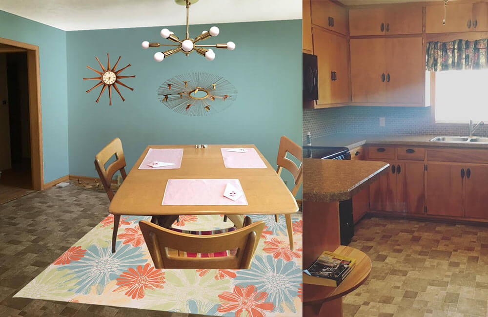 In this option, I found a light colored cheery flower print indoor/outdoor rug that will contrast with the medium brown floor tiles and inject some life into the room. Next, I pulled the aqua blue flower color found in the rug and used that shade to paint the walls. This instantly refreshes the space! Playing off Paige’s Jere inspired starburst wall hanging, I also added a coordinating sputnik light fixture that will not only add interest but also more light to the space. Finally, a medium toned vintage wood starburst clock helps repeat just a little bit of the wood up on the walls. Paige could recover her dining chairs with a solid coral, green or aqua fabric and also use that fabric to make coordinating valences for above the sink and dining room window.
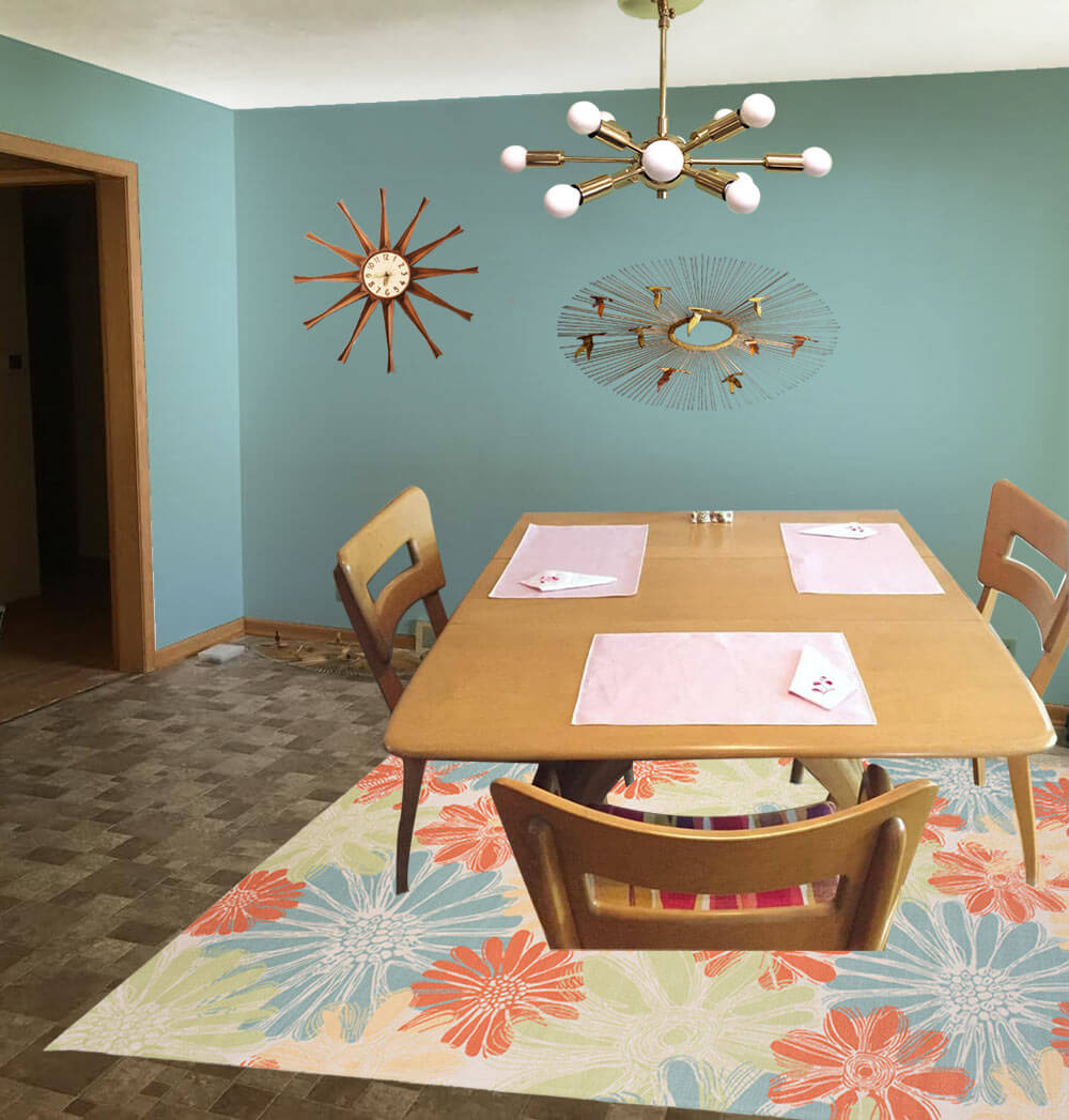
- Aqua walls — like Sherwin-Williams ‘Spa’
- Paige’s Heywood Wakefield dinette set
- Paige’s Jere inspired wall art
- Sputnik light from Practical Props
- Rug from Overstock.com
- Vintage starburst clock from Ebay
Kate’s option 2: Cheerful coral
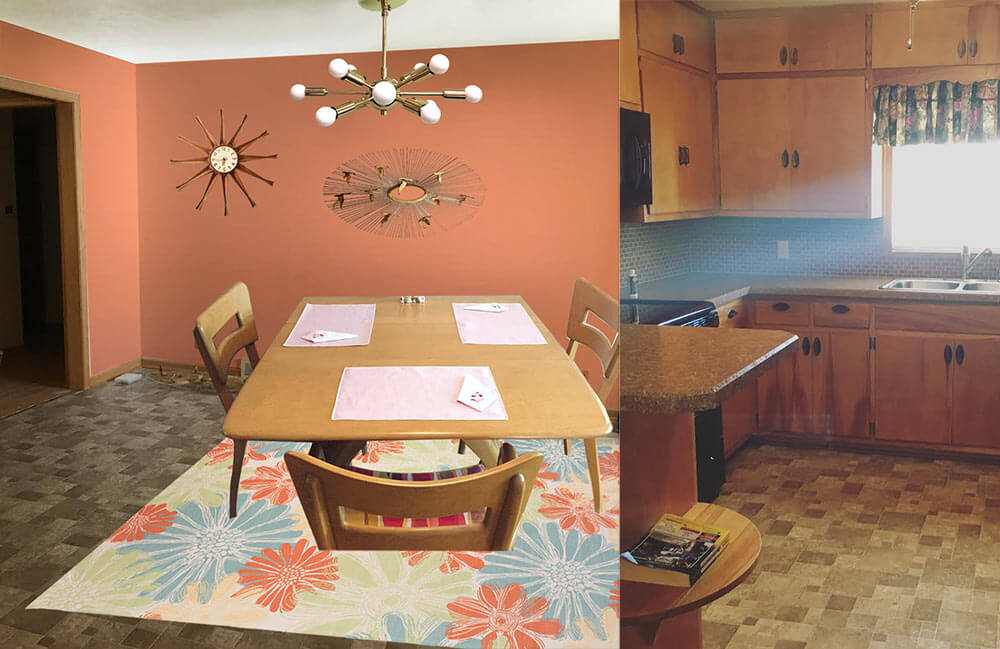 This option — similar to option 1 but a good choice if Paige likes warm colors more than cool colors — I used the same light colored cheery flower print indoor/outdoor rug that will contrast with the medium brown floor tiles and inject some life into the room. Next, I pulled the coral flower color found in the rug and used that shade to paint the walls. This instantly refreshes the space! Playing off Paige’s Jere inspired starburst wall hanging, I also added a coordinating sputnik light fixture that will not only add interest but also more light to the space. Finally, a medium toned vintage wood starburst clock helps repeat just a little bit of the wood up on the walls. Paige could recover her dining chairs with a solid coral, green or aqua fabric and also use that fabric to make coordinating valences for above the sink and dining room window.
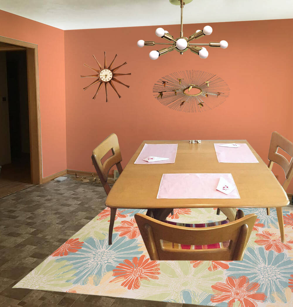
- Coral walls — like Sherwin-Williams ‘Persimmon’
- Paige’s Heywood Wakefield dinette set
- Paige’s Jere inspired wall art
- Sputnik light from Practical Props
- Rug from Overstock.com
- Vintage starburst clock from Ebay
Kate’s option 3: Kitschy kitchen wallpaper
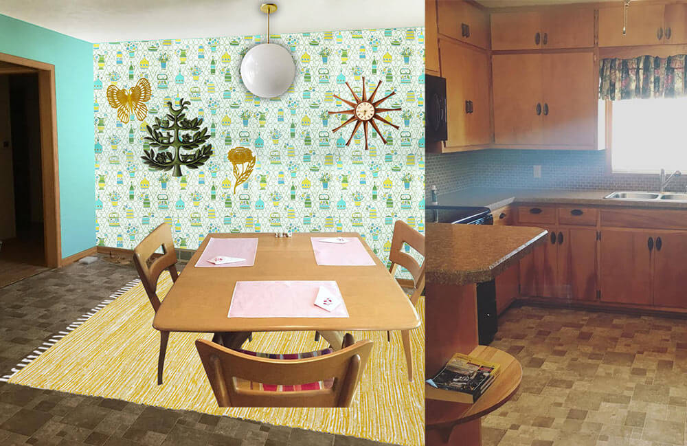
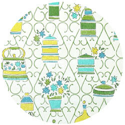 In this option, I started with some fabulous vintage 1970s wallpaper with a kitschy kitchen themed print. So as not to overwhelm the space and save on cost, I would wallpaper just one wall as an accent wall. The remainder of the walls would be painted a cheery aqua, pulled from the wallpaper pattern. Next, I’d add a yellow area rug — another color pulled from the wallpaper pattern — to help brighten up the floor and add even more color. A classic globe ceiling light over the table would not compete for attention with the wallpaper, and would provide a nice amount of light in the space. A grouping of vintage wall plaques in coordinating colors to the wallpaper helps repeat the color scheme and ads a bit more kitsch to this kitchen. Finally, a medium toned vintage wood starburst clock helps repeat just a little bit of the wood up on the walls. Paige could recover her dining chairs with a yellow, green or aqua fabric matched to the wallpaper pattern and also use that fabric to make coordinating valences for above the sink and dining room window.
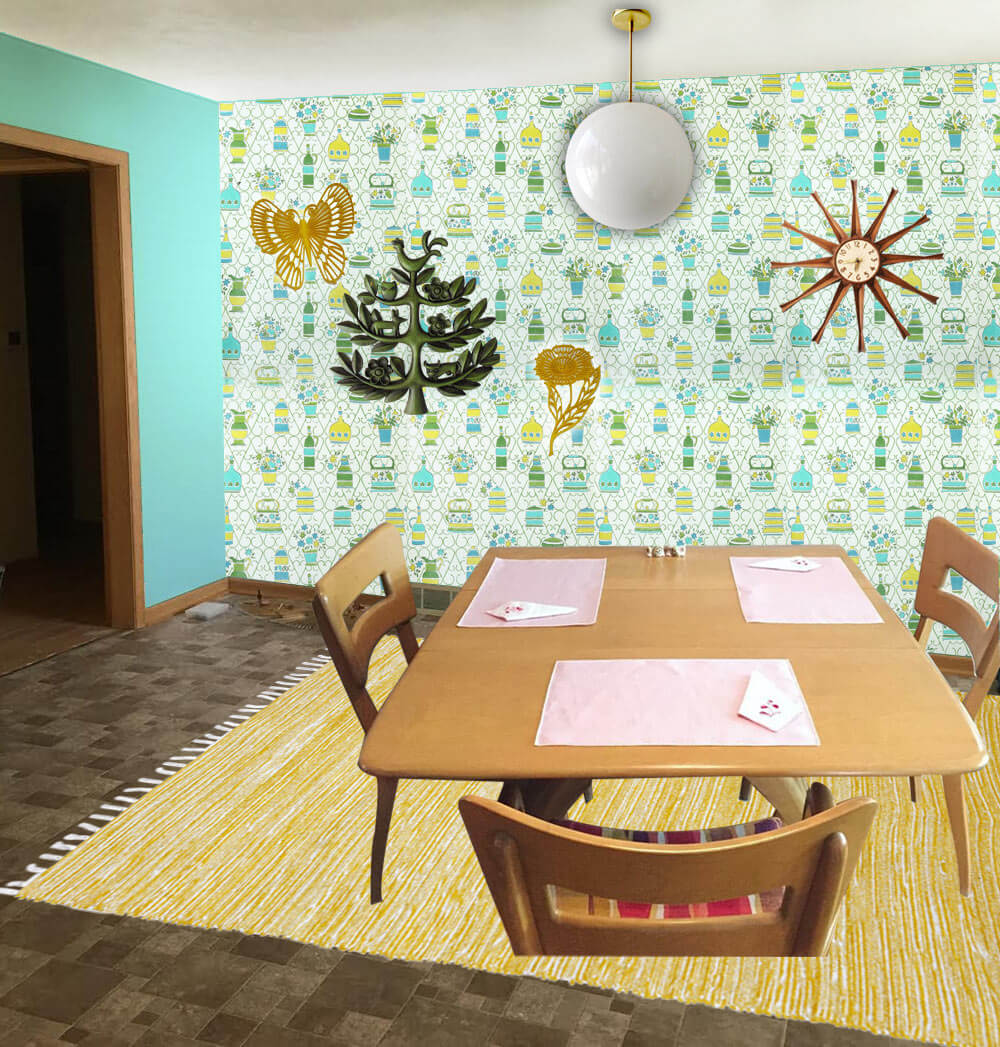
- 1970s wallpaper from Hannah’s Treasures
- Bright aqua walls that coordinate with the aqua in the vintage wallpaper — like Sherwin-Williams ‘Tantalizing Teal’
- Paige’s Heywood Wakefield dinette set
- Globe pendant light from Practical Props
- Rug from Overstock.com
- Vintage starburst clock from Ebay
- Vintage tree of life wall hanging from Ebay
- Vintage yellow flower and butterfly wall hanging from Ebay
Pam’s option 4: Warm and woodsy like Grandma’s kitchen
 Pam here. The first thing I thought of when I saw Paige’s kitchen was to start with a braided rug, because this whole space has old-fashioned feel, like a knotty pine kitchen. In addition, that DELICIOUS Heywood Wakefield Dogbone set can skew old-timey or mid mod. So I went for a kitchen like my Grandma Agnes had. I found a Capel rug that would look good with the brown — kinda foresty. I looked for a cheery barkcloth that would add more pattern via matching valances for the two windows — hey, you could also do a cafe curtain on the bottom half of the dining room window, which would add even more cheer. Kate chose a dusty blue paint color taken the rug and the barkcloth. In this concept, I skipped a light for over the table thinking you may want to keep the existing fan with light, for function. And I found forest green fabric for the chair pads.
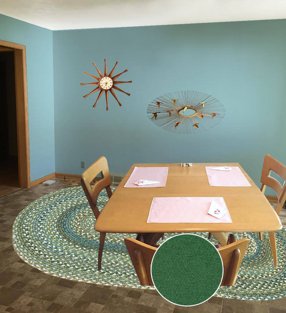
- Aqua blue wall paint — like Sherwin-Williams ‘Raindrop’
- Paige’s Heywood Wakefield dinette set
- Braided oval American Legacy rug in Pine Forest from Capel Rugs
- Maharam Messenger ‘Turf’ fabric from Modern Fabrics to recover the chair seats
- Martha’s Vineyard vintage barkcloth fabric from Ebay seller floridabungalow for window treatments
- Vintage starburst clock from Ebay
- Paige’s Jere inspired wall art
Ok, readers — here’s your chance to chime in. Which of these options do you like best for Paige’s kitchen? And: Feel free to add your own ideas to the comments, too!


Julie says
Adorable kitchen, adorable couple! I’m most drawn to the last option with the braided rug, but I also really like the coral (and I never would have thought of it, but it definitely works). I love smart kitchens like this that utilize every inch of the room–no wasted space over the cabinets or around appliances, etc.
ineffablespace says
I was going to say a fairly light pink, or a fairly light blue, and then I saw that there were actually solutions posted.
I think you have to be careful with colors the intensity of the coral because reds absorb a lot of light and they will also tend to make the brown woodwork look yellow, I think you want the woodwork to read darker or more saturated than the wall color
Carolyn says
Well this gives the term “mud room” a whole new meaning. What in the world were the former owners thinking?! There oughta be a law!
I was looking at the chair cushions to pull out the greens and corals for paint if the cushions are in good condition, sort of an “if it ain’t broke, don’t fix it” mentality (I’ve never had to re-upholster although I understand these chairs would be a really easy first project.)
Curtains in K in a similar pattern to the chairs and solid in the DR if they can’t find something that’s really close?
And, some crummy weekend, pull out the fridge or range and start picking off the backsplash (grease and dust magnet – better known as something else that needs to be cleaned). By starting in an inconspicuous spot, they can hide any gouges from the first course and just pickpickpick at those little squares and paint over the glue-y stuff left. The walls would need to be cleaned up anyways to put up laminate or be re-painted later and this gives an opportunity to live with different color paints til they find one they like.
My idea is a stop gap until they live in the house long enough for the house to tell them how to invest in a renovation. I also advise they take Kate’s paint suggestions and just do that one wall and live with each color (find sheet sets to hang – easier to putty holes than prime and paint and pillowcases for curtains.) Not knowing where they live or which side of the house these two rooms are, it’s hard to say to go with warm or cool.
Can’t wait to read others’ comments!
Mary Elizabeth says
I like all the suggestions. Pam’s idea of a braided rug with the Heywood Wakefield set is unexpected and nice. Getting more light into that kitchen and dining room is the main goal, with light fixtures and paint color.
But if I were Paige, I’d leave the chair fabric as it is and play off the red and gold, which I think will mix with the brown very happily. By playing off the red and gold, I mean she should pick a wall color that is in the gold spectrum but has a lot of white in it, like a golden yellow. Or, she could take the orange-red spectrum and go with that coral color Kate suggested. The valance and curtain should be something that also goes with those chair seats.
Also, people on this site have painted their tile backsplashes, and I have painted my laminate backsplash, so Paige can look back at the painted backsplash stories for inspiration.
Marcia says
I have the same problem in my 70s kitchen. I found that a couple of $10 rolls of contact paper was a quick & easy way to lighten up my faux-granite laminate backsplash and to test drive a new color. By the way I really like Kate’s kitschy wallpaper choice for the dining room. Something like that would look nice as a backsplash, too.
sherree says
Before I even scrolled down to see Kate and Pams suggestions, I thought of turquoise and orange 🙂 I used that in my kitchen which has an adjoining knotty pine mud room. My other choice would be to pull the colors in the atomic upholstery fabric on the dining room chairs. Maybe paint the walls the orange/ coral or lime/ chartreuse (it is hard to tell what the exact colors are) from that fabric and get accents in the other colors. If there is more fabric available I would make a valance or tiers for the windows in both rooms. Another option would be to go all-out Colonial, paint the walls turquoise, get vintage copper lighting and use turquoise and red accents. Whatever you do I am sure it will look wonderful. I would love to see more photos of your home!
Nancy says
Kate and Pam have come up with some fun ideas! Adding brighter lighting (under cabs, too) will help, as will lighter weight (sheer, but opaque if privacy is needed) window coverings. If the cab hardware isn’t valuable vintage, that could be painted or switched out for a color or metal to match the sink and trim on the black appliances.
There are a lot of tutorials on how to paint a vinyl floor and some bloggers have been very honest on how they have held up over time. It helps if you are a shoeless (or change into house-only shoes) for day to day. Something like that might help for a couple of years until you know what perm changes you’ll be doing. It helps to think of these changes as fun experiments and not as the need to reach perfection from the get-go.
The bones here look great and hope your decorating journey is fun!
pam kueber says
Undercabinet lighting – yes, a great idea for this kitchen!
Sheila says
Another vote for under cabinet lighting. There are a lot of plug-in or battery options if you can’t or don’t want to hard-wire.
I’d also consider painting the backsplash tile (http://www.abeautifulmess.com/2015/09/how-to-paint-a-tile-backsplash.html) either white or a lively color to highlight with those new lights! It’s probably not a long term solution but if you know you don’t like what’s there, it would let you play with another option to see how you like it.
Allison says
Paige might want to consider painting *the ceiling* in her kitchen one of the bright and happy colors you’ve chosen.
Pull that color into a valance and a small rug at the sink, and a few carefully chosen items for the countertop and you’ve brightened the space considerably.
Another DIY option is- if the backsplash is going to be replaced at a future time but not immediately (is it tile?) is to have ordinary cheap window glass cut to fit the backsplash space. Paint THE BACK of the glass a beautiful color; attach to the existing backsplash and seal carefully to the countertop with clear silicon. Its important to get a tight seal so water and guck can’t get behind the glass. This will last for several years at least with moderate care and is super cleanable..
Dan says
A light aqua or marine is definately the way to go. I would avoid anything in the orange or yellow families – we want a contrast to all that brown, not a complement. Instead of wallpaper, how about a bold painted graphic?
In the kitchen proper, how about adding color with a floorcloth, perhaps done in the same painted graphic as the dining room wall?
Janet says
I like the aqua blue wit mid century moder touches. Great transformation!