


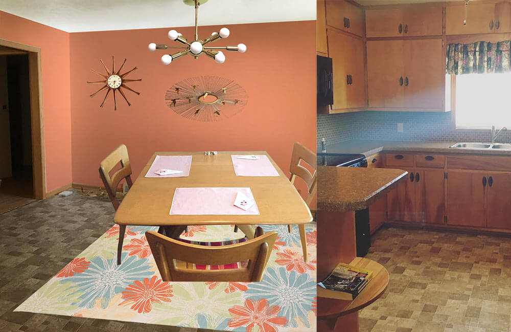
 Reader Paige needs our help — she and her husband Dustin recently bought a 1960 ranch house, and they are struggling to decide what paint color would help liven up the brown, brown and more brown found throughout the kitchen and connected dining room. She isn’t a fan of the brown backsplash, flooring and countertops, but they will have to stay for now. Can we give Paige a few paint and decorating ideas to help add some color her kitchen?

Paige writes:
I’ve been a follower of Retro Renovation for a long time and have seen you help fellow readers with paint! My husband and I just bought a 1960 ranch, and I am really struggling with what color to paint the kitchen/dining room.
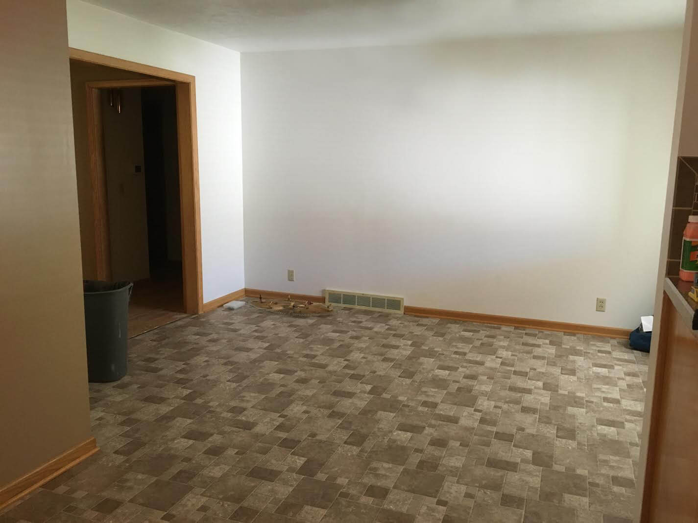
Our kitchen is open to the dining room, and unfortunately the brown back splash and brown floor will have to stay for a while.
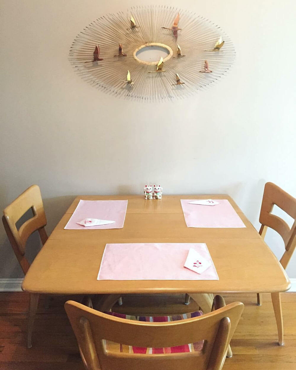
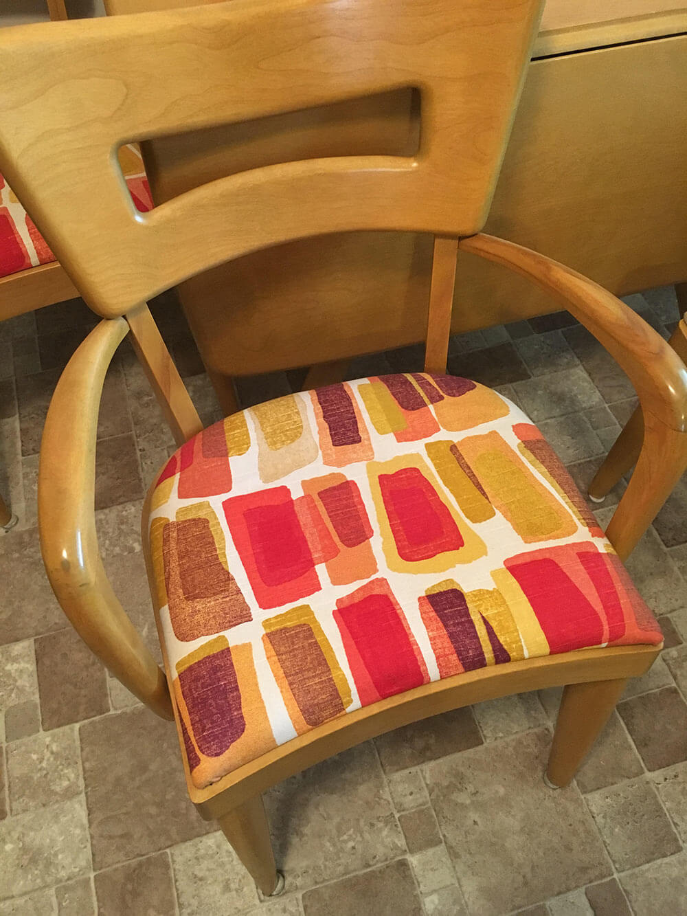
That, paired with the blonde woodwork and a wheat Heywood Wakefield table and chairs are really giving me some issues! I’m not attached to the upholstery on the chairs so that can be changed if need be! I definitely want to go with color in the kitchen but everything I pick seems to clash with the floor. Any advice would be greatly appreciated!
So, what can we do to help liven up all of that brown? We think there are a few key changes that can make a huge difference and up the happy factor in Paige’s kitchen:
- Light: Adding additional sources of bright light — like new, brighter ceiling lights — will help the space feel more cheery right away.
- Color: Between the brown wood cabinets and trim, brown tile floor, brown tile backsplash, brown countertop and beige walls, there is sure a lot of brown in Paige’s kitchen. The quick, easy and inexpensive way to fix this problem is to choose a cheery paint color for the walls, or maybe even a wallpaper accent wall.
- Rug: To further up the happy in Paige’s kitchen, we suggest getting a large area rug to place under the table in the dining area. This will not only add color and pattern to the space, but also help break up the large expanse of brown flooring.
Now, let’s see four options we came up with to help brighten up Paige’s brown kitchen.
Kate’s option 1: A happy aqua
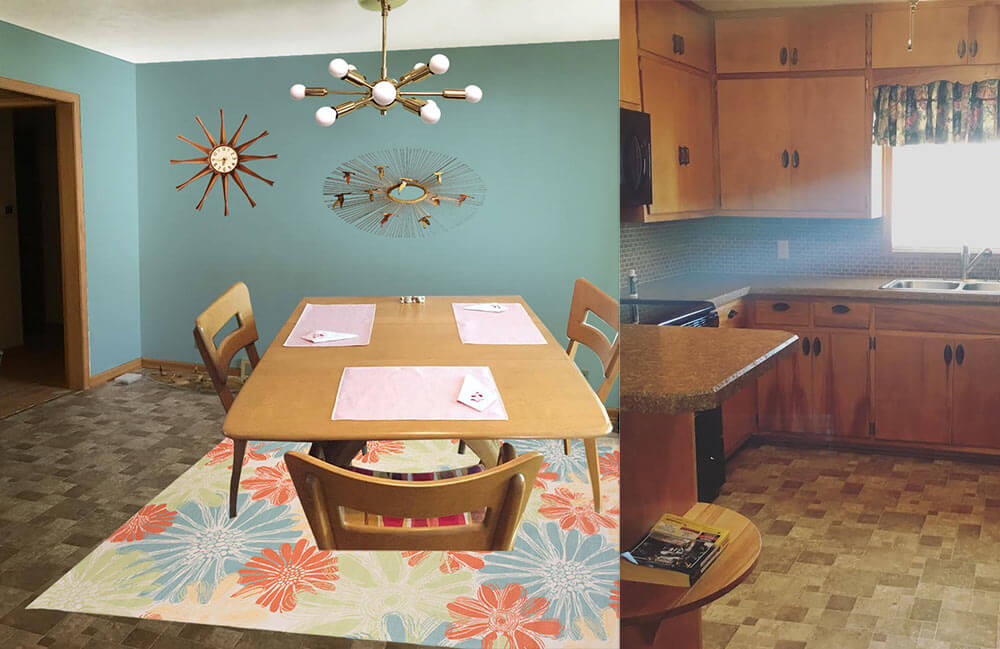 In this option, I found a light colored cheery flower print indoor/outdoor rug that will contrast with the medium brown floor tiles and inject some life into the room. Next, I pulled the aqua blue flower color found in the rug and used that shade to paint the walls. This instantly refreshes the space! Playing off Paige’s Jere inspired starburst wall hanging, I also added a coordinating sputnik light fixture that will not only add interest but also more light to the space. Finally, a medium toned vintage wood starburst clock helps repeat just a little bit of the wood up on the walls. Paige could recover her dining chairs with a solid coral, green or aqua fabric and also use that fabric to make coordinating valences for above the sink and dining room window.
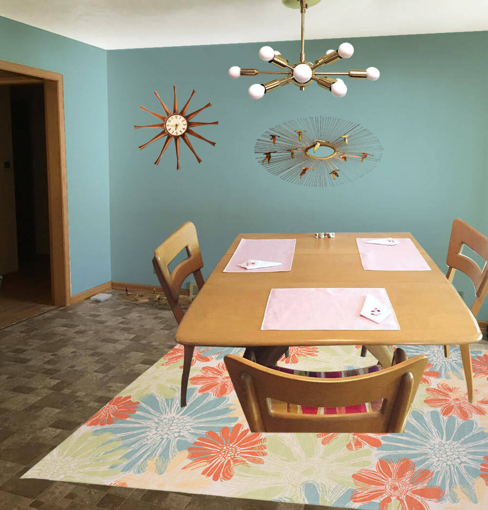
- Aqua walls — like Sherwin-Williams ‘Spa’
- Paige’s Heywood Wakefield dinette set
- Paige’s Jere inspired wall art
- Sputnik light from Practical Props
- Rug from Overstock.com
- Vintage starburst clock from Ebay
Kate’s option 2: Cheerful coral
 This option — similar to option 1 but a good choice if Paige likes warm colors more than cool colors — I used the same light colored cheery flower print indoor/outdoor rug that will contrast with the medium brown floor tiles and inject some life into the room. Next, I pulled the coral flower color found in the rug and used that shade to paint the walls. This instantly refreshes the space! Playing off Paige’s Jere inspired starburst wall hanging, I also added a coordinating sputnik light fixture that will not only add interest but also more light to the space. Finally, a medium toned vintage wood starburst clock helps repeat just a little bit of the wood up on the walls. Paige could recover her dining chairs with a solid coral, green or aqua fabric and also use that fabric to make coordinating valences for above the sink and dining room window.
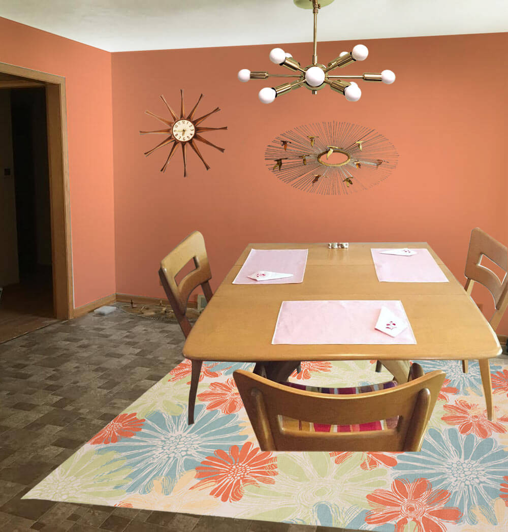
- Coral walls — like Sherwin-Williams ‘Persimmon’
- Paige’s Heywood Wakefield dinette set
- Paige’s Jere inspired wall art
- Sputnik light from Practical Props
- Rug from Overstock.com
- Vintage starburst clock from Ebay
Kate’s option 3: Kitschy kitchen wallpaper
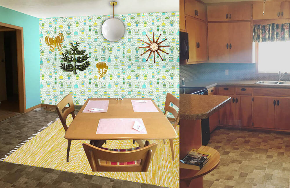
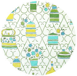 In this option, I started with some fabulous vintage 1970s wallpaper with a kitschy kitchen themed print. So as not to overwhelm the space and save on cost, I would wallpaper just one wall as an accent wall. The remainder of the walls would be painted a cheery aqua, pulled from the wallpaper pattern. Next, I’d add a yellow area rug — another color pulled from the wallpaper pattern — to help brighten up the floor and add even more color. A classic globe ceiling light over the table would not compete for attention with the wallpaper, and would provide a nice amount of light in the space. A grouping of vintage wall plaques in coordinating colors to the wallpaper helps repeat the color scheme and ads a bit more kitsch to this kitchen. Finally, a medium toned vintage wood starburst clock helps repeat just a little bit of the wood up on the walls. Paige could recover her dining chairs with a yellow, green or aqua fabric matched to the wallpaper pattern and also use that fabric to make coordinating valences for above the sink and dining room window.
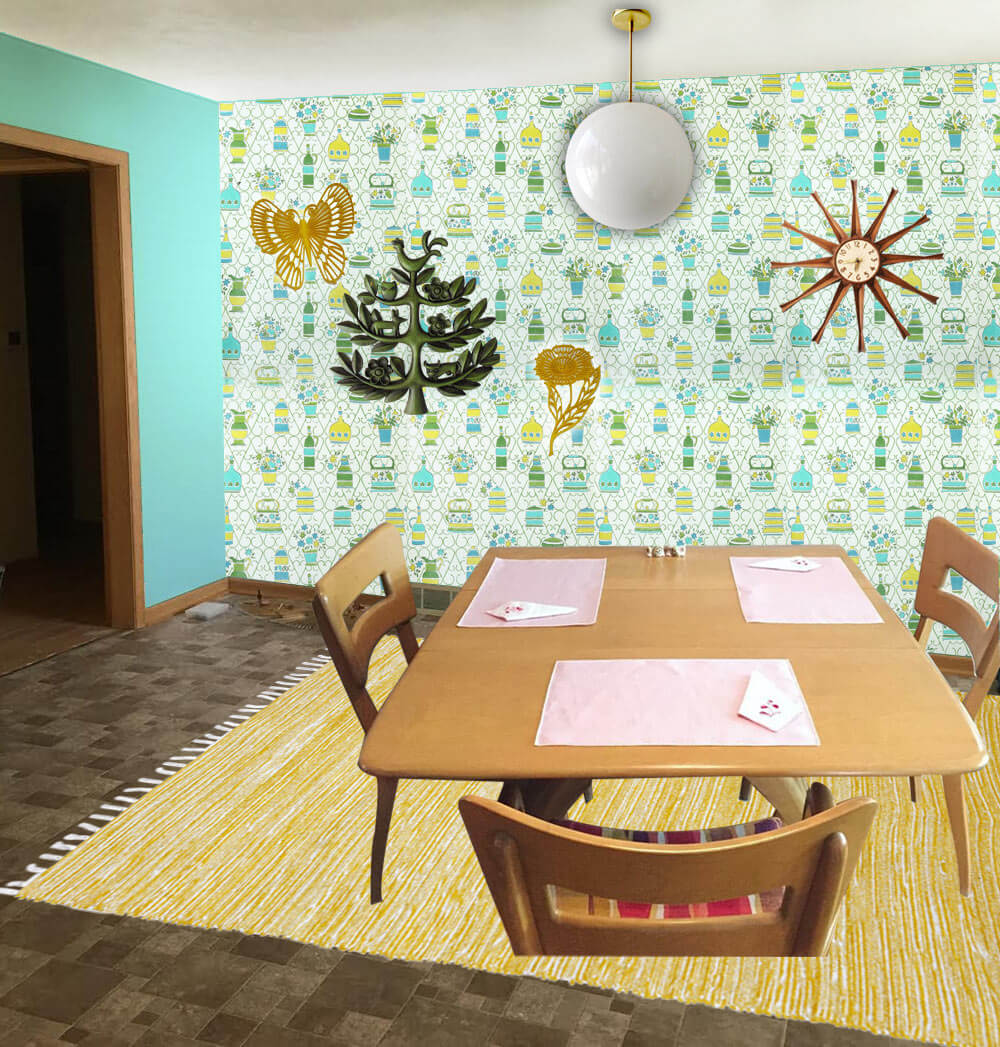
- 1970s wallpaper from Hannah’s Treasures
- Bright aqua walls that coordinate with the aqua in the vintage wallpaper — like Sherwin-Williams ‘Tantalizing Teal’
- Paige’s Heywood Wakefield dinette set
- Globe pendant light from Practical Props
- Rug from Overstock.com
- Vintage starburst clock from Ebay
- Vintage tree of life wall hanging from Ebay
- Vintage yellow flower and butterfly wall hanging from Ebay
Pam’s option 4: Warm and woodsy like Grandma’s kitchen
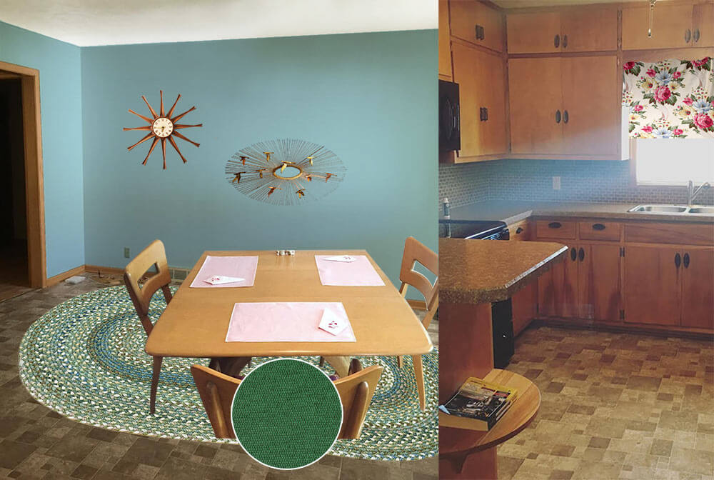 Pam here. The first thing I thought of when I saw Paige’s kitchen was to start with a braided rug, because this whole space has old-fashioned feel, like a knotty pine kitchen. In addition, that DELICIOUS Heywood Wakefield Dogbone set can skew old-timey or mid mod. So I went for a kitchen like my Grandma Agnes had. I found a Capel rug that would look good with the brown — kinda foresty. I looked for a cheery barkcloth that would add more pattern via matching valances for the two windows — hey, you could also do a cafe curtain on the bottom half of the dining room window, which would add even more cheer. Kate chose a dusty blue paint color taken the rug and the barkcloth. In this concept, I skipped a light for over the table thinking you may want to keep the existing fan with light, for function. And I found forest green fabric for the chair pads.
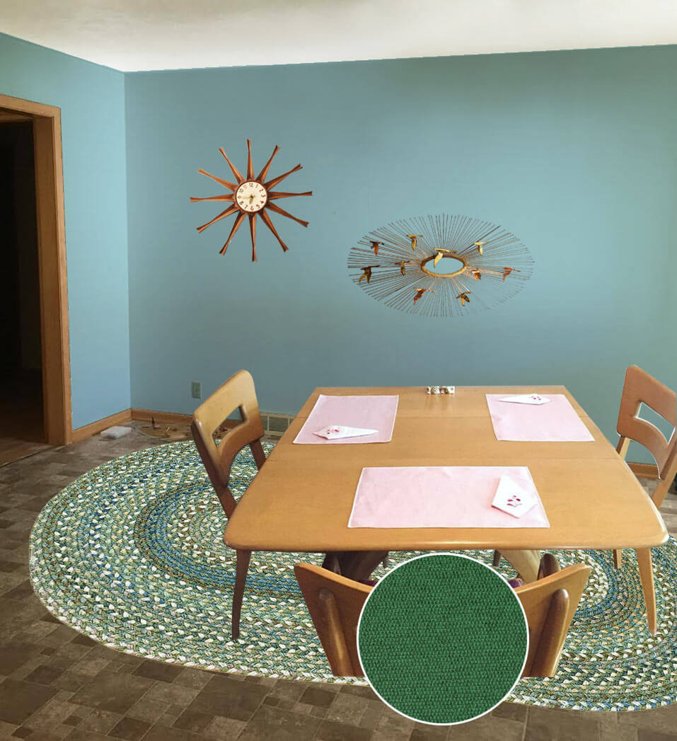
- Aqua blue wall paint — like Sherwin-Williams ‘Raindrop’
- Paige’s Heywood Wakefield dinette set
- Braided oval American Legacy rug in Pine Forest from Capel Rugs
- Maharam Messenger ‘Turf’ fabric from Modern Fabrics to recover the chair seats
- Martha’s Vineyard vintage barkcloth fabric from Ebay seller floridabungalow for window treatments
- Vintage starburst clock from Ebay
- Paige’s Jere inspired wall art
Ok, readers — here’s your chance to chime in. Which of these options do you like best for Paige’s kitchen? And: Feel free to add your own ideas to the comments, too!


pam kueber says
I just bumped into this story — inspiration? –> https://retrorenovation.com/2015/05/07/sell-house-travel-america-story/
Carolyn says
HAHA!!! I was drawn to the drawer pulls in aqua, I suppose they are Bakelite or something authentic. Paige and Dustin might consider painting theirs if they aren’t valuable to match a color from the dining room.
And I’ve been thinking about their dilemma all day…from what I’ve read since joining this group, not sure they can do an.y.thing until they have a project supervisor. I see no cat or dog.
Paige M says
We have three cats, and they make for the worst project supervisors!
lynda says
Drawer pulls are glass by Lewis Dolin. They come in many colors and have matching knobs. They also come in many different metal trim colors too. I have clear glass ones on my old white cabinets.
And for my opinion, I think the blues and aqua colors look nice in the room. Don’t forget to check overstock for braided rugs. You never know what you might find. Also, Colonial Mills is made in Pawtucket, Rhode Island. There is an outlet there and they have periodic sales. I have been there and they are very nice.
Paige M says
Pam that kitchen is gorgeous. Actually, the entire house is!
Paul - Ct says
Hi , Paige
I believe you wanted help with paint, so I’ll start with my thoughts on what I would do. I’m not a fan of mid-century kitsch, I adore mid-century Jackie Kennedy! So that being said and at risk of being banned by Pam, first thing I would do is paint the kitchen cabinets. Cover up that pine finish will a wonderful light, bright finish. I like the existing countertops, it looks like Wilsonart HD. Look at the lightest color in the laminate and maybe go with that for the cabinets. Also, I would go with a new laminate to replace the existing backsplash. It’s NOT expensive. (When I redid my kitchen I went with two different laminates). Again going with a light color and maybe even going with a solid. That will lighten the entire kitchen and adding a nice outdoor rug (kitchen floors get filthy so you want something you can take outside and hose down) in a light color and simple pattern that compliments. Simple shade in a light colored over the sink would work, too.
EBay has wonderful flat panel recessed LED lighting that has a mid century look that can be installed to also brighten the kitchen.
I’d keep the dining area neutral and pattern free and get a very elegant textured wool rug on Overstock with a simple pattern. Love your wall sculpture and wouldn’t add anything more to the walls other than maybe some artwork. A Capiz Shell ceiling fixture would be a nice touch and redo the chairs to compliment the rug. Pleather is easy to clean from food spills!
Good luck!
JeffK says
The fabric over the sink certainly could be something other than matching the floor! Seafoam? Gold?
Brooke says
I like a lot of the options but if someone is picking the wallpaper option I’d rather spend the money on a peel and stick floor to help get rid of the brown.
That wallpaper would end up being close to $300 and you can buy a black and white checker peel and stick floor from overstock for $120-140 for the square footage they have http://tinyurl.com/zmzt87n
Then you can paint the walls whatever colour you want without the floor being the major hold up.
The backsplash could be replace with just white subway tile which you can get incredibly cheap from Home Depot (I think our backspalsh cost $100 including the tools/grout etc)
Ikea has an super cheap white countertop for $39 / 8ft section so roughly $156 for the kitchen.
It would end up being fairly white with the white counter, white backsplash and checker floor but adding in accents in colour would help to balance everything. Total would be approx $400 +/- which is only $100 more than just the wallpaper alone.
You could even just do the floor and backsplash for $240 and live with the brown countertops. Or just the floor for $140
Paige M says
Hey! Thanks so much for the comment. Those options you gave are great and super helpful. I’ve considered a simple white subway tile backsplash to brighten the kitchen. If I chose to do anything right now it would definitely be the backsplash. It would brighten the kitchen significantly!
Brooke says
No problem Paige! Some renos are cheaper than you’d think they are and can make a huge impact. I’d have loved to have installed a more expensive tile but our house needs so much updating that we couldn’t afford it.
If you’re going for a more mid century modern look over a more retro diner look you can stack the subway tile (instead of a brick pattern) and it looks pretty great.
I should say we had access to a tile cutter and a wet saw that my parents had so that might bump up the price a tad (tile cutter isn’t too expensive. It just scores the tile and snaps it). The tile cutter works great on ceramic but there is a limitation on creating complex cuts to go around outlets etc.
I hope you send in an updated photo, I’d like to see why you guys end up doing. Good luck!
Robin, NV says
I’d do a mix of the last two suggestions – Kate’s wallpaper and Pam’s braided rug. Both brighten up the space considerably. But it would give the kitchen a real “Grandma’s house” vibe, which may not be what the homeowners are going for.
Martha says
Option #1, it’s just perfect!
modernT says
Based on your C. Jere wall art and your Hey Wake dining set, I’m guessing your taste runs a little more mid-mod than kitchy. However, your kitchen does give me more of a grandma vibe than mid-mod so I would balance the two. The cabinets look like they are in great shape so I would only consider new metal hardware to bring a little more sparkle to the space. I would remove the valance in the kitchen because it blocks the light and you need as much light as possible. I would accessorize the kitchen with retro canisters and a bright teakettle on the stove. I would also consider painting the backsplash as a stop-gap. It won’t last forever but it should hold up for awhile until you decide what to do with the rest. And maybe add a plant or two near the window. In the dining room, I would definitely replace the light fixture to something a little more mid-mod like a globe light, a sputnik, or one of the mid-century chandeliers from west elm. I like the options that Pam selected in option 4. The braided rug gives a nod to the grandma style of the kitchen but it is actually pretty clean-lined in style. I love it. I would also paint the walls a light blue to coordinate with the rug. I personally wouldn’t go too bright because I think a calmer shade would modernize the space without making it seem like a time warp. I would also put a valance on the window of the dining area to bring in some fabric and pattern. But hang it high so that it doesn’t block light because you need as much light as possible to brighten things up. I would also consider painting the trim in the dining room either the shade of the walls or white. I used to be in the “don’t paint the wood” camp but I think in this case painting the wood trim would really freshen up the space. I’ve done it in my own house after living with wood trip in some rooms for years and it did wonders to make things feel lighter, brighter, and fresh.
Hopefully this gives you a different view to think about. At the end of the day, do whatever makes you happy!! And enjoy your new house.
Alicia Damron says
The first one is my favorite. I love blue walls and that shade contrasts so nicely with all the tones of brown. I love it!
Lynne says
Yep, thats a whole lotta brown. So much that I wouldn’t even try to fight it. It is what it is. She says every color she has tried just isn’t right. So, find a color that matches. Blend the floor and the walls so it recedes. I think adding a big blast of contrasting color just draws unwanted attention.
Add your color of choice in art and accessories. A bright canister set, dish towels, table runner or place mats, a big vase of Gerbera Daisies, fun stuff in a color she loves. Maybe yellow or orange?
Whatever color of fabric she chooses for the chairs and window treatment make sure it has “just a touch” of that brown/clay/taupe in it. Use the same fabric for everything if possible.
Next, I agree, address the lighting. I couldn’t tell from the pictures…is the cabinet hardware original? If not, I’d switch out the dark for more sparkle in your choice of silver or brass.
I know this won’t be a popular opinion!
Stephanie in MD says
Aww. Such a cute couple. And the house has such great character. I am sure you will do lovely things with it. And I love both ideas of aqua and coral. (though my mom has the braided rug in her kitchen in the almost exact same color as Pam and Kate suggested, so I may be partial to that one).
An idea to liven up the backspash on the cheap and temporarily: I live in a rental and the backsplash is not in character with the rest of the kitchen and in bad shape, and I have been thinking of using the peel and stick wallpaper from Target (Devine brand, “horizon” pattern I think) to cover it up while I live here. They sell it at my local store and online in tubes of 16 feet long for about $30, and it is a pretty aqua color with streaks of gold. The Devine website says you can use it behind a range, as long as it doesn’t come in close contact with the burners (for example, yours has the controls and clock between the burners and backsplash), so that may be an option. Unfortunately, my range sits in the corner, so I need a solution for the right side of the range, but for the long wall, I may bite the bullet and try it. Then I can just peel it off when I leave.
PS- my brother in law is a professional painter, and he always recommends painting the ceiling when painting a room, so I recommend painting the ceiling also (even if you want to just paint it white) – it will make a huge difference, especially if you want to brighten up the space. Its amazing how dingy white can get over the years.
Good luck!