


 Reader Paige needs our help — she and her husband Dustin recently bought a 1960 ranch house, and they are struggling to decide what paint color would help liven up the brown, brown and more brown found throughout the kitchen and connected dining room. She isn’t a fan of the brown backsplash, flooring and countertops, but they will have to stay for now. Can we give Paige a few paint and decorating ideas to help add some color her kitchen?

Paige writes:
I’ve been a follower of Retro Renovation for a long time and have seen you help fellow readers with paint! My husband and I just bought a 1960 ranch, and I am really struggling with what color to paint the kitchen/dining room.
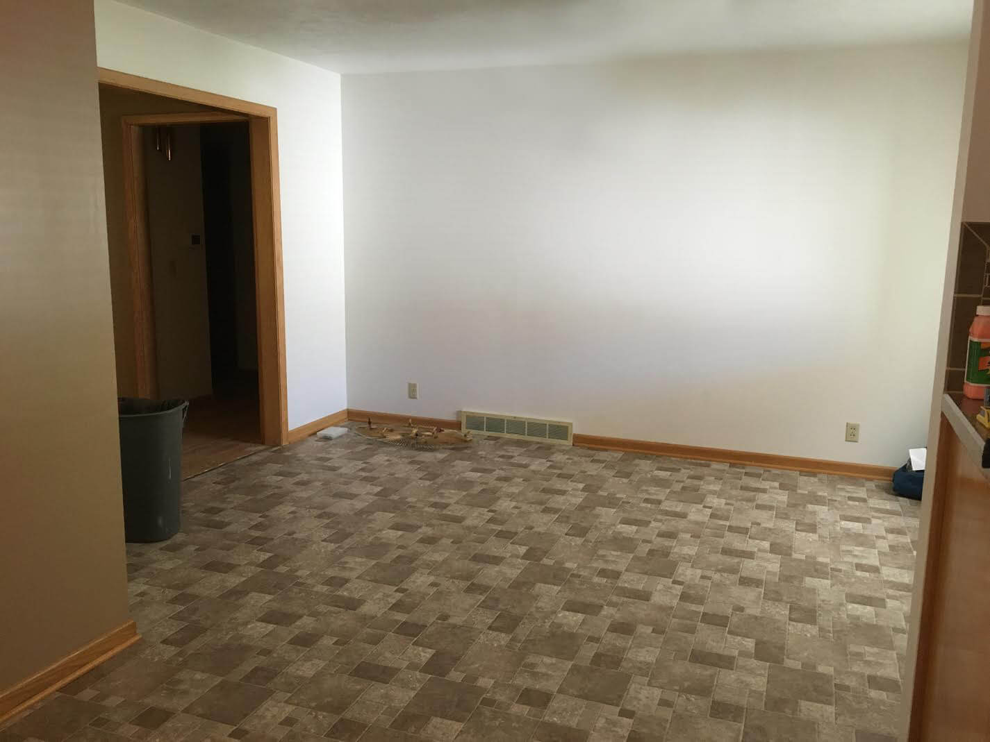
Our kitchen is open to the dining room, and unfortunately the brown back splash and brown floor will have to stay for a while.
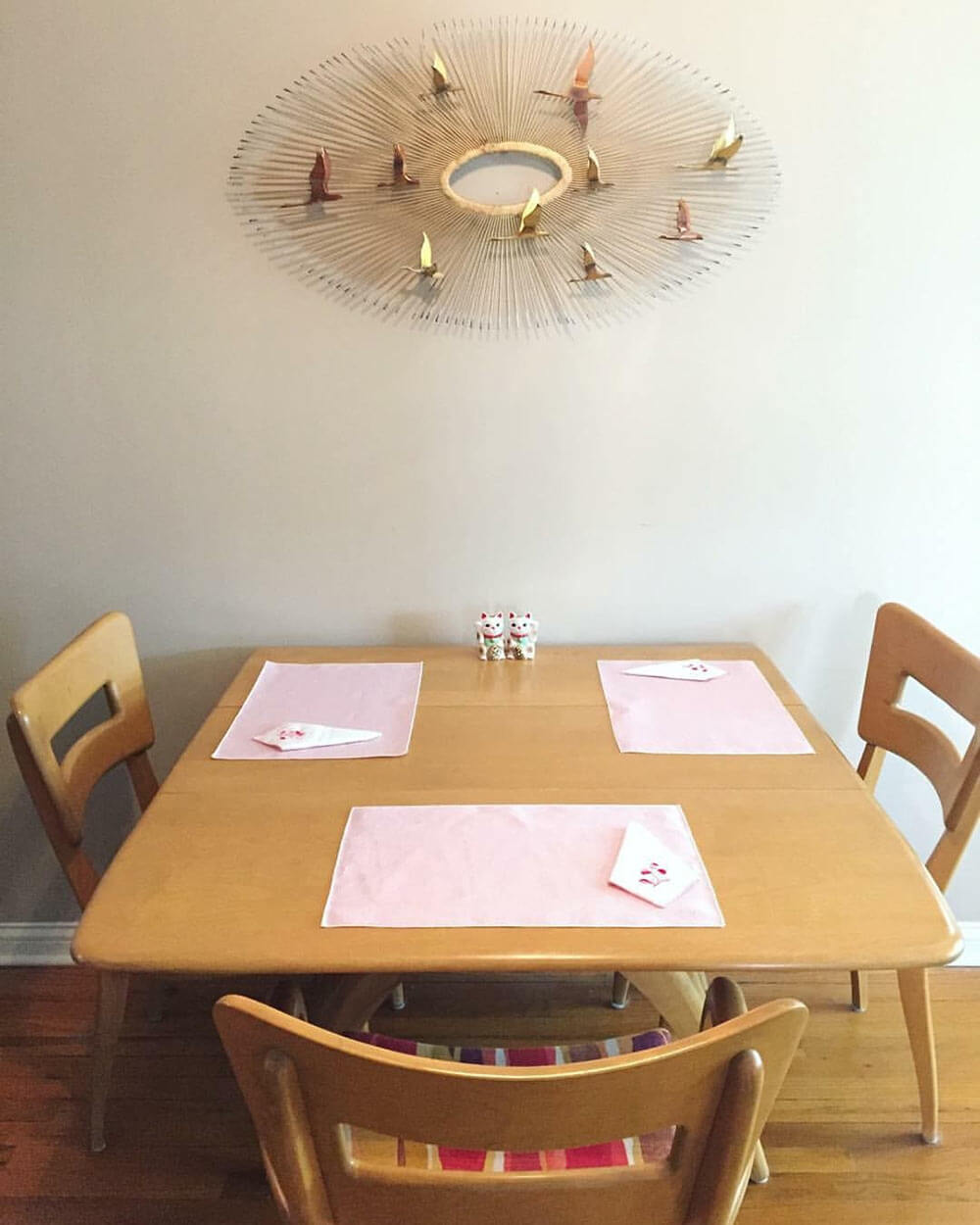
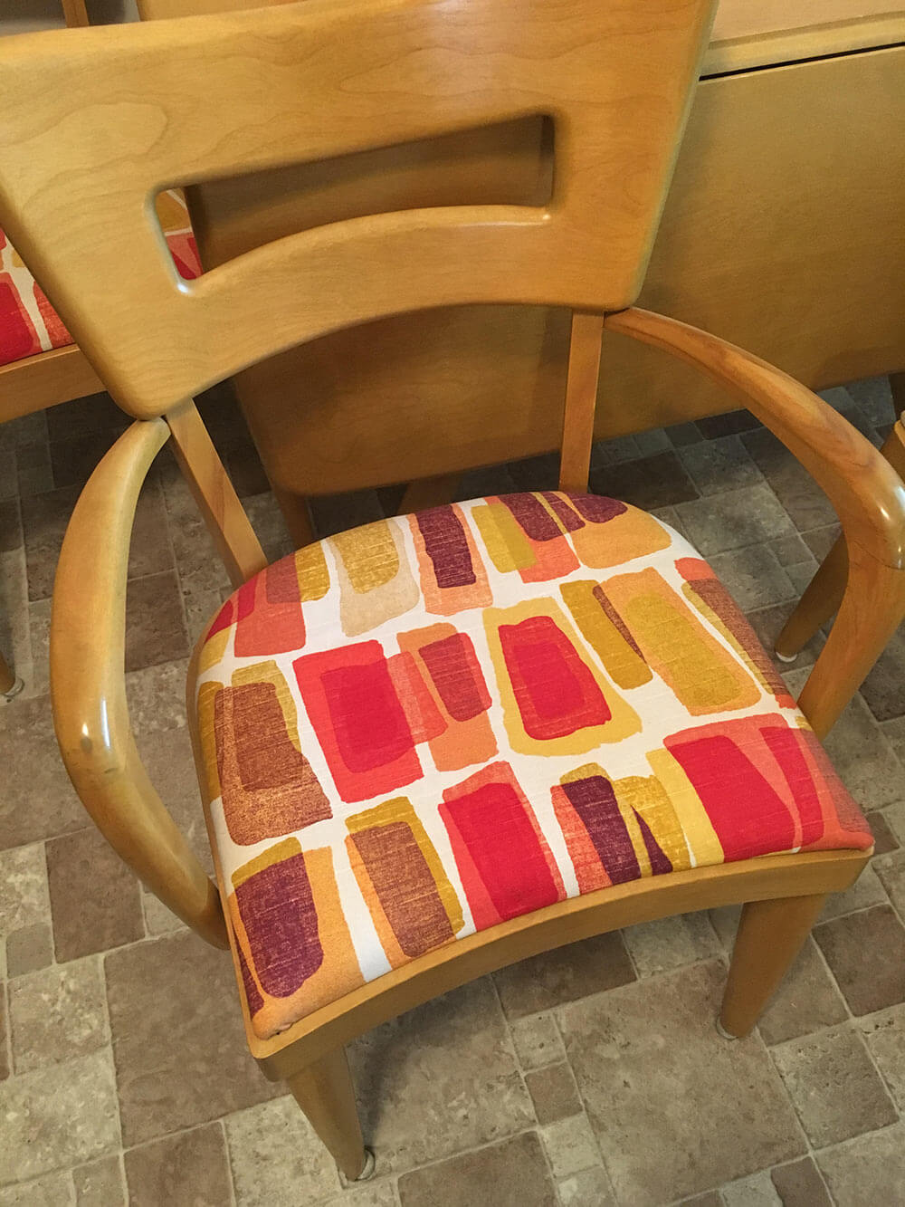
That, paired with the blonde woodwork and a wheat Heywood Wakefield table and chairs are really giving me some issues! I’m not attached to the upholstery on the chairs so that can be changed if need be! I definitely want to go with color in the kitchen but everything I pick seems to clash with the floor. Any advice would be greatly appreciated!
So, what can we do to help liven up all of that brown? We think there are a few key changes that can make a huge difference and up the happy factor in Paige’s kitchen:
- Light: Adding additional sources of bright light — like new, brighter ceiling lights — will help the space feel more cheery right away.
- Color: Between the brown wood cabinets and trim, brown tile floor, brown tile backsplash, brown countertop and beige walls, there is sure a lot of brown in Paige’s kitchen. The quick, easy and inexpensive way to fix this problem is to choose a cheery paint color for the walls, or maybe even a wallpaper accent wall.
- Rug: To further up the happy in Paige’s kitchen, we suggest getting a large area rug to place under the table in the dining area. This will not only add color and pattern to the space, but also help break up the large expanse of brown flooring.
Now, let’s see four options we came up with to help brighten up Paige’s brown kitchen.
Kate’s option 1: A happy aqua
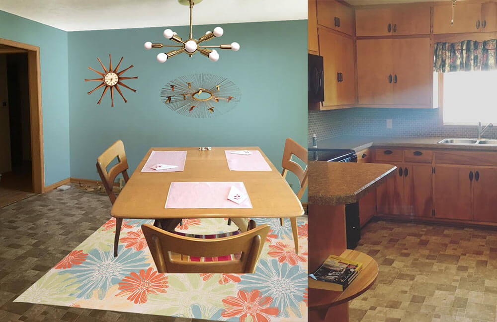 In this option, I found a light colored cheery flower print indoor/outdoor rug that will contrast with the medium brown floor tiles and inject some life into the room. Next, I pulled the aqua blue flower color found in the rug and used that shade to paint the walls. This instantly refreshes the space! Playing off Paige’s Jere inspired starburst wall hanging, I also added a coordinating sputnik light fixture that will not only add interest but also more light to the space. Finally, a medium toned vintage wood starburst clock helps repeat just a little bit of the wood up on the walls. Paige could recover her dining chairs with a solid coral, green or aqua fabric and also use that fabric to make coordinating valences for above the sink and dining room window.
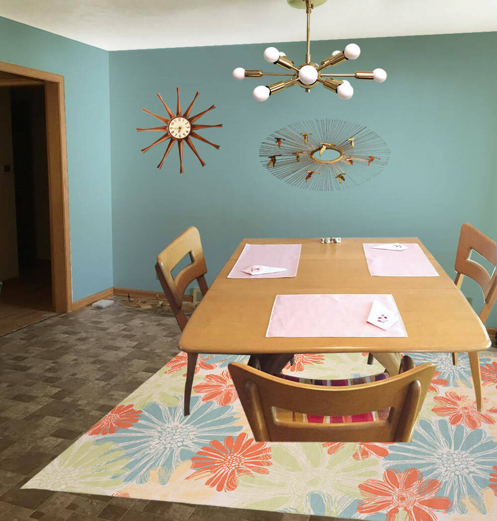
- Aqua walls — like Sherwin-Williams ‘Spa’
- Paige’s Heywood Wakefield dinette set
- Paige’s Jere inspired wall art
- Sputnik light from Practical Props
- Rug from Overstock.com
- Vintage starburst clock from Ebay
Kate’s option 2: Cheerful coral
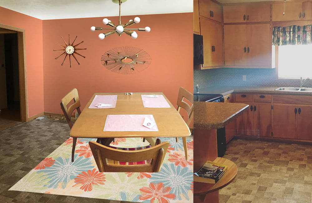 This option — similar to option 1 but a good choice if Paige likes warm colors more than cool colors — I used the same light colored cheery flower print indoor/outdoor rug that will contrast with the medium brown floor tiles and inject some life into the room. Next, I pulled the coral flower color found in the rug and used that shade to paint the walls. This instantly refreshes the space! Playing off Paige’s Jere inspired starburst wall hanging, I also added a coordinating sputnik light fixture that will not only add interest but also more light to the space. Finally, a medium toned vintage wood starburst clock helps repeat just a little bit of the wood up on the walls. Paige could recover her dining chairs with a solid coral, green or aqua fabric and also use that fabric to make coordinating valences for above the sink and dining room window.
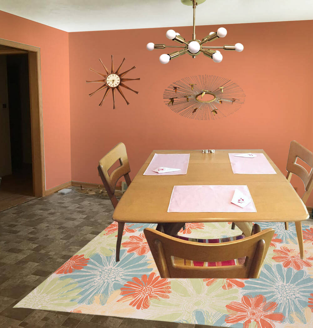
- Coral walls — like Sherwin-Williams ‘Persimmon’
- Paige’s Heywood Wakefield dinette set
- Paige’s Jere inspired wall art
- Sputnik light from Practical Props
- Rug from Overstock.com
- Vintage starburst clock from Ebay
Kate’s option 3: Kitschy kitchen wallpaper
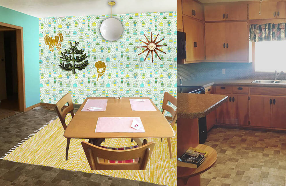
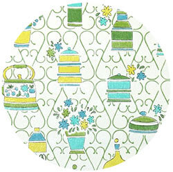 In this option, I started with some fabulous vintage 1970s wallpaper with a kitschy kitchen themed print. So as not to overwhelm the space and save on cost, I would wallpaper just one wall as an accent wall. The remainder of the walls would be painted a cheery aqua, pulled from the wallpaper pattern. Next, I’d add a yellow area rug — another color pulled from the wallpaper pattern — to help brighten up the floor and add even more color. A classic globe ceiling light over the table would not compete for attention with the wallpaper, and would provide a nice amount of light in the space. A grouping of vintage wall plaques in coordinating colors to the wallpaper helps repeat the color scheme and ads a bit more kitsch to this kitchen. Finally, a medium toned vintage wood starburst clock helps repeat just a little bit of the wood up on the walls. Paige could recover her dining chairs with a yellow, green or aqua fabric matched to the wallpaper pattern and also use that fabric to make coordinating valences for above the sink and dining room window.
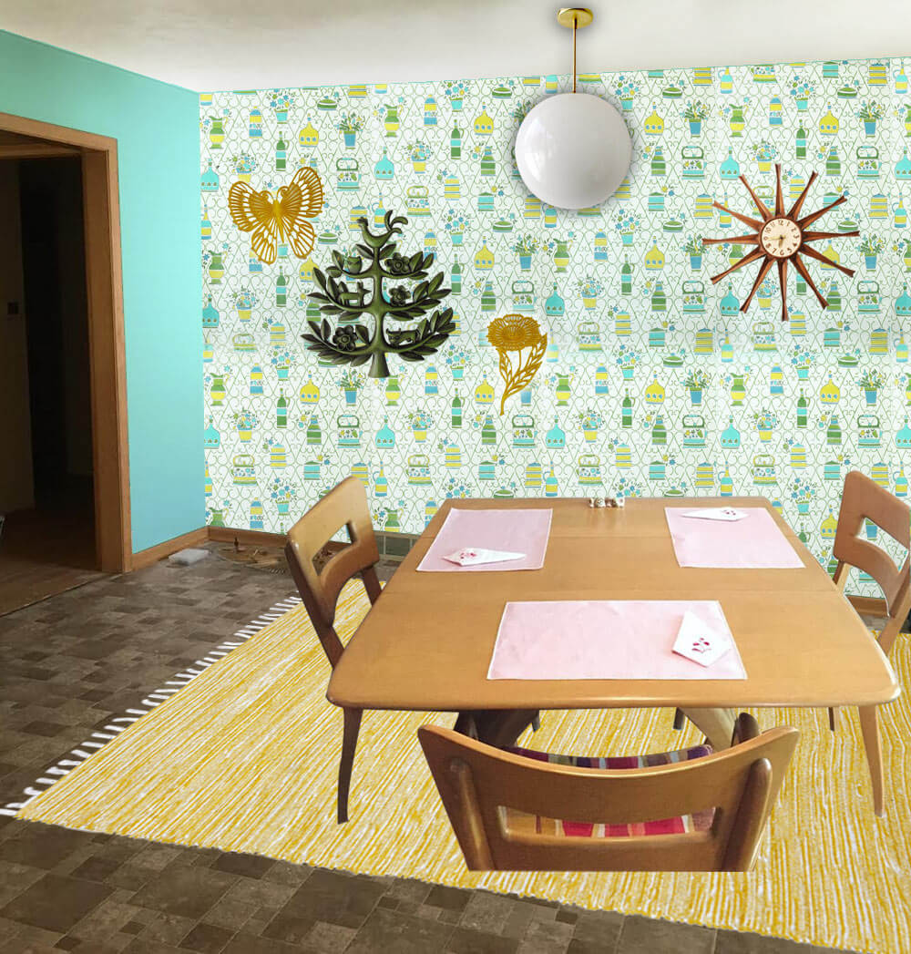
- 1970s wallpaper from Hannah’s Treasures
- Bright aqua walls that coordinate with the aqua in the vintage wallpaper — like Sherwin-Williams ‘Tantalizing Teal’
- Paige’s Heywood Wakefield dinette set
- Globe pendant light from Practical Props
- Rug from Overstock.com
- Vintage starburst clock from Ebay
- Vintage tree of life wall hanging from Ebay
- Vintage yellow flower and butterfly wall hanging from Ebay
Pam’s option 4: Warm and woodsy like Grandma’s kitchen
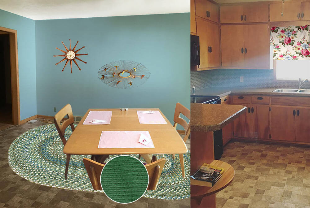 Pam here. The first thing I thought of when I saw Paige’s kitchen was to start with a braided rug, because this whole space has old-fashioned feel, like a knotty pine kitchen. In addition, that DELICIOUS Heywood Wakefield Dogbone set can skew old-timey or mid mod. So I went for a kitchen like my Grandma Agnes had. I found a Capel rug that would look good with the brown — kinda foresty. I looked for a cheery barkcloth that would add more pattern via matching valances for the two windows — hey, you could also do a cafe curtain on the bottom half of the dining room window, which would add even more cheer. Kate chose a dusty blue paint color taken the rug and the barkcloth. In this concept, I skipped a light for over the table thinking you may want to keep the existing fan with light, for function. And I found forest green fabric for the chair pads.
- Aqua blue wall paint — like Sherwin-Williams ‘Raindrop’
- Paige’s Heywood Wakefield dinette set
- Braided oval American Legacy rug in Pine Forest from Capel Rugs
- Maharam Messenger ‘Turf’ fabric from Modern Fabrics to recover the chair seats
- Martha’s Vineyard vintage barkcloth fabric from Ebay seller floridabungalow for window treatments
- Vintage starburst clock from Ebay
- Paige’s Jere inspired wall art
Ok, readers — here’s your chance to chime in. Which of these options do you like best for Paige’s kitchen? And: Feel free to add your own ideas to the comments, too!


tammyCA says
I like option 3…love that wallpaper. For me, I think I’d probably go more Boho, lively & bold colors, patterns that tie in with the browns but nobody will focus on that because they will recede to background. I’m all for preserving the vintage wood cabinets, floors if they are in good condition & working with them. I see so many cool eclectic interiors that have a mix of mid-century & bohemian (see one of my other fave blogs “Jungalow” & her book for example)..it gives more flexibility & less stressing over getting it perfect.
Elizabeth from Texas says
Both Paige AND her house are so cute! I like the blue one and the wallpaper one.
Mary Elizabeth says
Some more thoughts on the rug for the dining room–and maybe some small matching rugs in the kitchen. You can get a braided rug that makes a nod to the country/colonial (as in Pam’s idea) but creates a bridge to the MCM. Look at the rectangular braided rugs at Sturbridge Yankee Workshop on sturbridgeyankee.com. I had never seen any rectangular braided rugs until I saw these, and I like the variety of colors and styles they come in. Some even look like woven stripes until you are up close, when you see that they are a series of braids. Many (not all) of Sturbridge Yankee Workshop furnishings and rugs are made in the USA, and they periodically have great sales.
Donald says
I like the aqua, but how about yellow? I think it goes good with the browns, but not sure if it would match too much with the dining set. Here’s a 1957 Ranch just listed near me with a fabulous brown kitchen and yellow dining room. https://www.redfin.com/CA/Riverside/4581-Jarvis-St-92506/home/4948668/crmls-IG16089902
Paige M says
Paige here! Thanks so much Pam and Kate! All of these options are great! My husband loves the first and I love the second (coral is what I’ve been leaning toward this whole time) but I think all of them do great things to the kitchen/dining room! I also appreciate all of these suggestions in the comments. Some great ones that I’m going to use, like a new backsplash!
Paul-CT says
You going to paint the kitchen cabinets or leave them like that?
Carol says
It appears that carpet was in the living room and pulled up. Do the hardwoods go into the dining room? If so, that is much less floor to replace and you might be able to spring for a new floor in the kitchen. My grandma had a similar layout with similar cabinets and the hardwood was in all of it. They may have glued vinyl directly onto the hardwood before it was finished. Maybe worth investigating if you haven’t already. As for the kitchen, the tiles look tiny so I would paint them. There are paints made to go over tile. The glass on the backsplash was a great idea too. You can always go earthy with sage, fern, grass green or Pam’s chair upholstery green. With that you could add earthy colored barkcloth and McCoy pottery. This doesn’t amp up the color factor much but would be cohesive. I do like the braided rug with the Heywood Wakefield. I do secretly hope you have hardwoods under the vinyl. Hardwood is a neutral and frees up the paint colors a bit. It would get the dark taupe off the floor.
Retroski says
Lots of good ideas!
Brown and light blue/aqua always looks fresh, and the braided rug with the Hey-Wake is charming. The colors on the seats should go fine with light blue.
That splotchy brown floor isn’t doing the rooms any favors, and the squares slightly clash with the rugs. But, easy fix. You could make a DIY floor cloth out of plain canvas and a smaller decorated one for the kitchen. There’s tutorials online.
People mentioned contact paper and glass backsplashes, and you can also make temporary fabric wallpaper with fabric and paste made from cornstarch. It should stick to tile.
Finally, you might want to try a gallery wall in your dining area. You can mix your wall sculpture with some art/pictures in coordinating colors to add variety!
And yes, lighter floors, tile and countertops will make a difference. Under cab lighting, too! Good luck!
Johnna says
I wonder: since the brown floor is slated to go someday anyway, could it be fun to try painting it?
http://www.designertrapped.com/how-to-paint-your-linoleum-floors-yes/
Rhonda says
I agree! That’s the first thing that came to mind!
Laurie says
Yup! Paint that floor.
Other than that, I vote for option #1 with the happy aqua.
Sara in WA says
Love option 3 but they’re all great. With option 3 it would be nice to add yellow to the kitchen curtain and accessories on the kitchen counter. Cheery!
Jeanne Jeanne says
First I want to say that those cabinets are FABULOUS and well worth putting up with the brown-out for a while.
I think I like Pam’s option 4 the best. The oval braided rug looks fresh with the floor but not clashy. The flowered rug next to the busy tile floor feels a little distracting. My goal would be to bring the eye up, not down.
I also love the aqua-ish paint idea but instead of the Grandma curtain, I would probably go for a maximum bright/minimum sized valance over the window. Let in as much light as possible but inject some color.
Maybe find some vintage turquoise canisters for the countertop? Or some bright Fiestaware pieces?
I have to agree that adding red/peach/coral might just be enabling the brown too much.
Listen to me ramble! I can’t make a decision to save my life in my own home. Haha. Good luck to you! Can’t wait to see what you do.