


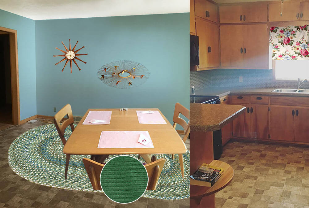
 Reader Paige needs our help — she and her husband Dustin recently bought a 1960 ranch house, and they are struggling to decide what paint color would help liven up the brown, brown and more brown found throughout the kitchen and connected dining room. She isn’t a fan of the brown backsplash, flooring and countertops, but they will have to stay for now. Can we give Paige a few paint and decorating ideas to help add some color her kitchen?

Paige writes:
I’ve been a follower of Retro Renovation for a long time and have seen you help fellow readers with paint! My husband and I just bought a 1960 ranch, and I am really struggling with what color to paint the kitchen/dining room.
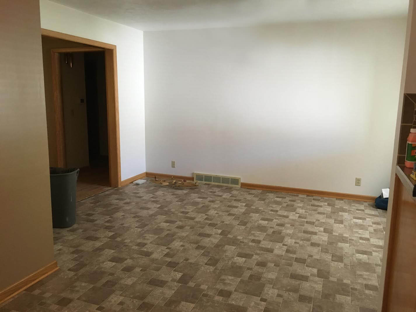
Our kitchen is open to the dining room, and unfortunately the brown back splash and brown floor will have to stay for a while.
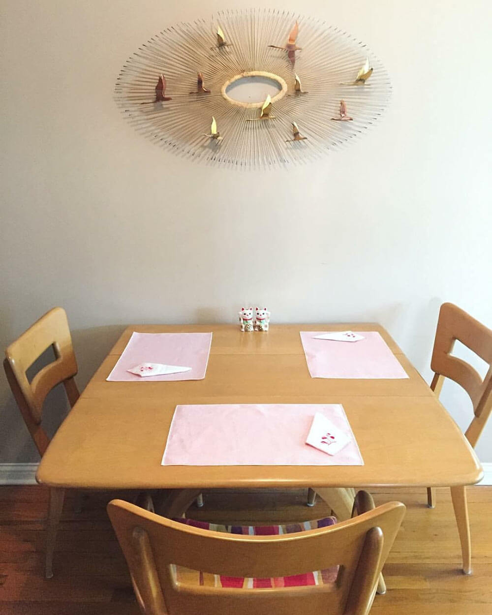
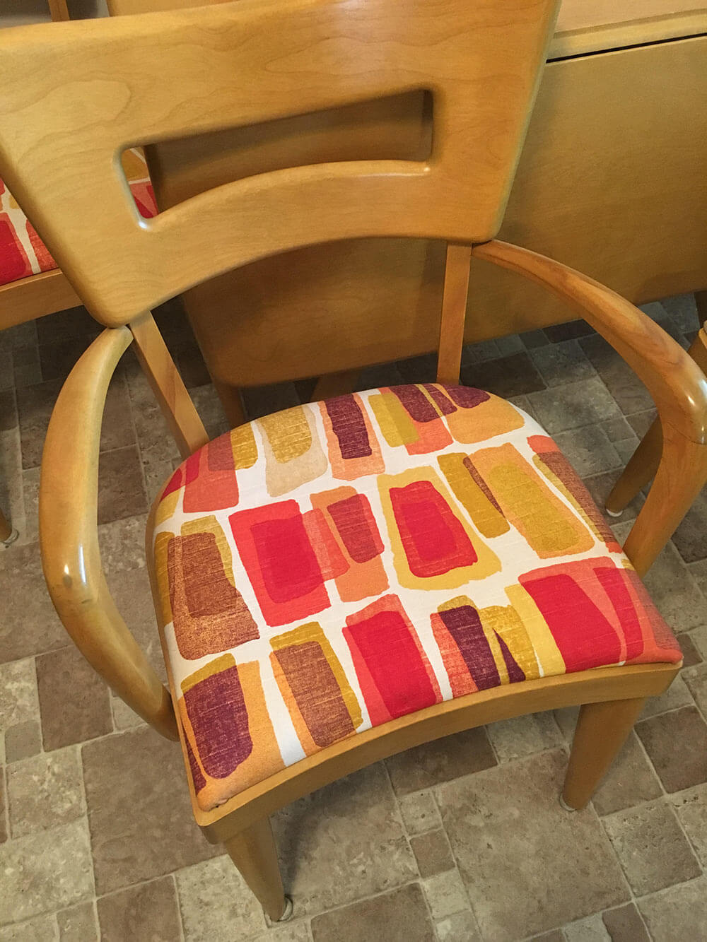
That, paired with the blonde woodwork and a wheat Heywood Wakefield table and chairs are really giving me some issues! I’m not attached to the upholstery on the chairs so that can be changed if need be! I definitely want to go with color in the kitchen but everything I pick seems to clash with the floor. Any advice would be greatly appreciated!
So, what can we do to help liven up all of that brown? We think there are a few key changes that can make a huge difference and up the happy factor in Paige’s kitchen:
- Light: Adding additional sources of bright light — like new, brighter ceiling lights — will help the space feel more cheery right away.
- Color: Between the brown wood cabinets and trim, brown tile floor, brown tile backsplash, brown countertop and beige walls, there is sure a lot of brown in Paige’s kitchen. The quick, easy and inexpensive way to fix this problem is to choose a cheery paint color for the walls, or maybe even a wallpaper accent wall.
- Rug: To further up the happy in Paige’s kitchen, we suggest getting a large area rug to place under the table in the dining area. This will not only add color and pattern to the space, but also help break up the large expanse of brown flooring.
Now, let’s see four options we came up with to help brighten up Paige’s brown kitchen.
Kate’s option 1: A happy aqua
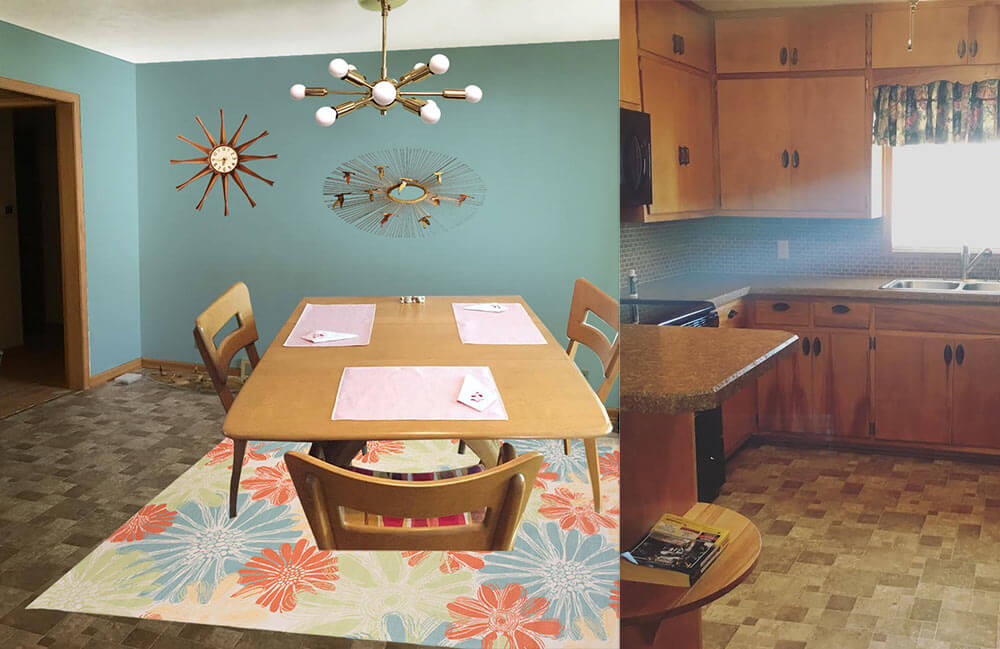 In this option, I found a light colored cheery flower print indoor/outdoor rug that will contrast with the medium brown floor tiles and inject some life into the room. Next, I pulled the aqua blue flower color found in the rug and used that shade to paint the walls. This instantly refreshes the space! Playing off Paige’s Jere inspired starburst wall hanging, I also added a coordinating sputnik light fixture that will not only add interest but also more light to the space. Finally, a medium toned vintage wood starburst clock helps repeat just a little bit of the wood up on the walls. Paige could recover her dining chairs with a solid coral, green or aqua fabric and also use that fabric to make coordinating valences for above the sink and dining room window.
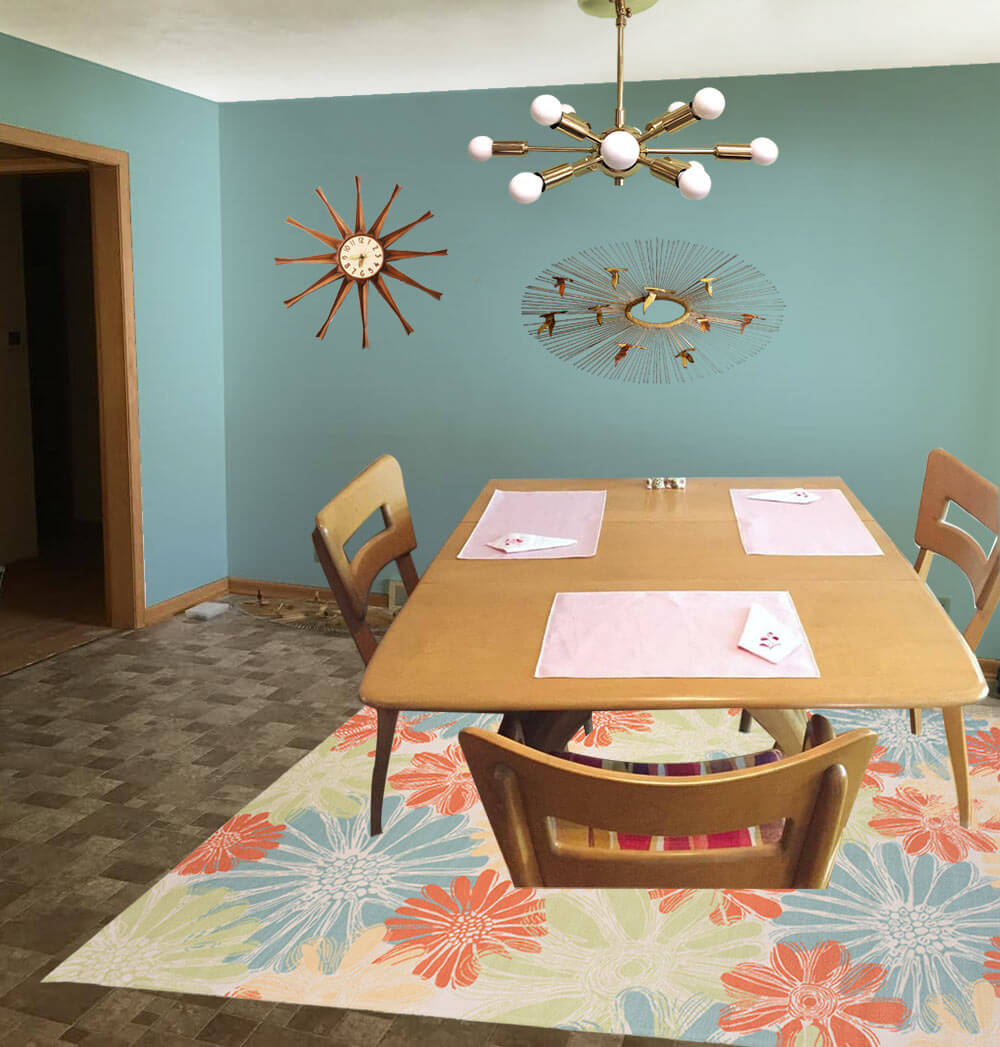
- Aqua walls — like Sherwin-Williams ‘Spa’
- Paige’s Heywood Wakefield dinette set
- Paige’s Jere inspired wall art
- Sputnik light from Practical Props
- Rug from Overstock.com
- Vintage starburst clock from Ebay
Kate’s option 2: Cheerful coral
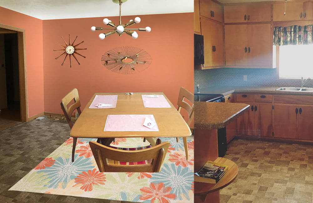 This option — similar to option 1 but a good choice if Paige likes warm colors more than cool colors — I used the same light colored cheery flower print indoor/outdoor rug that will contrast with the medium brown floor tiles and inject some life into the room. Next, I pulled the coral flower color found in the rug and used that shade to paint the walls. This instantly refreshes the space! Playing off Paige’s Jere inspired starburst wall hanging, I also added a coordinating sputnik light fixture that will not only add interest but also more light to the space. Finally, a medium toned vintage wood starburst clock helps repeat just a little bit of the wood up on the walls. Paige could recover her dining chairs with a solid coral, green or aqua fabric and also use that fabric to make coordinating valences for above the sink and dining room window.
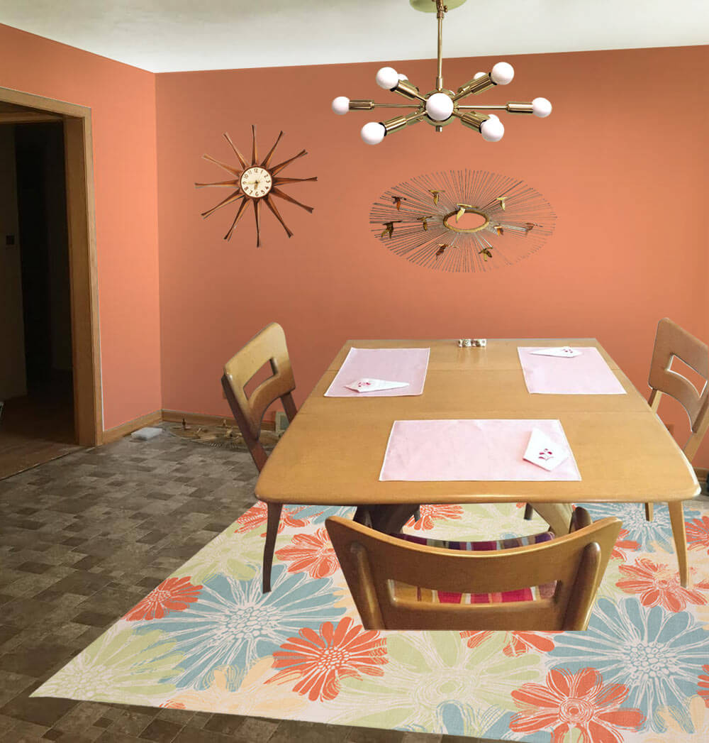
- Coral walls — like Sherwin-Williams ‘Persimmon’
- Paige’s Heywood Wakefield dinette set
- Paige’s Jere inspired wall art
- Sputnik light from Practical Props
- Rug from Overstock.com
- Vintage starburst clock from Ebay
Kate’s option 3: Kitschy kitchen wallpaper
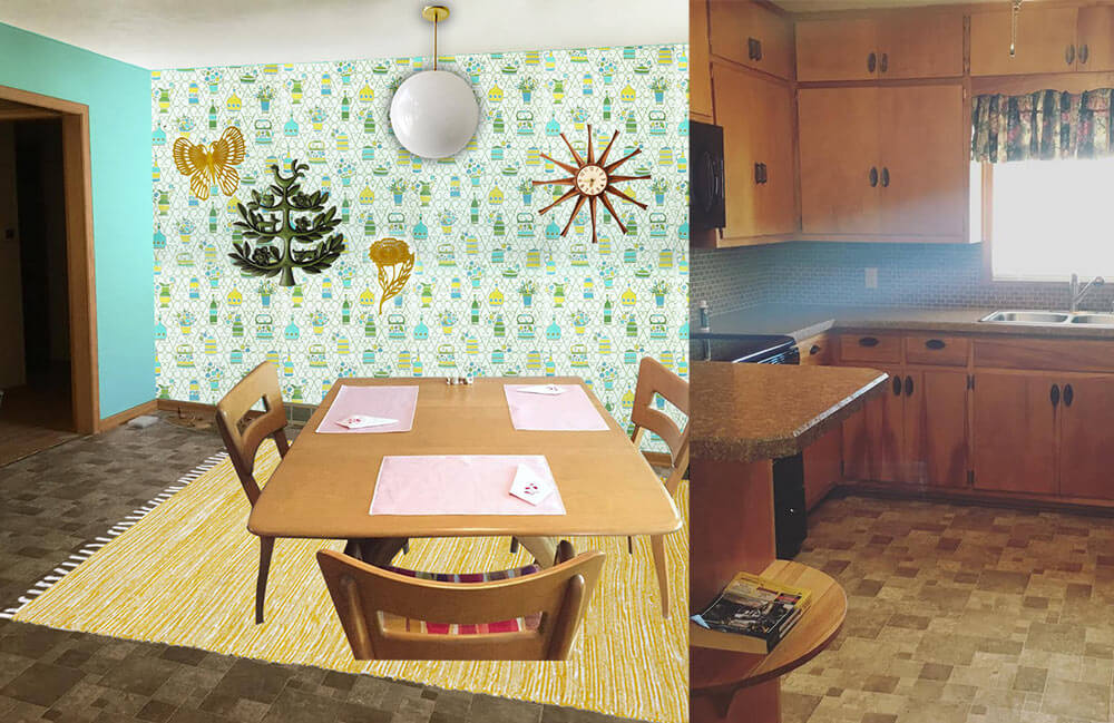
 In this option, I started with some fabulous vintage 1970s wallpaper with a kitschy kitchen themed print. So as not to overwhelm the space and save on cost, I would wallpaper just one wall as an accent wall. The remainder of the walls would be painted a cheery aqua, pulled from the wallpaper pattern. Next, I’d add a yellow area rug — another color pulled from the wallpaper pattern — to help brighten up the floor and add even more color. A classic globe ceiling light over the table would not compete for attention with the wallpaper, and would provide a nice amount of light in the space. A grouping of vintage wall plaques in coordinating colors to the wallpaper helps repeat the color scheme and ads a bit more kitsch to this kitchen. Finally, a medium toned vintage wood starburst clock helps repeat just a little bit of the wood up on the walls. Paige could recover her dining chairs with a yellow, green or aqua fabric matched to the wallpaper pattern and also use that fabric to make coordinating valences for above the sink and dining room window.
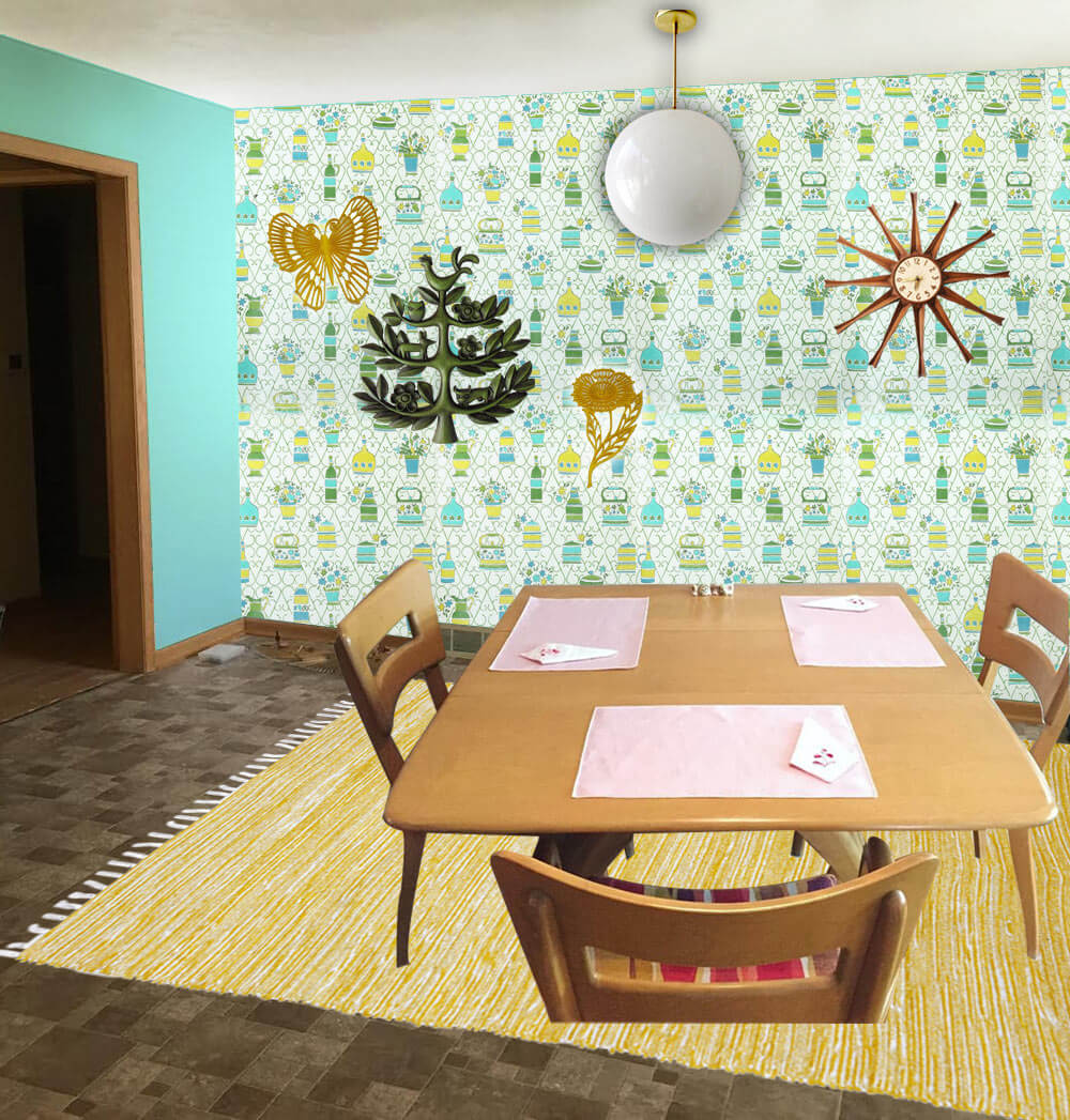
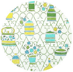
- 1970s wallpaper from Hannah’s Treasures
- Bright aqua walls that coordinate with the aqua in the vintage wallpaper — like Sherwin-Williams ‘Tantalizing Teal’
- Paige’s Heywood Wakefield dinette set
- Globe pendant light from Practical Props
- Rug from Overstock.com
- Vintage starburst clock from Ebay
- Vintage tree of life wall hanging from Ebay
- Vintage yellow flower and butterfly wall hanging from Ebay
Pam’s option 4: Warm and woodsy like Grandma’s kitchen
 Pam here. The first thing I thought of when I saw Paige’s kitchen was to start with a braided rug, because this whole space has old-fashioned feel, like a knotty pine kitchen. In addition, that DELICIOUS Heywood Wakefield Dogbone set can skew old-timey or mid mod. So I went for a kitchen like my Grandma Agnes had. I found a Capel rug that would look good with the brown — kinda foresty. I looked for a cheery barkcloth that would add more pattern via matching valances for the two windows — hey, you could also do a cafe curtain on the bottom half of the dining room window, which would add even more cheer. Kate chose a dusty blue paint color taken the rug and the barkcloth. In this concept, I skipped a light for over the table thinking you may want to keep the existing fan with light, for function. And I found forest green fabric for the chair pads.
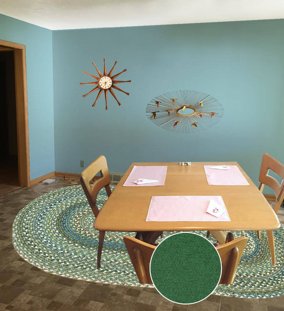
- Aqua blue wall paint — like Sherwin-Williams ‘Raindrop’
- Paige’s Heywood Wakefield dinette set
- Braided oval American Legacy rug in Pine Forest from Capel Rugs
- Maharam Messenger ‘Turf’ fabric from Modern Fabrics to recover the chair seats
- Martha’s Vineyard vintage barkcloth fabric from Ebay seller floridabungalow for window treatments
- Vintage starburst clock from Ebay
- Paige’s Jere inspired wall art
Ok, readers — here’s your chance to chime in. Which of these options do you like best for Paige’s kitchen? And: Feel free to add your own ideas to the comments, too!


Lisa says
So many good suggestions. I like option 3. Also, the suggestion about changing out the appliances is excellent. People are always remodeling kitchens and you would be surprised how many perfectly good appliances are available on Craigslist for next to nothing. Plus, you could sell yours and cover part of the cost. I know you said that the floor needs to stay, but have you priced putting linoleum over it (if that is an option)? By the time you add up all the costs of paint, wallpaper, a rug, curtains, tile etc trying to distract from the brown floor, are you sure just doing the floor is that much more expensive? Sometimes you just have to rip off the bandaid…..
Jeanne says
If you don’t eat a lot of greasy food, I’d suggest removing the doors on the small upper kitchen cabinets, painting the interiors a bright color, adding lighting and using those to display art glass or other collectibles.
Definitely paint your ceilings a highly reflective white, and I’d paint the backsplash, as others have suggested.
I’d also consider painting the door in your dining room a beautiful accent color from the palette you end up selecting. Add curtains or a laminated barkcloth roller shade on the window next to the door.
Betsy in Michigan says
I love those cabinets, but they sure want to save up for new counters – those look like inappropriately added later ones. There are such yummy retro (and lighter) Formicas available now (aqua, orange, etc.). How about cutting some sort of colorful/lighter plasticey or metal-type material (hang out large hardware stores and IKEA) to affix to the backsplash for now? That way, even if they want to keep the brown tile with a later brighter countertop, it wouldn’t be damaged. Or cover heavy cardboard with contact paper to do the same thing.
Rick says
Throw that ceiling fan out, the counter has to go – you can’t go wrong with the Wilsonart & metal edging. Tile backsplash.I really like Pam’s thoughts of Aqua as a wall color, ( or Teal ) this will go perfect with the great wood cabinets. If you can’t put a bunch of money into the flooring – go with a white ( little or no pattern ) – or white & black linoleum in the kitchen, carpet in the dining room; either grey, or something that would be in the teal / aqua tone….. NO BEIGE !!! – Huge potential there, with a little TLC, your going to have a Fantastic house – congrats !!!!
Terri says
Dunn Edwards-perfect Pear
It’s a pale yellow green and would freshen and lighten everything up. Plus it’s a natural color and would update the look and go well with fabric on your chairs. I’d get a bright contemporary fabric and make a Roman shade over the window (lose the ruffles). Spray paint cabinet knobs a tarnished brass so they don’t appear so dark and you’ll be amazed how that simple step will lighten the cabinets. A bright, cheerful throw rug under the dining table would brighten things up as well. Have fun!
Sarah says
Yellow would also pair beautifully with the cabinets’ warm undertones…a nice, pale, buttery yellow. I am a big fan of pale yellow for a kitchen. Warm, but not SO warm that it makes you hotter while cooking! (My 1952 kitchen is pale yellow, and I live in hotter-than-the-sun Texas ;))
Nikki says
Hi Paige and Dustin,
You have a lovely home! I hope you’ll send in a “house tour” when you “un-renovate” the 90’s vibe.
The cabinets are a lovely “medium brown” which is a nice neutral color so I wouldn’t paint over them. The “new” flooring seems to have a purple undertone that is clashing with the yellow undertones of the cabinets. To my eye, the flooring is the biggest problem because it takes up so much visual space, so that would be first on my ‘to do’ list when you start renovating. In the meantime most readers have identified rugs as the way to go.
Very last on the list (behind backsplash/lighting/flooring and paint) are the black appliances are also BIG “light suckers” so they always look like black holes. You may want to consider searching Craigslist for quality replacements however, I think addressing all of the other issues may help overcome the appliances. I have black appliances and they were worst color choice I ever made!
Carol says
I have the same dining room chairs just in a little bit darker Staind but I don’t know who my Tables by I wish I did like your house it’s pretty.
Kristen says
Wow those cabinets are absolutely beautiful! I like option 3 best (probably because I love wallpaper!), but all of the options are great.
Diana says
I love #3. The white background of the wallpaper really brightens the room and I love the blue paint color. Blue and brown are a classic color combo. I also like the solid color rug as opposed to a print. I personally would never paint tile or a vinyl floor. I’m afraid it just wouldn’t look natural. A lighter curtain would help too. I really don’t think you need to do much to make it a little lighter and brighter and less monochromatic.
Barb says
I vote for #1. I love Hey Wake too. I’d definitely reupholster them to something more period and neutral. My HW dining room set has original brown with gold thread seats. I love the cabinets and I prefer vinyl floors in eating areas. Not to date myself but another possible color choice is gold on the walls- popular when I was a kid in the late 60’s. I love your house- I wish you years of happiness in it.