

![]() Designing a well-functioning furniture layout for a room is one of the most challenging — and arguably the most important — aspects of interior design. I’m changing the furniture in my living room as part of its transformation into my Mahalo Lounge. So before I got too deep into the fun stuff (decorating), I am working to finalize the furniture layout. I am not a professional designer, and don’t know how to use such software (and honestly, I have no desire to learn yet another computer program). Instead, I design my furniture layouts (ala my kitchen cabinet layout) using Excel and Powerpoint and … scissors. Hey, it works well enough for me!
Designing a well-functioning furniture layout for a room is one of the most challenging — and arguably the most important — aspects of interior design. I’m changing the furniture in my living room as part of its transformation into my Mahalo Lounge. So before I got too deep into the fun stuff (decorating), I am working to finalize the furniture layout. I am not a professional designer, and don’t know how to use such software (and honestly, I have no desire to learn yet another computer program). Instead, I design my furniture layouts (ala my kitchen cabinet layout) using Excel and Powerpoint and … scissors. Hey, it works well enough for me!
Photo viewing tip: If you are on a desktop, once page is fully loaded, click on any photo and it should double in size up to 1,000 pixels for a better look at details.
Use Excel and Powerpoint to create room layouts
My process to do a furniture layout like this is so basic, it really doesn’t need a step-by-step. But, okay, here are the principles:
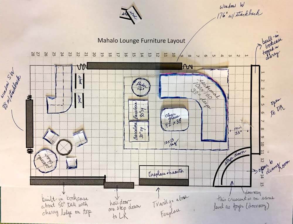
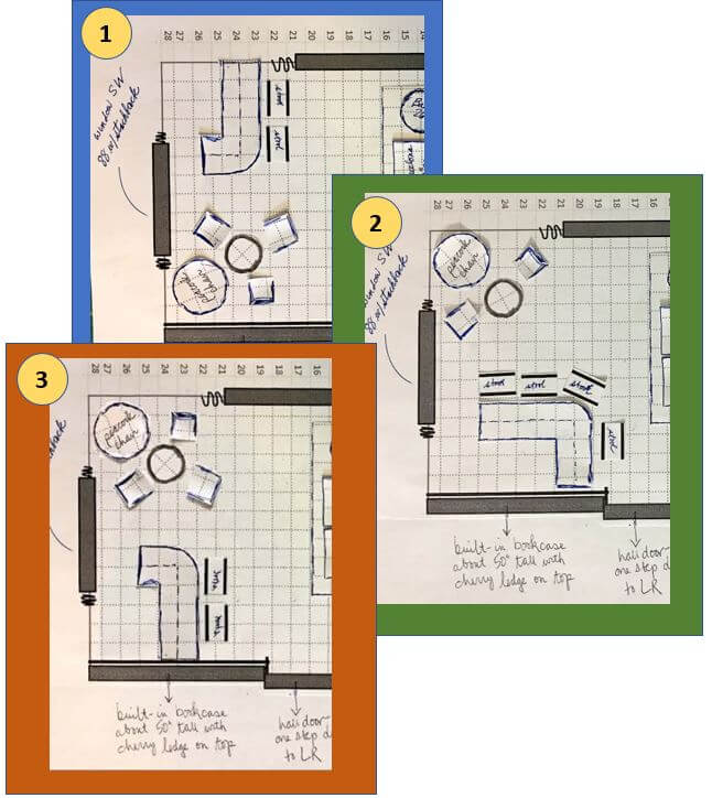
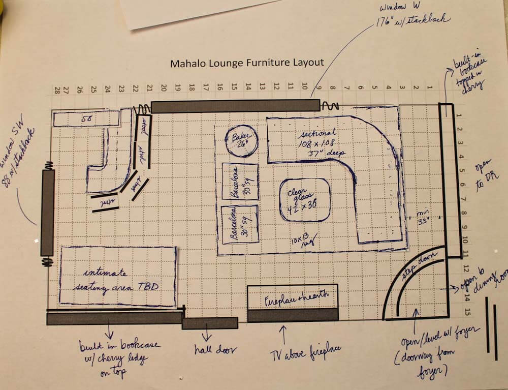
- Measure the four walls of your room, and then use these dimensions to outline a grid on Excel; on mine, one foot = one box. Important: Adjust the pixels within your grid so the height and width are the same — that is, square. Add interior grid lines that will show when printing and lighten the grid lines up to your liking. Add the bold exterior outline to your overall grid. Take a screen shot of your grid and transfer it to Powerpoint; enlarge or reduce it as needed to fit the page. Print out your first copy/worksheet.
- With your worksheet in hand, measure all the fixed elements of your room — draw the windows, doors, projections, etc., by hand right onto your worksheet.
- Return to the computer. Now, using the tools (e.g. boxes and lines, etc.) in Powerpoint, add your windows, doors, projections, etc. At this point, you may need to re-measure — I did — when numbers/boxes don’t add up. Keep working on the Powerpoint page until you believe it has all the fixed elements in place, measured accurately. Print out your final copy and a few extras to cut furniture from. Note: I hand-wrote notes on my copy after printing, but you could also add these in Powerpoint.
- Now, it’s time to do the furniture: Transfer the measurements of your furniture onto the same grid. Draw heavy lines around the edge of each piece (I used regular pens or markers) and then cut them out.
- Start playing: Move your furniture around until you get it right. Pay attention to the space available for moving through the room safely and comfortably. Maybe you will “create” several furniture pieces not knowing what size you will ultimately choose. Lay out your furniture on a separate piece of grid paper to play with rug sizes, then cut the rugs from that paper.
- If you like, use bits of museum or poster putty to hold furniture down once you get a design you like. You might also strengthen the pieces by gluing them to cardstock / old cereal boxes etc.
- Alternatively: You could even use Powerpoint to make little pieces of furniture — “cut” the furniture from your grid” and use PPT tools to outline each piece, etc. — and move them around on-screen. Still, for me, there’s nothing quite like moving little pieces of furniture by hand — dollhouse!
All the “Before” photos:
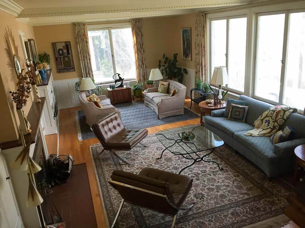

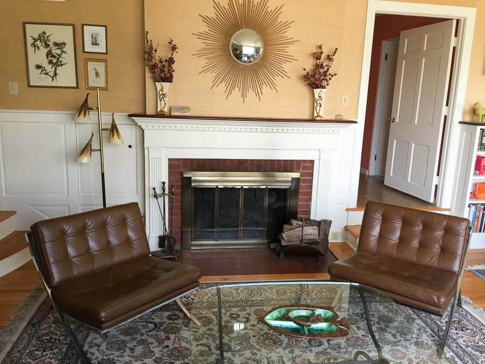
Above: The space “before”
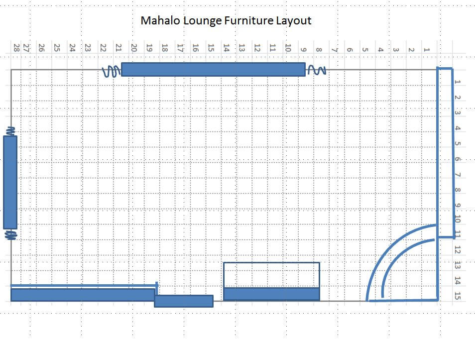
My Mahalo Lounge furniture layout:
My goal with this room is to make it a convivial space for relaxing and especially, for entertaining. I hope to have at least one good cocktail party every month — and to be remembered as that crazy old lady with the amazing Polynesian pop living room/dining room. So, I need places for people to sit and talk and enjoy their drinks and each other.
 As you can see, my first step is to create a main seating group facing the fireplace. Alas, there’s a fair amount of asymmetry to the original architecture. I am probably not going to be able to center this seating group on the fireplace, because if I did, it would create too much of an empty galley between the sectional and the bookcases. I’ll work toward “balanced asymmetry” using decorating tricks.
 Above: Per Jay’s suggestion, I added thsi photo: A “before” version of the bar area I’m about to talk about. This image was taken from the etsy video on my Pam’s Kitchen page.
Bar Area Version #1:
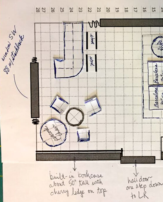
 On the other side of the room, I’m still playing with ideas. As shown above, I like the idea of having a smallish bar that is rounded… which you see right away when you enter the room…. and which gives the bartender a bird’s eye view of everyone in the room, as well. The bar is going to be a real focal point — I gotta get one of my Orchids of Hawaii lights over it for sure (ugh, the lighting plan, talk about nerve-wracking!)! In this version, my peacock chair, a 25″ rattan table that I picked up at a nearby used furniture store, and three vintage wood captains chairs (originally used at a kitchen table) from my husband’s family would go over by the bookcase.
Advantages of this option: My two lamps have natural places to go: One dangling above bar… the other, dangling lower above center of table in front of the peacock chair. Note, I have very high celings i this room. And, as I mentioned, bar tender has great view of everyone coming into the room. Finally, I don’t really know how much room for stuff I will need inside or adjacent to the bar (it’s not a wet bar). So maybe it’s best to keep that big built-in bookcase open for decor, etc.
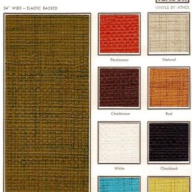
Bar Area Version #2:
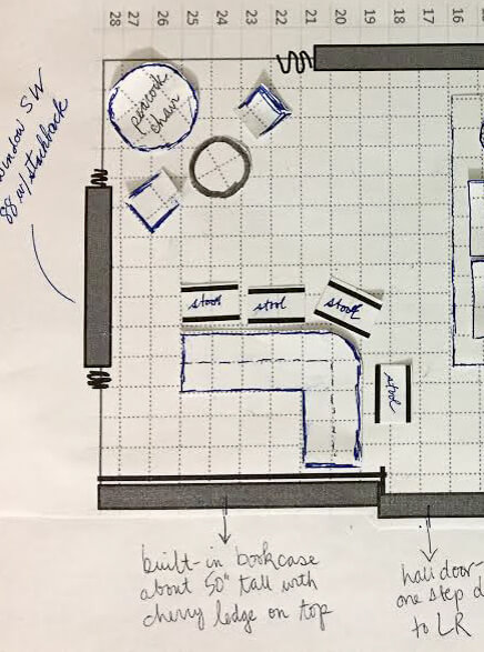 Above: In the second version of this design, the bar would be set against the bookcase. Advantages of this version: More space to store glasses, booze, display items (including on the wall)… Disadvantage: When you first enter the space you’d see the side of the bar; I kinda don’t like this idea.
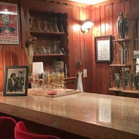
Bar Area Version #3:
 And (shown above) over on our Facebook page, Kelly through some miracle of Adobe Illustrator or some such (me no know) came up with this third version, saying:
Layout idea for Mahalo Lounge, combines the best of both of your initial plans. The bar is next to the bookshelf where it provides lots of display space for fabulous glassware , but you still see the front of the bar coming into the room.
Thanks, Kelly!
Meanwhile, in either case, I’m still noodling how to make either or both of these areas cozy and clearly differentiated from the main seating area. Indeed, nooks and crannies and surprise spaces are a hallmark of well-designed tiki bars. Maybe lower the ceiling with fish netting in on of the two areas?
Help!!!
I welcome your ideas, dear readers, on my furniture layout dilemma:
#1. bar in the back corner by the big window…
#2, bar by the bookcase…
or Kelly’s idea, version #3?
Photo viewing tip: On a desktop, click on any image and it should double in size on screen so you can see the detail better. Hit ESC to go back to story.
- Read all the stories about my Mahalo Lounge project here.


Tracy says
2 makes room look larger, less choppy. More seating at bar. Also bookcase offers lots of display space.
Kate says
If your goal is to have cocktail parties, I’d go with #2 — more space at the bar and seating and bar seats face shelving so people can admire your tiki mugs (conversation starters) and other collectibles while sipping their Zombies. If you make the corner of the bar visually appealing then I don’t see an issue with it being seen first thing as you walk in. Looks great so far!
Oh and are you adding any room dividers? Maybe something light weight like macrame that hangs from the ceiling? Remember creating the feeling of smaller tucked away space is part of the tiki bar feel…though you’ll have to be careful not to overdo it so you don’t break up the party too much!
Jay says
You came up with a good system for producing a furniture plan. The important part being that one square equals a square foot. If your boxes equal a 1/4 inch all the better as that’s usually the scale for interior layout.
You have given serious thought to both plans but I prefer the second one (assuming the thin lines in the corner represent glass) as bars (fixed or moveable) are usually placed in front of solid walls/book cases/cabinets rather then expanses of glass. The corner windows lend themselves to your seating area especially since the peacock chair will be framed by those new drapes. If your scale is correct, the end of the sectional may be too close to the stepped down entry as you should try to keep that 33″ clearance as a radius in front of the step for appearance and enough space to step into the room.
Kelly Wittenauer says
Pam,
Glad to see an update on this project 🙂 I posted a thought over on the FB page, where I could include a pic.
pam kueber says
I added your idea here, Kelly! Thank you!
Carolyn says
HA!HA! – everyone laughed at me when I picked up the 1988 Stanley cling-forms for decorating a house and landscaping at the sales! I don’t think any programs were available or flexible enough for the average homeowner to use even if they had a PC.
If you already have all the pieces except the bar, I’d say set those up (that sectional conversation area seems cemented) and use something as a facsimile of the bar along with the stools, if you have those. Even if you have to use an ironing board with a drape – anything to stand in for the bar area – and live with it in each corner. No wonder you’re asking advice – each way has its pros and cons but not enough to tip the balance.
You can ask anyone who’s worked with engineers – it all looks good on paper but reality is a whole ‘nother concept!
Good luck and can’t wait to see what happens!
JoAnn says
I’ve been reading your blog for at least 5 years but have never commented. It’s always the highlight of my day! Alas, I don’t have a retro home myself right now (been a fan of MCM style for 30 years and interior design for more than 20; however, homeschooling 5 kids doesn’t leave time or money for it, but I can still dream and drool!). … I prefer the bar in the far corner as a focal point, maybe with some fun art on the long wall and clear floating shelves on the short wall behind the bar to hold glassware and maybe a few fun accents. Move the bar toward the seating area a little and then you can make the short side of the bar the same size as it appears in the other layout, and therefore add a couple more stools. My main reason for recommending this is traffic flow … Coming into the room from the hall, you will have to take a step down into the room and will run into a bar stool on your left. Plus guests coming to the bar for drinks will block the entry into the room. There’s more breathing room around the bar in the first layout for people to line up and then adjust themselves before finding a seat. … Can’t wait to see your final product!
pam kueber says
Thanks for your advice, JoAnn — and I’m glad I drew you into our commenting world!
Lynne says
Let me warn you of most likely several posts today as different things come to mind!
The first thing I noticed were the two chairs facing the sectional. Is it possible to put the 26″ round table between the two chairs? Are they swivel chairs? I only remark on this because you say you plan on frequent cocktail parties. The guest in one chair has a convenient place for his/her drink, however the second guest does not. With the table in between it’s easy for both guests.
If space allows, maybe you could slightly angle those 3 pieces just a squidge?
I have two schools of thought on the bar placement.
One: I like the idea of the bookcase behind the bar, using the shelving unit to display glasses, and your top shelf liquors. Very snazzy. I am assuming the “hall door” is the way to the kitchen? Since its not a wet bar, that would save a few steps getting to the kitchen. If you don’t like seeing the side of the bar, you could put a tropical plant or some sort of floor decor there to disguise the side.
Two: The bookcase is visually heavy, as will be the bar. Also, the fire place is somewhat visually heavy. Then in the other corner, is the lacy, visually lightweight peacock chair and also lightweight wicker pieces. I’m worried the room will be off balance. Maybe your intended hanging lamp and some large scaled artwork would remedy this, I’m not sure.
Lastly, (and then I’ll shut up and go away for a while) I always do exactly as you are with a graph paper schematic. But, when its a MAJOR room shake up I go as far as to masking/painters tape off my large furniture pieces on the floor and live with it for a few days. I have also made newspaper templates and laid them on the floor. I have even gotten empty boxes from the grocery store and tried to simulate the actual “bulk” of a piece.
pam kueber says
Thanks, Lynne. Comment all day long!
The hall by the bookcase is to the bedroom wing.
We like the two barcelona chairs squished together. They look really good. The coffee table is high — find for putting drinks, I think.
I have a bar prototype already. (A DIY to come). I need to get a big piece of furniture out of the way over on that end (stuff’s moving around, my life’s been chaos) I can try moving the bar and the peacock chair/seating group to alternate sides to get a better sense.
I should also have shown in the drawing: There’s a veritable forest of plants in all the white space behind the two chairs in main seating area, in front of the large window. They already look pretty cool and provide good space differentiation. We have a few ideas about more we can do with the plant space to dress it up.
Madeline says
I like your method with Excel. I will have to try that!
If you ever wanted to do a 3D version of the room, you could always try SketchUp. I found it really intuitive and an invaluable help for our current kitchen remodel. Plus, it’s free!
I’m leaning towards bar by the bookcase. Somehow it seems a bit more welcoming? Plus, more bar stools = more guests = more fun entertaining…
Reader Deb says
lowes.com has a 3D virtual room designer that’s free also, but it doesn’t work with Microsoft edge yet–have to use firefox. Just type in “room designer” in the search box on the home page. You can save your designs for up to a year, and email photos of them to yourself. No “vintage” products to choose from to add to the room, so imagination comes in handy.
Julie says
YES! I love that you do this. This same basic idea helped me re-imagine my bedroom furniture arrangement in a way I never would have otherwise. More recently I’ve used it to make sure new pieces will really work like I picture them before I buy them. There’s just something about being able to physically move the pieces around (without hurting yourself).
linda h says
I like the bar by the bookcase because it echoes the shape of the sectional in the opposite corner and the shelves would be convenient for bar stuff.
linda h says
I also think fishnet would get dusty. I really love all the book case space, though.