

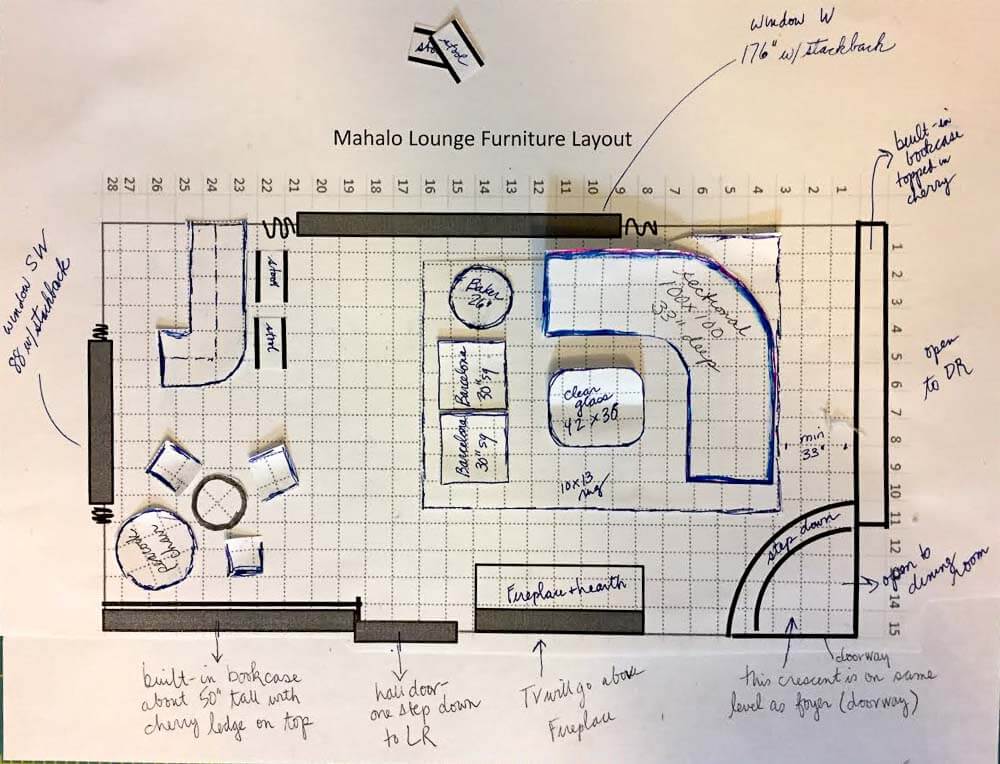
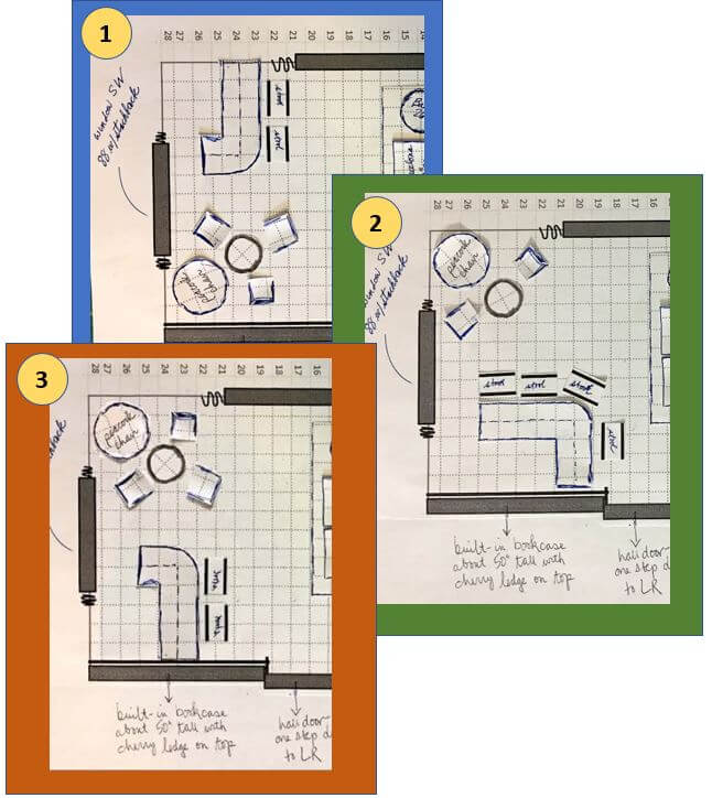
![]() Designing a well-functioning furniture layout for a room is one of the most challenging — and arguably the most important — aspects of interior design. I’m changing the furniture in my living room as part of its transformation into my Mahalo Lounge. So before I got too deep into the fun stuff (decorating), I am working to finalize the furniture layout. I am not a professional designer, and don’t know how to use such software (and honestly, I have no desire to learn yet another computer program). Instead, I design my furniture layouts (ala my kitchen cabinet layout) using Excel and Powerpoint and … scissors. Hey, it works well enough for me!
Designing a well-functioning furniture layout for a room is one of the most challenging — and arguably the most important — aspects of interior design. I’m changing the furniture in my living room as part of its transformation into my Mahalo Lounge. So before I got too deep into the fun stuff (decorating), I am working to finalize the furniture layout. I am not a professional designer, and don’t know how to use such software (and honestly, I have no desire to learn yet another computer program). Instead, I design my furniture layouts (ala my kitchen cabinet layout) using Excel and Powerpoint and … scissors. Hey, it works well enough for me!
Photo viewing tip: If you are on a desktop, once page is fully loaded, click on any photo and it should double in size up to 1,000 pixels for a better look at details.
Use Excel and Powerpoint to create room layouts
My process to do a furniture layout like this is so basic, it really doesn’t need a step-by-step. But, okay, here are the principles:
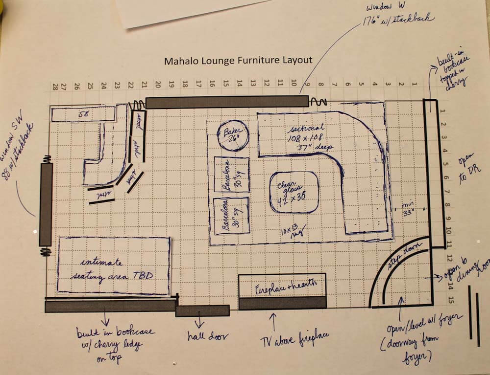
- Measure the four walls of your room, and then use these dimensions to outline a grid on Excel; on mine, one foot = one box. Important: Adjust the pixels within your grid so the height and width are the same — that is, square. Add interior grid lines that will show when printing and lighten the grid lines up to your liking. Add the bold exterior outline to your overall grid. Take a screen shot of your grid and transfer it to Powerpoint; enlarge or reduce it as needed to fit the page. Print out your first copy/worksheet.
- With your worksheet in hand, measure all the fixed elements of your room — draw the windows, doors, projections, etc., by hand right onto your worksheet.
- Return to the computer. Now, using the tools (e.g. boxes and lines, etc.) in Powerpoint, add your windows, doors, projections, etc. At this point, you may need to re-measure — I did — when numbers/boxes don’t add up. Keep working on the Powerpoint page until you believe it has all the fixed elements in place, measured accurately. Print out your final copy and a few extras to cut furniture from. Note: I hand-wrote notes on my copy after printing, but you could also add these in Powerpoint.
- Now, it’s time to do the furniture: Transfer the measurements of your furniture onto the same grid. Draw heavy lines around the edge of each piece (I used regular pens or markers) and then cut them out.
- Start playing: Move your furniture around until you get it right. Pay attention to the space available for moving through the room safely and comfortably. Maybe you will “create” several furniture pieces not knowing what size you will ultimately choose. Lay out your furniture on a separate piece of grid paper to play with rug sizes, then cut the rugs from that paper.
- If you like, use bits of museum or poster putty to hold furniture down once you get a design you like. You might also strengthen the pieces by gluing them to cardstock / old cereal boxes etc.
- Alternatively: You could even use Powerpoint to make little pieces of furniture — “cut” the furniture from your grid” and use PPT tools to outline each piece, etc. — and move them around on-screen. Still, for me, there’s nothing quite like moving little pieces of furniture by hand — dollhouse!
All the “Before” photos:
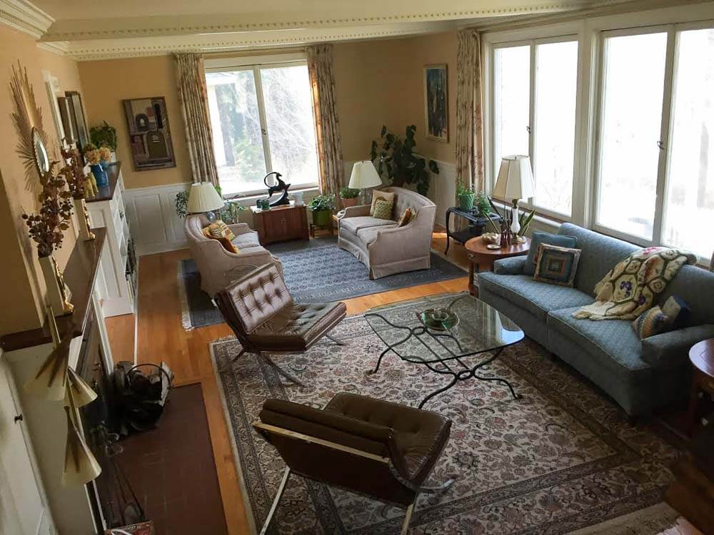

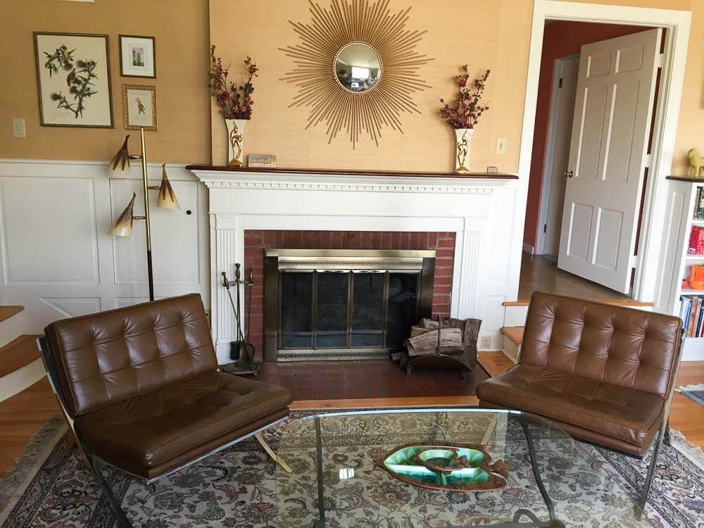
Above: The space “before”
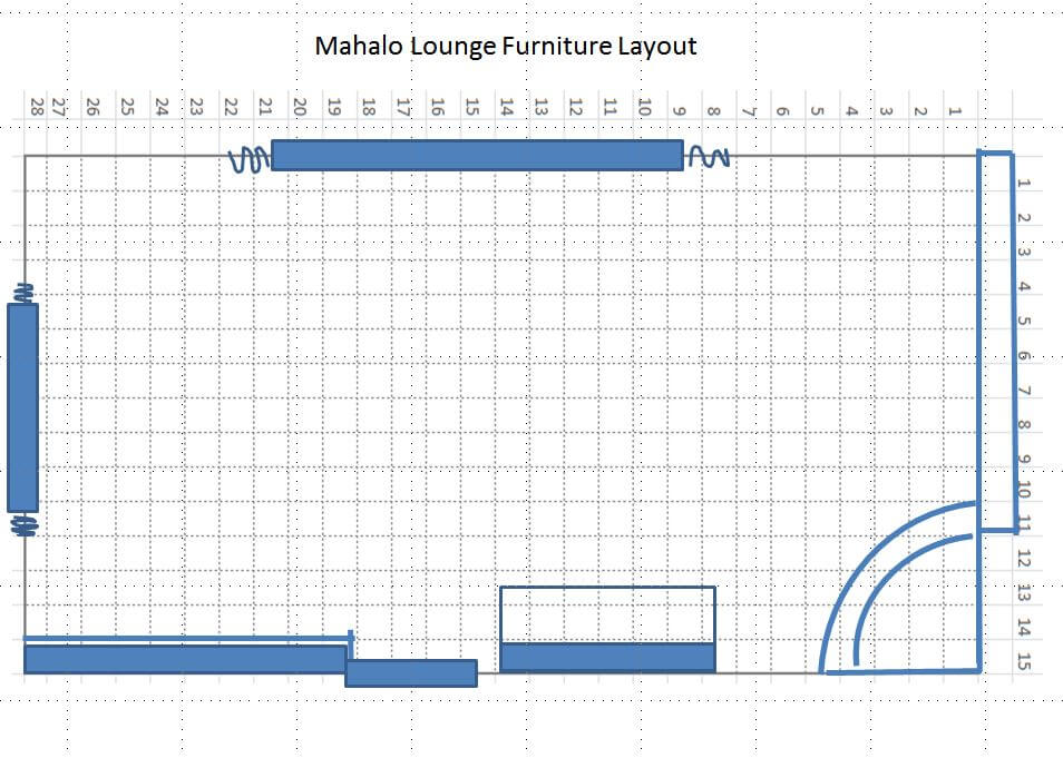
My Mahalo Lounge furniture layout:
My goal with this room is to make it a convivial space for relaxing and especially, for entertaining. I hope to have at least one good cocktail party every month — and to be remembered as that crazy old lady with the amazing Polynesian pop living room/dining room. So, I need places for people to sit and talk and enjoy their drinks and each other.
 As you can see, my first step is to create a main seating group facing the fireplace. Alas, there’s a fair amount of asymmetry to the original architecture. I am probably not going to be able to center this seating group on the fireplace, because if I did, it would create too much of an empty galley between the sectional and the bookcases. I’ll work toward “balanced asymmetry” using decorating tricks.
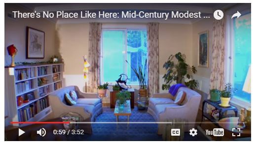 Above: Per Jay’s suggestion, I added thsi photo: A “before” version of the bar area I’m about to talk about. This image was taken from the etsy video on my Pam’s Kitchen page.
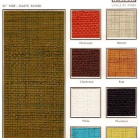
Bar Area Version #1:
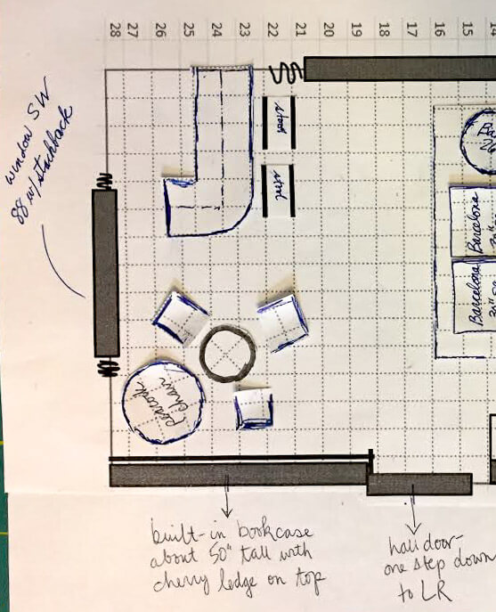
 On the other side of the room, I’m still playing with ideas. As shown above, I like the idea of having a smallish bar that is rounded… which you see right away when you enter the room…. and which gives the bartender a bird’s eye view of everyone in the room, as well. The bar is going to be a real focal point — I gotta get one of my Orchids of Hawaii lights over it for sure (ugh, the lighting plan, talk about nerve-wracking!)! In this version, my peacock chair, a 25″ rattan table that I picked up at a nearby used furniture store, and three vintage wood captains chairs (originally used at a kitchen table) from my husband’s family would go over by the bookcase.
Advantages of this option: My two lamps have natural places to go: One dangling above bar… the other, dangling lower above center of table in front of the peacock chair. Note, I have very high celings i this room. And, as I mentioned, bar tender has great view of everyone coming into the room. Finally, I don’t really know how much room for stuff I will need inside or adjacent to the bar (it’s not a wet bar). So maybe it’s best to keep that big built-in bookcase open for decor, etc.
Bar Area Version #2:
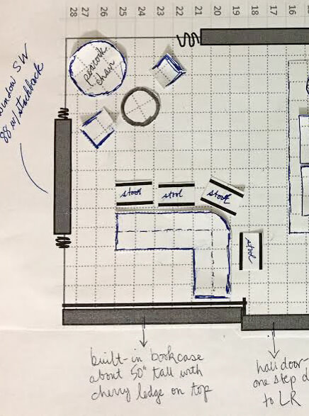 Above: In the second version of this design, the bar would be set against the bookcase. Advantages of this version: More space to store glasses, booze, display items (including on the wall)… Disadvantage: When you first enter the space you’d see the side of the bar; I kinda don’t like this idea.
Bar Area Version #3:
 And (shown above) over on our Facebook page, Kelly through some miracle of Adobe Illustrator or some such (me no know) came up with this third version, saying:
Layout idea for Mahalo Lounge, combines the best of both of your initial plans. The bar is next to the bookshelf where it provides lots of display space for fabulous glassware , but you still see the front of the bar coming into the room.
Thanks, Kelly!
Meanwhile, in either case, I’m still noodling how to make either or both of these areas cozy and clearly differentiated from the main seating area. Indeed, nooks and crannies and surprise spaces are a hallmark of well-designed tiki bars. Maybe lower the ceiling with fish netting in on of the two areas?
Help!!!
I welcome your ideas, dear readers, on my furniture layout dilemma:
#1. bar in the back corner by the big window…
#2, bar by the bookcase…
or Kelly’s idea, version #3?
Photo viewing tip: On a desktop, click on any image and it should double in size on screen so you can see the detail better. Hit ESC to go back to story.
- Read all the stories about my Mahalo Lounge project here.


Jill says
#2! It doesn’t block the window, gives the bartender a solid (safe feeling wall behind them), it also gives the best view to and of the bar.
If you ever want to play with a really, really simple digital design tool, Icovia is fantastic, and FREE! I have CAD and rarely use it, because this tool is so much easier and except for curved walls does almost everything you could want for interior design. 🙂 http://urbanbarn.icovia.com/icovia.aspx
Jill says
#2 also gives the “safest” view to the people sitting at the table. Which I assume will happen more often than someone standing behind the bar.
Rick G says
One more suggestion Pam, if you must have a newer TV in the room that won’t be hidden, maybe consider doing a bamboo frame for it ? !! ?
pam kueber says
I think we will be doing something creative with it, yes. I like the idea of a bamboo frame, thanks for the suggestion!
Heather says
I like number two! I feel like the bartender behind the bar; if there are there very long and has a better view of everyone and for some reason, my I just goes to that one. I work with floorplans every day as I am a custom modular home builder and that one just catches me. I’ve sold 1300 new homes and maybe had two or three people that weren’t the happiest with their designs so I don’t think that’s too bad. Best wishes on whatever you choose to do and thank you for continuing this very fabulous blog!
David Wayne Durrett says
I definitely think you should go with the # 1 corner opposite the bookcase. go ahead and use the bookcase for storage if you need it, it’s not like it’s in another room, after all, it is close by.
I like that having it there enables you to see the bar the minute you walk in, the way you have it makes the bar face into the room, and if you are behind the bar, you will instantly see anyone *about* to enter the room, instead of having to wait until they turn the corner to see them.
It balances the heavy blocks of ‘permanent’ furniture, but allows you more mobility for changing the more movable pieces around.
I love the idea of hanging netting to lower the ceiling, I had a cousin whose ‘party basement’ was done in the tiki Hawaiian style of the early sixties had tons of cotton netting hung everywhere, with lots of plaster fish and sand dollars and starfish and such strewn through the nets, it made a HUGE impact on me at an early age.
Don’t forget to hang a grass skirt or two!
Mikey Renn says
I concur.
Amy in Sacramento says
Like Mikey, I, too, like #1 for all of the reasons listed by David.
Heart says
#1 For Sure=Focal Point
Maybe with those Groovy 1940-50 wall shelves with mirror back to show off the glassware or booze. You could even all mini rope lights for the neon look.
Lookin Good!
Heart says
I meant: “add” (not all)
Martha says
I am going with option 2. You lose too much space, IMO, with the table by the bookshelves, space that could be a real blessing if you dont want the bar to look like an after thought. You are concerned with the view behind the bar..what kind of bar are you getting? Will it have doors? Can it have curtains, or how about some cute bamboo beads blocking the inner workings. this set up also lets anyone sitting at the bar at a slight angle enjoy the room as opposed to having their backs to it. And lastly, I think 2 chairs in addition to your peacock chair, for a total of 3, is the better number.
Meschelle Sahli Dolak says
#2 looks much more natural, the other ones look very tight and constrained. Good luck!
yma says
#3 – near the bookcase and also facing out. What a fun space!
Mikey Renn says
Yet, another… have the bar in the same space as #1, only forget a rectangular or squared off configuration- there are too many rectangular pieces in the room (including the bookcase). To soften the hard corners, make the bar rounded or half-circular in that corner. If that is impossible, consider placing the bar catty-cornered in that corner- which will create an interesting triangle effect. Build new shelving behind the bar on the two walls n between the windows to store/hang your bar stuff- use mirror or something eye popping- make it magnificent. This way, the bar area will be the focal point of the room as it will be viewed fun on from the entry and also from the fireplace sitting area. Putting the bar up against the books shelves confuses the focal points of the room- this means all focal points are on one wall and none can be seen from the entry. The focal points are the bar, the fireplace and the bookshelves. Since the bookshelves and fireplace are on the same wall, the best focal point in the room (the bar) should be placed on a different wall across from the 2 other focal points, creating a triangle viewing effect. If all focal points are on the one entry wall, this means all the seating (furniture) must be near the wall across which will create an unbalanced “crowded” look of only furniture with no place to draw the eye. The window across from the fireplace would become the focal point and persons would have to come into the room and turn to view the hidden points- the bookcase, bar and fireplace. With seating in front of the bookshelves, this area can be used as a library/reading game room space. If the bar is against the bookcase, that area cannot be used at all except for storage- and how awkward to have to go behind the bar to get a book. Number 1 is the best for balanced focal points, but the bar would be more eye-catching if rounded or placed at an angle in that corner so the bar is seen full-on when entering the room.
Kylllikki says
I like Mikey’s suggestions, very well thought out.
Doug says
I agree with Laney. I would pick layout #2
With the bar in that direction, it lengthens the look of the room, and lets you use the bookcase to (perhaps put some gold vein mirror on one of the back shelves) display your fancier bottles.
Laney says
I think you need the bar by the bookcase no matter what. I have quite a liquor and glassware collection and I’m here to tell you there’s never enough room.