

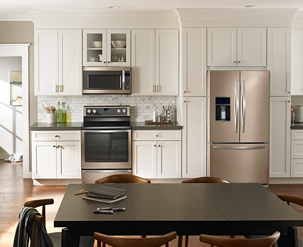
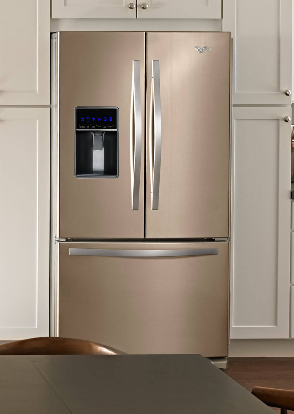
 Whirlpool Sunset Bronze kitchen appliances: Yes, the company has introduced this color and it will be available for purchase this fall. We first wrote this possible introduction a year and a half ago, and got 200 comments from people who eagerly wanted this warm color for their kitchen. Whirlpool was coy about whether it would actually introduce the color, but howdy hudee: Here it is. I like it because it reminds me of: vintage coppertone appliances. Whirlpool says the color, which is “achieved by color blocking painted stainless steel, is a perfect blend of gold, copper and bronze tones.”
BuilderOnline.com, which was at the show where this announcement was made, reported that the suite would be available on Whirlpool’s French door refrigerator, built-in dishwasher, over range microwave, and range oven.
BuilderOnline.com also talked to the company’s color manager for finishes, and reported that the company wanted to “soften the design of its appliances” and make them less industrial looking. It’s hygee time for kitchen appliances, tee hee!
The finish is also fingerprint proof. But it’s still stainless steel underneath, so that means no magnets on the fridge. Pooh. Now that would be cozy!
What do you think, readers? Are you interested in this new color for your retro kitchen?


Cyd says
I like it. But responding to a comment about 60’s colors, I have to say I grew up with a black, textured-surface refrigerator in the 60’s.
John M says
Points of reference: according to my 1957 Frigidaire appliance brochure they introduced Charcoal Gray (almost black) for the 1957 model year. In 1959 the line up was: Snowcrest (white), Mayfair Pink, Turquoise, Sunny Yellow, Aztec Copper (new color for 1959). Charcoal Grey (discontinued after 1960 model year). In 1966 Maytag introduces Spanish Avocado and GE has similar called Avocado which is an instant hot seller. In 1967 GE introduces Harvest (often mistakenly called Harvest Gold but it was really just labeled as Harvest) and in 1968 Maytag offers California Gold (a close match to GE Harvest). Avocado, Harvest and Coppertone were super popular (and they were attractively “shaded” around the edges with a slightly darker shade). 1977: Maytag Merchandiser Magazine reported that Gold (essentially Harvest) had since 1972 become their top selling color appliance (Avocado second, Coppertone third). Note: Turquoise and pale yellow had been discontinued by most manufacturers by 1968, pink was discontinued by 1966.
June 1969 Frigidaire introduces Poppy (deep red-orange) and although there was a big ad push it never caught on as much as Avocado and Harvest.
Early 1980s: White still number one but Harvest (Gold) still the most popular appliance in color (through 1984 when it was suddenly dropped). Avocado and Coppertone discontinued in 1981 or 1982 depending on the manufacturer. Almond or Bisque become the colors of 1982 and 1983 and offered through 1989. The 1990s…yuck…white appliances are the rage and the next generation of stainless becomes the trendy appliance material. Not a color to be found in any new 1990s appliance. Give me the 1960s and 70s and you can keep all the white and stainless!
Jane Panama says
I don’t think anything can replace the clean look of stainless. It goes well with just about anything. I never cared for granite anyway. Like the broad choice of laminates and if I could afford it, the natural look of marble. Laminate counters with a wide stainless grooved strip…almost as yummy as a pink bathroom…
Pat says
Looks better than stainless, I would love it, retro or not.
Joe Felice says
It looks like a new shade of stainless, but I like it better. I am so over stainless steel and granite. But I have to see this in person before I can be sure.
Laura Ainsworth says
I’d been waiting to see this. Lovely color, better than stainless steel, but doesn’t look at all appropriate for my original c.1955 kitchen. This refrigerator is a gleaming behemoth. It’s the kind of thing that, in a (shudder) “open concept” house, becomes the focal point for anyone walking through the front door. People who want to be on-trend for 2017 will, lamentably, desire that.
The original fridge in my house was that deeper brown coppertone, to go with the brown wall oven, which still works. The fridge I have is an almond GE from the ’70s, and the look is okay, but when it finally kicks off, I may have to shell out the $$$$ for a retro style fridge. This new one will not work.
Pencils says
I like it a lot. Doesn’t really go with my style of kitchen, but I do like it.
I finally got down to my local appliance store (Plessers–it has been here in our village for 98! years) which just happens to have Big Chill floor models featured–they’re right inside the front door. I was quite impressed by how solid the fridge was, and I was also impressed by how roomy it is. i was afraid it would be a step down, size-wise.
Pat says
Interesting, I didn’t know Big Chill sold at regular appliance stores.
Pencils says
Apparently buying through them isn’t really any different from buying directly through Big Chill, you still have to pay the shipping fees (I was hoping to save money there) but the sales guy said that if you have any problems, they’ll set up repair guys or whatever and there’s a friendly local face to talk to about the problems. I do like the idea of supporting a local business though. They’ve been here so long they have two huge Nipper statues, one of which they put outside every day. It’s a local tradition to take pictures of your kid with at least one of the Nippers. Also your dog. My stupider dog barks at the smaller Nipper sometimes from across the street.
Molly Graham says
Yes Yes Yes Yes Yes!
BobinAlabama says
It’s about time! I’ve enjoyed my “bisque” appliances for years, and when I replace them I’ll have another warm-color choice. Kudos to Whirlpool!
Wendellyn Plummer says
I like the color. I am getting new stainless as the current appliances are a mish mash of colors. The current is a fancy convection with glass top. Since I can vegetables, I am getting an electric stove, with burners. We bought the 1965 tri-level in December and are slowly bringing her back. It has not been and easy task and will be a labor of daily love and sometimes ire. LOL Every time one item gets checked off, two more get added. Sigh!
John M says
No way. It is not in any way, shape, form or color appropriate for a 1960s or 70s kitchen. Coppertone (with or without edge shading) was a deep, rich brown-copper. This pales in comparison with 1960s and 70s beautiful Coppertone. If major appliance companies truly wanted to get a share of the growing market interested in 1960s 70s Coppertone, Harvest Gold and Avocado they have the resources in their corporate history files to resurrect these beautiful colors. That’s what they should do. Until then, I buy original 1960s 70s major appliances and keep them serviced and well maintained.
Sam West says
My feelings exactly!
John M says
Yay! We are 1960s 70s purists! My cousin still has his parents 1971 Sears Coppertone refrigerator. I have a 1972 GE Harvest (gold) refrigerator in perfect working order that I moved to my senior apartment. No longer have the 1970 Maytag California Gold (Harvest) washer and dryer since I moved to a senior apartment but they went to a collector who promised not to junk them. Will never give up my ’72 GE Harvest refrigerator. It’s serviced properly and works just fine.
Felicia Alexander says
I agree completely (as my earlier post indicates). I’m just not seeing whatever it is that some readers are experiencing as “warm” about this color.