

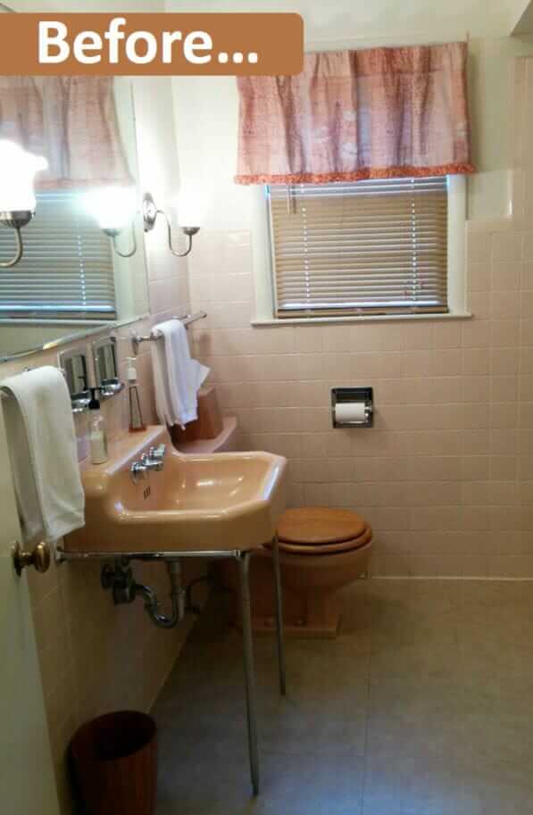
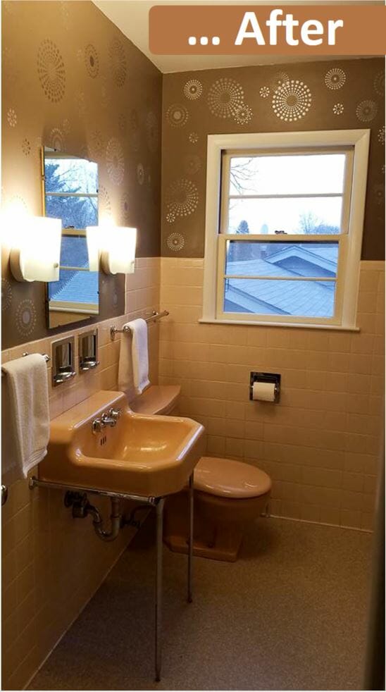
 So many great reader opinions on our story asking whether to paint or wallpaper Laura’s 1957 bathroom, but here’s an idea I forgot to mention, and which several readers suggested: Stenciling the walls to look like wallpaper. Kathi followed up to share photos after she stencilled her walls — what a transformation of this already glowy lovely midcentury bathroom >>>
Kathy wrote:
I’ve attached a couple pictures of a stencil project I did in the hall bathroom of our 1954 ranch. I used this stencil I found on Amazon and two shades of metallic stencil creme from Royal Design Studio. [Pam notes: The Amazon links earn me a wee commission if you click and buy.]
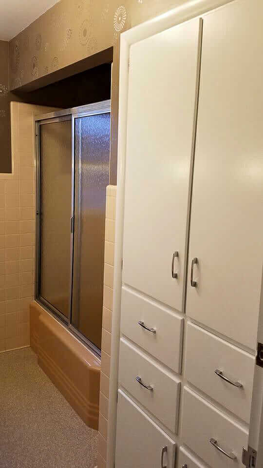
The refresh was completed by (a professional) removing about 4 layers of flooring (sadly the original layer was too damaged to restore) and installing a vintage-feel vinyl flooring. We also replaced the non-original light fixtures with something more appropriate and scored an older wall mirror at a neighbor’s garage sale.
Overall very pleased with the end result and like having the look of wallpaper without having to worry about the durability in a humid place like a bathroom.
I’m currently working on our daughter’s “big girl room” which involves stenciling “Flamingo Lagoon” on to the walls of the original Ming Green bathroom. I’m using four colors instead of two for this pattern, so I’ll need the Retro Reno gods in my corner.
Wish me luck!
Kathi
Luck!!! Thank you, Kathi, this is just beautiful! Indeed, since many readers are wary of putting up wallpaper given the humidity of bathrooms, stenciling is a wonderful option to get the look … without the paste. Arguably: Just as much work, though!
The new flooring looks fantastic, too! And — what pretty and spacious bathroom you have. I love the soft cocoa tiles and slightly more cocoa fixtures. And that built in cabinetry: Oh how many of us would just love to have that in our bathrooms!
The flooring that Kathi used:
Indeed, questions started flowing in and Kathi replied:
… The flooring is Armstrong Flooring DecorArt Corlon. I believe the color we chose was Stone Harbor. It’s a commercial grade product (thanks again to RR for all the inspiration) so a little spendy, but I’m hoping it’ll last for another 60 years!
Be sure to send us photos of the the Ming Green Flamingo Lagoon when it’s done!


CarolK says
Kathi, your bathroom is beautiful! You were wise, IMO, to paint the design instead of using wallpaper. Many wallpapers are not simpatico with steamy bathrooms. In fact, steaming is one of the ways you get old wallpaper off the wall.
kcastle129 says
I also would love to know more about the flooring!
Kathi says
The flooring is Armstrong Flooring DecorArt Corlon. I believe the color we chose was Stone Harbor. It’s a commercial grade product (thanks again to RR for all the inspiration) so a little spendy, but I’m hoping it’ll last for another 60 years!
Allison says
Golly, the last time I stenciled anything the trendy colors were dusty rose and Federal blue, and geese with ribbons around their necks was the popular motif.
I really like this look.; I may be forced to take up a stencil brush again.
My wee bathroom in my tiny ramshackle cottage had to be gutted, but will be emerging again in mid mod glory in vintage yellow fixtures and white field tile; I think a simple pattern in a gold metallic on white for above the tile might just look fabulous.
Thanks for the inspiration, Kathi!
Mary Elizabeth says
Yes, all those geese with (usually Federal blue) ribbons. Since we live in a farming area, I can tell you that geese do not cotton to ribbons. I have one souvenir from the 1980s, which is a little wooden goose with a magnet on the back and a dangling heart that says “Clean” on one side and “Dirty” on the other. It goes on the dishwasher. One of my precocious grandchildren, age 4, was sitting at the kitchen table and staring at the dishwasher, silently figuring out the letters in the word “Clean.” Finally, he asked, “Is that magnet a duck or a goose?”
I replied, “It’s a goose.”
“Well,” he said, “then that goose lies.”
This was 20 years ago, and of course I have to keep the goose.
Pam Kueber says
Reminds me of our 2009 conversation around M R Dux, head to comments: https://retrorenovation.com/2009/08/18/vintage-seagulls/
Jeff says
Outstanding. I think that I’m going to need to try this now!
Debbie in Portland says
The stencils add just the right amount of “oomph” to this bathroom. Eye-catching, but not over-the-top. They’re perfect!!
Amazing what the change of toilet seat and light fixtures over the sink did to bring this back to 1954, too. Can you tell me what the “speckled” flooring is? It’s also fabulous!
Kathi says
Thanks, Allison! The flooring is Armstrong Flooring DecorArt Corlon. I believe the color we chose was Stone Harbor. It’s a commercial grade product (thanks again to RR for all the inspiration) so a little spendy, but I’m hoping it’ll last for another 60 years!
Christine W says
It looks fabulous ! What a great job…a really nice choice of colours and design
Barbara says
Kathi!
What two metalli colors did you use?
Thanks!
Wendellyn says
Very nice!!
Carolyn says
I was so hoping metallics would be used before I got to the body of the article – yea! Nicely done!
Please note that if the darker color is copper, there is the “possibility” it will age to verde gris. This happened in my Crayola box so I wasn’t nearly as surprised when we removed the dysfunctional vanity to discover the pinstripe of my paneling wasn’t soft green but actually copper. It was decades in the making so don’t be alarmed.
While many of these DYI projects would be fairly easy to do, sometimes having a pro take over is probably a better option. Would it have been Kathi’s idea to overlap a few of the star-bursts or is that something a pro would bring up as an option? And this is only a small bathroom – would ALL the walls have been stenciled before you say “This is a pain in the doopa/dupa!” and quit after one? And…we have to support our professionals so there’s still a market when we need them.
Kathi, may I suggest that one of the 4 colors for the Ming bath be glow-in-the-dark, clustered around the most important fixture when Nature calls in the night?
Kathi says
Thanks, Carolyn. The lighting and camera work on my part aren’t the best, but the wall color is a dark brown with a bit of a plum tint to it. Sherwin Williams…something. I’ll have to see if I can find the sample somewhere. The stencil paints I chose were Antique Silver and Smoked Oyster, so no copper to worry about in this instance, but good to keep in mind for future projects.
RR’s post on Bemis toilet seats allowed us to identify our fixtures as being “Suez Tan” and order a matching seat.
Bette Jean says
This is pretty close to what I suggested for Laura’s bathroom…brown paint with metallic umbrellas to complement her mobile. Great job Kathi. Love seeing readers’ ideas and finished projects.