

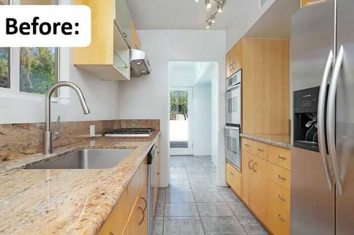
 The kitchen in Steven and John’s Palm Springs house — designed by midcentury architect Herbert W. Burns — had been pretty nicely updated, albeit, admittedly “tastefully bland.” Once in the house, there was no question that this creative couple — Steven Keylon is a landscape historian, and John De La Rosa, a metal sculptor — would revive the deserving space with a period kitchen remodel befitting its provenance. Very interesting to me: Steven and John also have been restoring the original colors used inside the house, which drove their choices for the kitchen cabinetry. This level of attention to detail is not something I have seen very often — a true restoration mindset — I’m extremely impressed!
 Steven wrote:
We bought our Herbert W. Burns designed house in the Deepwell Estates neighborhood of Palm Springs two years ago. We actually moved to Palm Springs from Los Angeles for the house!
We had long loved Herbert Burns’ Late Moderne style, and it fit our collection of Gilbert Rohde for Herman Miller furniture perfectly.
The house was pretty much a blank slate. It had been a wreck 10 years before, but our friend Jacques Caussin, one of the co-founders of Palm Springs Modernism Week, had bought the house to save it from flippers who didn’t know what they were doing.

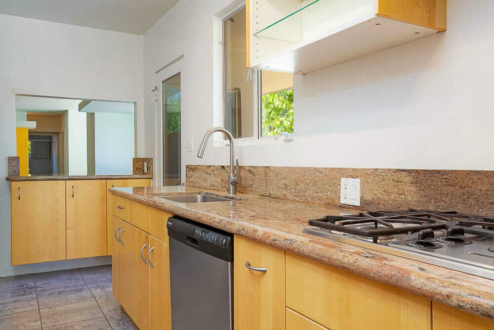
Because the kitchen had been badly redone in the 1970s, and that later kitchen was in deplorable shape, he quickly put in an Ikea kitchen with granite countertops, to keep it “tastefully bland,” since he was planning on quickly restoring the original features to flip the house himself.
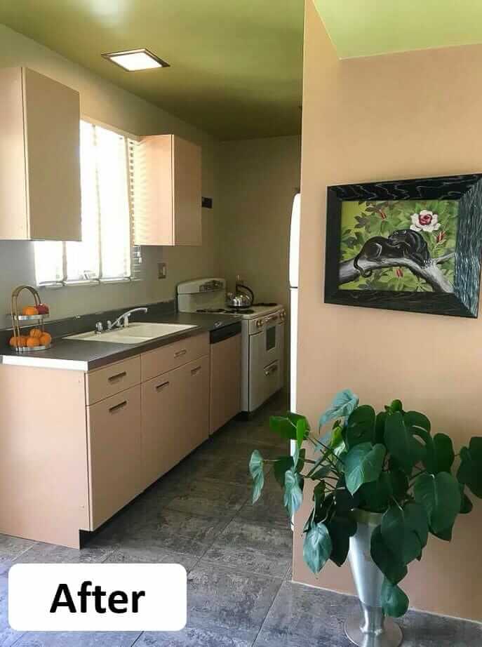
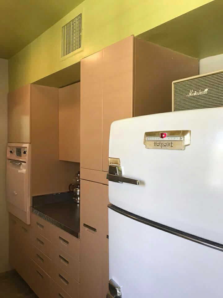
In the last two years, we’ve been restoring the house, including returning the paint palette to the original colors Herbert Burns chose for the house. One of the primary colors is a wonderful muted pinkish-tan color, he used to harmonize with the Arizona sandstone chimney.
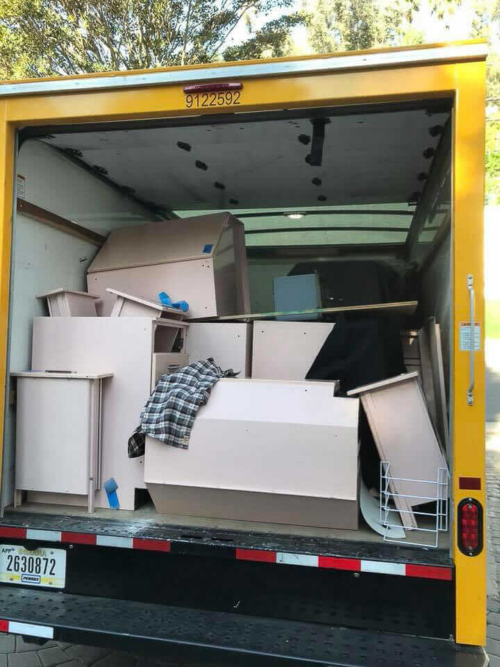
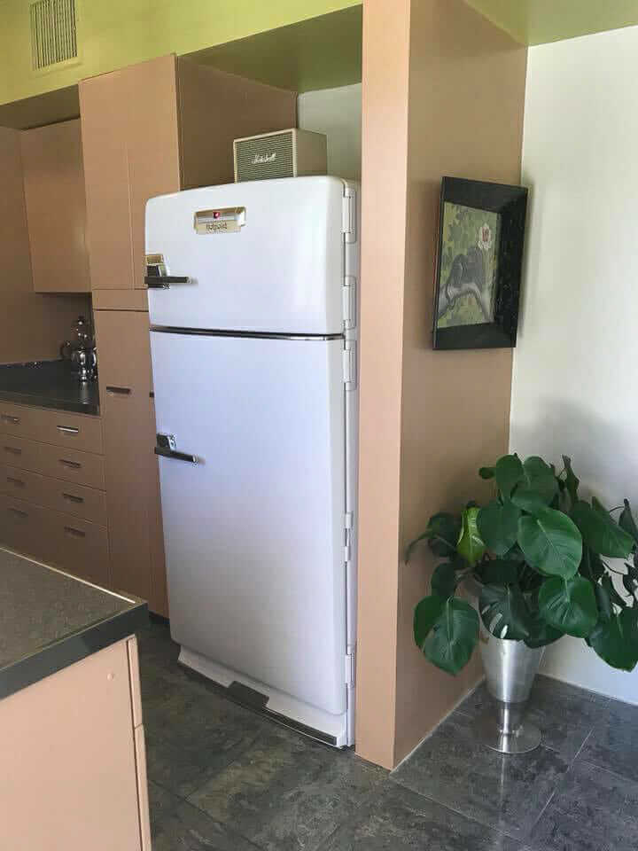
When we bought it, we knew we wanted vintage steel cabinets, but it took two years of searching to find a set nearby. John found a set of pink General Electric cabinets in Beverly Hills, so we rented a big truck and grabbed it all.

We were up against the clock, as our house was scheduled to be on a big tour for a weekend celebrating the work of Herbert Burns, which the Palm Springs Preservation Foundation (PSPF) planned a few weeks ago. I’m on the Board of PSPF, and wrote Burns’ biography for the event.
Sink:
We worked like mad to get the kitchen done in time, and did it, with minutes to spare! We seriously were hanging cabinets an hour before people were going to arrive.
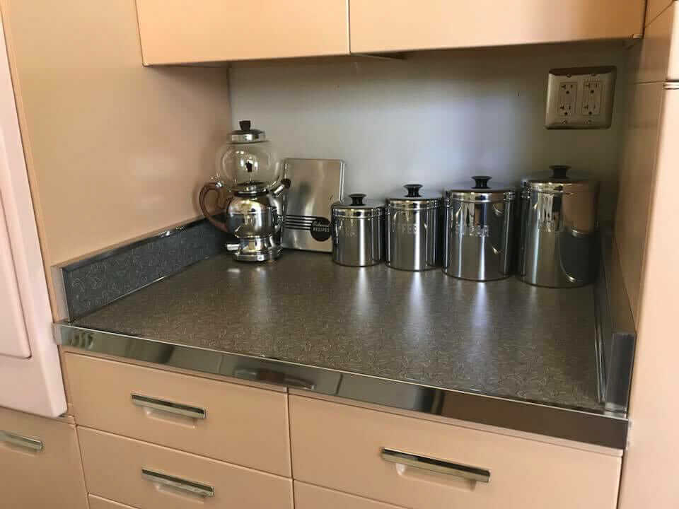
The kitchen was originally GE’s “petal pink,” but had been repainted at some point in the past in a color that was almost identical to Herbert Burns’ pinkish-tan. So we sprayed them in the same color, polished the hardware…
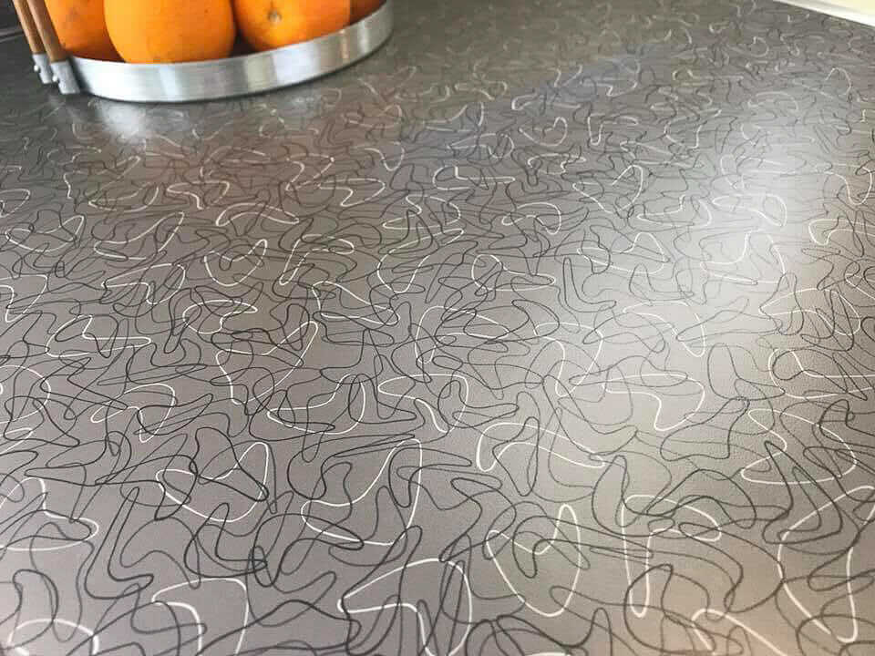
…and had Formica Skylark countertops in gray, with stainless steel trim installed.
Formica boomerang laminate in charcoal, so thrifty too, and in various sizes:
Your blog was a wealth of information, so we thank you! That’s also how we sourced the kitchen faucet. I painted the stainless steel dishwasher to match the cabinets.
Kohler Delafied sink with metal (hudee) ring:
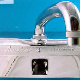
Central Brass kitchen faucet:
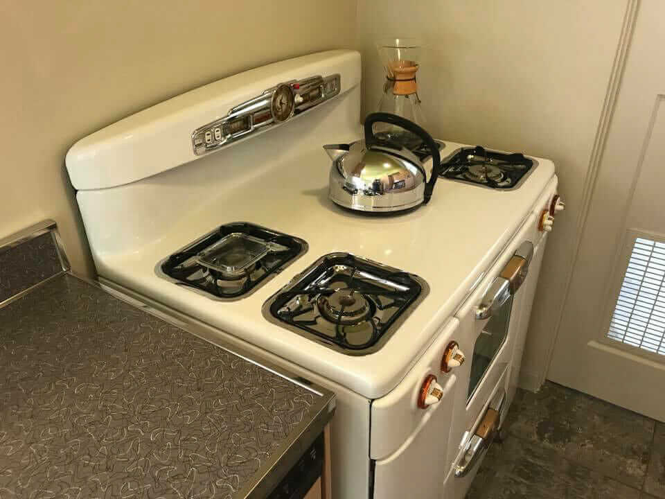
Our 1948 Tappan DeLuxe stove was in storage, as was our 1950 Hotpoint refrigerator, so we are happy to have them back again. We’ve still got to work out the vent exhaust situation…
Thank you, Steven — what a great project. Your research also is making me fell the pinky-beige love. I don’t think pinky-beige gets much love. This is literally a “Pinky Beige” in our first-and-best Sherwin Williams Suburban Modern paint color collection. Pinky beige is a fine color!
Nicely played.


Karin says
Well done, gentlemen! Congratulations on your incredible magazine-worthy restoration. That car is swoonworthy. What a feast for the eyes. The colours are perfect. I’d love to see the rest of the house.
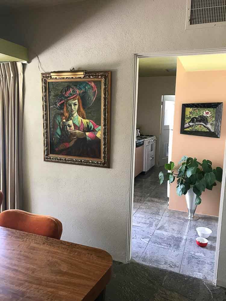
The art is really special too. I know the panther is probably Carlo of
Hollywood. Is the lady with the mask a rare Tretchikoff?
STEVEN KEYLON says
Thank you! Yes, you have a good eye, the panther is Carlo of Hollywood. John remembered it from an aunt’s house all his life, and when they were clearing out the house he asked his sister to see if it was still there. It was sitting on top of a pile at the curb! The lady is by Abruzzi, the brush name of a Hollywood artist named Harold Stephenson. He did a series of Harlequin themed paintings in the late 40s and early 50s, later doing post-apocalyptic surreal paintings, ending with a now popular series of big-eyed sad children.
Jay says
What a wonderful job! Like the horizontal streamlined look of the window wall. Hope to get to Pam Springs one day to take in all its MCM goodness. Pam, that pinky beige in the kitchen reminds me of the color of my parents living room walls from the 50s plus one dark green wall and remained for 25 years. Thanks for sharing!
Carolyn says
I’ve attempted to watch the “flip” show in that area and am so disappointed in how they manage to botch a simple cleanup. I could understand if they stood to make a major profit but if it’s for less than $50,000 what was the point? Especially since these homes are priced at over $350k! before they start.
Now see Herbert Burns used colors from nature – yes, granite & marble are natural but this house is in the desert! You wouldn’t think there was ANY color out there cuz it’s all dead and dried out. Thank you, guys, for bringing this cutie back to beauty. Good job (and when do we see more pics?)
Allison says
With all due respect, Carolyn, the desert is full of color! Some of the colors are garish, some are subtle… but it is NOT dead, although it may be dry.
The fact that the palette of this house is drawn from desert rock and vegetation is simply perfect.
Carolyn says
Allison, I was awkward in my wording – referencing the “flip” show, they seldom take into consideration the architecture (everything needs to be open and white) or surroundings, whether in the deep woods or on the water. Ranch houses are ubiquitous for mid-century but were modified for the locale. Where we see a myriad of hues and values of browns, they only see “builder beige”.
I only have two references for the desert – a drive from OK City to Lawton so I’m not sure that qualifies as desert. The other is Nov. in WI – leaves have mostly turned and dropped but it still hasn’t snowed, what DH calls the “ugly season”. He can’t see the beauty and variations in the dried cornstalks, fallow fields, or plowed fields against which the evergreens are highlighted, and brown & black deciduous trees are displayed.
STEVEN KEYLON says
Carolyn, I agree, banish the builder beige!
I hope you can come to the desert sometime, it does have its own unique seasons, and with those seasons a variety of color. The most spectacular time is around February, especially if there has a been a wet winter. The desert floor is carpeted in lilac pink sand verbena, with sagey green brittlebrush all flowering in bright yellow. The Palo Verde trees, with their sculptural green trunks are ablaze with yellow flowers. The smoke trees get deep purple flowers too. The native palms have reddish brown trunks, and matte green fronds. Not to mention the mesquites, tamarisks, desert willows etc etc etc, all with their own unique shades of green, textures, scents.
Ranger Smith says
Such a wonderful kitchen and your stove a refrigerator integrate perfectly! Lest not forget, there appears to be Venetian blinds above the sink! Great job!
STEVEN KEYLON says
Thank you, and yes! The 2″ venetian blinds complete the look. We lived with broken down plastic vertical blinds for a while, it was a joy to rip them down…
LuAnn says
I noticed the blinds too. ❤Love!❤
Pamela H. says
Would love to see the rest of this home!
Brandi says
I LOVE this….especially since I have the same counter top in my kitchen! I had the original wood cabinets but a water leak that the previous owner did nothing to stop meant I couldn’t save the lowers (or the floor for that matter) but the uppers were/are perfect and I managed to find lowers that were close. I had to do a few quick fixes to move in, but I’m slowly trying to “fix” my ’59 ranch. Thanks for sharing your home with us!
Pam Kueber says
Brandi, contact the manufacturer to get into this level of specificity. Good luck, Pam
Angus says
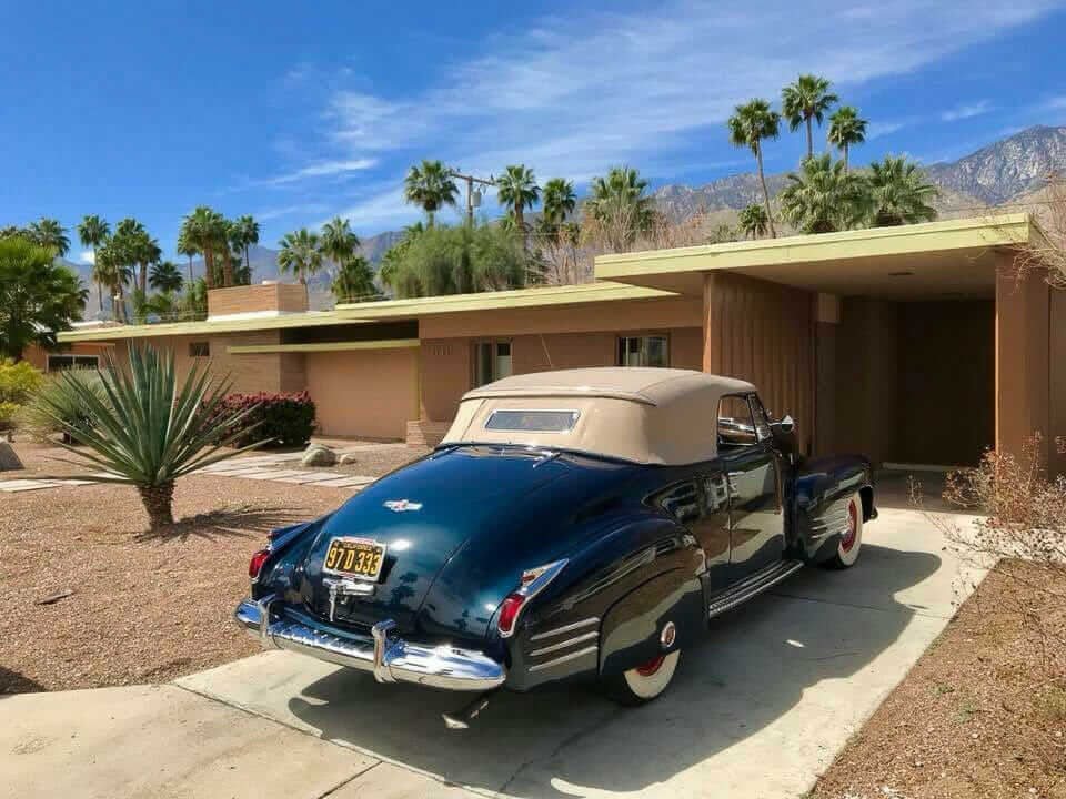
1941 Cadillac convertible, probably a “62 Series” model
Tom says
It’s beautiful, congratulations on a job well done. It does my heart good to see kitchen updates in reverse. It makes me want to cry when I see a vintage mid century kitchen torn out only to be replaced by granite countertops and cheap vinyl flooring and I see it all the time as a remodeling subcontractor.
Janet in ME says
It all came together just beautifully! I am curious – did the pink GE wall oven come with the cabinets? It seems to fit perfectly. And I am wondering – is the green soffit and ceiling something you determined was an original color? The charcoal boomerang formica is just right. I am always happy to see a well done job like this.
STEVEN KEYLON says
Hi Janet, thank you! Yes, the petal pink GE wall oven came with the kitchen cabinets. The steel cabinets were all that same color when the kitchen was new. At some point in the past, they had been painted the pinkish-tan that was almost identical to the Herbert Burns color our house had been painted, so we repainted the cabinets in that same exact shade. The chartreuse ceiling and soffit are the original colors from when the kitchen was new in 1950. Herbert Burns was a color consultant as well as an architectural designer, and was inspired by the natural colors of the desert when planning his color palettes. Julius Shulman, the famous photographer, wrote about Burns in an article for the Los Angeles Times Home Magazine in 1948, explaining that Burns went out to the desert, grabbed a rock from the Chocolate Mountains, had a piece of Arizona sandstone, branches from mesquite, tamarisk and Palo Verde trees, and told his painter to match them. I am a historic paintaholic, and have lots of old fan decks and paint catalogues. The colors in our house as I worked to re-establish the original paint palette all matched colors in a 1948 PPG set of paint chips I had, so I took those chips to PPG and had them matched. The house is two-toned, pinkish tan and deep coppery brown, with Palo Verde green (chartreuse) trim. All the ceilings in the house were chartreuse, and that color carries out to the exterior underhangs and fascia.
Pam Kueber says
My favorite line of the week — and it’s only Monday 9:36 a.m.:
STEVEN KEYLON says
HAR HAR! I have also become a Schlageaholic, but that is for another time….
Pam Kueber says
Yes, Schlageaholic – I get that too, and we ain’t talkin’ whipped cream.
Dan says
Yes, the kitchen is marvelous, but WHAT IS THAT CAR? We’re thinking Cadillac or Buick. The public demands answers! (Oh, well done).
STEVEN KEYLON says
Thank you Dan! That is Gracie, she’s a 1941 Cadillac convertible coupe.
Carolyn says
Steven Keylon – there are food and water dishes on the floor – where is the photo of the supervisor of this awesome job? Just happened to step out of the frame when you pressed the button?