

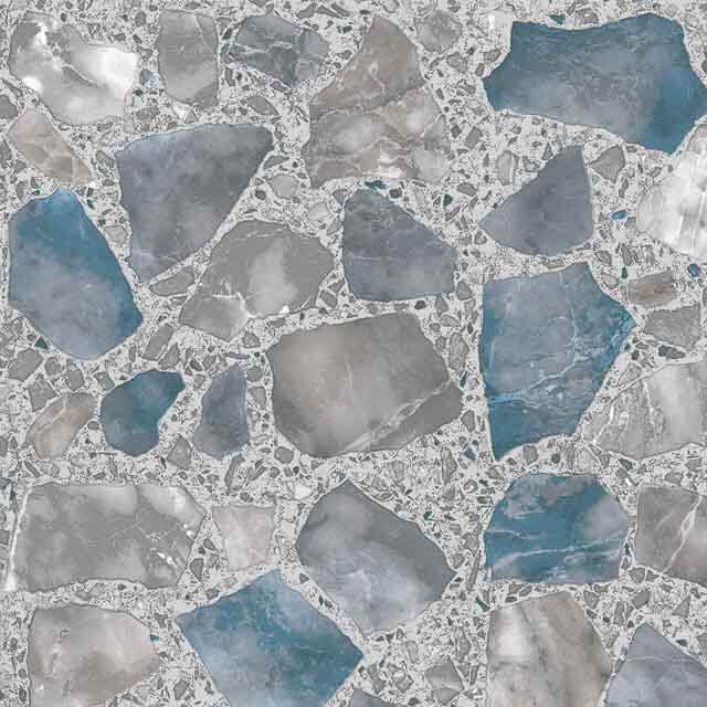
 Is the diversity of flooring choices starting to improve? It seems to me that these days, I’m seeing more than just flat gray stone after flat beige stone after flat greige stone flooring options pop up in manufacturers’ lineups. Like: This 1970s flooring design from Tarkett — okay, it’s stones in stones, but I recollect that this is what a lot of 1970s flooring and even mid-to-late 1960s flooring looked like. Above: Tarkett Mexican Agate Blue.
I recall that some 1970s flooring had this look
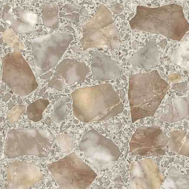
Above: Tarkett Mexican Agate Aztec Bronze. It’s nice to to have the two colorways — the Aztec Bronze provides a good option if you want to work within the cream/beige/gold and warm gray families. The other, the Blue, offers fans of cooler gray walls a complementary option, and I love that pop of … what will I call it: azure.
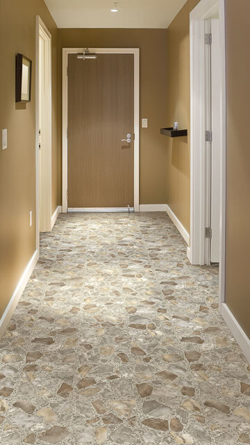 There’s even a room shot. Note: The 1970s were very brown. These walls aren’t quite brown — I’d say they have a golden or copper cast — gold walls were all the rage in the 1990s. I like gold walls.
You know I have a sweet spot for stone-look vinyl sheet flooring. I like its quiet movement — the fact it has pattern, but pattern that does not take over a room. There’s just something… primal, perhaps… about walking on stones, albeit faux, like this that is almost the very definition of providing ‘visual gravity.’
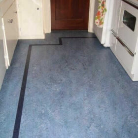
Another floor, featured in the past, that is one of my favorites for a mid-to-late 1960s flooring heading into 1970s flooring is Karndean’s Michelangelo. It comes in five colorways, including some true color-colors, and is available as a tile (rather than as sheet). Jessica installed the blue colorway in her kitchen here.


Beverly says
My kitchen has the stone-in-stone you’ve shown here, but it’s yellow/gold. It’s supposed to coordinate with the yellow leatherlook formica counters.
Good thing I like yellow kitchens. 🙂